So far, the cost of single-cell transcriptome is still high, so in most cases, we do two groups, that is, three or five samples in each group. In this case, the difference in the proportion of different single-cell subsets between the two groups often needs to be verified by expanding the sample queue with relatively cheap experimental techniques such as flow cytometry.
The proportion of different subpopulations of different single-cell samples is different, as we introduced earlier: Balloon plot and mosaic diagram showing the change of cell proportion , and Sanggi diagram showing the change of cell proportion , but they are usually not compared in groups. Recently, I saw an article published in NC magazine in 2020: integrated single cell analysis of blood and cerebrospin fluid leucocytes in multiple sclerosis, Its data set is: https://www.ncbi.nlm.nih.gov/geo/query/acc.cgi?acc=GSE138266 , it can be seen that there are 2 groups, and each group has 11 samples. The single cell ratio of the two groups can be compared.
First, it is still the classical dimensionality reduction clustering clustering and marker gene to name the subgroup, as shown below:
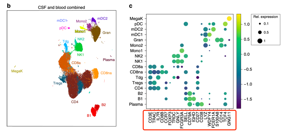
Classical Dimension Reduction Clustering
Basically, these genes can be recited. Then, we can take them apart according to the grouping of samples to see the proportion difference of single cell subsets:
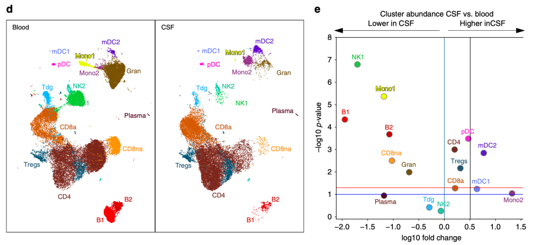
Proportion difference of single cell subsets
If you look at it with the naked eye, you can basically judge that NK1 cell subgroup is basically absent in CSF group, while Mono2, on the contrary, it was basically absent in blood, but the proportion in CSF disease group is quite high. However, other cell subsets that are not very obvious can not be seen with the naked eye, so the volcanic map on the right shows the changes in the proportion of single-cell subsets in the two groups.
Now let's demonstrate how to draw such a volcanic map. In fact, the most important thing is how to obtain the data! Here we can only say that we can select the simulation data, as shown in the following code:
library(dplyr)
library(ggplot2)
library(dplyr)

set.seed(1)
n=260000
phe = data.frame(
  celltype= sample(LETTERS ,n,replace = T) ,
  orig.ident = sample(paste0(c('case','control'),c(1:10,1:10)),n,replace = T)
)
head(phe)
table(phe$celltype)
table(phe$orig.ident)
phe$group = ifelse(grepl('case',phe$orig.ident) , 'case','control')
table(phe$group)
head(phe)
As follows:
> table(phe$group)

   case control
 130094  129906
> dim(phe)
[1] 260000      3
> head(phe)
  celltype orig.ident   group
1        Y      case3    case
2        D      case1    case
3        G   control8 control
4        A   control8 control
5        B      case1    case
6        W      case9    case
Our two groups, case and control, are 10 single-cell samples, and our single-cell subsets are 26, with a total of 260000 cells. The result of this simulation is the result of Dimension Reduction Clustering and clustering of single-cell data sets. Refer to the previous example: Single cell clustering and clustering annotation that everyone can learn , get the phe variable yourself.
Next, you can make a series of statistics on this phe. The code is as follows:
pro='group'
tb <- data.frame(table(phe$celltype,phe$orig.ident,
                       phe[,pro]))

tb=tb[which(tb$Freq != 0),]
tb=tb[,c(1,3,4)]
head(tb)

tb$Total <- apply(tb,1,function(x)sum(tb[tb$Var1 == x[1],3]))
tb<- tb %>% mutate(Percentage = round(Freq/Total,3) * 100)
tb=tb[,c(1,2,5)]
tb$Var1=as.factor(tb$Var1)
tb$Var3=as.factor(tb$Var3)
head(tb)
df= do.call(rbind,
            lapply(split(tb,tb$Var1), function(x){
              # x= split(tb,tb$Var1)[[1]]
              tmp = t.test(x$Percentage ~ x$Var3)
              return(c(tmp$p.value, tmp$estimate[1]-tmp$estimate[2]))
            }))
head(df)
It can be seen that there is little difference in the proportion of these 26 single-cell subsets in the two groups, and it is basically unlikely to be statistically significant, because I am a random simulation data, not a real single-cell data analysis practice.
> df
             mean in group case
A 0.58496895               0.10
B 0.22798735              -0.18
C 0.52050726               0.14
D 0.09569494               0.20
E 0.61076971               0.08
F 0.66543654              -0.12
G 0.67605420               0.06
H 0.32041576               0.28
I 0.49641609              -0.10
J 0.57703994               0.14
K 0.91762160               0.02
L 0.12634692              -0.28
M 0.39033329               0.18
N 0.70214693               0.08
O 0.30149845              -0.14
P 0.86727855              -0.02
Q 1.00000000               0.00
R 0.75319312              -0.08
S 0.45515512               0.14
T 0.45181182              -0.16
U 0.87092289              -0.04
V 0.22497991              -0.24
W 0.29969641               0.16
X 0.41407380               0.12
Y 0.54543081              -0.08
Z 0.36185885               0.18
Next, we need to draw the volcanic map of this statistical result, and the basic function is as follows:
pdf("p.pdf",width = 5.5,height = 5.5)
plot(df[,2],-log10(df[,1]),pch = 19)
abline(v = 0,lty = 2)
text(df[,2],-log10(df[,1]),rownames(df),cex = 0.6,pos = 2,col = "red")
dev.off()
And advanced drawing functions:
library(ggrepel)
library(ggplot2)
colnames(df) = c("pval","Difference")
df = as.data.frame(df)
df$threshold = factor(ifelse(df$Difference > 0 ,'Down','UP'))

ggplot(df,aes(x=Difference,y=-log10(pval),color=threshold))+
  geom_point()+
  geom_text_repel(
    aes(label = rownames(df)),
    size = 4,
    segment.color = "black", show.legend = FALSE ) + #Add the name of the cell group
  theme_bw()+#Modify picture background
  theme(legend.title = element_blank()) +  #Do not display legend title
  ylab('-log10(pval)')+  #Modify the y-axis name
  xlab('Difference')+  #Change x-axis name
  geom_vline(xintercept=c(0),lty=3,col="black",lwd=0.5)
ggsave("p1.pdf",width = 5,height = 4)
The effect is as follows:
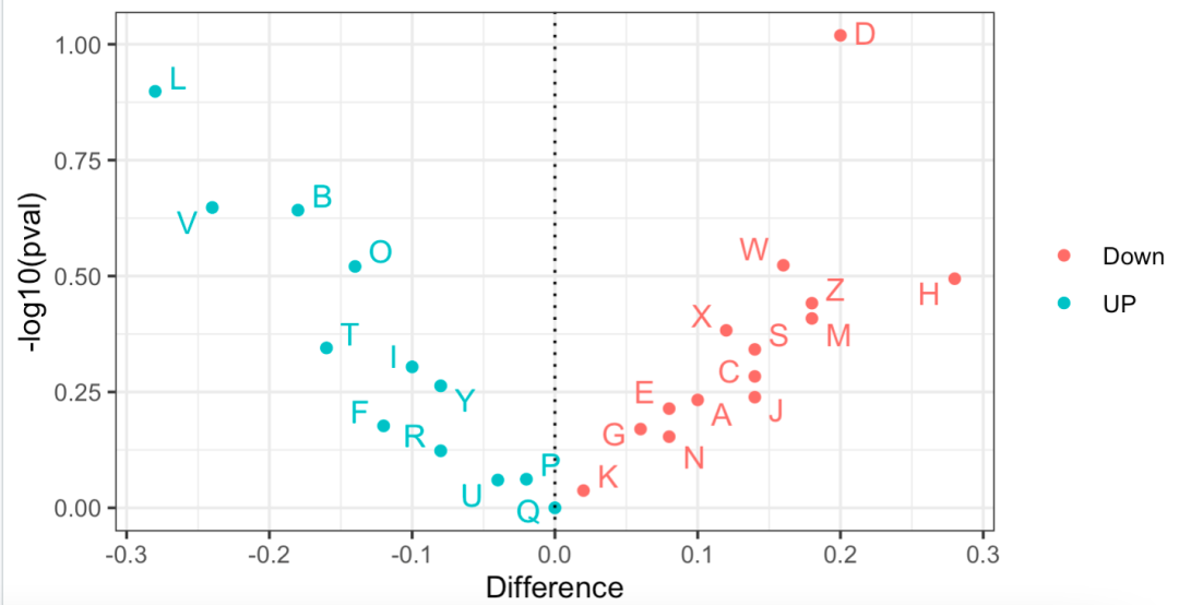
Volcanic map showing the proportion difference of different subgroups
If you really think my tutorial is helpful to your scientific research project and makes you enlightened, or your project uses a lot of my skills, please add a short thank you when publishing your achievements in the future, as shown below:
We thank Dr.Jianming Zeng(University of Macau), and all the members of his bioinformatics team, biotrainee, for generously sharing their experience and codes.
If I have traveled around the world in universities and research institutes (including Chinese mainland) in ten years, I will give priority to seeing you if you have such a friendship.