Look at the effect first (the source code is at the end):
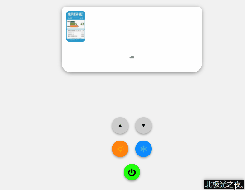
The video effect is as follows, with sound effect Station B:
A fan shared this effect with me. I thought it was very interesting, and then studied it. The specific implementation is as follows (there may be many codes, but they are relatively simple. Come on):
Implementation process:
1. Define label:
 <!-- Bottom box -->
    <div class="container">
        <!-- Air conditioning as a whole -->
        <div class="air">
            <!-- Picture showing air conditioning parameters -->
            <img src="./air-conditioning.png" alt="x" class="picture">
            <!-- Picture in display mode. The default is snowflake -->
            <img class="pattern" src="./snow.png" alt="x">
            <!-- Display temperature -->
            <span class="font">17°C</span>
            <!-- logo,If you put a special character directly, you won't quote the font icon -->
            <span class="logo">?</span>
            <!-- Small green dot in the lower right corner of the air conditioner -->
            <span class="dot"></span>
        </div>
        <!-- Show the effect of wind. There are 3 winds inside -->
        <div class="wind">
            <span class="wind1"></span>
            <span class="wind2"></span>
            <span class="wind3"></span>
        </div>
        <!-- Button box -->
        <div class="btn">
            <!-- upper -->
            <div class="up">▲</div>
            <!-- lower -->
            <div class="down">▼</div>
            <!-- sun -->
            <div class="sun"></div>
            <!-- snowflake -->
            <div class="snow"></div>
            <!-- switch -->
            <div class="open"></div>
        </div>
    </div>
    <!-- Music when the air conditioner is running -->
    <audio src="./open.mp3" class="music" loop></audio>
    <!-- Music with a "Ding" sound when you click the button -->
2. Define the global css style as usual and copy it:
*{
            padding: 0;
            margin: 0;
            box-sizing: border-box;
        }
        body{
            height: 100vh;
            display: flex;
            justify-content: center;
            align-items: center;
            background-color: rgb(241, 241, 241);
        }
3. css style of bottom box:
.container{
            position: relative;
            width: 400px;
            height: 500px;
        }
position: relative; Relative positioning
4. css style of air conditioner appearance:
.air{
            position: relative;
            margin: 0 auto;
            width: 300px;
            height: 120px;
            background-color: rgb(255, 255, 255);
            border-radius: 10px 10px 0 0;
            filter: drop-shadow(0 2px 4px rgb(145, 145, 145));
        }
        .air::after{
            content: '';
            position: absolute;
            bottom: -21px;
            left: 0;
            height: 20px;
            width: 300px;
            background-color: rgb(255, 255, 255);
            border-radius: 0 0 20px 20px;
        }
margin: 0 auto; Center.
background-color: rgb(255, 255, 255); The background is white.
border-radius: 10px 10px 0 0; Radians of the four corners.
filter: drop-shadow(0 2px 4px rgb(145, 145, 145)); Shadows.
5. The css style of parameter picture and mode picture is mainly positioned at the corresponding position:
.picture{
            position: absolute;
            top: 10px;
            left: 10px;
            width: 40px;
            height: 65px;
            border-radius: 5px;
        }
        .pattern{
            position: absolute;
            top: 25px;
            right: 35px;
            width: 20px;
            height: 20px;
            opacity: 0;
            transition: all 0.3s;
        }
position: absolute; Absolute positioning.
opacity: 0; If the transparency is 0, it will not be displayed first. You can write 1 first for observation, and then change it to 0 when writing js.
6. Define temperature font css Style:
.font{
            /* Reference LED font */
            font-family: "led regular";
            position: absolute;
            right: 30px;
            top: 45px;
            width: 50px;
            height: 30px;
            line-height: 30px;
            font-size: 25px;
            color: rgb(184, 184, 184);
            opacity: 0;
            transition: all 0.3s;
        }
The font effect of LED light style is generated by the external file I directly introduced, so I don't write it separately. If you want all the source files and materials, you can leave a message or send a private letter to me in your email and I'll send it to you.
line-height: 30px; Row spacing.
transition: all 0.3s; Transition effect.
7. The css style of logo and small green dot in the lower right corner can be realized. Just locate it in the corresponding position:
.logo{
            position: absolute;
            left: 50%;
            bottom: 3px;
            transform: translateX(-50%);
            font-size: 10px;
            color: rgb(139, 139, 139);
        }
        .dot{
            position: absolute;
            bottom: -8px;
            right: 12px;
            width: 5px;
            height: 5px;
            border-radius: 50%;
            background-color: rgb(19, 221, 53);
            z-index: 1;
            opacity: 0;
            transition: all 0.3s;
        }
left: 50%;
transform: translateX(-50%); You can also center left and right in this way.
z-index: 1; It's displayed on the top layer. Don't be covered.
8. css style of the bottom box of the wind:
.wind{
            position: relative;
            top: 30px;
            width: 250px;
            height: 60px;
            margin: 0 auto;
            opacity: 0;
            transition: all 1.2s;
            animation: move 1.5s ease-in-out infinite;
        }
        @keyframes move{
            0%,100%{
                transform: translateY(0px);
            }
            50%{
                transform: translateY(5px);
            }
        }
margin: 0 auto; Center.
animation: move 1.5s ease-in-out infinite; Animate repetitions.
transform: translateY(0px); Offset the corresponding distance on the Y axis.
9. The style of three small winds shall be positioned at the corresponding position:
.wind>span{
            position: absolute;
            width: 5px;
            height: 40px;
            background-color: rgb(206, 206, 206);

        }
        .wind1{
            left: 20%;
            transform: rotate(20deg);
        }
        .wind2{
            left: 50%;
        }
        .wind3{
            left: 80%;
            transform: rotate(-20deg);
        }
transform: rotate(20deg); Rotate a certain angle.
10. css style of button box:
 .btn{
            position: relative;
            top: 50px;
            margin:0 auto;
            width: 100px;
            height: 150px;
            display: flex;
            justify-content: space-around;
            flex-wrap: wrap;
            align-items: center;
        }
display: flex; flex layout.
justify-content: space-around; The child elements divide the remaining space horizontally.
flex-wrap: wrap; Multiple lines are allowed.
align-items: center; Center vertically.
11. Common style of all buttons:
.btn>div{
            width: 35px;
            height: 35px;
            border-radius: 50%;
            font-size: 12px;
            line-height: 35px;
            text-align: center;
            background-color: rgb(204, 204, 204);
            box-shadow: 0 2px 4px rgb(151, 151, 151);
            cursor: pointer;
            user-select: none;
        }
        .btn>div:active{
            background-color: rgb(240, 240, 240);
        }
border-radius: 50%; Turn into a circle.
text-align: center; Text centered.
box-shadow: 0 2px 4px rgb(151, 151, 151); Shadows.
cursor: pointer; The style is small hand.
user-select: none; Text cannot be selected.
. BTN > div: active: click the mouse to change the style instantly.
12. Unique background color or picture of each button:
.sun,.snow,.open{
            background-size: 50% 50%;
            background-position: 50% 50%;
            background-repeat: no-repeat;
        }
        .btn .sun{
            background-image: url(./sun.png);
            background-color: rgb(255, 130, 13);
        }
        .btn .snow{
            background-image: url(./snow.png);
            background-color: rgb(13, 138, 255);
        }
        .btn .open{
            background-image: url(./open.png);
            background-color: rgb(33, 255, 13);
        }
background-size: 50% 50%; Background image size.
background-position: 50% 50%; Location of background image.
background-repeat: no-repeat; The background image is not tiled.
13. Start js section, get elements and define variables.
         /* switch */
        var open = document.querySelector(".open");
        /* Sun button */
        var sun = document.querySelector(".sun");
        /* Snowflake button */
        var snow = document.querySelector(".snow");
        /* Up button */
        var up = document.querySelector(".up");
        /* Down button */
        var down = document.querySelector(".down");
        /* Pattern picture */
        var pattern = document.querySelector(".pattern");
        /* temperature */
        var font = document.querySelector(".font");
        /* Little green dot */
        var dot = document.querySelector(".dot");
        /* wind */
        var wind = document.querySelector(".wind");
        /* Music when the air conditioner is running */
        var music = document.querySelector(".music");
        /* Music with a "Ding" sound when you click the button*/
        var ding = document.querySelector(".ding");
        /* Variable to judge the switch state */
        var temp = 1;
        /* Temperature size */
        var num = 17;
14. When the switch button is clicked, the transparency of the corresponding mode, font, etc. changes to 1:
 open.addEventListener('click',function(){
            if(temp==0){
            // The background color turns green
                open.style.backgroundColor = 'rgb(33, 255, 13)';
                pattern.style.opacity = 0;
                font.style.opacity = 0;
                dot.style.opacity = 0;
                wind.style.opacity = 0;
                temp=1;
                // Pause the music of the air conditioner
                music.pause();
            }else if(temp==1){
            // Turn red
                open.style.backgroundColor = 'red';
                pattern.style.opacity = 1;
                font.style.opacity = 1;
                dot.style.opacity = 1;
                wind.style.opacity = 1;
                temp=0;
                // Music to start air conditioning
                music.play();
            }
        })
15. Change when clicking the up button, other buttons and so on:
up.addEventListener('click',function(){
           if(num==30) return ;
            //Temperature plus 1
            num++;
            // Temperature text rendering
            font.innerHTML = num+"°C";
            // Ding music reload
            ding.load();
            //Ding music playing
            ding.play();
        })
        down.addEventListener('click',function(){
         if(num==16) return ;
            num--;
            font.innerHTML = num+"°C";
            ding.load();
            ding.play();
        })
        sun.addEventListener('click',function(){
            pattern.src = "./sun.png";
            ding.play();
            music.load();
            music.play();
        })
        snow.addEventListener('click',function(){
            pattern.src = "./snow.png";
            ding.play();
            music.load();
            music.play();
        })
Full code:
<!DOCTYPE html>
<html lang="zh-CN">
<head>
    <meta charset="UTF-8">
    <meta http-equiv="X-UA-Compatible" content="IE=edge">
    <meta name="viewport" content="width=device-width, initial-scale=1.0">
    <title>Small air conditioner</title>
    <style>
        @font-face {
         font-family: 'led regular';
         src: url('./font/ds_digital/DS-DIGI.TTF');
        }

        *{
            padding: 0;
            margin: 0;
            box-sizing: border-box;
        }
        body{
            height: 100vh;
            display: flex;
            justify-content: center;
            align-items: center;
            background-color: rgb(241, 241, 241);
        }
        .container{
            position: relative;
            width: 400px;
            height: 500px;
           /*  border: 1px solid rgb(201, 201, 201); */
        }
        .air{
            position: relative;
            margin: 0 auto;
            width: 300px;
            height: 120px;
            background-color: rgb(255, 255, 255);
            border-radius: 10px 10px 0 0;
            filter: drop-shadow(0 2px 4px rgb(145, 145, 145));
        }
        .air::after{
            content: '';
            position: absolute;
            bottom: -21px;
            left: 0;
            height: 20px;
            width: 300px;
            background-color: rgb(255, 255, 255);
            border-radius: 0 0 20px 20px;
        }
        .picture{
            position: absolute;
            top: 10px;
            left: 10px;
            width: 40px;
            height: 65px;
            border-radius: 5px;
        }
        .pattern{
            position: absolute;
            top: 25px;
            right: 35px;
            width: 20px;
            height: 20px;
            opacity: 0;
            transition: all 0.3s;
        }
        .font{
            /* Reference LED font */
            font-family: "led regular";
            position: absolute;
            right: 30px;
            top: 45px;
            width: 50px;
            height: 30px;
            line-height: 30px;
            font-size: 25px;
            color: rgb(184, 184, 184);
            opacity: 0;
            transition: all 0.3s;
        }
        .logo{
            position: absolute;
            left: 50%;
            bottom: 3px;
            transform: translateX(-50%);
            font-size: 10px;
            color: rgb(139, 139, 139);
        }
        .dot{
            position: absolute;
            bottom: -8px;
            right: 12px;
            width: 5px;
            height: 5px;
            border-radius: 50%;
            background-color: rgb(19, 221, 53);
            z-index: 1;
            opacity: 0;
            transition: all 0.3s;
        }
        .wind{
            position: relative;
            top: 30px;
            width: 250px;
            height: 60px;
            margin: 0 auto;
            opacity: 0;
            transition: all 1.2s;
            animation: move 1.5s ease-in-out infinite;
        }
        @keyframes move{
            0%,100%{
                transform: translateY(0px);
            }
            50%{
                transform: translateY(5px);
            }
        }
        .wind>span{
            position: absolute;
            width: 5px;
            height: 40px;
            background-color: rgb(206, 206, 206);

        }
        .wind1{
            left: 20%;
            transform: rotate(20deg);
        }
        .wind2{
            left: 50%;
        }
        .wind3{
            left: 80%;
            transform: rotate(-20deg);
        }
        .btn{
            position: relative;
            top: 50px;
            margin:0 auto;
            width: 100px;
            height: 150px;
            display: flex;
            justify-content: space-around;
            flex-wrap: wrap;
            align-items: center;
        }
        .btn>div{
            width: 35px;
            height: 35px;
            border-radius: 50%;
            font-size: 12px;
            line-height: 35px;
            text-align: center;
            background-color: rgb(204, 204, 204);
            box-shadow: 0 2px 4px rgb(151, 151, 151);
            cursor: pointer;
            user-select: none;
        }
        .btn>div:active{
            background-color: rgb(240, 240, 240);
        }
        .sun,.snow,.open{
            background-size: 50% 50%;
            background-position: 50% 50%;
            background-repeat: no-repeat;
        }
        .btn .sun{
            background-image: url(./sun.png);
            background-color: rgb(255, 130, 13);
        }
        .btn .snow{
            background-image: url(./snow.png);
            background-color: rgb(13, 138, 255);
        }
        .btn .open{
            background-image: url(./open.png);
            background-color: rgb(33, 255, 13);
        }
    </style>
</head>
<body>
    <!-- Bottom box -->
    <div class="container">
        <!-- Overall air conditioning -->
        <div class="air">
            <!-- Picture showing air conditioning parameters -->
            <img src="./air-conditioning.png" alt="x" class="picture">
            <!-- Picture in display mode. The default is snowflake -->
            <img class="pattern" src="./snow.png" alt="x">
            <!-- Display temperature -->
            <span class="font">17°C</span>
            <!-- logo,If you put a special character directly, you won't quote the font icon -->
            <span class="logo">?</span>
            <!-- Small green dot in the lower right corner of the air conditioner -->
            <span class="dot"></span>
        </div>
        <!-- Show the effect of wind. There are 3 winds inside -->
        <div class="wind">
            <span class="wind1"></span>
            <span class="wind2"></span>
            <span class="wind3"></span>
        </div>
        <!-- Button box -->
        <div class="btn">
            <!-- upper -->
            <div class="up">▲</div>
            <!-- lower -->
            <div class="down">▼</div>
            <!-- sun -->
            <div class="sun"></div>
            <!-- snowflake -->
            <div class="snow"></div>
            <!-- switch -->
            <div class="open"></div>
        </div>
    </div>
    <!-- Music when the air conditioner is running -->
    <audio src="./open.mp3" class="music" loop></audio>
    <!-- Music with a "Ding" sound when you click the button -->
    <audio src="./12763.wav" class="ding"></audio>
    <script>
        /* switch */
        var open = document.querySelector(".open");
        /* Sun button */
        var sun = document.querySelector(".sun");
        /* Snowflake button */
        var snow = document.querySelector(".snow");
        /* Up button */
        var up = document.querySelector(".up");
        /* Down button */
        var down = document.querySelector(".down");
        /* Pattern picture */
        var pattern = document.querySelector(".pattern");
        /* temperature */
        var font = document.querySelector(".font");
        /* Little green dot */
        var dot = document.querySelector(".dot");
        /* wind */
        var wind = document.querySelector(".wind");
        /* Music when the air conditioner is running */
        var music = document.querySelector(".music");
        /* Music with a "Ding" sound when you click the button*/
        var ding = document.querySelector(".ding");
        /* Variable to judge the switch state */
        var temp = 1;
        /* Temperature size */
        var num = 17;

        open.addEventListener('click',function(){
            if(temp==0){
                open.style.backgroundColor = 'rgb(33, 255, 13)';
                pattern.style.opacity = 0;
                font.style.opacity = 0;
                dot.style.opacity = 0;
                wind.style.opacity = 0;
                temp=1;
                music.pause();
            }else if(temp==1){
                open.style.backgroundColor = 'red';
                pattern.style.opacity = 1;
                font.style.opacity = 1;
                dot.style.opacity = 1;
                wind.style.opacity = 1;
                temp=0;
                music.play();
            }
        })
        up.addEventListener('click',function(){
            if(num==30) return ;
            num++;
            font.innerHTML = num+"°C";
            ding.load();
            ding.play();
        })
        down.addEventListener('click',function(){
            if(num==16) return ;
            num--;
            font.innerHTML = num+"°C";
            ding.load();
            ding.play();
        })
        sun.addEventListener('click',function(){
            pattern.src = "./sun.png";
            ding.play();
            music.load();
            music.play();
        })
        snow.addEventListener('click',function(){
            pattern.src = "./snow.png";
            ding.play();
            music.load();
            music.play();
        })
    </script>
</body>
</html>
Summary:
Other articles:
Text smoke effect html+css+js
Surround reflection loading effect html+css
Bubble floating background effect html+css
Simple clock effect html+css+js
Cyberpunk style button html+css
Simulated Netease cloud official website rotation map html+css+js
Water wave loading animation html+css
Navigation bar scrolling gradient effect html+css+js
Book page turning html+css
3D photo album html+css
Neon painting board effect html+css+js
Summary of some css attributes (1)
Sass summary notes
... wait
Go to my home page to see more~