In order to achieve the effect, the case uses randomly generated data, which is more suitable for static pages that tend to display the effect, such as the home page and login page of the portal website. The color and style are self-adjusting.
It should be noted that in some projects, the dashboard may not display normally. This is because the version of eckarts5 you introduced in the project is too low. You need to introduce a new version of eckarts5.
catalogue
2. Create method, draw chart and call
3. Set the chart and its style in option
4, Complete code + detailed comments
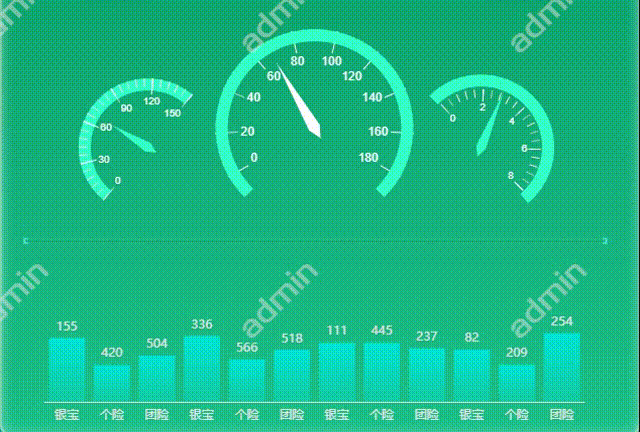
1, Case effect
Before making a case, we normally introduce the chart of echarts. The download and installation of the dependent package of echarts are omitted here. For details, please refer to the article:
2, Implementation steps
1. Create page structure
Two containers with id names. The style is customized.
<template>
  <div style="width: 100%;">
      <!--Dashboard-->
      <div id="gauge"></div>
      <!--Column diagram-->
      <div id="bar"></div>
    </div>
</template>

<style scoped>
  #gauge {
    width: 8rem;
    height: 5.5rem;
    position: absolute;
    top: 2.55rem;
    left: 5.7rem;
  }

  #bar {
    width: 8rem;
    height: 2.2rem;
    position: relative;
    top: 2.8rem;
    left: 5.7rem;
  }
</style>
2. Create method, draw chart and call
Methods to create the methods for drawing charts respectively, and then call them respectively in the mounted phase.
<script>
export default {
  data() {
    return {};
  },
  methods: {
    //Draw histogram
    draw_bar() {
      let myEchart = this.$echarts.init(document.getElementById("bar"));
      var option = {};
      myEchart.setOption(option);
    },

    //Draw dashboard
    draw_gauge() {
      let myEchart = this.$echarts.init(document.getElementById("gauge"));
      var option = {};
      myEchart.setOption(option);
    },
  },
  mounted() {
    //Call the method of drawing the chart
    this.draw_bar();
    this.draw_gauge();
  },
};
</script>
3. Set the chart and its style in option
You can directly copy the code of the case on the official website to option and modify it yourself.
3, Summary of key knowledge
The principle of realizing the dynamic change of chart is actually based on the timer setInterval(). The difference between setInterval() and setTimeout() is that setInterval() is periodic. The program contained in it is executed repeatedly according to the given time period, while setTimeout() is executed once after the given time.
Therefore, our approach is to set the cycle timer, obtain the data in the chart every certain time, and the data is completely random, and re display the chart, and then set the appropriate animation and interval time, so as to realize the dynamic change of the chart.
For example, the timer of histogram is set as follows:
setInterval(() => {
   for (let i = 0; i <= 11; i++) {  //Define i to ensure that each item of the column diagram can be refreshed
     option.series[0].data[i] = (Math.round(Math.random() * 600) + 1); //The random value of the data is 1-600, not 0. If it is 0, the column will disappear
     }
   myEchart.setOption(option, true); //Redisplay the chart every refresh
   }, 200);
The data in the histogram (option.series[0].data[i]) is redefined every 200 milliseconds, which is a random number of 1-600. The chart (myEchart.setOption(option, true)) is displayed again after each data update, so as to achieve the effect of continuous data change.
Then there is the animation. There are such attributes in the configuration item document on the official website of ecarts. You can set the transformation speed of the dashboard pointer and the column transformation speed in the column diagram.
animation: true
Turn on animation
animationDuration: 1020
Duration of initial animation
animationDurationUpdate: 1020
Duration of data update animation
animationEasingUpdate: "quadraticIn"
Slow effect of data update animation
Finally, the dynamic effect can be achieved by reasonably matching the animation duration with the timer interval duration.
4, Complete code + detailed comments
<template>
<div style="width: 100%;">
<!--Dashboard-->
<div id="gauge"></div>
<!--Column diagram-->
<div id="bar"></div>
</div>
</template>
<script>
export default {
data() {
return {}
},
methods: {
// Draw histogram
draw_bar() {
let myEchart = this.$echarts.init(document.getElementById("bar"));
var option = {
xAxis: {
type: 'category',
data: ['Lurpak ', 'Personal insurance', 'Group insurance', 'Lurpak ', 'Personal insurance', 'Group insurance', 'Lurpak ', 'Personal insurance', 'Group insurance', 'Lurpak ', 'Personal insurance', 'Group insurance'],
axisLine: {
show: true,
onZero: true,
symbol: "none",
lineStyle: {
color: "#e5e5e5"
}
},
axisTick: {
show: false
},
},
yAxis: {
show: false,
type: 'value',
axisTick: {
show: false
},
axisLine: {
show: false
},
axisLabel: {
show: false
}
},
//Positional relationship between chart and container
grid: {
left: '3%', // Distance from the left side of the container
right: '3%', // Distance from the right side of the container
top: '11%', // Distance from the top of the container
bottom: '12%', // Distance from the bottom of the container
},
series: [
{
data: [520, 600, 450, 380, 370, 510, 120, 200, 150, 620, 600, 450,],
type: 'bar',
backgroundStyle: {
color: "rgba(111, 111, 22, 1)"
},
//Text label of coordinate axis display
label: {
show: true,
position: 'top',
color: '#e5e5e5'
},
//Column color
itemStyle: {
color: {
type: 'linear',
x: 0,
y: 0,
x2: 0,
y2: 1,
colorStops: [{
offset: 0, color: 'rgba(0,234,223,0.9)' // Color at 0%
}, {
offset: 1, color: 'rgba(0,234,223,0.3)' // Color at 100%
}],
global: false // The default is false
}
},
animationEasing: "linear",
animationEasingUpdate: "quadraticIn", //Buffering effect during data update
animationDurationUpdate: 300, //Duration of data update animation
animation: true //Turn on animation
}
]
};
//Here, the timer setInterval is used to refresh the value of the histogram in a loop. The data is different each time
setInterval(() => {
for (let i = 0; i <= 11; i++) { //Define i to ensure that each item of the column diagram can be refreshed
option.series[0].data[i] = (Math.round(Math.random() * 600) + 1); //The random value of the data is 1-600, not 0. If it is 0, the column will disappear
}
myEchart.setOption(option, true); //Redisplay the chart every refresh
}, 200);
},
//Draw dashboard
draw_gauge() {
let myEchart = this.$echarts.init(document.getElementById("gauge"));
var option = {
series: [
//Left instrument cluster
{
name: 'gauge 1',
type: 'gauge',
min: 0,
max: 150,
startAngle: 230,
endAngle: -310,
splitNumber: 5,
radius: '35%',
center: ['21%', '55%'],
axisLine: {
lineStyle: {
color: [[1, '#34FFCA']],
width: 12,
}
},
splitLine: {
distance: -7,
length: 16,
lineStyle: {
color: '#fff',
width: 1
}
},
axisLabel: {
distance: 2,
fontSize: 10,
fontWeight: 400,
fontFamily: 'Arial',
color: '#fff'
},
anchor: {},
pointer: {
width: 5,
length: '60%',
itemStyle: {
color: '#fff'
}
},
detail: {
show: false
},
data: [
{
value: 20
}
],
animationEasing: "linear",
animationEasingUpdate: "quadraticIn", //Buffering effect during data update
animationDurationUpdate: 1000, //Duration of data update animation
animation: true //Turn on animation
},
//Middle dashboard
{
name: 'gauge 2',
type: 'gauge',
min: 0,
max: 180,
z: 10,
startAngle: 210,
endAngle: -30,
splitNumber: 9,
radius: '50%',
center: ['50%', '50%'],
axisLine: {
show: false,
lineStyle: {
width: 2,
color: [
[0.825, '#fff'],
]
}
},
splitLine: {
distance: 35,
length: 22,
lineStyle: {
color: '#fff',
width: 1
}
},
axisLabel: {
distance: 3,
fontSize: 12,
fontWeight: 400,
fontFamily: 'Arial',
color: '#fff'
},
anchor: {},
pointer: {
width: 6,
offsetCenter: [0, '-10%'],
length: '75%',
itemStyle: {
color: '#fff'
}
},
data: [
{
value: 130
// name: '1/min x 1000'
}
],
detail: {
show: false
},
animationEasing: "linear",
animationEasingUpdate: "quadraticIn", //Buffering effect during data update
animationDurationUpdate: 1000, //Duration of data update animation
animation: true //Turn on animation
},
{
name: 'gauge 3',
type: 'gauge',
min: 0,
max: 8,
z: 10,
splitNumber: 8,
radius: '50%',
axisLine: {
lineStyle: {
width: 12,
color: [[1, '#34FFCA']]
}
},
splitLine: {
show: false,
},
axisTick: {
show: false
},
axisLabel: {
show: false
},
anchor: {},
pointer: {
show: false
},
title: {
show: false
},
detail: {
show: false,
offsetCenter: ['0', '70%'],
color: '#FFF',
fontSize: 18,
formatter: '{value}.00'
},
// value is speed
data: [
{
value: 130,
}
],
animationEasing: "linear",
animationEasingUpdate: "quadraticIn", //Buffering effect during data update
animationDurationUpdate: 1000, //Duration of data update animation
animation: true //Turn on animation
},
//Instrument cluster on the right
{
name: 'gauge 4',
type: 'gauge',
min: 0,
max: 8,
startAngle: 135,
endAngle: -50,
radius: '37%',
center: ['79%', '55%'],
//Right dial color
axisLine: {
lineStyle: {
color: [[1, '#34FFCA']],
width: 12
}
},
detail: {
show: false
},
splitLine: {
show: false,
length: 6
},
axisTick: {
show: false
},
axisLabel: {
show: false
},
anchor: {},
pointer: {
show: true,
width: 5,
itemStyle: {
color: '#fff'
}
},
data: [
{
value: 6,
name: ''
}
],
animationEasing: "linear",
animationEasingUpdate: "quadraticIn", //Buffering effect during data update
animationDurationUpdate: 1000, //Duration of data update animation
animation: true //Turn on animation
},
{
name: 'gauge 5',
type: 'gauge',
min: 0,
max: 8,
splitNumber: 4,
startAngle: 132,
endAngle: -45,
radius: '30%',
center: ['79%', '55.3%'],
axisLine: {
lineStyle: {
width: 0,
color: [
[0.15, '#f00'],
[1, 'rgba(255, 0, 0, 0)']
]
}
},
axisLabel: {
distance: 1,
fontSize: 10,
fontWeight: 400,
fontFamily: 'Arial',
color: '#fff',
},
splitLine: {
distance: 35,
length: 12,
lineStyle: {
color: '#fff',
width: 1
}
},
animationEasing: "linear",
animationEasingUpdate: "quadraticIn", //Buffering effect during data update
animationDurationUpdate: 1000, //Duration of data update animation
animation: true //Turn on animation
},
]
};
//Use the timer setInterval cycle to refresh the value of the dashboard
setInterval(() => {
option.series[0].data[0].value = (Math.random() * 150).toFixed(2) - 0; //Dial 1
option.series[1].data[0].value = (Math.random() * 180).toFixed(2) - 0; //Dial 2
option.series[3].data[0].value = (Math.random() * 8).toFixed(2) - 0; //Dial 3
myEchart.setOption(option, true); //Redisplay chart after each refresh
}, 500);
}
},
mounted() {
//Call the method of drawing the chart
this.draw_bar();
this.draw_gauge()
}
}
</script>
<style scoped>
#gauge {
width: 8rem;
height: 5.5rem;
position: absolute;
top: 2.55rem;
left: 5.7rem;
}
#bar {
width: 8rem;
height: 2.2rem;
position: relative;
top: 2.8rem;
left: 5.7rem;
}
</style>