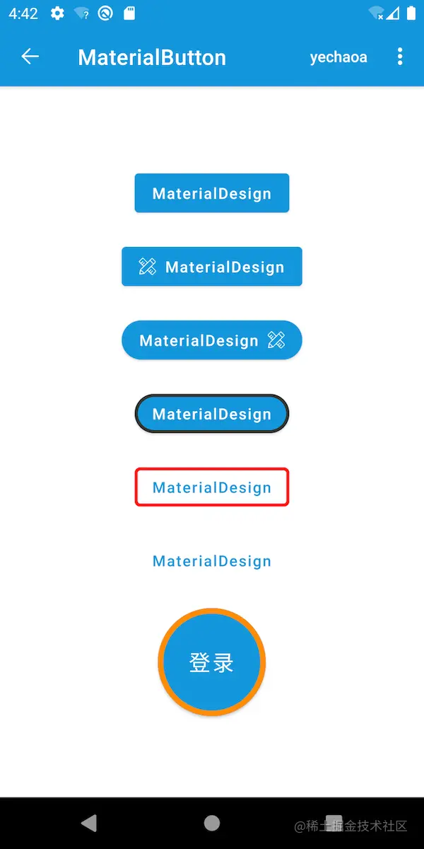
effect
preface
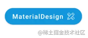
Let's take a look at what a MaterialButton is
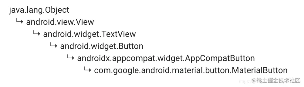
As can be seen from the above figure, MaterialButton is not mysterious, but a subclass of Button. However, after being encapsulated by Google, it is more convenient to use and easy to achieve the expected effect on the basis of conforming to Material Design.
use
Import material package
implementation 'com.google.android.material:material:1.2.1'
Copy code
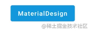
routine
<com.google.android.material.button.MaterialButton
    android:layout_width="wrap_content"
    android:layout_height="wrap_content"
    android:text="@string/app_name"
    android:textAllCaps="false" />
Copy code- Using textAllCaps is the same as using a Button. textAllCaps cancels all case.
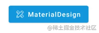
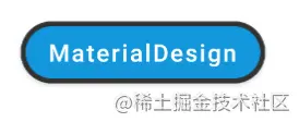
Icon
<com.google.android.material.button.MaterialButton
    android:layout_width="wrap_content"
    android:layout_height="wrap_content"
    android:layout_marginTop="20dp"
    android:text="@string/app_name"
    android:textAllCaps="false"
    app:icon="@mipmap/ic_launcher" />
Copy code- The app:icon attribute specifies the icon.
fillet
<com.google.android.material.button.MaterialButton
    android:id="@+id/btn"
    android:layout_width="wrap_content"
    android:layout_height="wrap_content"
    android:layout_marginTop="20dp"
    android:text="@string/app_name"
    android:textAllCaps="false"
    app:cornerRadius="25dp"
    app:icon="@mipmap/ic_launcher"
    app:iconGravity="end" />
Copy code- The app:cornerRadius property specifies the fillet size.
Button stroke
<com.google.android.material.button.MaterialButton
    android:layout_width="wrap_content"
    android:layout_height="wrap_content"
    android:layout_marginTop="20dp"
    android:text="@string/app_name"
    android:textAllCaps="false"
    app:cornerRadius="25dp"
    app:strokeColor="@color/black"
    app:strokeWidth="3dp" />
Copy code- app:strokeColor stroke color
- app:strokeWidth stroke width
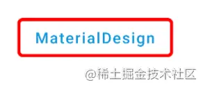
Text stroke
<com.google.android.material.button.MaterialButton
    style="@style/Widget.MaterialComponents.Button.OutlinedButton"
    android:layout_width="wrap_content"
    android:layout_height="wrap_content"
    android:layout_marginTop="20dp"
    android:text="@string/app_name"
    android:textAllCaps="false"
    app:cornerRadius="5dp"
    app:rippleColor="@color/red"
    app:strokeColor="@color/red"
    app:strokeWidth="3dp" />
Copy code-
Different from the above, style is used here. The difference is that the above is the stroke in the normal Button state, and this is the stroke in the text Button state.
-
app:rippleColor click ripple color
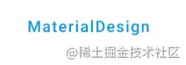
text button
<com.google.android.material.button.MaterialButton
    style="@style/Widget.MaterialComponents.Button.TextButton"
    android:layout_width="wrap_content"
    android:layout_height="wrap_content"
    android:layout_marginTop="20dp"
    android:text="@string/app_name"
    android:textAllCaps="false" />
Copy code- It is the same as the normal use method, but style is added. This style sets transparency to the background color when it is not selected.
Round Button

<com.google.android.material.button.MaterialButton
    android:layout_width="100dp"
    android:layout_height="100dp"
    android:layout_marginTop="20dp"
    android:insetTop="0dp"
    android:insetBottom="0dp"
    android:text="@string/login"
    android:textAllCaps="false"
    android:textSize="20sp"
    app:cornerRadius="999dp"
    app:strokeColor="@color/orange"
    app:strokeWidth="5dp" />
Copy code
Why a round Button here? It's because it involves two attributes
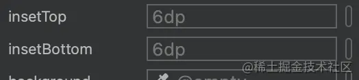
- android:insetTop top margin
- android:insetBottom bottom margin
These two parameters are 6dp by default. If they are not set to 0dp, they are not a regular circle.
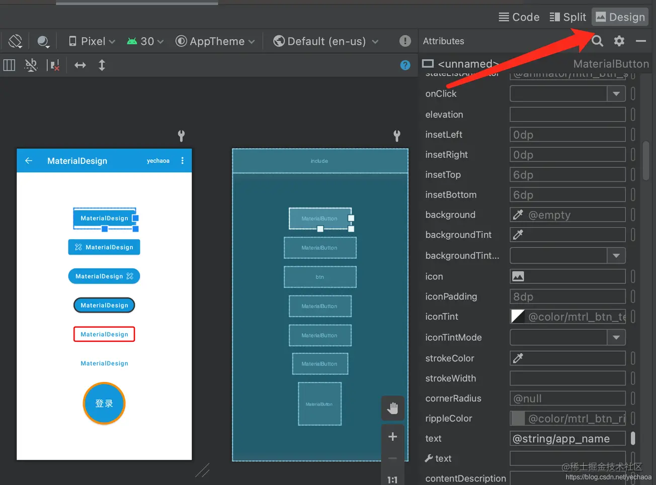
For the default parameters of other attributes, you can select the Design panel in the upper right corner of the xml file and select the View to View.
Source code analysis icon
The only disadvantage is that MaterialButton cannot set events for icon like chip.
Let's take a look at the specific implementation of icon in the source code:
  public void setIcon(@Nullable Drawable icon) {
    if (this.icon != icon) {
      this.icon = icon;
      updateIcon(/* needsIconUpdate = */ true);
    }
  }
Copy code
It's relatively simple here. Continue to look at the updateIcon method called
  private void updateIcon(boolean needsIconUpdate) {
    // Forced icon update
    if (needsIconUpdate) {
      resetIconDrawable(isIconStart);
      return;
    }
	...
    if (hasIconChanged) {
      resetIconDrawable(isIconStart);
    }
  }
Copy code
If omitted, look at the key two pieces of code. Both of them call the resetIconDrawable method. Continue
  private void resetIconDrawable(boolean isIconStart) {
    if (isIconStart) {
      TextViewCompat.setCompoundDrawablesRelative(this, icon, null, null, null);
    } else {
      TextViewCompat.setCompoundDrawablesRelative(this, null, null, icon, null);
    }
  }
Copy code
I believe that many people will understand that the implementation of icon is equivalent to drawableStart. But in the MaterialButton, drawableStart has no effect, but icon and iconGravity are used together to achieve the effect.
attribute
About xml attributes, I made a sorting
| attribute | meaning |
|---|---|
| insetBottom | Bottom margin, default 6dp |
| insetTop | Top margin, default 6dp |
| cornerRadius | Fillet size |
| icon | Icon |
| iconGravity | Icon position, front and back only |
| iconPadding | The distance between icon and text is 8dp by default |
| iconSize | Icon size |
| iconTint | Shaded Icon |
| iconTintMode | Icon shading mode |
| rippleColor | Click the ripple color |
| strokeColor | stroke color |
| strokeWidth | Stroke Width |
| app:backgroundTint | Background color (note namespace) |
Github
thank
Author: yechaoa
Link: https://juejin.cn/post/6965442836787855390
Source: rare earth Nuggets
The copyright belongs to the author. For commercial reprint, please contact the author for authorization. For non-commercial reprint, please indicate the source.