Flex flexible layout
1. Development history of flex
The W3C put forward the concept in 2009, but the word flex is not officially available. display:box was used at that time; Represents a flexible layout
In 2011, browser manufacturers decided to use flexbox to describe its layout characteristics
In 2015, W3C officially revised it to flexbox layout
In May 2016, the latest stable flex layout specifications and standards were officially announced, and the support of major browsers became more and more stable
2. flex definition
-
Flex is the abbreviation of Flexible Box, which means "flexible layout", and is used to provide maximum flexibility for box model
-
effect
- It can control the alignment and arrangement of elements more efficiently and conveniently
- It can automatically calculate the size of elements in the layout, whether the size of this element is fixed or dynamic
- Controls the layout direction of elements on the page
- Reorder the elements on the screen in a manner different from that specified by the DOM
2. Application scenario
In modern browsers, prehistoric browsers do not support, such as chorme4 0
In the design with certain tolerance requirements, because the flexibility of elastic layout is too high, it is difficult to 100% restore the design draft. A design draft with certain tolerance is required
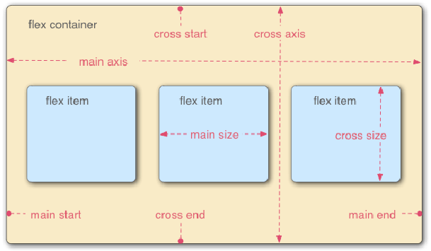
3. Basic concepts of Flex
- Elements with Flex layout are called Flex containers, or "containers" for short. All its child elements automatically become container members, which are called Flex items, or "items" for short
- The default horizontal direction is main axis
- The default vertical direction is cross axis and cross axis
- Items are arranged along the main axis by default
4. Flex layout syntax
-
grammar
Set the flex attribute on the element that you want to make flex
- Block level element display: Flex/ display:-webkit-flex
- Inline element display: inline flex;
-
Add prefix, i.e. browser prefix
-
After setting it to Flex layout, the float, clear and vertical align attributes of Flex item (item) will be invalid, and the positioning will not be invalid >
5. Attributes on container - elements that set flex attributes
| Container properties | explain |
|---|---|
| flex-direction | Determine the direction of the spindle (i.e. the arrangement direction of items) |
| flex-wrap | Defines how to wrap a line if it cannot be arranged on one axis |
| flex-flow | Compound attribute: short form of flex direction and flex wrap attributes |
| justify-content | Defines the alignment of items on the spindle |
| align-items | Defines how items are aligned on the cross axis and side axis |
| align-content | Defines the alignment of multiple grid lines. This property has no effect if the project has only one axis |
Flex direction:
Determine the direction of the spindle (i.e. the arrangement direction of items)
flex-direction: row | row-reverse | column | column-reverse;
Attribute value meaning:
row(Default) row-reverse: The main shaft is horizontal, and the starting point is at the left and right ends
column ,column-reverse: The main axis is vertical, and the starting point is at the upper and lower edges
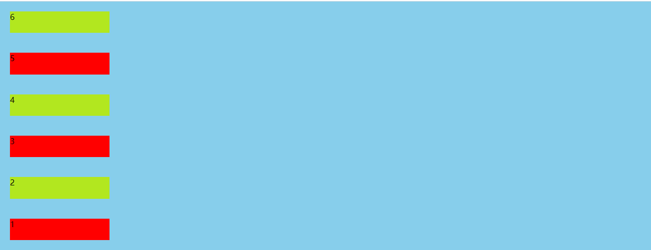
characteristic:
It can automatically calculate the size of elements in the layout, whether the size of this element is fixed or dynamic
That is, no matter what the item size is, all items will be displayed on one line by default without line feed
<!DOCTYPE html>
<html>
<head>
<meta charset="UTF-8">
<meta name="viewport" content="width=device-width, initial-scale=1.0, maximum-scale=1.0, user-scalable=0">
<meta http-equiv="X-UA-Compatible" content="ie=edge">
<title>Document</title>
<link rel="stylesheet" href="">
<script src=""></script>
<style>
*{
margin: 0;
padding: 0;
}
ul{
list-style: none;
height: 500px;
background-color: skyblue;
display: flex;
/* flex-direction: row; By default, it is arranged left and right along the x axis */
/* flex-direction: row-reverse Arranged in reverse order along the x-axis; */
/* flex-direction: column Arranged from top to bottom along the y-axis; */
/* Arranged from bottom to top along the y-axis */
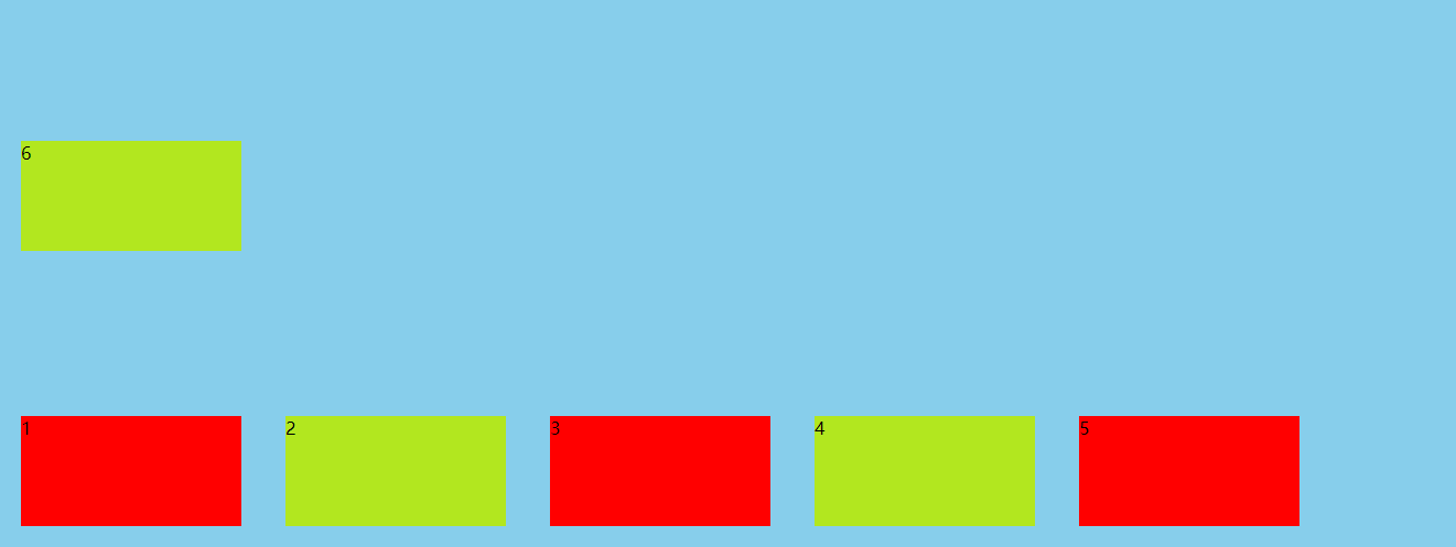
flex-direction: column-reverse ;
}
li{
width: 200px;
height: 100px;
margin: 20px;
background-color: red;
}
ul>li:nth-of-type(2n){
background-color: rgb(178, 231, 31);
}
</style>
</head>
<body>
<ul>
<li>1</li>
<li>2</li>
<li>3</li>
<li>4</li>
<li>5</li>
<li>6</li>
</ul>
</body>
</html>
Flex wrap defines how to wrap lines if there is no row in one axis:
By default, a row of items is also called a row of lines"axis")Come on. flex-wrap Property defines how to wrap a line if a line cannot be arranged
flex-wrap: nowrap | wrap | wrap-reverse;
Attribute value meaning
nowrap(Default): no line breaks
wrap: Wrap, first line above
wrap-reverse: Wrap, first line below
flex-wrap:wrap:
flex-wrap:wrap-reverse
Compound writing method of flex flow spindle direction and line feed attribute:
Yes composite attribute: Yes flex-direction and flex-wrap The default value is row nowrap
flex-flow: <flex-direction> || <flex-wrap>;
flex-flow: column wrap; //Indicates that the spindle is arranged in x-axis line feed
 Attribute value: take the value of two attributes, separated by a space
be careful:
When using compound writing and separate writing, we should use the habit of compound team development
You can't lose the readability of the code because of convenience
Justify content: sets the arrangement of spindle elements
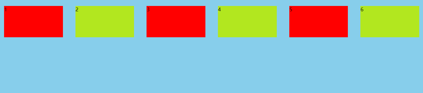
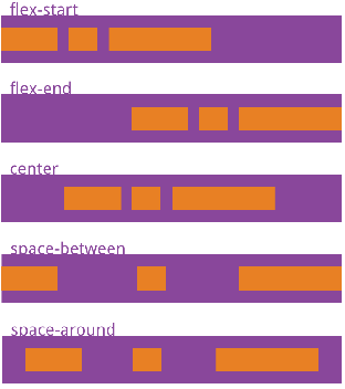
Defines the alignment of items on the spindle
justify-content: flex-start | flex-end | center | space-between | space-around;
Attribute value meaning
flex-start(Default): align left
flex-end: Right align
center:  Center
space-between: Align both ends so that the spacing between items is equal
space-around: The spacing on both sides of each item is equal. Therefore, the spacing between items is twice as large as that between items and borders
space-evenly:Equally spaced (equally divided)
 ul{
            height: 500px;
            list-style: none;
            background-color: rgb(240, 126, 126);
            display: flex;
            justify-content: space-between;
        }
Align items: sets the arrangement of side axis elements
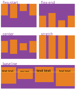
Defines how items are aligned on the cross axis
align-items: flex-start | flex-end | center | baseline | stretch;
Attribute value: the specific alignment is related to the direction of the cross axis. It is assumed that the cross axis is from top to bottom
flex-start: Align the start point of the cross axis
flex-end: End alignment of cross axis
center: Align the midpoint of the cross axis
baseline: Align the lower baseline of the first line of text of the item
stretch(Default): if the project is not set to height or set to auto,It will occupy the height of the whole container
Align content: sets the arrangement of child elements on the side axis (multiple lines)
Set the arrangement mode of sub items on the side axis, which can only be used when sub items break lines (multiple lines). It has no effect in a single line.
Defines the alignment of the project on the cross axis when multiple axes are defined
align-content: flex-start | flex-end | center | space-between | space-around | stretch;
| Attribute value | explain |
|---|---|
| flex-start | By default, it is arranged at the beginning of the side axis |
| flex-end | Start at the tail of the side shaft |
| center | Middle arrangement with side shaft |
| space-between | Align with both ends of the cross axis, and the spacing between the axes is evenly distributed |
| space-around | The spacing on both sides of each axis is equal. Therefore, the spacing between the axes is twice as large as that between the axis and the frame. The subitem bisects the remaining space on the side axis |
| stretch (default) | Set the height of the child element to divide the height of the parent element equally, and the axis occupies the whole cross axis |
//Using the attributes of justify content and align items can easily solve the problem of vertical center alignment in traditional layout
The difference between align content and align items:
-
Align items: it is applicable to single line cases. There are only top alignment, bottom alignment, centering and stretching
-
Align content: it is applicable to the case of line feed (multiple lines) (invalid in the case of single line). You can set the attribute values of up alignment, down alignment, centering, stretching and evenly allocating the remaining space.
-
The summary is to find align items in a single line and align content in multiple lines
6. Attributes on the project - attributes of child elements
| Container properties | explain |
|---|---|
| order | Defines the arrangement order of items. The smaller the value, the higher the arrangement. The default is 0 |
| flex-grow | Defines the magnification of the project. The default is 0, that is, if there is remaining space, it will not be enlarged |
| flex-shrink | Defines the reduction scale of the item, which defaults to 1, that is, if there is insufficient space, the item will be reduced |
| flex-basis | Defines the spindle space occupied by the project before allocating excess space |
| flex | Is a composite attribute, which stands for the abbreviations of flex growth, flex shrink and flex basis |
| align-self | Defines the alignment on the cross axis |
Order: order of items
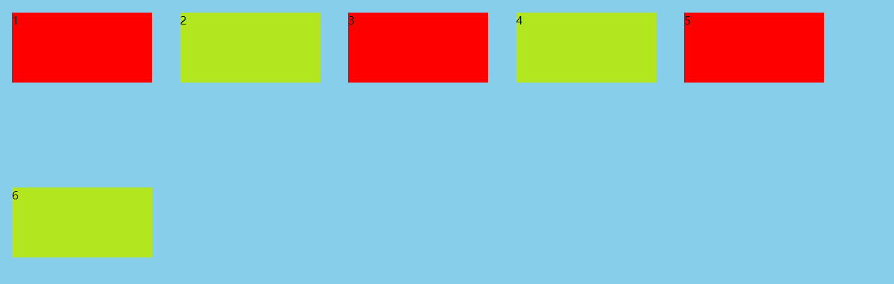
Defines the order in which items are arranged. The smaller the value, the higher the arrangement. The default value is 0
order: int;
Attribute value
 Must be 0 or a positive integer
 If negative numbers don't work, they will rank first. It's set order Property will be displayed according to order The value size of the property
 ul>li:nth-of-type(2){
            order: 1;
        }
Flex grow: allocate remaining space
Defines the magnification of the project. The default is 0, that is, if there is remaining space, it will not be enlarged. The main function is to allocate the remaining space
flex-grow: <number>;
Attribute value
 It cannot be negative. Although it can be set as positive or small value, it is generally not used in this way

Allocate the remaining space,
such as:
first li flex-grow:1;
the second li flex-grow:2;
Third li flex-grow:3;

The remaining space is divided into 1+2+3  6 share
 first li 1 share
 the second li 2 copies
 Third li 3 copies
Flex shrink: insufficient space, project shrinking
Defines the reduction scale of the item, which defaults to 1, that is, if there is insufficient space, the item will be reduced. The main function is to reduce the space. 0 does not shrink without space
flex-shrink: <number>;
Attribute value
 Negative values are not valid for this property

as flex-shrink:3; It means that in case of insufficient space, other elements are reduced by 1 and this element is reduced by 3
Flex basis: the width and height effective before zooming in and out is similar to the width and height we set
stay flex-grow  and flex-shinrk Before attributes work, define each flex The default size of the item. Its default value is auto,That is, the original size of the project. be similar to width
flex-basis: auto || <length>;
Attribute value
length: We usually use some attribute values, such as px,%, rem etc.
flex: zoom in and out default value compound writing method
Is a composite attribute that represents flex-grow, flex-shrink and flex-basis The last two properties are optional. The default value is 0 and 1 auto
flex: auto | <'flex-grow'> [ <'flex-shrink'>  <'flex-basis'> ];
Attribute value
 Two quick values
flex: auto;representative (1 1 auto)
flex: none;representative (0 0 auto)
flex:1 If there is any space left, zoom in
Align self: the attribute of the side axis of a single item
The alignment on the cross axis allows a single item to have a different alignment from other items and can be overwritten align-items attribute
align-self: auto | flex-start | flex-end | center | baseline | stretch;
Attribute value
 The default value is auto,Represents an element that inherits from the parent element align-items attribute
 Six values may be taken, except auto,Everything else align-items The properties are exactly the same
For example, let one of the items fill the entire side shaft:
ul>li:nth-of-type(1){
            margin: 10px ;
            height: auto;
            align-self: stretch;

        }
7. flex layout considerations
- With the change of flex direction, some attributes that depend on the definition of the spindle also change
- justify-content
- align-content
- align-items
- After the container is converted to flex layout, the project is not affected by float
- The default of flex wrap is nowrap. We need to set it to wrap automatically
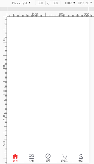
8. Making the bottom of JD app
<!DOCTYPE html>
<html>

<head>
    <meta charset="UTF-8">
    <meta name="viewport" content="width=device-width, initial-scale=1.0, maximum-scale=1.0, user-scalable=0">
    <meta http-equiv="X-UA-Compatible" content="ie=edge">
    <title>JD.COM app bottom</title>
    <link rel="stylesheet" href="">
    <script src=""></script>

    <style>
        *{
            margin: 0;
            padding: 0;
        }
        footer{
            width: 100%;
            position: absolute;
            bottom: 0;
            display: flex;
            flex-direction: row;
            justify-content: space-between;
        }
        footer>a{
            flex: 1;//Zoom in as long as there is room left
        }

        img{
            width: 100%;
        }
    </style>
</head>

<body>
    <footer>
        <a href="#">
            <img src="./image/icon-home-active.png" alt="">
        </a>

        <a href="#">
            <img src="./image/icon-find.png" alt="">
        </a>

        <a href="#">
            <img src="./image/icon-cart.png" alt="">
        </a>

        <a href="#">
            <img src="./image/icon-catergry.png" alt="">
        </a>

        <a href="#">
            <img src="./image/icon-me.png" alt="">
        </a>


    </footer>

</body>

</html>
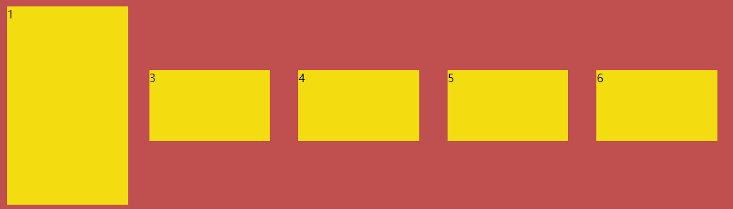
9. Make three column layout
<!DOCTYPE html>
<html>

<head>
    <meta charset="UTF-8">
    <meta name="viewport" content="width=device-width, initial-scale=1.0, maximum-scale=1.0, user-scalable=0">
    <meta http-equiv="X-UA-Compatible" content="ie=edge">
    <title>Three column layout</title>
    <link rel="stylesheet" href="">
    <script src=""></script>

    <style>
        *{
            margin: 0;
            padding: 0;
        }
        html,body{
            height: 100%;
            display: flex;
            flex-direction: column;
        }
        header,footer{
            width: 100%;
            height: 50px;
            background-color: rgb(253,69,0);
        }
        footer{
            background-color: rgb(146,237,144);
        }

        /* The elastic layout of the middle part automatically fills the rest */
        main{
            flex: 1;
            display: flex;
        }

        .main_l{
            flex-grow:1 ;
            background-color: rgb(254,215,0);
        }
        .main_c{
            flex-grow: 3;
            background-color: rgb(254,165,0);
        }
        .main_r{
            flex-grow: 1;
            background-color: rgb(135,206,234);
        }


    </style>
</head>

<body>
    <header></header>
    <main>
        <div class="main_l"></div>
        <div class="main_c"></div>
        <div class="main_r"></div>
    </main>
    <footer></footer>


</body>

</html>