Learn the layout of WEB mobile terminal and learn the layout record through the streaming layout development of JD project 01
What is the mobile terminal layout
The so-called mobile terminal layout is through percentage (streaming layout), flex layout, rem layout and responsive layout.
In general development, mobile page development is also divided into
[independent mobile terminal page] jd.com, Taobao, etc., [response page] Samsung official website, etc
Of course, the mainstream in the current industry is developed with [independent mobile terminal page] because of more convenience and beautiful performance.
——In this record, I imitated the mobile page development of JD APP (m.jd.com) through the traditional streaming layout——
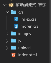
Carry out project construction
Create a folder for JD mobile, which creates images, uploads, css,js directory and index HTML file.
Create the default style Moren. In css CSS and authoring style index css, the introduction of simple will not say much.
Theoretical knowledge that the mobile terminal needs to pay attention to (key points)
meta tag (default)
<meta charset="UTF-8">
    <meta name="viewport" content="width=device-width, initial-scale=1.0">
meta tag (after adding restrictions)
 <meta charset="UTF-8">
    <meta name="viewport" content="width=device-width,
    initial-scale=1.0, user-scalable=no,
    maximum-scale=1.0,minimum-scale=1.0">
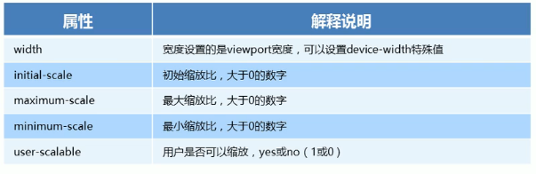
Explanation: Web pages can match the size and width of devices (mobile phones of different sizes), that is, how wide the mobile phone is, how wide the viewport area of our page layout is. Viewport is the viewport label of the screen area where the browser displays the content of the page. Content is the content, which contains parameters; Width = device width is equal to the width of the device, and user scalable = No. whether the user can zoom the page by hand (no). You can see the figure below
To put it simply: the development of mobile end pages requires meta tags, which are generally fixed, and can be copied and pasted directly. Some items need different functions, and the permissions are out of the column.
Page making
Technical point
- Width percentage distribution.
- Use max width, min width, maximum width, minimum width limit. (only this is required for streaming layout)
- Vertical align image positioning.
- CSS3 box sizing of box model.
- Nth child selector.
Header 1.0
Let's start with the style file index CSS sets the width of the body to 100%, and sets the resolution of the maximum and minimum width, which is suitable for previewing the production effect. (key points)
body{
    max-width: 630px;
    min-width: 320px;
    width: 100%;
    margin: 0 auto;
    color: rgb(200, 79, 79);
    font-size: 14px;
    background-color: rgb(233, 233, 233);
}
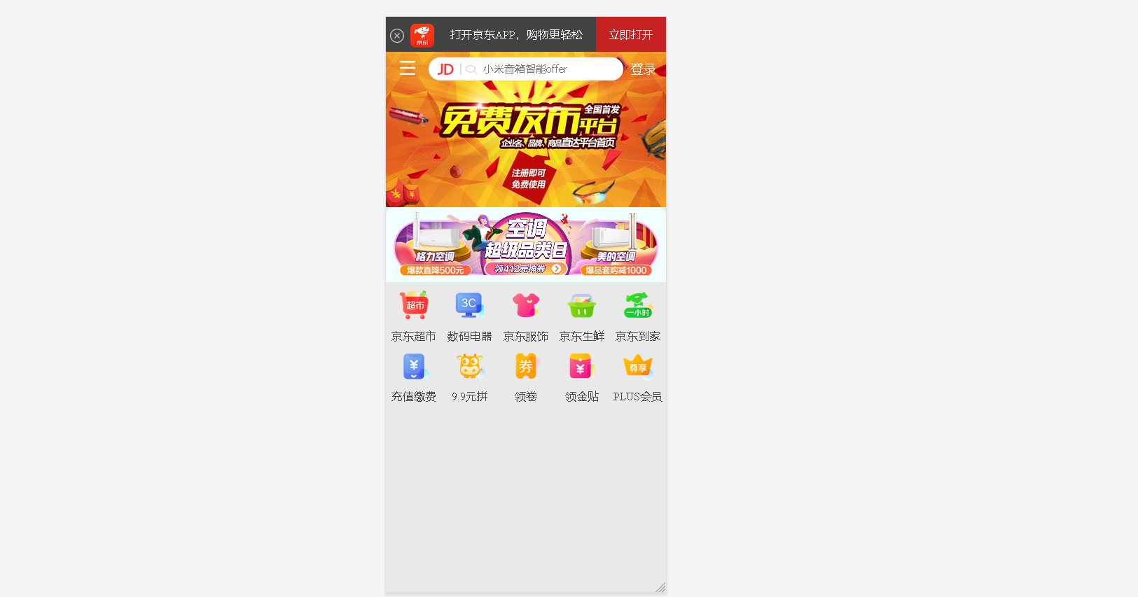
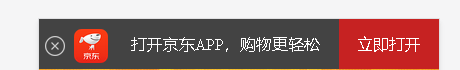
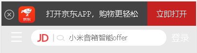
To write html structure, we need to put it in the header ×, logo, text and login are divided into 4 blocks by percentage.
<body>

    <header class="app">
        <ul>
            <li><img src="images/delete.png" alt=""></li>
            <li><img src="images/logo.png" alt=""></li>
            <li>Open Jingdong APP,Shopping easier</li>
            <li>Open now</li>
        </ul>
    </header>
Use the nth child selector to select the li write style.
.app{
    width: 100%;
    height: 45px;

}
.app ul li{
    float: left;
    height: 45px;
    background-color: rgb(67, 67, 67);
    line-height: 45px;
    text-align: center;
    color: #fff;
}


.app ul li:nth-child(1){
     width: 8%;

}
.app ul li:nth-child(1) img{
   width: 18px;
   height: 18px;
   vertical-align: middle;
}
.app ul li:nth-child(2){
    width: 10%;

}
.app ul li:nth-child(2) img{
   width: 30px;
   vertical-align: middle;

}
.app ul li:nth-child(3){
    width: 57%;

}
.app ul li:nth-child(4){
    width: 25%;
  background-color: rgb(198, 34, 34);
}
Search bar 2.0
Create a search bar with a height of 45px and set a fixed location (it is out of stream and cannot adapt to the width), so we need to reset it to 100% width and limit the size.
It should be noted that the bread icon and login are a block. We are divided into three div's, and only let the search div scale with the screen, so let the blocks on both sides be absolutely positioned, and then put a high and adaptive 100% wide search div, as long as the left and right outer margins on both sides are reduced to the middle
 <div class="sousuo">
        <div class="xl"></div>
        <div class="ss">
            <div class="jd_icon"></div>
            <div class="ss_icon"></div>
            <input type="text" value="" placeholder="Xiaomi speaker intelligent offer">
        </div>
        <div class="dl">Sign in</div>
    </div>
.sousuo{
    height: 45px;

    position: fixed;
   overflow: hidden;//The clipping here is to make the outer margin of the search div fall down without causing the margin to collapse
   width: 100%;
   min-width: 320px;
   max-width: 630px;
}

.xl{
width: 45px;
height: 45px;

float: left;
}
.dl{
    width: 45px;
    height: 45px;
  font-size: 16px;
   position: absolute;
   right: 0;
   top: 0;
   line-height: 45px;
   color: #fff;

}
.ss{
    height: 30px;
    background-color: rgb(255, 255, 255);
    margin: 7px 55px;
  //Moving down 7px will move down the entire parent block sousou sou. The solution is to add overflow: hidden to the parent block;
    border-radius: 15px;
    position: relative;

}

.xl::before{
    content: "";
    display: block;
    width: 20px;
    height: 18px;
    background: url(../images/xl.png) no-repeat;
    background-size: 20px 18px;
    transform: translate(18px,12px);
}

.ss .jd_icon{
    width: 30px;
    height: 15px;
    background-color: aqua;
   position: absolute;
   top: 8px;
   left: 12px;
   background: url(../images/jd_icon.png) no-repeat;
   background-size: 20px 15px;
   border-right: 2px solid #dbdbdb;
}

.ss .ss_icon{
    position: absolute;
    width: 20px;
    height: 15px;
    background-color: aqua;
    top: 8px;
    left: 45px;
    background: url(../images/ss_icon.png) no-repeat;
    background-size: 20px 15px;
}
.ss input{
   border: 0;
   background: 0 0;
     width: 60%;
    height: auto;
    margin-left: 70px;
   line-height: 30px;
   outline: none;
   /* outline Border outline, similar to border */

}
Production of main content (rotation map, advertising map, and our navigation icon)
<!-- Main content -->
    <div class="zhu_neiron">
        <!-- Rotation map -->
    <div class="bannt">
        <img src="upload/1.jpg" alt="">
    </div>

        <!-- Advertising map -->
    <div class="brand">
        <div><a href="#"><img src="upload/z1.gif" alt=""></a></div>
        <div><a href="#"><img src="upload/z2.gif" alt=""></a></div>
        <div><a href="#"><img src="upload/z3.gif" alt=""></a></div>
    </div>

  <!-- Navigation we use nav,The mobile terminal is simple a Label is enough -->
  <nav>
   <a href="#"><img src="images/daohan1. Png "ALT =" "> < p > Jingdong supermarket</p></a>
   <a href="#"><img src="images/daohan1. Png "ALT =" "> < p > Jingdong supermarket</p></a>
   <a href="#"><img src="images/daohan1. Png "ALT =" "> < p > Jingdong supermarket</p></a>
   <a href="#"><img src="images/daohan1. Png "ALT =" "> < p > Jingdong supermarket</p></a>
   <a href="#"><img src="images/daohan1. Png "ALT =" "> < p > Jingdong supermarket</p></a>
   <a href="#"><img src="images/daohan1. Png "ALT =" "> < p > Jingdong supermarket</p></a>
   <a href="#"><img src="images/daohan1. Png "ALT =" "> < p > Jingdong supermarket</p></a>
   <a href="#"><img src="images/daohan1. Png "ALT =" "> < p > Jingdong supermarket</p></a>
   <a href="#"><img src="images/daohan1. Png "ALT =" "> < p > Jingdong supermarket</p></a>
   <a href="#"><img src="images/daohan1. Png "ALT =" "> < p > Jingdong supermarket</p></a>
  </nav>

</div>
CSS settings
/* Rotation map */
.bannt{
    width: 100%;
    height: 200px;
}
.bannt img{
    width: 100%;
    height: 100%;
}


/*  Advertising map */

.brand{
    border-radius: 10px 10px 0 0;
    overflow: hidden;
    background-color: azure;
}

.brand div{
    width: 33.33%;
    float: left;

}
.brand div img{
    width: 100%;
}

/* navigation bar */
nav a{
    width: 20%;
    display: block;
    float: left;
    text-align: center;
}

nav a img{
    width: 40px;
    margin: 10px 0;
}
Main content explanation
1.0
Because jd.com's advertising map jumps to different pages by clicking on three pictures on the left, middle and right,
Therefore, it is divided into three percentages, accounting for 33.33%.
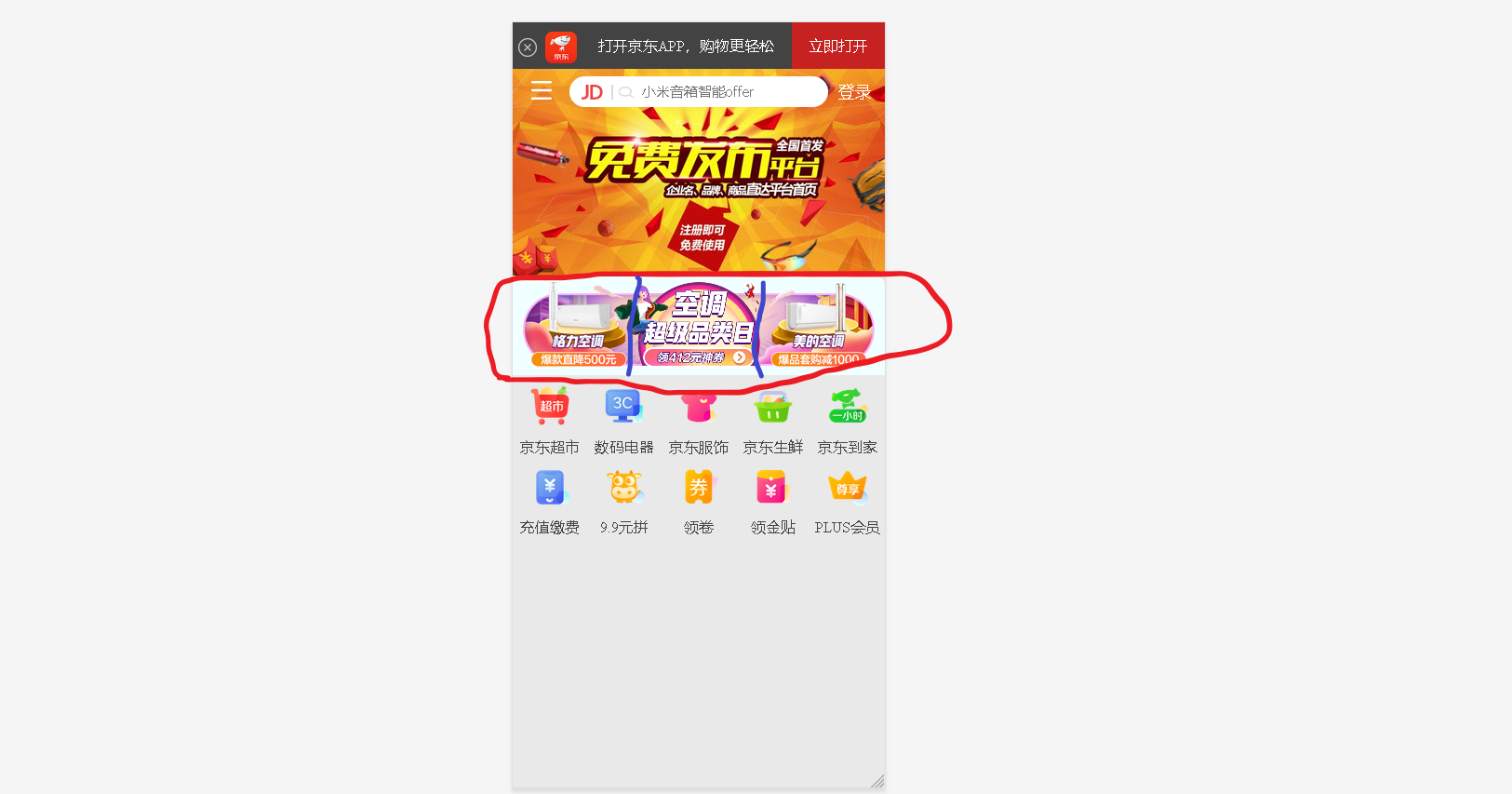
2.0
Navigation icons and text production for convenience, I use js to write, attached code.
window.addEventListener("load",function(){

   var all_img=document.querySelector("nav").querySelectorAll("img");
   var all_p=document.querySelector("nav").querySelectorAll("p");

    var img=["daohan1.png","daohan2.png","daohan3.png","daohan4.png","daohan5.png",
             "daohan6.png","daohan7.png","daohan8.png","daohan9.png","daohan10.png"]

    var p=["Jingdong supermarket","Digital appliances","Jingdong clothing","Jingdong fresh","Jingdong home",
                "Recharge payment","9.9 Yuan spell","Collar roll","Receive gold paste","PLUS member"]
//    Navigation map

    for(let i=0;i<all_img.length;i++){
        all_img[i].src='images/'+img[i];
    }


// Navigation text
     for(let i=0;i<all_p.length;i++){
         all_p[i].innerHTML=p[i];
     }


})
Well, first record here, the mobile terminal and the project are still learning, and then continue to update the learning record~~~