
Author: Han Xinzi@ShowMeAI
Tutorial address: http://www.showmeai.tech/tutorials/84
Article address: http://www.showmeai.tech/article-detail/176
Notice: All Rights Reserved. Please contact the platform and the author for reprint and indicate the source
introduction
2020, since covid-19 has changed the world and affects everyone's life, this case combines data analysis technology with pyspark to analyze the data of the 2020 new crown pneumonia epidemic in 2020.
1. Experimental environment
- (1)Linux: Ubuntu 16.04
- (2)Hadoop3.1.3
- (3)Python: 3.8
- (4)Spark: 2.4.0
- (5)Jupyter Notebook
2. Data set
1) Dataset Download
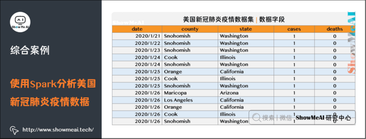
The covid-19 case data set used in this case is from the Kaggle new platform for the United States, the new crown pneumonia epidemic data set. The data name is us-counties.csv, covid-19, is the csv file, which contains the data of the first case of new crown pneumonia diagnosed in the United States to 2020-05-19.
Data set download (Baidu online disk)
Link: https://pan.baidu.com/s/1YNY2UREm5lXsNkHM3DZFmA
Extraction code: show
The data are as follows:
2) Format conversion
The original data is in csv format. We first do some data format conversion to facilitate spark to read the data and generate RDD or DataFrame. The specific data conversion code is as follows:
import pandas as pd
#.csv->.txt
data = pd.read_csv('/home/hadoop/us-counties.csv')
with open('/home/hadoop/us-counties.txt','a+',encoding='utf-8') as f:
    for line in data.values:
        f.write((str(line[0])+'\t'+str(line[1])+'\t'
                +str(line[2])+'\t'+str(line[3])+'\t'+str(line[4])+'\n'))
3) Data upload to HDFS
Then upload "/ home / Hadoop / US counts. TXT" to the HDFS file system. The specific path is "/ user / Hadoop / US counts. TXT". The operation commands are as follows:
./bin/hdfs dfs -put /home/hadoop/us-counties.txt /user/hadoop
3. Use Spark to analyze the data
Here, Python is used as the programming language, combined with pyspark for data analysis.
1) Data reading and DataFrame construction
First, we read the data file and generate Spark DataFrame.
The data used in this case is structured data, so you can use spark to read the source file and generate DataFrame to facilitate subsequent analysis and implementation.
from pyspark import SparkConf,SparkContext
from pyspark.sql import Row
from pyspark.sql.types import *
from pyspark.sql import SparkSession
from datetime import datetime
import pyspark.sql.functions as func

def toDate(inputStr):
    newStr = ""
    if len(inputStr) == 8:
        s1 = inputStr[0:4]
        s2 = inputStr[5:6]
        s3 = inputStr[7]
        newStr = s1+"-"+"0"+s2+"-"+"0"+s3
    else:
        s1 = inputStr[0:4]
        s2 = inputStr[5:6]
        s3 = inputStr[7:]
        newStr = s1+"-"+"0"+s2+"-"+s3
    date = datetime.strptime(newStr, "%Y-%m-%d")
    return date


#Main program:
spark = SparkSession.builder.config(conf = SparkConf()).getOrCreate()

fields = [StructField("date", DateType(),False),StructField("county", StringType(),False),StructField("state", StringType(),False),
                    StructField("cases", IntegerType(),False),StructField("deaths", IntegerType(),False),]
schema = StructType(fields)

rdd0 = spark.sparkContext.textFile("/user/hadoop/us-counties.txt")
rdd1 = rdd0.map(lambda x:x.split("\t")).map(lambda p: Row(toDate(p[0]),p[1],p[2],int(p[3]),int(p[4])))

shemaUsInfo = spark.createDataFrame(rdd1,schema)

shemaUsInfo.createOrReplaceTempView("usInfo")
2) Data analysis
This case mainly carries out the following statistical analysis. The objectives and methods of the analysis are as follows:
- Get data set and code → official GitHub of ShowMeAI https://github.com/ShowMeAI-Hub/awesome-AI-cheatsheets
- Running code segment and learning → online programming environment http://blog.showmeai.tech/python3-compiler
(1) Statistics of the cumulative number of confirmed cases and cumulative deaths in the United States as of the end of each day.
- Take date as the grouping field and summarize the cases and deaths fields.
(2) Count the number of new diagnoses in the United States every day.
- Because "new number = today's number - yesterday's number", self connection is used here, and the connection condition is T1 date = t2. Date + 1, then use T1 totalCases – t2.totalCases calculates the number of new items added on that day.
(3) Count the number of new diagnoses and new deaths in the United States every day.
- Because "new number = today's number - yesterday's number", self connection is used here, and the connection condition is T1 date = t2. Date + 1, then use T1 totalCases – t2.totalCases calculates the number of new items added on that day.
(4) Statistics show that the cumulative number of confirmed cases and deaths in U.S. states as of May 19.
- First, filter out the data of May 19, and then take state as the grouping field to summarize and count the cases and deaths fields.
(5) According to statistics, the top ten states in the United States had the highest number of confirmed cases as of May 19.
- Register the temporary table for the result DataFrame of 3), and then arrange it in descending order according to the number of confirmed cases, and take the top 10 states.
(6) According to statistics, as of May 19, the ten states with the highest death toll in the United States.
- Register the temporary table for the result DataFrame of 3), and then arrange it in descending order according to the number of deaths, and take the top 10 states.
(7) According to statistics, as of May 19, the ten states with the lowest number of confirmed cases in the United States.
- Register the temporary table for the result DataFrame of 3), and then arrange it in ascending order according to the number of confirmed cases, and take the top 10 states.
(8) According to statistics, as of May 19, the ten states with the lowest death toll in the United States.
- Register the temporary table for the result DataFrame of 3), and then arrange it in ascending order according to the number of deaths, and take the top 10 states.
(9) The mortality of the United States and states was counted as of May 19.
- Case fatality rate = number of deaths / number of confirmed cases, register the temporary table for the result DataFrame of 3), and then calculate according to the formula.
We will make statistical analysis based on Spark DataFrame and Spark sql.
# 1. Calculate the cumulative number of confirmed cases and deaths per day
df = shemaUsInfo.groupBy("date").agg(func.sum("cases"),func.sum("deaths")).sort(shemaUsInfo["date"].asc())

# Column rename
df1 = df.withColumnRenamed("sum(cases)","cases").withColumnRenamed("sum(deaths)","deaths")
df1.repartition(1).write.json("result1.json")                               #Write hdfs

# Register as a temporary table for the next step
df1.createOrReplaceTempView("ustotal")

# 2. Calculate the number of newly confirmed cases and deaths per day compared with yesterday
df2 = spark.sql("select t1.date,t1.cases-t2.cases as caseIncrease,t1.deaths-t2.deaths as deathIncrease from ustotal t1,ustotal t2 where t1.date = date_add(t2.date,1)")

df2.sort(df2["date"].asc()).repartition(1).write.json("result2.json")           #Write hdfs

# 3. Count the cumulative number of confirmed cases and deaths in U.S. states as of May 19
df3 = spark.sql("select date,state,sum(cases) as totalCases,sum(deaths) as totalDeaths,round(sum(deaths)/sum(cases),4) as deathRate from usInfo  where date = to_date('2020-05-19','yyyy-MM-dd') group by date,state")

df3.sort(df3["totalCases"].desc()).repartition(1).write.json("result3.json") #Write hdfs

df3.createOrReplaceTempView("eachStateInfo")

# 4. Find out the top 10 states in the United States
df4 = spark.sql("select date,state,totalCases from eachStateInfo  order by totalCases desc limit 10")
df4.repartition(1).write.json("result4.json")

# 5. Find out the 10 states with the most deaths in the United States
df5 = spark.sql("select date,state,totalDeaths from eachStateInfo  order by totalDeaths desc limit 10")
df5.repartition(1).write.json("result5.json")

# 6. Identify the 10 states with the least confirmed cases in the United States
df6 = spark.sql("select date,state,totalCases from eachStateInfo  order by totalCases asc limit 10")
df6.repartition(1).write.json("result6.json")

# 7. Identify the 10 states with the least deaths in the United States
df7 = spark.sql("select date,state,totalDeaths from eachStateInfo  order by totalDeaths asc limit 10")
df7.repartition(1).write.json("result7.json")

# 8. The mortality rate of the United States and states was calculated as of 5.19
df8 = spark.sql("select 1 as sign,date,'USA' as state,round(sum(totalDeaths)/sum(totalCases),4) as deathRate from eachStateInfo group by date union select 2 as sign,date,state,deathRate from eachStateInfo").cache()
df8.sort(df8["sign"].asc(),df8["deathRate"].desc()).repartition(1).write.json("result8.json")
3) Result file
Save the above Spark calculation results json file to facilitate subsequent visual processing. Since it is inconvenient to read the HDFS file system with Python, dump the result file on HDFS to the local file system with the following command:
./bin/hdfs dfs -get /user/hadoop/result1.json/*.json /home/hadoop/result/result1
...
For result2 and other result files, use the same command and just change the path. The download process is shown in the figure below:

4. Data visualization
1) Visualizer selection and code
Choose to use the python third-party library pyecharts as the visualization tool.
- Get data set and code → official GitHub of ShowMeAI https://github.com/ShowMeAI-Hub/awesome-AI-cheatsheets
- Running code segment and learning → online programming environment http://blog.showmeai.tech/python3-compiler
Before use, you need to install pyecarts. The installation code is as follows:
pip install pyecharts
The specific visualization code is as follows:
from pyecharts import options as opts
from pyecharts.charts import Bar
from pyecharts.charts import Line
from pyecharts.components import Table
from pyecharts.charts import WordCloud
from pyecharts.charts import Pie
from pyecharts.charts import Funnel
from pyecharts.charts import Scatter
from pyecharts.charts import PictorialBar
from pyecharts.options import ComponentTitleOpts
from pyecharts.globals import SymbolType
import json
Cumulative confirmed cases and deaths per day → double histogram
#1. Draw the cumulative number of confirmed cases and deaths per day → double histogram

def drawChart_1(index):
    root = "/home/hadoop/result/result" + str(index) +"/part-00000.json"
    date = []
    cases = []
    deaths = []
    with open(root, 'r') as f:
        while True:
            line = f.readline()
            if not line:                            # To EOF and return an empty string, the loop is terminated
                break
            js = json.loads(line)
            date.append(str(js['date']))
            cases.append(int(js['cases']))
            deaths.append(int(js['deaths']))

    d = (
    Bar()
    .add_xaxis(date)
    .add_yaxis("Cumulative number of confirmed cases", cases, stack="stack1")
    .add_yaxis("Cumulative deaths", deaths, stack="stack1")
    .set_series_opts(label_opts=opts.LabelOpts(is_show=False))
    .set_global_opts(title_opts=opts.TitleOpts(title="Cumulative number of confirmed cases and deaths per day in the United States"))
    .render("/home/hadoop/result/result1/result1.html")
    )
Number of newly confirmed cases and deaths per day → line chart
#2. Draw the daily number of newly confirmed cases and deaths → broken line chart
def drawChart_2(index):
    root = "/home/hadoop/result/result" + str(index) +"/part-00000.json"
    date = []
    cases = []
    deaths = []
    with open(root, 'r') as f:
        while True:
            line = f.readline()
            if not line:                            # To EOF and return an empty string, the loop is terminated
                break
            js = json.loads(line)
            date.append(str(js['date']))
            cases.append(int(js['caseIncrease']))
            deaths.append(int(js['deathIncrease']))

    (
    Line(init_opts=opts.InitOpts(width="1600px", height="800px"))
    .add_xaxis(xaxis_data=date)
    .add_yaxis(
        series_name="New diagnosis",
        y_axis=cases,
        markpoint_opts=opts.MarkPointOpts(
            data=[
                opts.MarkPointItem(type_="max", name="Maximum")

            ]
        ),
        markline_opts=opts.MarkLineOpts(
            data=[opts.MarkLineItem(type_="average", name="average value")]
        ),
    )
    .set_global_opts(
        title_opts=opts.TitleOpts(title="Us daily new diagnostic broken line chart", subtitle=""),
        tooltip_opts=opts.TooltipOpts(trigger="axis"),
        toolbox_opts=opts.ToolboxOpts(is_show=True),
        xaxis_opts=opts.AxisOpts(type_="category", boundary_gap=False),
    )
    .render("/home/hadoop/result/result2/result1.html")
    )
    (
    Line(init_opts=opts.InitOpts(width="1600px", height="800px"))
    .add_xaxis(xaxis_data=date)
    .add_yaxis(
        series_name="New deaths",
        y_axis=deaths,
        markpoint_opts=opts.MarkPointOpts(
            data=[opts.MarkPointItem(type_="max", name="Maximum")]
        ),
        markline_opts=opts.MarkLineOpts(
            data=[
                opts.MarkLineItem(type_="average", name="average value"),
                opts.MarkLineItem(symbol="none", x="90%", y="max"),
                opts.MarkLineItem(symbol="circle", type_="max", name="the peak"),
            ]
        ),
    )
    .set_global_opts(
        title_opts=opts.TitleOpts(title="New daily death line chart in the United States", subtitle=""),
        tooltip_opts=opts.TooltipOpts(trigger="axis"),
        toolbox_opts=opts.ToolboxOpts(is_show=True),
        xaxis_opts=opts.AxisOpts(type_="category", boundary_gap=False),
    )
    .render("/home/hadoop/result/result2/result2.html")
    )
Cumulative number of confirmed cases, deaths and case fatalities by States as of May 19 - > table
#3. Draw a table showing the cumulative number of confirmed cases, deaths and case fatality rate -- > by 5.19
def drawChart_3(index):
    root = "/home/hadoop/result/result" + str(index) +"/part-00000.json"
    allState = []
    with open(root, 'r') as f:
        while True:
            line = f.readline()
            if not line:                            # To EOF and return an empty string, the loop is terminated
                break
            js = json.loads(line)
            row = []
            row.append(str(js['state']))
            row.append(int(js['totalCases']))
            row.append(int(js['totalDeaths']))
            row.append(float(js['deathRate']))
            allState.append(row)

    table = Table()

    headers = ["State name", "Total cases", "Total deaths", "Death rate"]
    rows = allState
    table.add(headers, rows)
    table.set_global_opts(
        title_opts=ComponentTitleOpts(title="List of epidemic situations in various states of the United States", subtitle="")
    )
    table.render("/home/hadoop/result/result3/result1.html")
10 states with the most confirmed cases in the United States → word cloud map
#4. Draw the top 10 states in the United States → word cloud map
def drawChart_4(index):
    root = "/home/hadoop/result/result" + str(index) +"/part-00000.json"
    data = []
    with open(root, 'r') as f:
        while True:
            line = f.readline()
            if not line:                            # To EOF and return an empty string, the loop is terminated
                break
            js = json.loads(line)
            row=(str(js['state']),int(js['totalCases']))
            data.append(row)

    c = (
    WordCloud()
    .add("", data, word_size_range=[20, 100], shape=SymbolType.DIAMOND)
    .set_global_opts(title_opts=opts.TitleOpts(title="Confirmed by states in the United States Top10"))
    .render("/home/hadoop/result/result4/result1.html")
    )
10 states with the most deaths in the United States → histogram
#5. Draw the 10 states with the most deaths in the United States → histogram
def drawChart_5(index):
    root = "/home/hadoop/result/result" + str(index) +"/part-00000.json"
    state = []
    totalDeath = []
    with open(root, 'r') as f:
        while True:
            line = f.readline()
            if not line:                            # To EOF and return an empty string, the loop is terminated
                break
            js = json.loads(line)
            state.insert(0,str(js['state']))
            totalDeath.insert(0,int(js['totalDeaths']))

    c = (
    PictorialBar()
    .add_xaxis(state)
    .add_yaxis(
        "",
        totalDeath,
        label_opts=opts.LabelOpts(is_show=False),
        symbol_size=18,
        symbol_repeat="fixed",
        symbol_offset=[0, 0],
        is_symbol_clip=True,
        symbol=SymbolType.ROUND_RECT,
    )
    .reversal_axis()
    .set_global_opts(
        title_opts=opts.TitleOpts(title="PictorialBar-Death toll in US states Top10"),
        xaxis_opts=opts.AxisOpts(is_show=False),
        yaxis_opts=opts.AxisOpts(
            axistick_opts=opts.AxisTickOpts(is_show=False),
            axisline_opts=opts.AxisLineOpts(
                linestyle_opts=opts.LineStyleOpts(opacity=0)
            ),
        ),
    )
    .render("/home/hadoop/result/result5/result1.html")
    )
Find out the 10 states with the least diagnosis in the United States → word cloud map
#6. Find out the 10 states with the least diagnosis in the United States → word cloud map
def drawChart_6(index):
    root = "/home/hadoop/result/result" + str(index) +"/part-00000.json"
    data = []
    with open(root, 'r') as f:
        while True:
            line = f.readline()
            if not line:                            # To EOF and return an empty string, the loop is terminated
                break
            js = json.loads(line)
            row=(str(js['state']),int(js['totalCases']))
            data.append(row)

    c = (
    WordCloud()
    .add("", data, word_size_range=[100, 20], shape=SymbolType.DIAMOND)
    .set_global_opts(title_opts=opts.TitleOpts(title="10 states with the least confirmed cases in the United States"))
    .render("/home/hadoop/result/result6/result1.html")
    )
10 states with the least deaths in the United States → funnel chart
#7. Find out the 10 states with the least deaths in the United States → funnel chart
def drawChart_7(index):
    root = "/home/hadoop/result/result" + str(index) +"/part-00000.json"
    data = []
    with open(root, 'r') as f:
        while True:
            line = f.readline()
            if not line:                            # To EOF and return an empty string, the loop is terminated
                break
            js = json.loads(line)
            data.insert(0,[str(js['state']),int(js['totalDeaths'])])

    c = (
    Funnel()
    .add(
        "State",
        data,
        sort_="ascending",
        label_opts=opts.LabelOpts(position="inside"),
    )
    .set_global_opts(title_opts=opts.TitleOpts(title=""))
    .render("/home/hadoop/result/result7/result1.html")
    )
Case fatality rate in the United States - > pie chart
#8. Mortality in the United States -- > pie chart
def drawChart_8(index):
    root = "/home/hadoop/result/result" + str(index) +"/part-00000.json"
    values = []
    with open(root, 'r') as f:
        while True:
            line = f.readline()
            if not line:                            # To EOF and return an empty string, the loop is terminated
                break
            js = json.loads(line)
            if str(js['state'])=="USA":
                values.append(["Death(%)",round(float(js['deathRate'])*100,2)])
                values.append(["No-Death(%)",100-round(float(js['deathRate'])*100,2)])
    c = (
    Pie()
    .add("", values)
    .set_colors(["blcak","orange"])
    .set_global_opts(title_opts=opts.TitleOpts(title="Mortality in the United States"))
    .set_series_opts(label_opts=opts.LabelOpts(formatter="{b}: {c}"))
    .render("/home/hadoop/result/result8/result1.html")
    )

#visualization
index = 1
while index<9:
    funcStr = "drawChart_" + str(index)
    eval(funcStr)(index)
    index+=1
2) Result icon display
The visualization result is In html format, the saving path of the result display diagram of result1 is "/ home/hadoop/result/result1/result1.html", and the saving path of the result display diagram of result2 is "/ home/hadoop/result/result2/result1.html". The rest are similar to recursion. The specific screenshot is as follows:
(1) Cumulative number of confirmed cases and deaths per day in the United States → double histogram

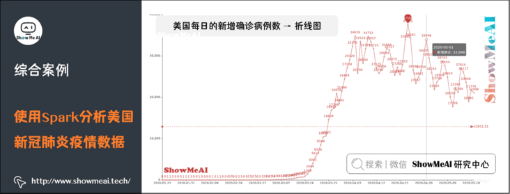
(2) Daily number of newly confirmed cases in the United States → line chart
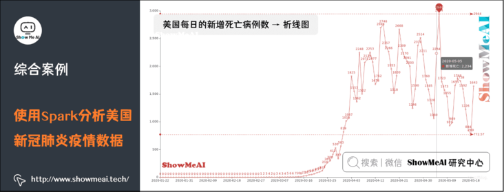
(3) Daily new deaths in the United States → line chart
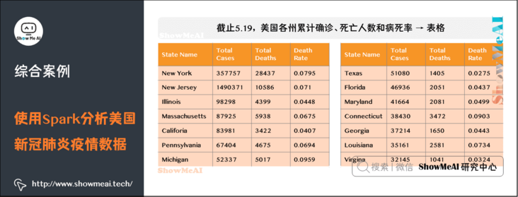
(4) By the end of May 19, the cumulative number of confirmed cases, deaths and case fatality rates in various states of the United States → table
(5) As of May 19, the top 10 states in the United States → word cloud map

(6) As of May 19, the top 10 states in the United States with cumulative deaths → histogram

(7) As of May 19, the 10 states with the lowest cumulative number of confirmed cases in the United States → word cloud map

(8) As of May 19, the 10 states with the lowest cumulative death toll in the United States → funnel chart

(9) Mortality in the United States as of 5.19 → pie chart

5. References
- Quick search of data science tools | Spark User Guide (RDD version) http://www.showmeai.tech/article-detail/106
- Quick search of data science tools | Spark User Guide (SQL version) http://www.showmeai.tech/article-detail/107
ShowMeAI related articles recommended
- Illustrated big data | introduction: big data ecology and Application
- Graphic big data | distributed platform: detailed explanation of Hadoop and map reduce
- Illustrated big data | practical case: Hadoop system construction and environment configuration
- Illustrated big data | practical case: big data statistics using map reduce
- Illustrated big data | practical case: Hive construction and application case
- Graphic big data | massive database and query: detailed explanation of Hive and HBase
- Graphic big data | big data analysis and mining framework: Spark preliminary
- Graphic big data | Spark operation: big data processing analysis based on RDD
- Graphic big data | Spark operation: big data processing analysis based on Dataframe and SQL
- Illustrating big data covid-19: using spark to analyze the new US crown pneumonia epidemic data
- Illustrated big data | comprehensive case: mining retail transaction data using Spark analysis
- Illustrated big data | comprehensive case: Mining music album data using Spark analysis
- Graphic big data | streaming data processing: Spark Streaming
- Graphic big data | Spark machine learning (Part I) - workflow and Feature Engineering
- Graphical big data | Spark machine learning (Part 2) - Modeling and hyperparametric optimization
- Graphic big data | Spark GraphFrames: graph based data analysis and mining
ShowMeAI series tutorial recommendations
- Proficient in Python: Tutorial Series
- Graphic data analysis: a series of tutorials from introduction to mastery
- Fundamentals of graphic AI Mathematics: a series of tutorials from introduction to mastery
- Illustrated big data technology: a series of tutorials from introduction to mastery