Before learning elastic layout, we should first understand its concept.
Flexible layout (flex) literally means flexible layout. Flexible layout is a very convenient layout in html. It allows the content in the structure to adapt to different resolutions and simplifies many cumbersome codes.
The syntax of flexible layout is divided into two types: first, the syntax added to the parent container and second, the syntax added to the child items
Syntax added to parent container:
display:flex;
flex-direction;
flex-wrap;
flex-flow;
justify-content;
alig-items;
align-content;
Syntax added to subprojects:
order;
flex-grow;
flex-shrink;
flex-basis;
flex;
align-self;
Parent container properties:
display:flex is to turn the container into an elastic box
	.father{
		display: flex;
	}
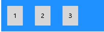
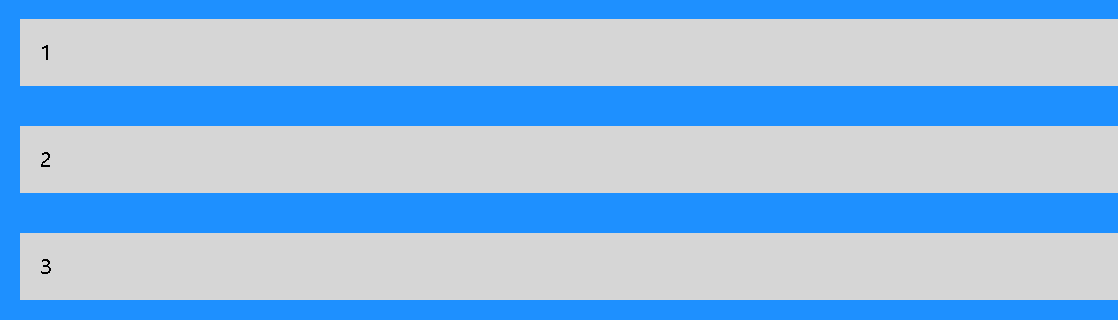
Flex direction defines the direction in which containers stack sub items. row means horizontal stacking from left to right, column means vertical stacking from top to bottom, and - reverse means reverse stacking.
Stack items from left to right
	.father{
		display: flex;
		flex-direction:row;
	}

Stack items from top to bottom
	.father{
		display: flex;
		flex-direction:column;
	}
Stack items from right to left
	.father{
		display: flex;
		flex-direction:row-reverse;
	}

Similarly, adding column reverse can stack items from bottom to top.
Flex wrap specifies whether sub items wrap lines, wrap specifies line breaks, no wrap specifies no line breaks, and wrap reverse specifies that items wrap lines in reverse order
Specified item wrap
	.father{
		display: flex;
		flex-wrap:wrap;
	}

Specifies that the item does not wrap
	.father{
		display: flex;
		flex-wrap:no-wrap;
	}

Specifies that items wrap in the opposite direction
	.father{
		display: flex;
		flex-wrap:wrap-reverse;
	}

Flex flow is a shorthand property used to set both flex direction and flex wrap properties
	.father{
		display: flex;
		flex-flow:row wrap;
	}

Justify content is used to align sub items. Center aligns items at the center of the container, flex start aligns items at the beginning of the container (default), flex end aligns items at the end of the container, space around displays items with spaces before, between and after lines, and space between displays items with spaces between lines.
Center alignment
	.father{
		display: flex;
		justify-content:center;
	}

Start alignment
	.father{
		display: flex;
		justify-content:flex-start;
	}

End alignment
	.father{
		display: flex;
		justify-content:flex-end;
	}

Displays the interval before, after, and between rows
	.father{
		display: flex;
		justify-content:space-around;
	}

Displays the spacing between rows
	.father{
		display: flex;
		justify-content:space-between;
	}

Align items is used to align items vertically, center aligns items in the middle of the container, flex start aligns items at the top of the container, flex end aligns items at the bottom of the container, stretch items to fill the container (default), and baseline value aligns the baseline of the items.
center: Align items in the middle of the container
flex-start: Align items on top of container
flex-end: Align items at the bottom of the container
stretch: Stretch items to fill containers (default)
baseline: Align project baselines
Align content is used to align elastic lines
space-between:The distance between elastic lines is equal
space-around:Elastic lines have spaces before, after and
stretch:Stretch elastic lines occupy the remaining space (default)
center:Show elastic lines in the middle of the container
flex-start:Displays elastic lines at the beginning of the container
flex-end:Displays elastic lines at the end of the container
Subproject properties
Order specifies the order of items
The default value is 0
The smaller the value, the higher the ranking
Flex growth specifies how much a project will grow relative to other projects
The default value is 0
Flex shrink specifies how much a project will shrink for the rest of the project
The default value is 0
Flex basis specifies the initial length of the project
The default is auto
You can set the width and height to make the project occupy a fixed space
Flex is short for flex growth, flex shrink, and flex basis
You can specify values in the above order. The default values are 0 and 0 auto respectively
align-self
Specifies the alignment of the selected items in the container
You can override the alignment set by the align items property of the container
The above is a brief introduction to elastic layout. If you want to have a deeper understanding of the usage of elastic layout, you have to knock more codes to observe different. The rational use of elastic layout can also make our production easier.