This paper mainly realizes the switching effect between the bottom navigation bar and the top card through fluent
1, Bottom navigation bar
There are many application scenarios in the bottom navigation bar, which are basically used by every app. It is often used for top-level page hosting after app login
In fluent, the creation of the bottom navigation bar mainly uses
1. State management
2. Bottom navigation component of BottomNavigationBar
3. IndexedStack cache component
1.1. Create a new entry page
app entry file (main.dart)
import 'package:flutter/material.dart';

import 'BottomTabBar.dart';

void main() {
  runApp(MyApp());
}

class MyApp extends StatelessWidget {
  @override
  Widget build(BuildContext context) {
    return MaterialApp(
      home: BottomTabBar(),
    );
  }
}
1.2. Bottom navigation bar assembly
First, we need to define the state variable and page binding
Define currentIndex: current page index,
Define pageList: a list of specific business pages
int currentIndex = 0;
List pageList = [FirstPage(), SecondPage(), ThirdPage()];
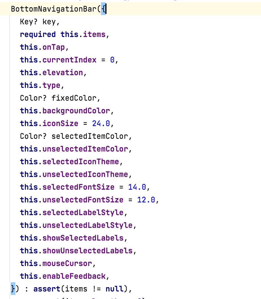
For the component ui style of the bottom navigation bar, we use the BottomNavigationBar provided by the system. The BottomNavigationBar component api is as follows
The specific implementation is as follows (BottomTabBar.dart)
import 'package:flutter/material.dart';

import 'tabs/category/CategoryPage.dart';
import 'tabs/home/HomePage.dart';
import 'tabs/mine/MinePage.dart';
import 'tabs/setting/SettingPage.dart';

class BottomTabBar extends StatefulWidget {
  @override
  State<StatefulWidget> createState() {
    return _BottomTabBarState();
  }
}

class _BottomTabBarState extends State<BottomTabBar> {
  int currentIndex = 0;
  List pageList = [HomePage(), CategoryPage(), SettingPage(), MinePage()];

  @override
  Widget build(BuildContext context) {
    return Scaffold(
      appBar: AppBar(
        title: Text('navigation bar'),
      ),
      body: this.pageList[this.currentIndex],
      bottomNavigationBar: BottomNavigationBar(
        currentIndex: this.currentIndex,
        onTap: (int index) {
          setState(() {
            this.currentIndex = index;
          });
        },
        type: BottomNavigationBarType.fixed, //Configuring the bottom tabs can have
        items: [
          BottomNavigationBarItem(icon: Icon(Icons.home), title: Text('home page')),
          BottomNavigationBarItem(icon: Icon(Icons.category), title: Text('classification')),
          BottomNavigationBarItem(icon: Icon(Icons.settings), title: Text('set up')),
          BottomNavigationBarItem(icon: Icon(Icons.people), title: Text('my')),
        ],
      ),
    );
  }
}
1.3. Other page processing
For other loaded business pages (CategoryPage.dart, HomePage.dart, MinePage.dart, SettingPage.dart), the processing is as follows
import 'package:flutter/material.dart';

class MinePage extends StatelessWidget {
  @override
  Widget build(BuildContext context) {
    return Center(
      child: Text('my'),
    );
  }
}
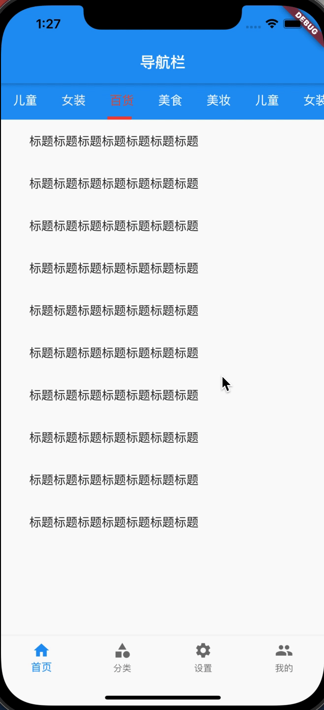
1.5 bottom TabBar gif presentation
In this way, we can run a simple bottom switching demo
The effect is as follows
1.4 page cache
But there is a problem
When the bottom Tabbar switches, the currentPage will be destroyed and the page will be reloaded. The bottom Tabbar requests the network every time it switches, resulting in a waste of resources and poor user experience.
Here, we use IndexedStack as the cache, and adjust the page of the body as follows
//Before adjustment
body: this.pageList[this.currentIndex],
//Add cache
body: IndexedStack(
        children: <Widget>[
          ...this.pageList,
        ],
        index: currentIndex,
      ),
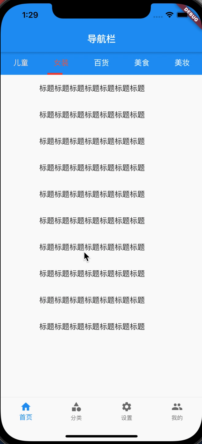
2, Top navigation bar (card switching)
The top navigation bar is also used in many scenarios, which is often used for card switching in a single page
2.1. Create a new entry file
First, the top navigation bar is written to the home page (HomePage.dart)
import 'package:flutter/material.dart';

import 'widget/TopTabBar.dart';

class HomePage extends StatelessWidget {
  @override
  Widget build(BuildContext context) {
    return Center(
      child: TopTabBar()
    );
  }
}
2.2 top navigation bar assembly
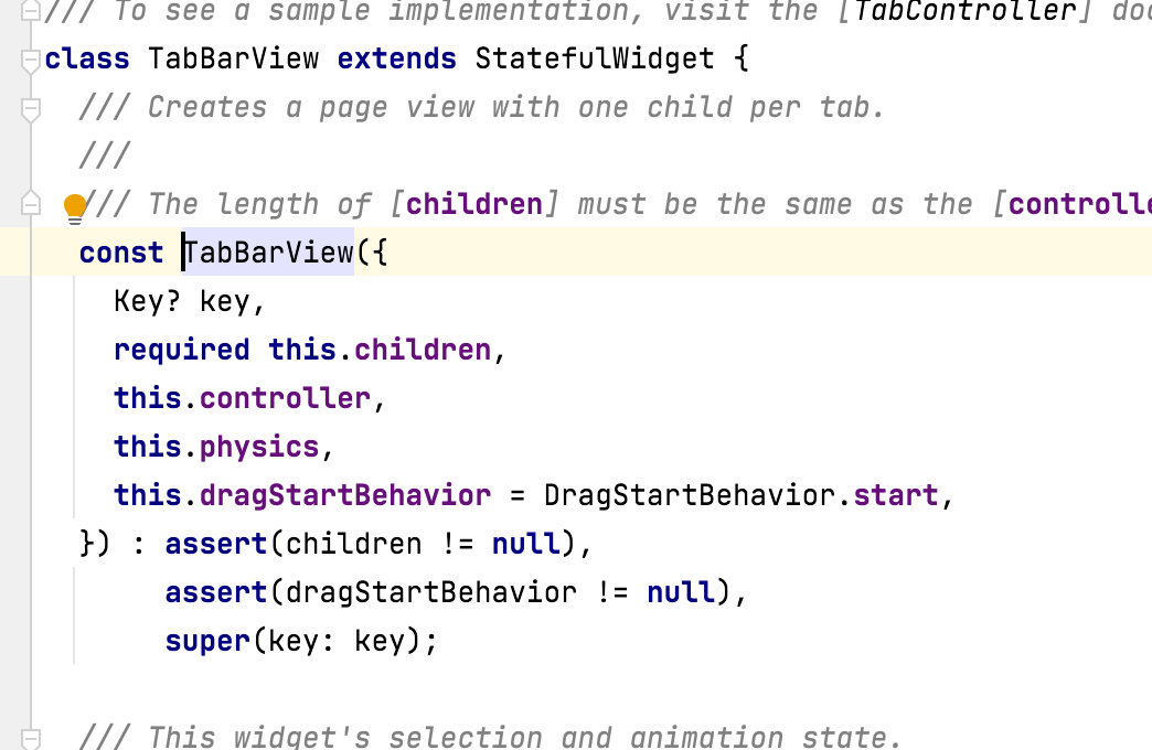
We use TabBarView as cache, which is equivalent to ScrollTabView. The component api is as follows
Specific code (TopTabBar.dart)
import 'package:flutter/material.dart';

class TopTabBar extends StatefulWidget {
  @override
  TopTabBarState createState() => TopTabBarState();
}

class TopTabBarState extends State<TopTabBar>
    with SingleTickerProviderStateMixin {
  late TabController tabController;
  var tabs = <Text>[];

  @override
  void initState() {
    super.initState();
    tabs = <Text>[
      Text('children'),
      Text('Women's wear'),
      Text('Department store'),
      Text('delicious food'),
      Text('Beauty makeup'),
    ];

    tabController = TabController(length: tabs.length, vsync: this);
    //. addListenter can listen to the TabController. Each time a switch occurs, it can go to the method
    this.tabController.addListener(() {
      print(this.tabController.toString());
      print(this.tabController.index);
      print(this.tabController.length);
      print(this.tabController.previousIndex);
    });
  }

  @override
  Widget build(BuildContext context) {
    return Scaffold(
      body: new Column(
        children: <Widget>[
          ConstrainedBox(
            constraints: BoxConstraints(
              minWidth: double.infinity,
              minHeight: Size.fromHeight(kMinInteractiveDimension).height,
            ),
            child: Container(
              color: Colors.blue,
              child: TabBar(
                tabs: tabs,
                controller: tabController,
                onTap: (int index) {
                  print('Selected......$index');
                },
                unselectedLabelColor: Colors.white,
                //Set the font color when it is not selected. The font style in tabs has the highest priority
                unselectedLabelStyle: TextStyle(fontSize: 16),
                //Set the font style when it is not selected. The font style in tabs has the highest priority
                labelColor: Colors.red,
                //Set the font color when selected. The font style in tabs has the highest priority
                labelStyle: TextStyle(fontSize: 16.0),
                //Set the font style when selected. The font style in tabs has the highest priority
                isScrollable: false,
                //isScrollable is false by default, and the titles are displayed equally; true to scroll the display unevenly
                indicatorColor: Colors.red,
                //Select the color of the underline
                indicatorSize: TabBarIndicatorSize.label,
                //Select the length of the underline. When label is selected, it is the same as the length of the text content, and when tab is selected, it is the same as the length of a tab
                indicatorWeight: 4.0, //Select the height of the underline. The higher the value, the higher the height. The default is 2. 0
              ),
            ),
          ),
          Expanded(
              child: new TabBarView(
            controller: tabController,
            children: <Widget>[
              ListViewContnet(),
              ListViewContnet(),
              ListViewContnet(),
              ListViewContnet(),
              ListViewContnet(),
            ],
          )),
        ],
      ),
    );
  }
}


class ListViewContnet extends StatelessWidget {
  const ListViewContnet({Key? key}) : super(key: key);

  @override
  Widget build(BuildContext context) {
    const TITLE = 'Title Title Title Title Title Title';

    return ListView(
      children: <Widget>[
        ListTile(title: Text(TITLE)),
        ListTile(title: Text(TITLE)),
        ListTile(title: Text(TITLE)),
        ListTile(title: Text(TITLE)),
        ListTile(title: Text(TITLE)),
        ListTile(title: Text(TITLE)),
        ListTile(title: Text(TITLE)),
        ListTile(title: Text(TITLE)),
        ListTile(title: Text(TITLE)),
        ListTile(title: Text(TITLE)),
      ],
    );
  }
}
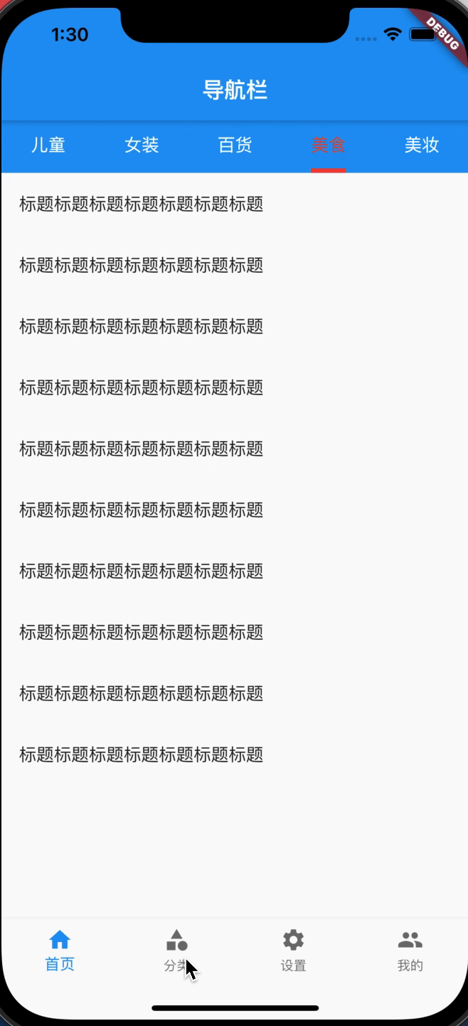
2.3 top fixed card switching gif demonstration
In this way, the card switching effect (sliding uneven size) is realized, and the effects are as follows
2.4 top slidable card gif presentation
The news card may have multiple dynamic loads. We need the effect that the top can slide with uneven size
Here, we can change the isScrollable property of TabBar to true. The effect is as follows