Python has many map visualization libraries. Although the Matplotlib library is very powerful, it can only be used for static maps. Today I'm going to talk about interactive map libraries, namely pyecharts and folium. Mastering these two libraries can basically solve your map visualization needs.
pyecharts
First of all, we must talk about the powerful pyecarts library, which is easy to use and cool, and can make almost any chart. Pyecarts has v0 5 and v1 are incompatible. The latest v1 version supports chained calls and uses options to configure charts. In terms of Map making, pyecarts includes Map, Geo and Bmap. The Map class supports four levels of maps: world, country, province, city and county. It needs to be installed independently before use. so, pip them!
1pip install pyecharts
2pip install echarts-countries-pypkg
3pip install echarts-china-provinces-pypkg
4pip install echarts-china-cities-pypkg
5pip install echarts-china-counties-pypkg
After the pip is finished, check the pyecarts version.
1import pyecharts
2print(pyecharts.__version__)
There is no doubt that it must be the latest version. The version number is 1.6.2.
One Map
Before making the map, first of all, there must be data. I exported the total GDP data of all provinces from the Wind database, named GDP Xlsx, as shown in the figure below.
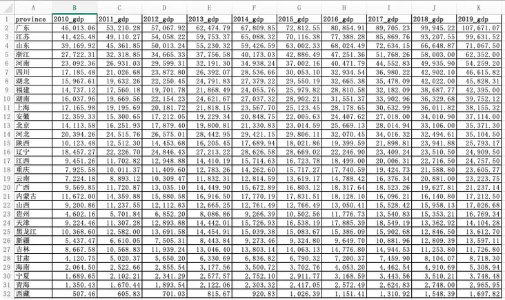 \
\
With the data, we can start the operation with python. First import the required library.
1import pandas as pd  #pandas is a powerful data processing library
2from pyecharts.charts import Map
3from pyecharts import options as opts
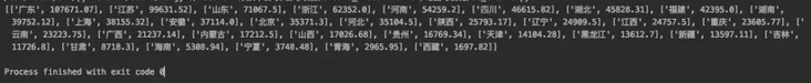
Read GDP with pandas Xlsx, take the GDP data of each province in 2019 as an example, let's make a map. Here, notice the zip() function, which takes the iteratable object as a parameter, packages the corresponding elements in the object into tuples, and then returns the object composed of these tuples.
1data = pd.read_excel('GDP.xlsx')
2province = list(data["province"])
3gdp = list(data["2019_gdp"])
4list = [list(z) for z in zip(province,gdp)]
Let's print out the list, which looks like this:
In fact, it is the data structure of nested list in the list. Only this structure can add data to the Map. We use the common methods add and set in the Map class_ global_ Opts and render to configure the Map.
 1c = (
 2    Map(init_opts=opts.InitOpts(width="1000px", height="600px"))  #Initialize map size
 3    .set_global_opts(
 4        title_opts=opts.TitleOpts(title="2019 Provinces in GDP Distribution map unit:RMB100mn"),  #Configuration title
 5        visualmap_opts=opts.VisualMapOpts(
 6            type_ = "scatter"   #Scatter type
 7        )
 8    )
 9    .add("GDP",list,maptype="china")  #Pass in the list. The map type is China map
10    .render("Map1.html")
11)
Run the above code and open the generated MAP1 with a browser HTML, the effect is as follows: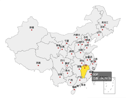
A friend may ask, there is a map, but your map is not easy to distinguish the GDP of different provinces. Don't panic. We will continue to optimize the above codes and configure different colors for different provinces according to the size of GDP, so that you can see it at a glance.
 1c = (
 2    Map(init_opts=opts.InitOpts(width="1000px", height="600px")) #Switchable theme
 3    .set_global_opts(
 4        title_opts=opts.TitleOpts(title="2019 Provinces in GDP Distribution map unit:RMB100mn"),
 5        visualmap_opts=opts.VisualMapOpts(
 6            min_=1000,
 7            max_=110000,
 8            range_text = ['GDP Total (100 million) color range:', ''],  #Partition
 9            is_piecewise=True,  #The legend is defined as segmented, and the default is continuous legend
10            pos_top= "middle",  #Segment position
11            pos_left="left",
12            orient="vertical",
13            split_number=10  #Divided into 10 sections
14        )
15    )
16    .add("GDP",list,maptype="china")
17    .render("Map2.html")
18)
Run the above code and open the generated map2.0 with a browser HTML, the effect is as follows:
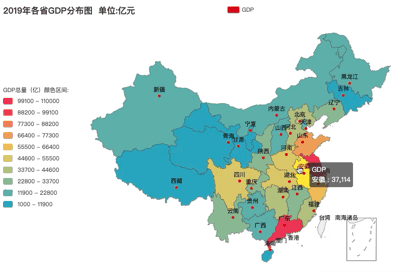
How about this? Is the effect much better? The redder the color, the higher the GDP. What color segment is your province's GDP in 2019? Of course, some aesthetic friends may still not meet your requirements.

In that case, I'll optimize the code and add themes to the map. Adding a theme is simple. Just import the ThemeType and add the theme to the Mpa() method. I use ThemeType Take dark as an example to see the effect.
1from pyecharts.globals import ThemeType #Introduce theme
2Map(init_opts=opts.InitOpts(width="1000px", height="600px",theme = ThemeType.DARK)) #Add theme themetype DARK
Run it to see the effect: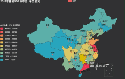 \
\
If you are not satisfied, ok, pyecharts has built-in more than 10 themes for you to switch. Radishes and vegetables have their own love. Let's transfer them~
 \
\
2, Geo
Geo is similar to Map. You can select the Map type by setting the maptype parameter, and the supported methods are also similar to Map. I won't repeat it here, but directly paste the code.
 1#Geo map - ripple map
 2import pandas as pd
 3from pyecharts import options as opts
 4from pyecharts.charts import Geo
 5from pyecharts.globals import ChartType
 6
 7data = pd.read_excel('GDP.xlsx')
 8province = list(data["province"])
 9gdp = list(data["2019_gdp"])
10list = [list(z) for z in zip(province,gdp)]
11print(list)
12c = (
13    Geo()
14    .add_schema(maptype="china")
15    .add(
16        "geo",
17        list,  #incoming data
18        symbol_size=10, large_threshold=110000,  #Set ripple size
19        type_=ChartType.EFFECT_SCATTER,   #The map type is ripple map
20    )
21    .set_series_opts(label_opts=opts.LabelOpts(is_show=False))
22    .set_global_opts(visualmap_opts=opts.VisualMapOpts(max_=110000),title_opts=opts.TitleOpts(title="2019 Provinces in GDP Ripple diagram"))
23    .render("Geomap1.html")
24)
Run it, and the effect is as follows: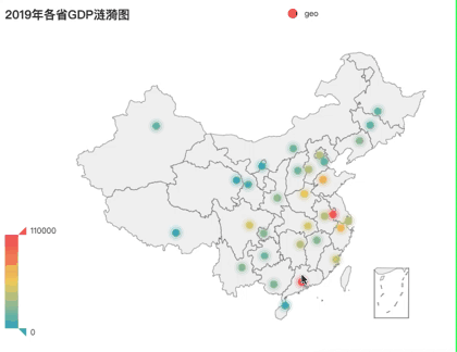
Three Bmap
Bmap is an interface of Baidu Map. If Map and Geo understand, Bmap can be done in minutes. However, one thing to note is that you need to register with Baidu Map open platform to obtain AK before you can call it. Registered address: https://lbsyun.baidu.com/inde... If you register and get AK, you can make a map happily. Take the thermal map as an example, and the code is as follows.
 1#Bmap scatter diagram, thermal diagram and ripple diagram
 2import pandas as pd
 3from pyecharts.charts import BMap
 4from pyecharts import options as opts
 5from pyecharts.globals import ChartType
 6
 7data = pd.read_excel('GDP.xlsx')
 8province = list(data["province"])
 9gdp = list(data["2019_gdp"])
10list = [list(z) for z in zip(province,gdp)]
11print(list)
12c = (
13    BMap(init_opts=opts.InitOpts(width="1000px", height="600px"))
14    .add_schema(baidu_ak="Yours AK", center=[120.13066322374, 30.240018034923])
15    .add(
16        "GDP",
17        list,
18        type_="heatmap",  #Scatter is scatter diagram, heatmap is thermodynamic diagram, charttype EFFECT_ Scatter is a ripple graph
19        label_opts=opts.LabelOpts(formatter="{b}")
20    )
21    .set_global_opts(
22        title_opts=opts.TitleOpts(title="2019 Provinces in GDP Thermodynamic diagram"), visualmap_opts=opts.VisualMapOpts(max_=110000)
23    )
24    .render("Bmap1.html")
25)
After running, it will be as follows:
folium
You think the above maps can satisfy Charlie's pursuit of the beauty of data visualization. You underestimate Charlie. After research, I found that folium library is the existence of the sky.
First of all, I used python to access the Gaode map API interface, and obtained the geographic data of nearly 6000 scenic spots in Guangzhou, which was saved as poi_scenic_spot.csv. The following are some data: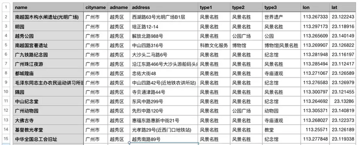
Then install the folium library and set the stimulating battlefield base map. Of course, you can also play with other base maps. mapbox base map and Gaode base map are provided in the code, which can be switched at will.
 1#folium thermodynamic diagram
 2import pandas as pd
 3import folium
 4from folium import plugins
 5
 6data = pd.read_csv('./poi_scenic_spot.csv',encoding='utf-8')
 7
 8# heatmap1 = folium.Map(location=[23.122373,113.268027], zoom_start=10,control_scale = True) # Draw map, determine focus, default basemap (slow loading)
 9heatmap1 = folium.Map(location=[23.122373,113.268027], zoom_start=10,control_scale = True,tiles='stamen Terrain') #Stimulating battlefield base map
10# heatmap1 = folium.Map(location=[23.122373,113.268027], zoom_start=10,control_scale = True,tiles='Mapbox Bright') #mapbox basemap
11# heatmap1 = folium.Map(location=[23.122373,113.268027], zoom_start=10,control_scale = True,tiles='stamentoner') #Black and white base map
12
13# heatmap1 = folium.Map(   #Gaode base map
14#     location=[23.122373,113.268027],
15#     zoom_start=15,
16#     control_scale = True,
17#     tiles='http://webrd02.is.autonavi.com/appmaptile?lang=zh_cn&size=1&scale=1&style=8&x={x}&y={y}&z={z}',
18#     attr='© < a href=" http://ditu.amap.com/ "> Gaode map < / a > '
19#     )
20
21folium.Marker([23.122373,113.268027],popup='<i>Charlie</i>',icon=folium.Icon(icon='cloud',color='green')).add_to(heatmap1)  #Create center mark
22heatmap1.add_child(plugins.HeatMap([[row["lat"],row["lon"]] for name, row in data.iterrows()]))  #Incoming latitude and longitude
23heatmap1.save("folium_map1.html")  #Generate web page
Can't wait to run. The results are as follows:
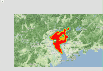
Ha ha ha, what a big braised chicken.
The heat map is a little useless. It's difficult for me to understand the distribution of scenic spots in Guangzhou. Let's try a different picture.
 1#folium aggregate scatter map
 2import pandas as pd
 3import folium
 4from folium import plugins
 5
 6data = pd.read_csv('./poi_scenic_spot.csv',encoding='utf-8')
 7
 8plotmap1 = folium.Map(location=[23.122373,113.268027], zoom_start=10,control_scale = True,tiles='stamentoner')
 9
10folium.Marker([23.122373,113.268027],popup='<p style="color: green">I am J brother</p>',icon=folium.Icon(icon='cloud',color='green')).add_to(plotmap1)  #Create center mark
11plotmap1.add_child(plugins.MarkerCluster([[row["lat"],row["lon"]] for name, row in data.iterrows()]))
12plotmap1.save('folium_map2.html')
Look at the effect!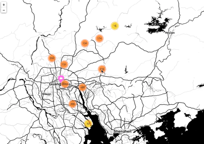 \
\
You say cool, cool, cool?
Conclusion
Charlie thinks the above summary is relatively complete. Of course, there are many Map Libraries in python, which are worth further mining. I will write the content of map visualization in the future. Welcome to continue to pay attention to it. Don't miss it! If you are interested in the dataset and complete code used in this map, you can get it free by replying to "map visualization" in the background.