After receiving the task to do bjfindata mobile version adaptation, I was confused at first. After consulting Baidu, I had some inspiration. Now the more common way is to use flexible . js performs equal scaling on the web page, but this method is not feasible because the computer version is a horizontal version of the web page and the mobile version needs to be a vertical version.
Later, I came up with a second solution. When I log in to the computer version, I judge the login device. If it is a mobile phone, I will switch to the mobile version of the web page.
To determine whether it is a mobile login method:
mounted() {
    if (this.isMobile()) {
      // console.log("mobile terminal");
      location.replace('/index-phone');
    } else {
      // console.log("pc side");
    }
  },

 methods: {
	isMobile() {
	      const flag = navigator.userAgent.match(/(phone|pad|pod|iPhone|iPod|ios|iPad|Android|Mobile|BlackBerry|IEMobile|MQQBrowser|JUC|Fennec|wOSBrowser|BrowserNG|WebOS|Symbian|Windows Phone)/i)
	      return flag;
	    }
}
- If it is judged as the page of mobile phone login, add / index phone after the web address
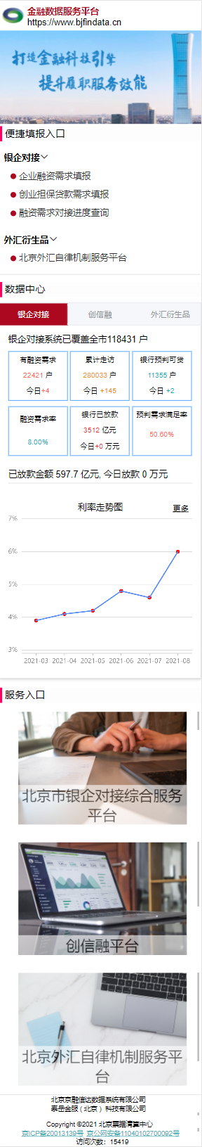
The following convenient filling entry is divided into two versions. One version is the tab area grouping. One is a vertical arrangement (the same as the computer version). A pop-up window will appear after clicking on the vertical arrangement, in which the QR code and website entry will be retained. The tab area is folded to keep only the jump.
Vertical arrangement
<div class="fuzq_box" >
        <div style="height: 40px; font-size: 16px; padding-left: 8px; line-height: 40px; font-weight: bold;">Bank enterprise connection<van-icon name="arrow-down" /></div>
<!--        <a href="https://yq.bjfindata.cn/xqtb.html">-->
          <div
            class="nav1 zk_js"
          >
            <span @click="yqLoadMorePopup1">Filling in of enterprise financing needs</span>
            <van-popup
              v-model="YqMorePopup1" closeable
            >
              <div style="width: 15rem; height: 17rem; background-color: rgb(255, 255, 255);">
                  <div>
                    <img
                      style="vertical-align: middle;margin:50px auto 30px 60px;margin-left: 60px;width: 120px"
                      src="images/qrcode-rzxqtb.png"
                    />
                    <a href="https://yq.bjfindata.cn/xqtb.html">
                      <div style="display: flex">
                        <div style="margin-left: 45px;">Filling in of enterprise financing needs</div>
                        <van-image src="../images/arrow.png" fit="fill" style="width: 40px;height: 40px;margin-top: -8px"></van-image>
                      </div>
                    </a>
                  </div>
              </div>
            </van-popup>
          </div>
      </div>

data() {
   return {
        YqMorePopup1:false,
   }
 },

methods: {
	yqLoadMorePopup1() {
          this.YqMorePopup1 = true
          // Dialog ({message: 'this part will pop up'});
        },
    }
- Only one pop-up window is reserved here to ensure the cleanliness of the code, and the implementation methods of other codes are the same.
- Add a click event to span. After clicking, YqMorePopup1 property changes from false to true, and a window pops up here.
- In Van pop V-model = "YqMorePopup1" closeable, it is the close cross option. If this attribute is not added, it will not be displayed.
tab group collapse
<div id="tab">
<div id="tab-header">
<div
id="yinqi0"
:class="{
'tabs__item': true,
'is-active': CurrenIndex === 0,
}"
@click="TabChange(0)"
>Bank enterprise connection<van-icon name="arrow-down" /></div>
<div
id="foreignExchange"
:class="{
'tabs__item': true,
'is-active': CurrenIndex === 1,
}"
@click="TabChange(1)"
>Foreign exchange derivatives<van-icon name="arrow-down" /></div>
</div>
<!-- <div style="padding: 16px">-->
<div class="el-tab-pane"
:style="{display: CurrenIndex === 0 ? 'block' : 'none'}">
<a href="https://yq.bjfindata.cn/xqtb.html">
<div class="dom" style="float:left;">
Enterprise financing <br>
Demand filling
</div>
</a>
</div>
<div class="el-tab-pane"
:style="{display: CurrenIndex === 1 ? 'block' : 'none'}">
<a href="https://yq.bjfindata.cn/feddcp/#/HomePage">
<div class="dom" style="float:left;width: 40%">
Beijing Foreign Exchange self regulatory mechanism <br>
Service platform
</div>
</a>
</div>
TabChange(index){
this.CurrenIndex = index
},
- Click to trigger the div area corresponding to this event
dom.css
.dom{
  width: 33%;
  height: 5rem;
  font-size: 14px;
  display: flex;
  /*Achieve vertical centering*/
  align-items: center;
  background-image: url(../images/yinqiBackground.png);
  background-repeat:no-repeat;
  background-position:right;
  background-position-x: 70px;
  color: #000000;
}
- No repeat realizes that the background image is not repeated
- Adjust the display position of background picture
- This function is changed according to the folding area in the data center below
Service entry css
#imgbox{
  display: flex;
  justify-content: center;
  align-items: center;
  flex-wrap: wrap;
  transform-style: preserve-3d;
  width: 90%;
  overflow: hidden;
  margin-left: 6%;
  text-align: center;
}
- The three pictures of the service entrance here need to be centered horizontally and vertically. The solution is to use flex layout and then center.
- When setting the size of a web page, try to use percentage or rem. when zooming in or out, it will not disturb the layout. Reduce the use of px
- Most of the other implementation parts are to adjust the css implementation, which will not be repeated here. Try a few more times to achieve the effect