After the company has done many large screen projects, there are many solutions for screen adaptation, such as media query, scale scaling, Rem, vw, etc. to be honest, but each solution has its own specific use scenarios. In the face of different projects, our first consideration is not which solution is the best, but the most appropriate.
After summarizing our large screen projects, I wrote this complete solution for large screen adaptation, hoping to help you.
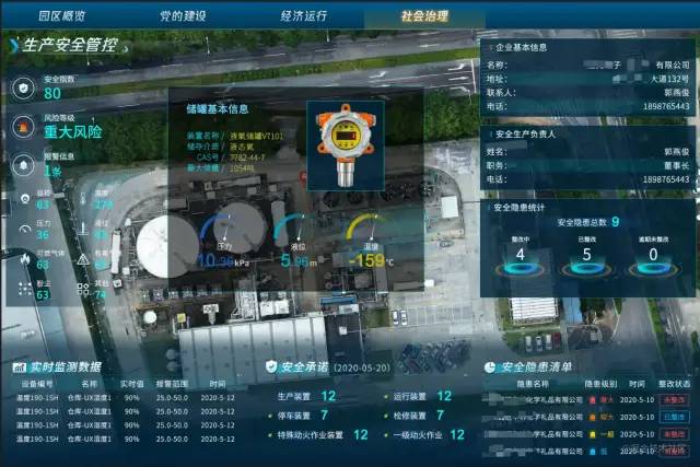
First look at the project renderings
Project 1: Metro 3D visualization large screen system
The total resolution is 9600 * 2160, which is divided into three screens: left, middle and right. It will not adapt to too large and too small screens
Left screen resolution: 2880 * 2160
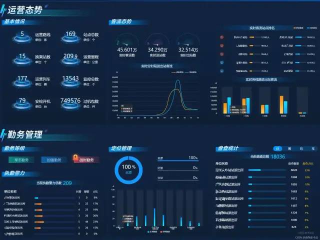
Medium screen resolution: 3840 * 2160
Right screen resolution: 2880 * 2160
Left, middle and right stitching effect

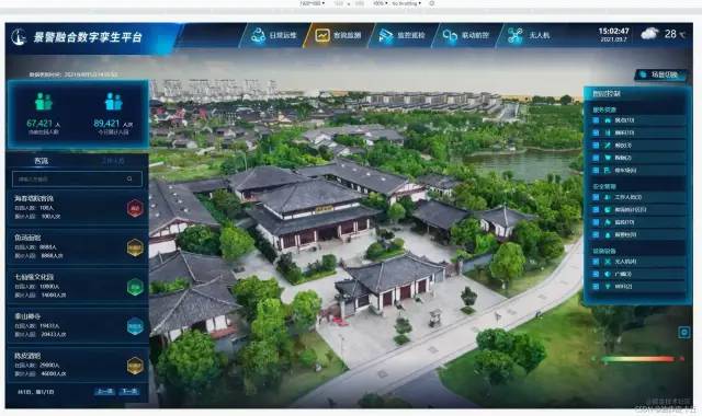
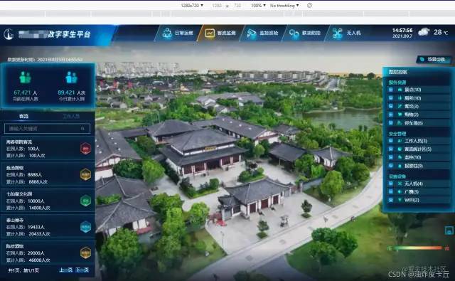
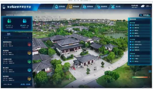
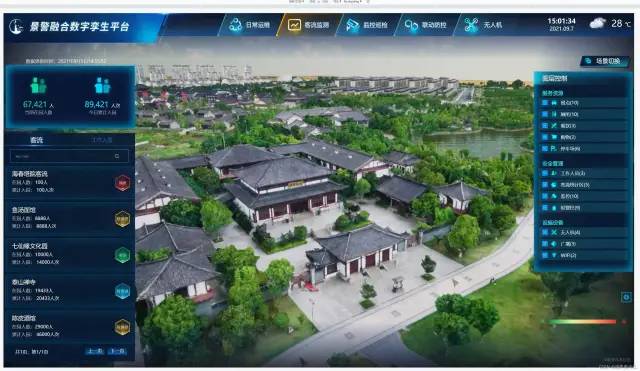
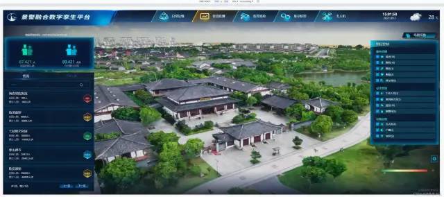
Project 2: Digital twin platform of scenic spot
The basic resolution is 1920 * 1080, and it is required to adapt the 16:9 screen up and down
1920*1080
1280*720
2560*1440
3840*2160
7480*3240
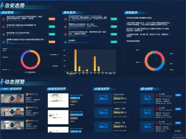
Project 3: situational awareness platform of xxx Park
Multiple 2880 * 2160 splices
2880*2160
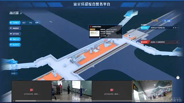
Project 4: xxx comprehensive law enforcement platform
6000*2160

Adaptation scheme
The adaptation scheme is not only screen adaptation, but also the icons and DOM elements inside. It is introduced separately below
Screen adaptation
vw and vh adaptation scheme
-
Convert px into vw and vh according to the size of the design draft
-
The conversion formula is as follows
It is assumed that the size of the design draft is 1920*1080(Be sure to ask before you do it UI Size of design draft)

  Namely:
  Page width=1920px
  Web page height=1080px

  We all know
  Page width=100vw
  Page width=100vh

  So, in 1920 x*1080px Screen resolution

  1920px = 100vw

  1080px = 100vh

  In this way, with a width of 300 px And 200 px of div Generally speaking, the width and height occupied by its work are vw and vh Unit, calculated as follows:

  vwDiv = (300px / 1920px ) * 100vw
  vhDiv = (200px / 1080px ) * 100vh

  So, in 1920*1080 At the screen resolution of, a single div Width and height of

  When the screen zooms in or out, div Or with vw and vh As wide and high, it will automatically adapt to the screen with different resolutions
Therefore, it's good to switch every time we write css, but it's very slow to use the calculator, so we need to use the function of scss to help us calculate
Install scss
npm install sass@1.26.5 sass-loader@8.0.2 --save
Encapsulating computing tool functions
-
Create a utils.scss file under src/styles to define the width and height of the design
-
Here, the math.div function built in scss is used to define two calculation functions of vw and vh
-
We pass in specific pixel values, which help us automatically calculate the values of vw and vh
util.scss
//Using the math function of scss, https://sass-lang.com/documentation/breaking-changes/slash-div
@use "sass:math";


//The width of the default design
$designWidth:1920;
//The height of the default design
$designHeight:1080;

//Function from px to vw
@function vw($px) {
  @return math.div($px , $designWidth) * 100vw;
}

//Function from px to vh
@function vh($px) {
  @return math.div($px , $designHeight) * 100vh;
}
Path configuration
I use the Vue project built by Vue 2.6 and vue-cli3, so I only need to configure the path of utils.scss in vue.config.js to use it globally
const path = require('path')

function resolve(dir) {
  return path.join(__dirname, dir)
}

module.exports={
  publicPath: '',
  configureWebpack: {
    name: "app name",
    resolve: {
      alias: {
        '@': resolve('src')
      }
    }
  },
  css:{
            //For global configuration of utils.scss, please refer to the official website of Vue cli for details
            loaderOptions:{
                sass:{
                     prependData:`@import "@/styles/utils.scss";`
                }
            }
  }
}
Dynamic DOM element adaptation
Sometimes it may not only be used in. vue files, such as DOM elements dynamically created in js
It may be rendered directly into html
let oDiv = document.createElement('div')
document.body.appendChild(oDiv)
In this case, I use the following two methods to style the div created
1. Define global class style
Create a new global.scss file in the scr/styles directory and import it in main.js
global.css
.global-div{
        width: vw(300);
        height: vw(200);
        background-color: green;
    }
main.js
import './styles/global.scss'
When using, set className to the div you created
let oDiv = document.createElement('div')
oDiv.className = "global-div"
2. Define js style processing function
This processing method is similar to the scss processing function, except that pure js is used to convert px to vw and vh
Create a new styleUtil.js file in the src/utils directory, as follows
//Define the width and height of the design
const designWidth = 1920;
const designHeight = 1080;

let styleUtil = {
    // px to vw
    px2vw: function (_px) {
        return _px * 100.0 / designWidth + 'vw';
    },
    // px to vh
    px2vh: function (_px) {
        return _px * 100.0 / designHeight + 'vh';
    },

};

export default styleUtil;
When used, the width and height attributes are set separately
import styleUtil from "./src/utils/styleUtil.js"

let oDiv = document.createElement('div')
oDiv.style.width = styleUtil.px2vw(300)
oDiv.style.height = styleUtil.px2vh(200)
oDiv.style.margin = styleUtil.px2vh(20)
However, there is a disadvantage of this method, that is, after the screen size changes, you need to refresh it manually to complete the adaptive adjustment
Echarts chart adaptation and encapsulation
Why package?
-
The option configuration of each chart is similar. It must be rewritten in the business code every time, which is very redundant
-
In the same project, all kinds of chart designs are very similar or even the same, so there is no need to repeat the work all the time
-
Some developers may forget to consider the characteristics of echarts updating data and the adaptation of window scaling. In this way, the data updates the eckarts view but does not update, and the scaling of the window causes the deformation of the eckarts graphics
Effect after packaging
-
Business data and style configuration data are separated. I just need to import business data
-
Its size is entirely up to the user
-
It will not deform due to scaling, but can adapt well
-
Sometimes the style of a chart may be a little different. I hope I can keep the flexibility of configuring the style myself
-
No matter what data is passed in, the view can be updated correctly
-
If my incoming data is empty, it can show an empty status
Packaging recommendations
-
Place all chart components in the components/Chart folder
-
Create a new folder for each chart, such as components/Chart/PieChart, components/Chart/LineChart, etc
-
There is a default defaultOption.js configuration file in each diagram
-
The chart must have a README.md file
Dependency
-
"echarts": "^5.1.2",
-
"element-resize-detector": "^1.2.3",
-
"lodash": "^4.17.21",
Specific packaging, take pie chart as an example
<template>

  <h3 v-if="isSeriesEmpty">No data</h3>

  <div v-else class="chart">

  </div>
</template>

<script>

import * as Echarts from "echarts"
import ResizeListener from "element-resize-detector";
import { merge, isEmpty } from "lodash";
import {basicOption} from "./defaultOption.js"
import {pieChartColor} from "./../color.js"

  export default{
            name: "PieChart",
            props: {
                // Normal business data, corresponding to series[0].data in the ecarts pie chart configuration
                seriesData: {
                  type: Array,
                  required: true,
                  default: () => [],
                },
                // Indicates that special customized configuration is required
                // Generally, the UI will specify a unified design specification (such as color, font, legend format, location, etc.)
                // However, it is not ruled out that an icon is different from the design specification and requires special custom styles, so open this configuration to enhance flexibility
                extraOption: {
                  type: Object,
                  default: () => ({}),
                },
              },
              data() {
                return {
                  chart: null,
                };
              },

                computed:{
                        isSeriesEmpty() {
                          return (
                            isEmpty(this.seriesData) || this.seriesData.every((item) => !item.value)
                          );
                        },
                },


              watch: {
                seriesData: {
                  deep: true,
                  handler() {
                    this.updateChartView();
                  },
                },
              },

            mounted() {
                    this.chart = Echarts.init(this.$el);
                    this.updateChartView();
                    window.addEventListener("resize", this.handleWindowResize);
                    this.addChartResizeListener();
            },
            beforeDestroy() {
              window.removeEventListener("resize", this.handleWindowResize);
            },

            methods:{
                    /* Merge configuration items and data. For configuration items and data that need to be customized, use the merge function to merge them into one option */

                assembleDataToOption() {
                    // The legend formatter in this part depends on the UI requirements. If it is not needed in your project, you can not write the formatter
                    // Due to the iteration of echarts version, the writing method here has also changed slightly
                    const formatter = (name) => {
                            const total = this.seriesData.reduce((acc, cur) => acc + cur.value, 0);
                            const data = this.seriesData.find((item) => item.name === name) || {};
                            const percent = data.value
                                    ? `${Math.round((data.value / total) * 100)}%`
                                    : "0%";

                            return `${name} ${percent}`;
                    };

                    return merge(
                            {},
                            basicOption,
                            { color: pieChartColor },
                            {
                                    legend: { formatter },
                                    series: [{ data: this.seriesData }],
                            },
                            this.extraOption
                    );
                },
                    /**
                     * Listen to the chart element size and update the chart view synchronously when changes occur
                     */
                    addChartResizeListener() {
                            const instance = ResizeListener({
                                strategy: "scroll",
                                callOnAdd: true,
                            });

                            instance.listenTo(this.$el, () => {
                                if (!this.chart) return;
                                this.chart.resize();
                            });
                    },

                    /**
                     * Update Eckart view
                     */
                    updateChartView() {
                        if (!this.chart) return;
                        const fullOption = this.assembleDataToOption();
                        this.chart.setOption(fullOption, true);
                    },

                    /**
                     * As the window zooms, echart dynamically resizes itself
                     */
                    handleWindowResize() {
                        if (!this.chart) return;
                        this.chart.resize();
                    },
            }
  }
</script>

<style scoped="scoped" lang="scss">
    .chart {
        width: 100%;
        height: 100%;
    }
</style>
Chart width height adaptation
Here, it is directly set to 100%, and the width and height of the parent element during the service life,
This parent element can directly use our encapsulated scss function.
.chart {
    width: 100%;
    height: 100%;
 }
Chart font, spacing and other dimensions are adaptive
-
The font size of ecarts only supports specific values (pixels), not percentages or vw. Generally, fonts will not be adaptive. If necessary, an adaptive processing function can be written for fonts
-
By default, take your design draft as 1920 * 1080, that is, the web page width is 1920px (be sure to ask the size of the UI design draft before doing it)
-
I write this function in a separate tool file dataUtil.js and call it when necessary
-
The principle is to calculate the ratio of the current screen width to the default design width, and multiply the original size by this value
-
In addition, this function can also be used for other configuration items of ecarts, such as spacing, positioning and margin
dataUtil.js
/* Echarts Chart font and spacing adaptation */
export const fitChartSize = (size,defalteWidth = 1920) => {
  let clientWidth = window.innerWidth||document.documentElement.clientWidth||document.body.clientWidth;
  if (!clientWidth) return size;
  let scale = (clientWidth / defalteWidth);
  return Number((size*scale).toFixed(3));
}
I use the vue framework, which can mount this function on the prototype
import {fitChartSize} from '@src/utils/dataUtil.js'
Vue.prototype.fitChartFont = fitChartSize;
In this way, you can call this.fitChartSize() directly in the. vue file
Specific use of encapsulated charts
<template>
   /** Parent element of pie chart**/
  <div class="echart-pie-wrap">
   <pie-chart :series-data="dataList" :extra-option="extraOption"></pie-chart>
  </div>
</template>

<script>
import PieChart from "@/components/Chart/PieChart/PieChart.vue"
export default {
  components: {
    PieChart,
  },
  data() {
    return {
      dataList: [
        {
          name: "watermelon",
          value: 20,
        },
        {
          name: "a mandarin orange",
          value: 13,
        },
        {
          name: "Carambola",
          value: 33,
        },
      ],
      extraOption: {
        color: ["#fe883a", "#2d90d1", "#f75981", "#90e2a9"],
            grid: {
                top: this.fitChartSize(30),
                right: this.fitChartSize(10),
                left: this.fitChartSize(20),
                bottom: this.fitChartSize(20) //Spacing adaptation
            },
            textStyle: {
                color: "green",
                fontSize: this.fitChartSize(10) //Font adaptation
            },
      },
    };
  },
};
</script>

<style lang="scss">
    .echart-pie-wrap {
        display: flex;
        justify-content: center;
        align-items: center;
        width: vw(300);
        height: vh(300);
        margin: 1vw auto;
    }
</style>
Description of the source code of chart encapsulation
-
In the source code, I use a public function merge of lodash to merge the configuration items of charts. Subsequent source object properties overwrite previous properties with the same name
-
Another function isEmpty is used. When the business data I pass in is empty, such as empty array [], undefined and null, it will be considered as a case without data. At this time, we will show an empty component, which may be composed of a background diagram;
-
When binding to a specific DOM element, I do not use the querySelector selector to select a class or the id generated by Math.random, because neither is absolutely reliable. I directly use the root DOM element $el associated with the current vue example
-
I monitor the change of window size and add the corresponding event handler function for this situation -- the resize method provided by echorts, so that the echorts graph will not deform
-
Set the width and height of the corresponding DOM to 100%, so that its size is completely controlled by the container provided by the user
-
The second parameter of setOption method indicates whether the incoming new option will not be merged with the previous old option. The default is false, that is, merging. This obviously doesn't work. We need to be completely independent of each business configuration
-
Naming is very semantic and can be understood at a glance
-
It retains the flexibility of configuring some custom styles separately, that is, extraOption
-
The chart font adaptive function is decoupled separately to maintain flexibility
What should defaultOption.js include?
-
Under normal circumstances, it is OK to expose a basic configuration basic option
-
If you need to deal with font and spacing size adaptation, please introduce the fitChartSize function here
import {fitChartSize} from "@src/utils/dataUtil.js"
export const basicOption = {
  title: {
      text: "So and so mobile data",
      subtext: "come from xx company",
      left: "center",
    },
    tooltip: {
      trigger: "item",
    },
    legend: {
      orient: "vertical",
      left: "left",
                textStyle: {
                    color: "RGB(254,66,7)",
                    fontSize: fitChartSize(10) //Use font adaptation
                },
    },
    series: [
      {
        name: "Proportion of mobile phone purchase",
        type: "pie",
        radius: "50%",
        emphasis: {
          itemStyle: {
            shadowBlur: 10,
            shadowOffsetX: 0,
            shadowColor: "rgba(0, 0, 0, 0.5)",
          },
        },
        data: [], // It will be replaced by business data when used
      },
    ],
}
What is the function of element resize detector?
This is a plug-in for listening for changes in the size of DOM elements. We have monitored window scaling, but sometimes the size of its parent container will change dynamically. We monitor the width of the parent container. When the size of the parent container changes, echart can call its own resize method to keep the view normal.
Of course, this does not apply to the tab. In the tab, the parent container may complete from display:none to the actual clientWidth before registering a resizeDetector. Therefore, it may be too late to start listening to the parent container resize.
The most effective way to solve this problem is to manually obtain the Eckart instance through ref and manually call the resize method when switching tabs, which is the safest and most effective.
summary
The above is all the ideas of project adaptation. It can be seen that the adaptation scheme adopted by our company is relatively simple. In principle, pixels are converted to VW and VH.
Although this scheme is not the most perfect, it meets our business needs to a great extent.