In the previous article, we used the scrapy framework to crawl information about 112W users, followed by analysis, processing and front-end visualization of this information.
Tools used
Java web
servlet + jsp
mysql database
echarts
The key point here is echarts, a visual development tool based on canvas developed by Baidu, or very useful. See the official website for details: echarts website
Analysis of the data is a simple sql statement, then the results are stored in a table, and then the database data is obtained by writing javaweb code, which is passed to the data in.jsp as echarts drawings.Visualize the front-end of the data.
Let's look at the gender distribution of users:
/*
			Pie chart of sex distribution
		*/


		// Specify the configuration items and data for the chart
		var sexoption = {
		    title : {
		        text: 'Knowing user gender distribution',
		        subtext: '112w Bar data',
		        x:'60%'
		    },
		    tooltip : {
		        trigger: 'item',
		        formatter: "{a} <br/>{b} : {c} ({d}%)"
		    },
		    legend: {
		        orient: 'vertical',
		        left: '30%',
		        data: ['male','female','Unknown']
		    },
		    series : [
		        {
		            name: 'User gender',
		            type: 'pie',
		            radius : '55%',
		            center: ['70%', '50%'],
		            data:[{value:435265, name:'male'},
		                {value:367175, name:'female'},
		                {value:318923, name:'Unknown'},]
		        }
		    ]
		};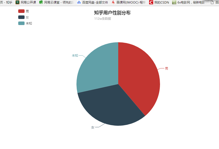
28.44% of men and 32.74% of women are unknown, and nearly a third of users do not indicate their gender.
Look at the User Alumni Chart again -->
/*
			School Column
		*/
		//Specify the configuration items and data for the chart
		var schooloption = {
			//Title
			title: {
				text: 'Know Alumni Ranking(Top 20)',
				textStyle :{
					color: '#408829'
				}
			},
			//Hold-all
			toolbox: {
				show: true,
				feature: {
					dataView:{
						show: true
					},
					restore:{
						show:true
					},
					dataZoom:{
						show: true
					},
					saveAsImage: {
						show: true
					},
					magicType: {
						type:['line', 'bar']
					}
				}
			},
			tooltip: {
				trigger: 'axis'
			},
			//Legend
			legend: {
				data: ['School']
			},
			grid: {
				y2: 100
			},

			//x-axis
			xAxis: {
				axisLabel :{
					textStyle: {
						color:'green',
						fontSize: 15
					},
					rotate: 40,   //Tilt number
    				interval:0
				},
				data: arrName.slice(0, 20)
			},
			yAxis: {},
			//data
			series: [{
				name: 'School',
				type: 'bar',
				center: ['50%', '50%'],
				itemStyle: {
					normal: {
						color: '#00ffcc'
					}
				},
				data: arrNum.slice(0, 20)
			}]
		};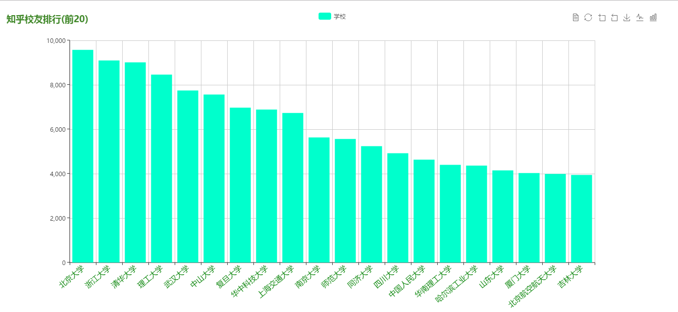
Don't graduates from these schools feel shy writing about their own schools (23233333)?
Take a look at the user's expertise - >
/*
			Professional distribution pie chart
		*/
		// Specify the configuration items and data for the chart
		var majoroption = {
		    title : {
		        text: 'Know user specialty (top 20)',
		        subtext: '112w Bar data',
		        x:'60%'
		    },
		    tooltip : {
		        trigger: 'item',
		        formatter: "{a} <br/>{b} : {c} ({d}%)"
		    },
		    legend: {
		        orient: 'vertical',
		        left: '30%',
		        data: majorName
		    },
		    series : [
		        {
		            name: 'User's Major',
		            type: 'pie',
		            radius : '55%',
		            center: ['70%', '50%'],
		            data:majorJson
		        }
		    ]
		};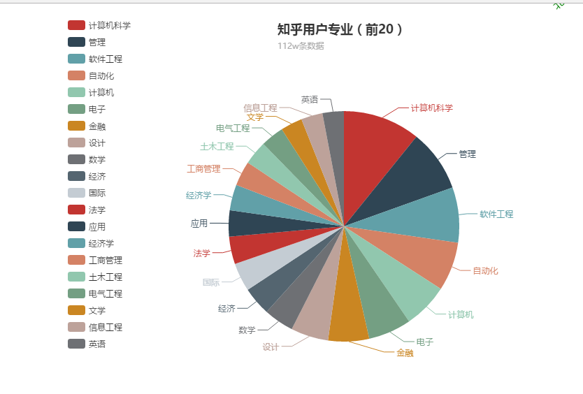
Knowing is the programmer's knowledge, which is not unreasonable!!!
Let's look at the ranking of cities where users live -->
/*
			Location Distribution

		*/
		// Specify the configuration items and data for the chart
		var addreoption = {
		    title : {
		        text: 'Know the user's city (top 10)',
		        subtext: '112w Bar data',
		        x:'60%'
		    },
		    tooltip : {
		        trigger: 'item',
		        formatter: "{a} <br/>{b} : {c} ({d}%)"
		    },
		    legend: {
		        orient: 'vertical',
		        left: '30%',
		        data: ['Beijing','Shanghai','Hangzhou', 'Chengdu', 'Nanjing', 'Guangzhou', 'Shenzhen', 'Wuhan', 'Xi'an', 'Chongqing']
		    },
		    series : [
		        {
		            name: 'User City',
		            type: 'pie',
		            radius : '55%',
		            center: ['70%', '50%'],
		            data:[
		                {value:50002, name:'Beijing'},
		                {value:32055, name:'Shanghai'},
		                {value:11925, name:'Hangzhou'},
		                {value:8794, name:'Chengdu'},
		                {value:8331, name:'Nanjing'},
		                {value:7748, name:'Guangzhou'},
		                {value:7548, name:'Shenzhen'},
		                {value:7456, name:'Wuhan'},
		                {value:5639, name:'Xi'an'},
		                {value:4202, name:'Chongqing'},
		            ]
		        }
		    ]
		};
and Results - >
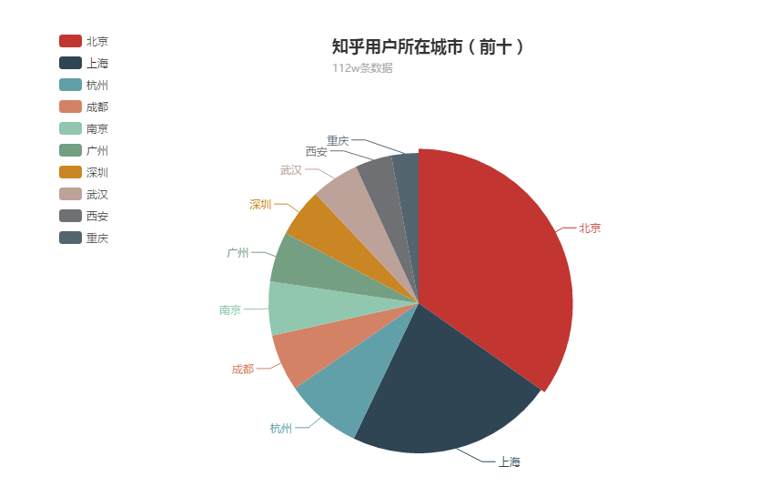
Beijing and Shanghai account for the majority!!!!
Let's take a look at the fan charts again -->
/*
			Fan Ranking Column
		*/
		//Specify the configuration items and data for the chart
		var fanoption = {
			//Title
			title: {
				text: 'Number of fans ranking(Top 20)',
				textStyle :{
					color: '#408829'
				}
			},
			//Hold-all
			toolbox: {
				show: true,
				feature: {
					dataView:{
						show: true
					},
					restore:{
						show:true
					},
					dataZoom:{
						show: true
					},
					saveAsImage: {
						show: true
					},
					magicType: {
						type:['line', 'bar']
					}
				}
			},
			tooltip: {
				trigger: 'axis'
			},

			//Legend
			legend: {
				data: ['', '', '']
			},
			grid: {
				y2: 100
			},

			//x-axis
			xAxis: {
				axisLabel :{
					textStyle: {
						color:'green',
						fontSize: 15

					},
					rotate: 30,   //Tilt number
    				interval:0
				},
				data: arrfanName.slice(0, 20)
			},
			yAxis: {},
			//data
			series: [{
				name: 'Full name',
				type: 'bar',
				itemStyle: {
					normal: {
						 color:function(params) {
							if (arrfanGender[params.dataIndex] ==1){
								return '#0088a8';
							} else if(arrfanGender[params.dataIndex] ==0){
								return '#ffb7dd';
							}else {
								return '#dddddd';
							}
						}
					}
				},
				data: arrfanFollower_count.slice(0, 20)

			}]
		};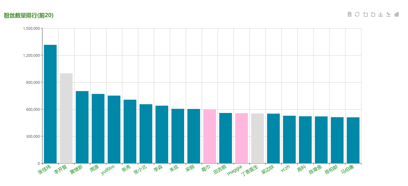
Different colors represent different gender Blue is male, pink is female, gray is unknown, (just look!)
Although you look at the user's city rankings, you still want to look at the user's geographic distribution. So, the code -->
var convertData = function (data) {
		    var res = [];
		    for (var i = 0; i < data.length; i++) {
		        var geoCoord = geoCoordMap[data[i].name];
		        if (geoCoord) {
		            res.push({
		                name: data[i].name,
		                value: geoCoord.concat(data[i].value)
		            });
		        }
		    }
		    return res;
		};

		mapoption = {
		    backgroundColor: '#ffffff',
		    title: {
		        text: 'Know the user's City',
		        left: 'center',
		        textStyle: {
		            color: '#666666'
		        }
		    },
		    tooltip: {
		        trigger: 'item',
		        formatter: function (params) {
		            return params.name + ' : ' + params.value[2];
		        }
		    },
		    legend: {
		        orient: 'vertical',
		        y: 'bottom',
		        x:'right',
		        data:['Number'],
		        textStyle: {
		            color: '#666666'
		        }
		    },
		    dataRange: {
		        min: 0,
		        max: 51000,
		        calculable: true,
		        color: ['#d94e5d','#eac736','#50a3ba'],
		        textStyle: {
		            color: '#666666'
		        }
		    },
		    geo: {
		        map: 'china',
		        label: {
		            emphasis: {
		                show: false
		            }
		        },
		        roam: true,
		        left: 'center',
		        itemStyle: {
		            normal: {
		                areaColor: '#323c48',
		                borderColor: '#111'
		            },
		            emphasis: {
		                areaColor: '#2a333d'
		            }
		        }
		    },
		    series : [
		        {
		            name: 'Number',
		            type: 'scatter',
		            coordinateSystem: 'geo',
		            data: convertData(addressJson),
		            symbolSize: 12,
		            label: {
		                normal: {
		                    show: false
		                },
		                emphasis: {
		                    show: false
		                }
		            },
		            itemStyle: {
		                emphasis: {
		                    borderColor: '#fff',
		                    borderWidth: 1
		                }
		            }
		        }
		    ]
		};
Look at the results:
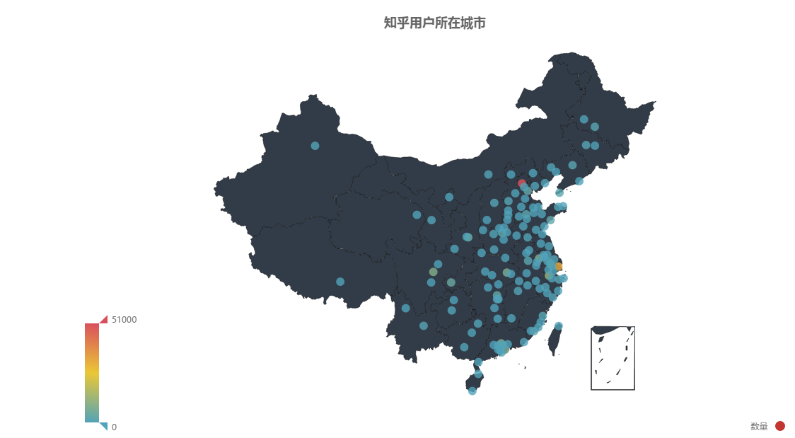
At a glance, users are still concentrated in the eastern region.