Let's start with the effect map (see the explanation later if you are interested in it):
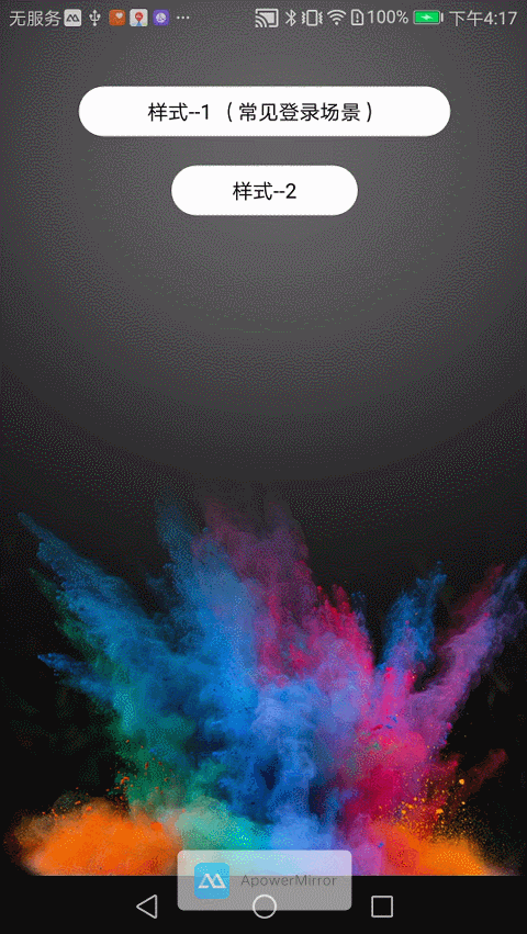
1. Display of login effect
2. Pay attention to effect demonstration
1. [Drawing rounded rectangle]
Drawing begins with the onDraw method (I'll write the circle code, step by step). First, define an attribute in the view: private RectF rectf = new RectF(); // It can be understood as the area where the control button is loaded.
rectf.left = current_left;
rectf.top = 0;      //(These two points determine the upper left corner of the space area, current_left, which is prepared for the later animation rectangle to become an equilateral rectangle, where you can see as 0)
rectf.right = width - current_left;
rectf.bottom = height;       //(By changing the current_left size and updating the rendering, the animation effect can be achieved)
//round rectangle
//Parametric 1: Region
//Parametric 2,3: The rounded corner of a rectangle is actually the radius of the rectangular rounded corner.
//Parametric 4: Brush
canvas.drawRoundRect(rectf, circleAngle, circleAngle, paint);
2. [Determine the size of the control]
Above is the drawing of rounded corners, so how do width and height come from, of course, through onMeasure?
@Override
protected void onMeasure(int widthMeasureSpec, int heightMeasureSpec) {
    height = measuredHeight(heightMeasureSpec);  //Here is the measurement of control size
    width = measureWidth(widthMeasureSpec);  //We often see that we set controls wrap_content, match_content or fixed values.
    setMeasuredDimension(width, height);
}
Take measureWidth as an example:
private int measureWidth(int widthMeasureSpec) {
        int result;
        int specMode = MeasureSpec.getMode(widthMeasureSpec);
        int specSize = MeasureSpec.getSize(widthMeasureSpec);
        //Here is the exact mode, such as match_content, or the size of the control is specified in your control.
        if (specMode == MeasureSpec.EXACTLY) {
            result = specSize;
        } else {
            //Here's wrap_content mode, but here's a default value.
            //The following logout code is the first one to give the user a default fixed value if he does not set the size. It's more reasonable to use font length here.
            //result = (int) getContext().getResources().getDimension(R.dimen.dp_150);
            //Here is the length I set, of course, you can write custom controls to set the logic you want, according to your actual situation.
            result = buttonString.length() * textSize + height * 5 / 3;
            if (specMode == MeasureSpec.AT_MOST) {
                result = Math.min(result, specSize);
            }
        }
        return result;
    }
3. [Drawing text]
Here I do it in my own way: when the text length exceeds the control length, the text needs to scroll back and forth. So customize the control because you need what kind of functions can be achieved by yourself (of course, this method is also in onDraw, why in this order, I hope you can understand step by step, if you think the onDraw code is too complicated, you can use a method to go out independently, you can use p as the author does. Rivate void drawText (Canvas canvas) {}, // the path of drawing text (text scrolling back and forth needs to be used when text is too long)
private Path textPath = new Path():
textRect.left = 0;
textRect.top = 0;
textRect.right = width;
textRect.bottom = height; //Here we determine the text rendering area, which is actually the control area.
Paint.FontMetricsInt fontMetrics = textPaint.getFontMetricsInt();
//Here is the y-axis position for text rendering, understandable in the middle.
int baseline = (textRect.bottom + textRect.top - fontMetrics.bottom - fontMetrics.top) / 2;
//Here to determine whether the length of text is greater than the length of the control, of course, I need to leave the distance between the two sides of the control, so it is not greater than width, so it is just a better understanding.
//Here is when the text content is longer than the control length, start the rollback effect. It's suggested that we look at the normal situation in else below.
if ((buttonString.length() * textSize) > (width - height * 5 / 3)) {
    textPath.reset();
    //Because we need to leave two intervals, heigh/3 is the interval.
    textPath.moveTo(height / 3, baseline);
    textPath.lineTo(width - height / 3, baseline);
    //This means where the text begins to be written. It can be centered. Here it is on the right.
    textPaint.setTextAlign(Paint.Align.RIGHT);
    //Here is a path to draw text, scroll Size can be understood as text on the x axis of the cheap, at the same time, my mixing effect is by changing scroll Size.
    //Refresh Drawing to Realize
    canvas.drawTextOnPath(buttonString, textPath, scrollSize, 0, textPaint);
    if (isShowLongText) {
        //Here's how to draw the occlusion, because there's no space between the paths, so drawing the occlusion is similar to spacing.
        canvas.drawRect(new Rect(width - height / 2 - textSize / 3, 0, width - height / 2, height),paintOval);
        canvas.drawRect(new Rect(height / 2, 0, height / 2 + textSize / 3, height), paintOval);
        //Here's a bug with a small dot - 5 because of the thickness of the brush.
        canvas.drawArc(new RectF(width - height, 0, width - 5, height), -90, 180, true, paintOval);
        canvas.drawArc(new RectF(0, 0, height, height), 90, 180, true, paintOval);
    }

    if (animator_text_scroll == null) {
        //Here is the calculation of the range of distances mixed to the rightmost and leftmost
        animator_text_scroll = ValueAnimator.ofInt(buttonString.length() * textSize - width + height * 2 / 3,-textSize);
        //Here is the time for animation, scrollSpeed can be understood as the time required for each text scroll control, which can be provided as control properties.
        animator_text_scroll.setDuration(buttonString.length() * scrollSpeed);
        //Set the animation mode, here's scrolling back and forth
        animator_text_scroll.setRepeatMode(ValueAnimator.REVERSE);
        //Set up an interpolator to make the whole animation flow smoothly
        animator_text_scroll.setInterpolator(new LinearInterpolator());
        //Here is the number of scrolls, - 1 scrolls indefinitely.
        animator_text_scroll.setRepeatCount(-1);
        animator_text_scroll.addUpdateListener(new ValueAnimator.AnimatorUpdateListener() {
            @Override
            public void onAnimationUpdate(ValueAnimator animation) {
                //Change the offset of the x-axis of the text path
                scrollSize = (int) animation.getAnimatedValue();
                postInvalidate();
            }
        });
        animator_text_scroll.start();
    }
} else {
    //This is the normal situation, isShow Long Text, is whether I start the control animation when the text has a gradient effect logo.
    //If it is long text, start the gradient effect, if the control becomes smaller, the text content outside the current control will look ugly, so according to this logo, close, here you can ignore (at the same time, because drawing text according to the path can not have the effect of spacing, the logo is still to determine whether to draw occlusion twice in the control. Things, this is the author's solution, if you have a better way to leave a message below.
    isShowLongText = false;
    /**
     * Simple rendering of text without considering that text length exceeds control length
     * */
    //Here is the center display.
    textPaint.setTextAlign(Paint.Align.CENTER);
    //Parametric 1: Text
    //Parametric 2,3: Drawing the central point of text
    //Parametric 4: Brush
    canvas.drawText(buttonString, textRect.centerX(), baseline, textPaint);
}
4. [Custom Control Properties]
<?xml version="1.0" encoding="utf-8"?>
<resources>
    <declare-styleable name="SmartLoadingView">
        <attr name="textStr" format="string" />
        <attr name="errorStr" format="string" />
        <attr name="cannotclickBg" format="color" />
        <attr name="errorBg" format="color" />
        <attr name="normalBg" format="color" />
        <attr name="cornerRaius" format="dimension" />
        <attr name="textColor" format="color" />
        <attr name="textSize" format="dimension" />
        <attr name="scrollSpeed" format="integer" />
    </declare-styleable>
</resources>
Here, for example, textStr. For example, you use app:txtStr= "text content" for layout. Get the following in the custom control:
public SmartLoadingView(Context context, AttributeSet attrs, int defStyleAttr) {
    super(context, attrs, defStyleAttr);
    //The attrs of the 3-parameter method of the custom control is the key to setting the custom property.
    //For example, we customize our attributes in attrs.xml.
    TypedArray typedArray = getContext().obtainStyledAttributes(attrs, R.styleable.SmartLoadingView);
    //Here is to get whether the user has set the entire property.
    //Here is to get the settings from the user.
    String title = typedArray.getString(R.styleable.SmartLoadingView_textStr);
    if (TextUtils.isEmpty(title)){
       //If the acquired attribute is empty, you can default to an attribute
       //(The author forgot to set it up! It's embarrassing to post-release optimization.)
       buttonString ="Default Text";
    }else{
       //If there is a setup copy
       buttonString = title;
    }

}
5. [Setting Click Events, Starting Animation]
In order to visualize click events, it is also possible to encapsulate processing to prevent repeated click events.
//This is my custom login click interface
public interface LoginClickListener {
    void click();
}

public void setLoginClickListener(final LoginClickListener loginClickListener) {
    this.setOnClickListener(new OnClickListener() {
        @Override
        public void onClick(View v) {
            if (loginClickListener != null) {
                //Prevent repeated clicks
                if (!isAnimRuning) {
                    start();
                    loginClickListener.click();
                }

            }
        }
    });
}
6. [Animation Explanation]
6.1. First animation, from rectangle to square, and from rectangle to rounded rectangle (here are two animations, just at the same time)
Rectangles to squares (to simplify, I removed some other attributes of the source code, which is easy to understand)
//Where default_all_distance = w - h) / 2; divided by 2 because both times are shortened to the middle
private void set_rect_to_circle_animation() {
    //This is an attribute animation. Curr_left will change uniformly from 0 to default_all_distance in duration time.
    //If you want to add variety, you can also add an interpolator.
    animator_rect_to_square = ValueAnimator.ofInt(0, default_all_distance);
    animator_rect_to_square.setDuration(duration);
    animator_rect_to_square.addUpdateListener(new ValueAnimator.AnimatorUpdateListener() {
        @Override
        public void onAnimationUpdate(ValueAnimator animation) {
            //The current_left here is related to onDraw, remember?
            //Control area in onDraw
            //Control left area rectf.left = current_left;
            //Control right area rectf.right = width - current_left;
            current_left = (int) animation.getAnimatedValue();
            //Refresh Drawing
            invalidate();
        }
    });
Rectangular to rounded rectangle. It's from a rectangle without rounded corners to a rectangle with completely rounded corners. Of course, when I show it, only the third figure and the last button are obvious.
Others I set directly to the rounded button, because I made the rounded corner into an attribute.
Remember the canvas. draw Round Rect (rectf, circle Angle, circle Angle, paint) in onDraw; circle Angle is the radius of the corner.
Imagine what circleAngle would be if it were all rounded corners, of course height/2; yes, so
Because I made the rounded corners into attributes obtainCircleAngle is an attribute obtained from the xml file, if not set, then 0, there is no rounded corners effect.
animator_rect_to_angle = ValueAnimator.ofInt(obtainCircleAngle, height / 2);
animator_rect_to_angle.setDuration(duration);
animator_rect_to_angle.addUpdateListener(new ValueAnimator.AnimatorUpdateListener() {
    @Override
    public void onAnimationUpdate(ValueAnimator animation) {
        //Let's imagine if it's a square, it's just a round corner, it's a circle.
        circleAngle = (int) animation.getAnimatedValue();
        //Refreshing Painting
        invalidate();
    }
});
When two attribute animations are finished, use private AnimatorSet animatorSet = new AnimatorSet(); add the attribute animation, you can set two animations at the same time, or in sequence here is the same use with
animatorSet
        .play(animator_rect_to_square).with(animator_rect_to_angle);
6.2. After turning into a circle, there is a loading animation
Here is the drawing of an arc, just changing constantly. The starting point and the end point of the arc, finally showing the loading state, is also in onDraw.
//Draw loading schedule
if (isLoading) {
    //Parametric 1: Drawing the arc region
    //Parametric 2,3: Draw the starting and ending points of an arc
    canvas.drawArc(new RectF(width / 2 - height / 2 + height / 4, height / 4, width / 2 + height / 2 - height / 4, height / 2 + height / 2 - height / 4), startAngle, progAngle, false, okPaint);

    //Here is my best loading animation through practice
    //Of course, there are many ways, because I customize this view to put everything in this class, you can also have your way.
    //If there is a better way, please leave a message and let me know.
    startAngle += 6;
    if (progAngle >= 270) {
        progAngle -= 2;
        isAdd = false;
    } else if (progAngle <= 45) {
        progAngle += 6;
        isAdd = true;
    } else {
        if (isAdd) {
            progAngle += 6;
        } else {
            progAngle -= 2;
        }
    }
    //Refresh rendering, there is no need to worry about so many refresh rendering, will affect performance
    //
    postInvalidate();
}
6.3. loading status, to tick animation
So first of all, we need to cancel the loading animation, then change isLoading=false directly; it will not only start ticking animation at the same time; ticking animation animation, here is more troublesome, but also I learned in other people's custom animation, through PathMeasure, to achieve path animation.
/**
 * Path -- Path used to get checks
 */
private Path path = new Path();
/**
 * Take the length of the path
 */
private PathMeasure pathMeasure;
//Initialize the tick animation path;
private void initOk() {
    //The Path of Check
    path.moveTo(default_all_distance + height / 8 * 3, height / 2);
    path.lineTo(default_all_distance + height / 2, height / 5 * 3);
    path.lineTo(default_all_distance + height / 3 * 2, height / 5 * 2);
    pathMeasure = new PathMeasure(path, true);
}
//Initialize tick animation
private void set_draw_ok_animation() {
    animator_draw_ok = ValueAnimator.ofFloat(1, 0);
    animator_draw_ok.setDuration(duration);
    animator_draw_ok.addUpdateListener(new ValueAnimator.AnimatorUpdateListener() {
        @Override
        public void onAnimationUpdate(ValueAnimator animation) {
            startDrawOk = true;
            isLoading = false;
            float value = (Float) animation.getAnimatedValue();
            effect = new DashPathEffect(new float[]{pathMeasure.getLength(), pathMeasure.getLength()}, value * pathMeasure.getLength());
            okPaint.setPathEffect(effect);
            invalidate();

        }
    });
}

//Starting tick animation only requires calling
animator_draw_ok.start();
Drawing tick animation in onDraw
//Draw a tick. This is onDraw. startDrawOk is a sign to determine whether to turn on the tick animation.
if (startDrawOk) {
    canvas.drawPath(path, okPaint);
}
6.4. Back to failure in loading mode (a bit similar to failure in networking)
The previous 6.1 mentioned rectangular to rounded rectangle and rectangular to square animation.
So here's just the first two animations in turn, plus the text of the failure of the network, and the background picture of the failure of the network immediately.
6.5. Start Diffusion Full Screen Animation in loading State (Key Points)
Here I start different effects by using the type of parameters in login Success:
1,Start Diffusion Full Screen Animation
public void loginSuccess(Animator.AnimatorListener endListener) {}

2,Start tick animation
public void loginSuccess(AnimationOKListener animationOKListener) {}
Start the diffusion full screen is the focus of this article, which also involves a custom view.
CirclBigView, this control is full-screen, and from a small circle constantly changing the radius into a large circle of animation, then some people will ask, the full screen is certainly not good, will affect the layout,
But here I put it in the activity layer:
ViewGroup activityDecorView = (ViewGroup) ((Activity) getContext()).getWindow().getDecorView();
ViewGroup.LayoutParams layoutParams = new ViewGroup.LayoutParams(ViewGroup.LayoutParams.MATCH_PARENT, ViewGroup.LayoutParams.MATCH_PARENT);
activityDecorView.addView(circlBigView, layoutParams);
This inspiration was also found recently in the thought of learning Weixin and dragging out. The code is as follows:
public void toBigCircle(Animator.AnimatorListener endListener) {
    //Reduce it to the radius of the circle and tell circlBigView
    circlBigView.setRadius(this.getMeasuredHeight() / 2);
    //Tell circlBigView the current background color
    circlBigView.setColorBg(normal_color);
    int[] location = new int[2];
    //Measure the screen coordinates x,y of the current control
    this.getLocationOnScreen(location);
    //Give the current coordinates to the circlBigView, and the circlBigView calculates the maximum distance from the current point to the four points on the screen, that is, the radius to which the current control is to spread.
    //Specifically, the reader is advised to download and play after reading this blog.
    circlBigView.setXY(location[0] + this.getMeasuredWidth() / 2, location[1]);
    if (circlBigView.getParent() == null) {
        ViewGroup activityDecorView = (ViewGroup) ((Activity) getContext()).getWindow().getDecorView();
        ViewGroup.LayoutParams layoutParams = new ViewGroup.LayoutParams(ViewGroup.LayoutParams.MATCH_PARENT, ViewGroup.LayoutParams.MATCH_PARENT);
        activityDecorView.addView(circlBigView, layoutParams);
    }
    circlBigView.startShowAni(endListener);
    isAnimRuning = false;
}
Concluding remarks
Because the project is to write the previous function into a control, so there are many imperfections. I hope Daniel and his buddies who have suggestions will prompt me to make me better. Thank you
I hope you can forward, share and concern me, and share Android knowledge points and parsing in the future. Your support is my greatest motivation!! ____________