1. Implementation of Android Custom Properties
1.1 Customize a View
package com.self.view.view;

import android.content.Context;
import android.content.res.TypedArray;
import android.graphics.Canvas;
import android.graphics.Color;
import android.graphics.Paint;
import android.support.annotation.Nullable;
import android.util.AttributeSet;
import android.view.View;

import com.self.view.R;
import com.self.view.common.GraphicsUtil;
import com.self.view.common.L;

/**
 * Created by Administrator on 2017/6/5 0005.
 */

public class SelfDefineAttrView extends View {
    private String text = "";
    public SelfDefineAttrView(Context context) {
        super(context);
    }

    public SelfDefineAttrView(Context context, @Nullable AttributeSet attrs) {
        super(context, attrs);
        L.i("Constructor of Two Parameters");
        init(context, attrs);
    }

    private void init(Context context, @Nullable AttributeSet attrs) {
        TypedArray typedArray = context.obtainStyledAttributes(attrs, R.styleable.SelfDefineAttrView);
        if(null != typedArray) {
            text = typedArray.getString(R.styleable.SelfDefineAttrView_android_text);
            int attrValue = typedArray.getInteger(R.styleable.SelfDefineAttrView_attrValue, -1);
            L.i("text=" + text + "   attrValue=" + attrValue);
        }
        typedArray.recycle();
    }

    public SelfDefineAttrView(Context context, @Nullable AttributeSet attrs, int defStyleAttr) {
        super(context, attrs, defStyleAttr);
    }

//    public SelfDefineAttrView(Context context, @Nullable AttributeSet attrs, int defStyleAttr, int defStyleRes) {
//        super(context, attrs, defStyleAttr, defStyleRes);
//    }

    @Override
    protected void onDraw(Canvas canvas) {
        super.onDraw(canvas);
        canvas.drawColor(Color.WHITE);
        if(null != text && text.trim().length() > 0){
            Paint paint = new Paint();
            paint.setColor(Color.BLUE);
            paint.setTextSize(20);
            float height = GraphicsUtil.measureTextHeight(paint);
            canvas.drawText(text,0,height,paint);
        }
    }
}
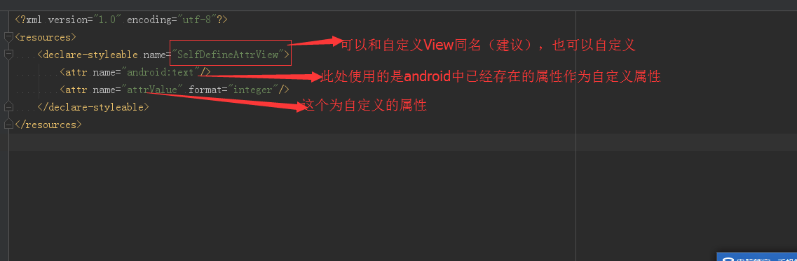
1.2 Add an attrs.xml file to the values folder
<?xml version="1.0" encoding="utf-8"?>
<resources>
    <declare-styleable name="SelfDefineAttrView">
        <attr name="android:text"/>
        <attr name="attrValue" format="integer"/>
    </declare-styleable>
</resources>
1.3 is practical in xml file of corresponding Activity
<?xml version="1.0" encoding="utf-8"?>
<LinearLayout xmlns:android="http://schemas.android.com/apk/res/android"
    xmlns:zhy="http://schemas.android.com/apk/com.self.view"
    android:id="@+id/root"
    android:orientation="vertical"
    android:layout_width="match_parent"
    android:layout_height="match_parent">
    <com.self.view.view.SelfDefineAttrView
        android:layout_width="100dp"
        android:layout_height="100dp"
        android:text="hello!Custom Properties"
        zhy:attrValue="520"/>


</LinearLayout>
2. Explanation of the above examples
2.1 Description of contents in attrs.xml file
2.2 Usage in Layout Files
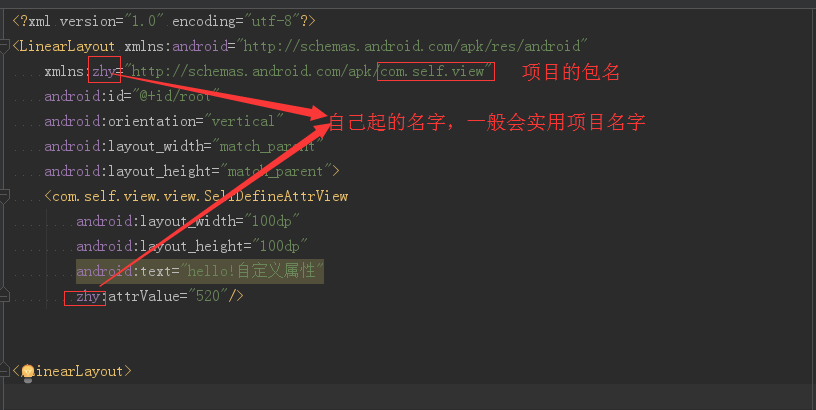
The package name of the item in the figure above can not be written directly. Direct use of res-auto.
Up to now: xmlns:zhy="http://schemas.android.com/apk/com.self.view"
Replace with: xmlns:zhy="http://schemas.android.com/apk/res-auto"
2.3 How to get the value of the corresponding attribute in the custom View
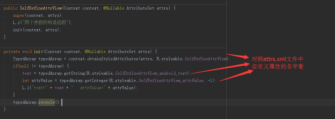
AttributeSets is an object in the constructor of a custom View, which encapsulates the corresponding custom attributes and the values of the corresponding attributes. But you need to use the TypedArray object to get the corresponding value. The relationship between them will be explained in 4.1.
3. API for Android custom attributes
api of format of attr node in 3.1 attrs.xml file
Reference: Reference to a resource ID
Attribute Definition:
<declare-styleable name = "Name">
     <attr name = "background" format = "reference" />
</declare-styleable>
Attribute use:
<ImageView android:background = "@drawable/picture ID"/>
(2). color: color value
Attribute Definition:
<attr name = "textColor" format = "color" />
Attribute use:
<TextView android:textColor = "#00FF00" />
(3). boolean: Boolean value
Attribute Definition:
<attr name = "focusable" format = "boolean" />
Attribute use:
<Button android:focusable = "true"/>
(4). dimension: dimension value
Attribute Definition:
<attr name = "layout_width" format = "dimension" />
Attribute use:
<Button android:layout_width = "42dip"/>
(5). float: floating point value
Attribute Definition:
<attr name = "fromAlpha" format = "float" />
Attribute use:
<alpha android:fromAlpha = "1.0"/>
(6). integer: Integer values
Attribute Definition:
<attr name = "framesCount" format="integer" />
Attribute use:
<animated-rotate android:framesCount = "12"/>
(7). string: string
Attribute definitions:
<attr name = "text" format = "string" />
Attribute use:
<TextView android:text = "I am the text"/>
(8). fraction: percentage
Attribute Definition:
<attr name = "pivotX" format = "fraction" />
Attribute use:
<rotate android:pivotX = "200%"/>
(9). enum: enumerated values
Attribute Definition:
<attr name="orientation">
        <enum name="horizontal" value="0" />
        <enum name="vertical" value="1" />
    </attr>
Attribute use:
<LinearLayout
    android:orientation = "vertical">
</LinearLayout>
Note: Attributes of enumerated types can only be used with one of them, not android:orientation = horizontal vertical“
(10). flag: bits or operations
Attribute Definition:
<attr name="gravity">
            <flag name="top" value="0x30" />
            <flag name="bottom" value="0x50" />
            <flag name="left" value="0x03" />
            <flag name="right" value="0x05" />
            <flag name="center_vertical" value="0x10" />
            ...
    </attr>
Attribute use:
<TextView android:gravity="bottom|left"/>
Note: Attributes of bitwise operation types can use multiple values in their use
Mixed Types: Multiple Type Values can be specified in attribute definitions
Attribute Definition:
<declare-styleable name = "Name">
     <attr name = "background" format = "reference|color" />
</declare-styleable>
Attribute use:
<ImageView
android:background = "@drawable/picture ID" />
//Or:
<ImageView
android:background = "#00FF00" />
4. Principle of Android Custom Attribute
4.1 On the relationship between Attributeset and TypedArray
Attributeset is a class that stores all key-value pairs of attributes. But many of these attributes can not be used directly. For example, some attributes whose format is reference are the corresponding values in R.id.
But the value obtained by TypedArray can be used directly. So using TypedArray simplifies our work.
You can see the corresponding example in the reference link below.
4.2 Some Tips
In some projects, because of the number of modules and all the custom attributes, it is not necessary to write them all in attrs.xml file, or to create a new XML file named after the module. Just define and follow the rules!
Reference address:
Excellent: http://blog.csdn.net/xmxkf/article/details/51468648
More in-depth: http://blog.csdn.net/lmj623565791/article/details/45022631/