Android development from entry to mastery
Chapter III: Layout
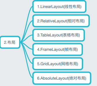
Six of the Android layouts are:
- LinearLayout
- Relativelayout
- Tablelayout
- FrameLayout
- Absolute layout
- GridLayout
LinearLayout (linear layout). We use the Weight attribute of LinearLayout more for screen adaptation. LinearLayout includes some basic attributes, the use of Weight attribute and how to calculate the proportion. In addition, we will talk about the next less used attribute: android:divider drawing underline!
Overview of LinearLayout properties
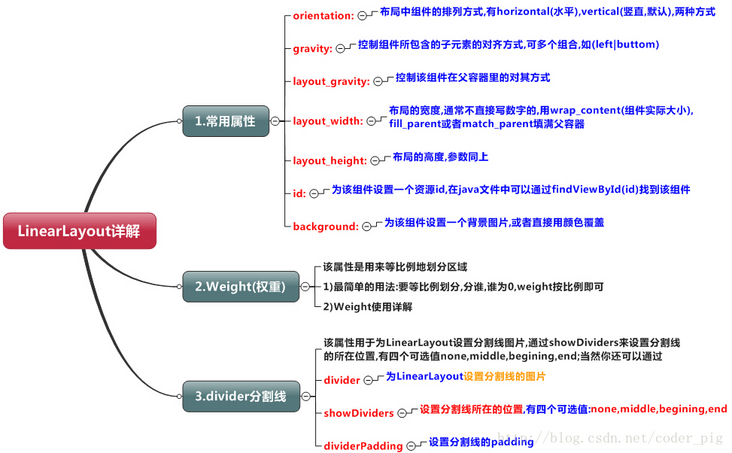
2. Detailed explanation of weight attribute
Code example
<LinearLayout xmlns:android="http://schemas.android.com/apk/res/android"
xmlns:tools="http://schemas.android.com/tools"
android:id="@+id/LinearLayout1"
android:layout_width="match_parent"
android:layout_height="match_parent"
android:orientation="horizontal">
<LinearLayout
android:layout_width="0dp"
android:layout_height="fill_parent"
android:background="#ADFF2F"
android:layout_weight="1" />
<LinearLayout
android:layout_width="0dp"
android:layout_height="fill_parent"
android:background="#DA70D6"
android:layout_weight="2"/>
</LinearLayout>
In code
<font color=Red>
android:layout_weight="1"
</font>
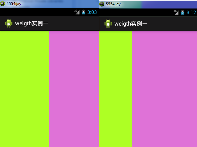
It refers to the weight, which involves the screen proportion allocation. When both weights are 1, it is the effect drawing on the left, and the above code is on the right of the effect drawing
<font color=Red size=4>
When it comes to the weight to be calculated, there are two cases,wrap_content And match_parent The setting of length and width depends on LinearLayout of orientation Is it horizontal or vertical,This determines which direction is divided equally
</font>
Follow wrap_content. The effect is as follows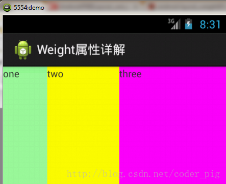
<LinearLayout xmlns:android="http://schemas.android.com/apk/res/android"
    xmlns:tools="http://schemas.android.com/tools"
    android:id="@+id/LinearLayout1"
    android:layout_width="match_parent"
    android:layout_height="match_parent"
    android:orientation="horizontal" >

    <TextView
        android:layout_weight="1"
        android:layout_width="wrap_content"
        android:layout_height="fill_parent"
        android:text="one"
        android:background="#98FB98"/>
     <TextView
        android:layout_weight="2"
        android:layout_width="wrap_content"
        android:layout_height="fill_parent"
        android:text="two"
        android:background="#FFFF00"/>
     <TextView
        android:layout_weight="3"
        android:layout_width="wrap_content"
        android:layout_height="fill_parent"
        android:text="three"
        android:background="#FF00FF"/>

</LinearLayout>
According to match_ The effect is as follows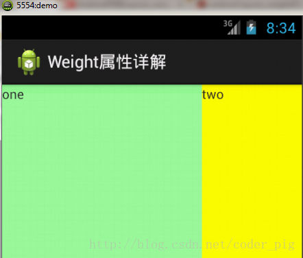
<LinearLayout xmlns:android="http://schemas.android.com/apk/res/android"
    xmlns:tools="http://schemas.android.com/tools"
    android:id="@+id/LinearLayout1"
    android:layout_width="match_parent"
    android:layout_height="match_parent"
    android:orientation="horizontal" >

    <TextView
        android:layout_weight="1"
        android:layout_width="wrap_content"
        android:layout_height="fill_parent"
        android:text="one"
        android:background="#98FB98"/>
     <TextView
        android:layout_weight="2"
        android:layout_width="wrap_content"
        android:layout_height="fill_parent"
        android:text="two"
        android:background="#FFFF00"/>
     <TextView
        android:layout_weight="3"
        android:layout_width="wrap_content"
        android:layout_height="fill_parent"
        android:text="three"
        android:background="#FF00FF"/>

</LinearLayout>
<font color=red Size=4>
There will be questions at this time,How did this happen? The ratio is 2:1 bar,that three Where have you been? It's clearly in the code three Yes,Also set 3,And the ratio of 1 to 2 is not right,1:2:3 But it became 2:1:0,How could this happen?
</font>
<font color=green Size=4>
A: it's not that simple here. We still need to calculate. There are several algorithms given online. Here's one that I think is easier to understand: step 1: all of them are fill_parent, but there is only one screen, so 1 - 3 = - 2 fill_parent step 2: 1/6,2/6,3/6 step 3: first come, first served, first served to one, calculation: 1 - 2 (1 / 6) = 2 / 3 fill_parent then goes to two and calculates: 1 - 2 (2 / 6) = 1 / 3 fill_ When the parent finally reaches three, calculate 1 - 2 * (3/6) = 0 fill_parent step 4: so the final result is: one takes two and two takes one. Three has nothing. That's why three doesn't appear!
</font>
Divider property
A divider attribute of LinearLayout directly sets the dividing line for LinearLayout. Here you need to prepare a picture of the line yourself
- 1)android:divider sets the picture as the dividing line
- 2)android:showDividers sets the position of the dividing line, none, beginning, end, and middle
- 3)dividerPadding sets the Padding of the divider
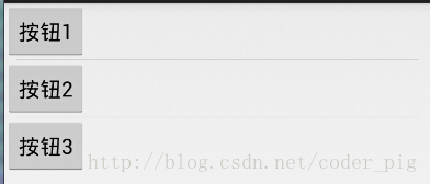
<LinearLayout xmlns:android="http://schemas.android.com/apk/res/android"
    xmlns:tools="http://schemas.android.com/tools"
    android:id="@+id/LinearLayout1"
    android:layout_width="match_parent"
    android:layout_height="match_parent"
    android:divider="@drawable/ktv_line_div"
    android:orientation="vertical"
    android:showDividers="middle"
    android:dividerPadding="10dp"
    tools:context="com.jay.example.linearlayoutdemo.MainActivity" >

    <Button
        android:layout_width="wrap_content"
        android:layout_height="wrap_content"
        android:text="Button 1" />

    <Button
        android:layout_width="wrap_content"
        android:layout_height="wrap_content"
        android:text="Button 2" />

    <Button
        android:layout_width="wrap_content"
        android:layout_height="wrap_content"
        android:text="Button 3" />

</LinearLayout>
matters needing attention:
Using Layout_gravity is a very important issue!!!
Question content: how to arrange two textviews in the horizontal direction of a LinearLayout to make one left and one right?
A: at present, there is no good implementation effect. If you want to implement it, you can use RelativeLayout. It is recommended to use RelativeLayout for layout
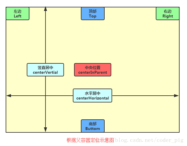
Relativelayout
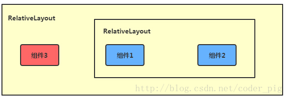
In RelativeLayout, you can set the display position of the component by referring to the parent container or brother component + margin +padding, which is more convenient! Of course, it is not absolute. Specific problems are analyzed in detail!
Summary: try to use the weight attribute of RelativeLayout + LinearLayout together!
RelativeLayout property
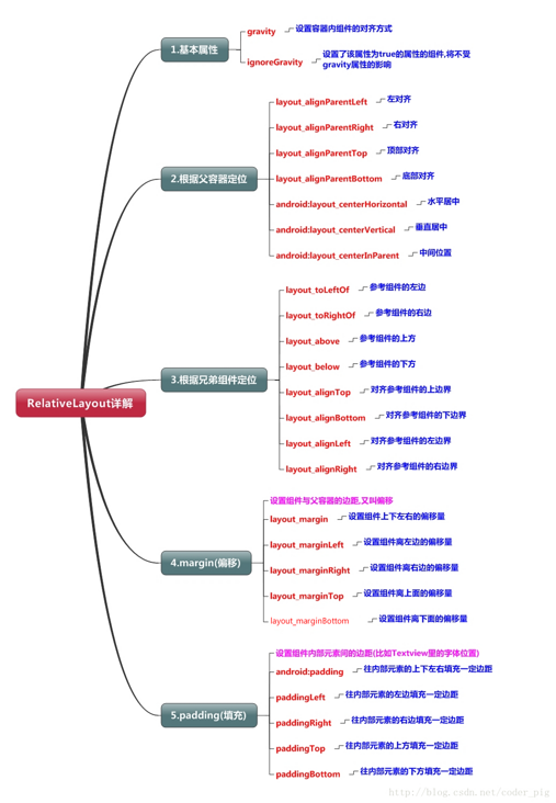
Parent container location attribute diagram
Brother component positioning intention
The difference between margin and padding
margin is for the components in the container, while padding is for the elements in the components
Demo renderings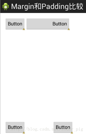
Example code:
<RelativeLayout xmlns:android="http://schemas.android.com/apk/res/android"
    xmlns:tools="http://schemas.android.com/tools"
    android:layout_width="match_parent"
    android:layout_height="match_parent"
    android:paddingBottom="@dimen/activity_vertical_margin"
    android:paddingLeft="@dimen/activity_horizontal_margin"
    android:paddingRight="@dimen/activity_horizontal_margin"
    android:paddingTop="@dimen/activity_vertical_margin"
    tools:context=".MainActivity" >

    <Button
        android:id="@+id/btn1"
        android:layout_height="wrap_content"
        android:layout_width="wrap_content"
        android:text="Button"/>
    <Button
        android:paddingLeft="100dp"
        android:layout_height="wrap_content"
        android:layout_width="wrap_content"
        android:text="Button"
        android:layout_toRightOf="@id/btn1"/>

    <Button
        android:id="@+id/btn2"
        android:layout_height="wrap_content"
        android:layout_width="wrap_content"
        android:text="Button"
        android:layout_alignParentBottom="true"/>
    <Button
        android:layout_marginLeft="100dp"
        android:layout_height="wrap_content"
        android:layout_width="wrap_content"
        android:text="Button"
        android:layout_toRightOf="@id/btn2"
        android:layout_alignParentBottom="true"/>

</RelativeLayout>
Tablelayout
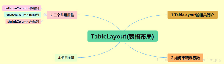
① If we add a component directly to TableLayout, the component will fill a row
② If we want to have multiple components on a row, we need to add a TableRow container and throw all the components into it
③ The number of components in the tablerow determines how many columns there are in the row, and the width of the column is determined by the widest cell in the column
④ Layout of tablerow_ Width attribute. The default is fill_ If we set the value of parent to other values, it will not take effect, but layout_height is wrapten - content by default, but we can set the size ourselves
⑤ The width of the entire table layout depends on the width of the parent container (occupying the parent container itself)
⑥ You have to count the number of rows by yourself. A tablerow is a row, and a separate component is also a row. The number of columns depends on the number of components in the tablerow. The largest number of components is the number of columns in the TableLayout
Three common attributes
Android: columnsecolumns: sets the ordinal number of the column to be hidden
android:shrinkColumns: sets the column ordinal of columns that are allowed to be shrunk
android:stretchColumns: set the column sequence number of the stretched column to run
The column numbers of the above three attributes are calculated from 0. For example, shrinkColunmns = "2", which corresponds to the third column!
Multiple columns can be set, separated by commas, such as "0,2". If all columns are effective, use the "*" sign
In addition to these three common attributes, there are also two attributes, namely, skip grid and merge cells, which are similar to tables in HTML:
android:layout_column="2": it means to skip the second one and display it directly to the third grid, starting from 1!
android:layout_span="4": it means merging 4 cells, that is, this component accounts for 4 cells
Summary:
TableLayout generally involves the use of five attributes. We don't use much in the actual development of table layout. Just know the simple usage!
FrameLayout
FrameLayout can be said to be the simplest of the six layouts. This layout directly opens up a blank area on the screen. When we add controls to it, they will be placed in the upper left corner of this area by default. However, this layout mode does not have any positioning mode, so its application scenarios are not many; By default, the control will be placed in the upper left corner, or through layout_gravity attribute, specify to another location
Common properties
FrameLayout rarely has two attributes, but before we talk about it, let's introduce one thing:
Foreground image: always at the top of the frame layout, the image directly facing the user is the image that will not be covered.
Two properties:
android:foreground: * set the foreground image of the framing layout container
android:foregroundGravity: set the display position of foreground image
GridLayout
This layout is a new layout introduced after Android 4.0. It is a little similar to the tablelayout learned earlier, but it has many things that the former does not have and is easier to use,
- Support to customize the arrangement of components in the layout
- How many rows and columns are supported for custom grid layout
- Direct setting of components in a row or column is supported
- Support setting components across several rows or columns
Related properties
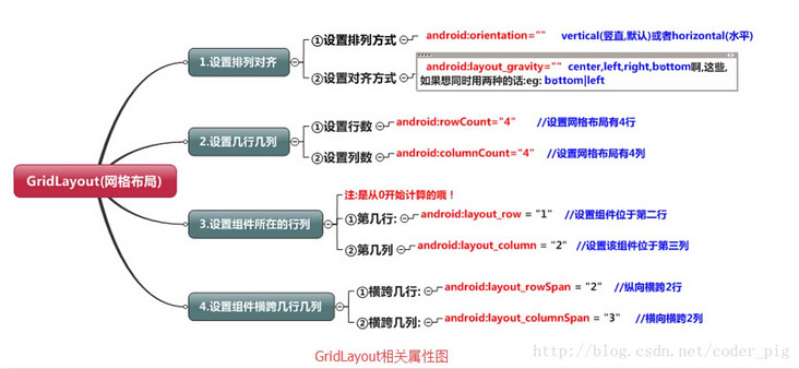
Attentive
We passed: android:layout_rowSpan and android:layout_columnSpan sets the component to span multiple rows or columns. If you want the component to fill the crossed rows or columns, you need to add the following attribute: android:layout_gravity = "fill"
Usage Summary:
① GridLayout uses thin dashed lines to divide the layout into rows, columns and cells. At the same time, it also supports staggered arrangement on rows and columns. ② use process:
step 1: first define the alignment method of components, android:orientation horizontal or vertical, and set how many rows and columns
step 2: set the row or column where the component is located. Remember that it starts from 0. It is not set. By default, each component occupies one row and one column
step 3: set the component to span several rows or columns; After setting, you need to set a fill: android:layout_gravity = "fill"
Absolute layout
As shown in the chapter title, absolute positioning
1. Four control attributes (all in dp):
① Control size: android:layout_width: component width android:layout_height: component height ② control position: android:layout_x: Set the X coordinate of the component android:layout_y: Set the Y coordinate of the component
Blogger GitHub address
Official account is not lost.