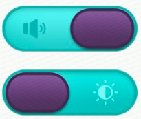
After several days of tossing and turning, this App has basically been completed. Part of it is a custom SwitchBar. I have seen many other people's solutions online. They are all based on the system's own SwitchBar. They just modify some background image resources or something. The effect is not very ideal. The following is my solution. First paste it. Design sketch:
First is the switchbar.xml file in layout:
<?xml version="1.0" encoding="utf-8"?>
<LinearLayout xmlns:android="http://schemas.android.com/apk/res/android"
    xmlns:app="http://schemas.android.com/apk/res-auto"
    android:orientation="vertical"
    android:layout_width="match_parent"
    android:layout_height="match_parent">

    <FrameLayout
        android:id="@+id/speakerframe"
        android:layout_width="296px"
        android:layout_height="100px"
        android:layout_gravity="center"
        android:background="@mipmap/btn_frame"
        android:onClick="onClick"
        android:layout_marginTop="30dp"
        android:layout_weight="1">
        <android.support.v7.widget.AppCompatImageView
            android:id="@+id/bspeaker"
            android:layout_width="416px"
            android:layout_height="match_parent"
            android:layout_marginEnd="20dp"
            android:layout_gravity="center"
            app:srcCompat="@mipmap/btn_slider_n"
            android:background="@mipmap/btn_state_bspeaker_n" />
    </FrameLayout>

    <FrameLayout
        android:id="@+id/lightframe"
        android:layout_width="296px"
        android:layout_height="100px"
        android:layout_gravity="center"
        android:background="@mipmap/btn_frame"
        android:onClick="onClick"
        android:layout_marginTop="30dp"
        android:layout_weight="1">
        <android.support.v7.widget.AppCompatImageView
            android:id="@+id/light"
            android:layout_width="416px"
            android:layout_height="match_parent"
            android:layout_marginEnd="20dp"
            android:layout_gravity="center"
            app:srcCompat="@mipmap/btn_slider_n"
            android:background="@mipmap/btn_state_light_n" />
    </FrameLayout>

    <android.support.v7.widget.AppCompatImageView
        android:id="@+id/speed"
        android:layout_width="wrap_content"
        android:layout_height="wrap_content"
        android:layout_gravity="center"
        app:srcCompat="@mipmap/btn_speed_bg"
        android:layout_weight="10"/>

</LinearLayout>In short, and
and Composition, when the click event occurs, change the location of bspeaker. (Ignore the size of my screenshot...)
So all that's left is the way the click happens:
@Override
    public void onClick(View v) {

        switch (v.getId()) {
            case R.id.speakerframe:
                onspeak();
                break;

            case R.id.lightframe:
                onLight();
                break;

            default:
                break;
        }
    }

    int set = 1;

    private void onLight() {
        Toast.makeText(this, "Click on the light", Toast.LENGTH_SHORT).show();
        ImageView lightBar = (ImageView) findViewById(light);
        FrameLayout.LayoutParams params = (FrameLayout.LayoutParams) lightBar.getLayoutParams();
        if (set == 1) {
            params.setMarginStart(120);
            //Other related operations...
            set = 0;
        } else {
            params.setMarginStart(0);
            set = 1;
        }
        lightBar.setLayoutParams(params);

    }

    private void onspeak() {
        Toast.makeText(this, "Click on the sound", Toast.LENGTH_SHORT).show();
        ImageView speakBar = (ImageView) findViewById(bspeaker);
        FrameLayout.LayoutParams params = (FrameLayout.LayoutParams) speakBar.getLayoutParams();
        if (set == 1) {
            params.setMarginStart(120);
            //Other related operations...
            set = 0;
        } else {
            params.setMarginStart(0);
            set = 1;
        }
        speakBar.setLayoutParams(params);
    }
At this point, the SwitchBar is fully customized. If there is old fellow iron, you need to use it. However, resources are just sounds and lights. If you want to use other functions, you can drop it by yourself. P can be used as an example. In addition, there is a big problem in this solution, that is, the mobile size of bSpeaker is suitable for the mobile phone I tested. If a mobile phone with different sizes or different pixels is changed, there will be deviation. Because it is just for fun rather than for regular use, it will have to go by for a while, if who is it? God has good compatibility, please don't hesitate to teach!