- home page
- special column
- android
- Article details
Android introductory tutorial | linear layout of UI layout
 Android_ An Zi Published 3 minutes ago
How many layouts does Android have?
- LinearLayout
- RelativeLayout
- FrameLayout
- TableLayout
- GridLayout
- Absolute layout
LinearLayout
LinearLayout, also known as linear layout, is a very common layout.
Multiple views can be placed in the LinearLayout (called sub views and sub items here). The sub view can be TextView, Button, linear layout, RelativeLayout, etc. They will be arranged in a column or row in order. Next, we introduce some settings in xml.
First put a LinearLayout in the xml.
<LinearLayout
    android:layout_width="match_parent"
    android:layout_height="wrap_content"
    android:orientation="vertical">
</LinearLayout>
Some properties are described below.
Vertical and horizontal layout
Determine the horizontal or vertical layout of sub view s by setting orientation. The optional values are vertical and horizontal.
Vertical arrangement
Set orientation to vertical.
android:orientation="vertical"
Horizontal arrangement
Set orientation to horizontal.
android:orientation="horizontal"
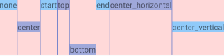
Layout gravity
Determines the layout of child views. Gravity means "gravity". We extend it to the direction in which the sub view will approach. Gravity has several options to choose from. We often use start, end, left, right, top and bottom.
For example:
<LinearLayout
    android:layout_width="match_parent"
    android:layout_height="wrap_content"
    android:gravity="start"
    android:orientation="vertical">

</LinearLayout>
Here are the options for gravity. We will call LinearLayout "parent view" or "container".
| constant | Define value | describe |
|---|---|---|
| top | 30 | Push the view to the top of the container. Does not change the size of the view. |
| bottom | 50 | Push the view to the bottom of the container. Does not change the size of the view. |
| center | 11 | The subview is centered horizontally and vertically. Does not change the size of the view. |
| center_horizontal | 1 | The subview is centered horizontally. Does not change the size of the view. |
| center_vertical | 10 | The child view is vertically centered. Does not change the size of the view. |
| start | 800003 | Push the view to the beginning of the container. Does not change the size of the view. |
| end | 800005 | Put the subview at the end of the container. Do not change the size of the view. |
| left | 3 | The child views are arranged from the left side of the container. Does not change the size of the view. |
| right | 5 | The child views are arranged from the right side of the container. Does not change the size of the view. |
Start and left, end and right do not necessarily have the same effect. For RTL (right to left) mobile phones, such as some Arabic systems. Start is from right to left. We seldom see RTL in our daily life, generally LTR. However, it is recommended to use start instead of left.
Gravity can set multiple values at the same time, connected by or symbol |. For example, android:gravity="end|center_vertical".
<LinearLayout
    android:layout_width="match_parent"
    android:layout_height="60dp"
    android:gravity="end|center_vertical"
    android:orientation="vertical">

</LinearLayout>
Layout of sub view_ gravity
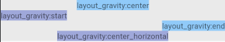
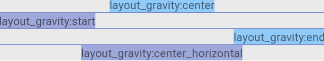
layout_gravity looks a little similar to gravity.
- android:gravity Controls the child elements within itself.
- android:layout_gravity Is to tell the parent element its location.
The value range is the same as gravity. The meaning of representative is also similar.
<LinearLayout
        android:layout_width="match_parent"
        android:layout_height="100dp"
        android:orientation="horizontal">

        <TextView
            android:layout_width="wrap_content"
            android:layout_height="wrap_content"
            android:background="#90CAF9"
            android:text="none" />

        <TextView
            android:layout_width="wrap_content"
            android:layout_height="wrap_content"
            android:layout_gravity="center"
            android:background="#9FA8DA"
            android:text="center" />

    </LinearLayout>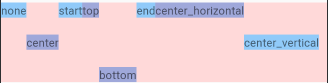
Split proportion layout_weight
You can set the layout of sub view s in the_ Weight to determine the space share. Set layout_ Layout is usually set for weight_ width="0dp".
<LinearLayout
        android:layout_width="match_parent"
        android:layout_height="wrap_content"
        android:layout_marginTop="10dp"
        android:background="#FFCC80"
        android:orientation="horizontal">

        <TextView
            android:layout_width="0dp"
            android:layout_height="wrap_content"
            android:layout_weight="1"
            android:background="#eaeaea"
            android:gravity="center"
            android:text="1" />

        <TextView
            android:layout_width="0dp"
            android:layout_height="wrap_content"
            android:layout_weight="2"
            android:text="2" />

        <TextView
            android:layout_width="0dp"
            android:layout_height="wrap_content"
            android:layout_weight="1"
            android:background="#eaeaea"
            android:text="1" />

        <TextView
            android:layout_width="0dp"
            android:layout_height="wrap_content"
            android:layout_weight="3"
            android:background="#BEC0D1"
            android:text="3" />

    </LinearLayout>
Sum of split percentages weightSum
android:weightSum Defines the maximum value of the sum of the weight of the child views. If not specified directly, it will be the layout of all child views_ The sum of weight. If you want to give a single sub view half the space, you can set the layout of the sub view_ The weight is 0.5 and the weightsum of the LinearLayout is set to 1.0.
The value can be a floating point number, such as 9.3.
<LinearLayout
        android:layout_width="match_parent"
        android:layout_height="wrap_content"
        android:layout_marginTop="10dp"
        android:background="#4DB6AC"
        android:weightSum="9.3"
        android:orientation="horizontal">

        <TextView
            android:layout_width="0dp"
            android:layout_height="wrap_content"
            android:layout_weight="4.6"
            android:background="#eaeaea"
            android:gravity="center"
            android:text="4.6" />

        <TextView
            android:layout_width="0dp"
            android:layout_height="wrap_content"
            android:background="#7986CB"
            android:layout_weight="2.5"
            android:text="2.5" />

    </LinearLayout>
divider
Set the divider and showDividers properties.
<pre id="__code_8" style="box-sizing: inherit; color: var(--md-code-fg-color); font-feature-settings: "kern"; font-family: "Roboto Mono", SFMono-Regular, Consolas, Menlo, monospace; direction: ltr; position: relative; margin: 1em 0px; line-height: 1.4;"> `android:divider="@drawable/divider_linear_1"
android:showDividers="middle"Setting the color directly to the divider is invalid.
Create a new XML called divider in the drawable directory_ linear_ 1.xml.
<?xml version="1.0" encoding="utf-8"?>
<shape xmlns:android="http://schemas.android.com/apk/res/android">
    <solid android:color="#7986CB" />
    <size
        android:width="1dp"
        android:height="1dp" />
</shape>
size must be specified, otherwise it will not be displayed when used as a divider.
LinearLayout sets the divider.
<LinearLayout
        android:layout_width="match_parent"
        android:layout_height="wrap_content"
        android:background="#eaeaea"
        android:divider="@drawable/divider_linear_1"
        android:orientation="vertical"
        android:showDividers="middle">
        ....
<LinearLayout
        android:layout_width="match_parent"
        android:layout_height="100dp"
        android:layout_marginTop="20dp"
        android:background="#FFD9D9"
        android:divider="@drawable/divider_linear_1"
        android:orientation="horizontal"
        android:showDividers="middle">
        ...
showDividers has several options:
- Split line in the middle
- Dividing line from beginning
- end split line
- none has no split lines
LinearLayout introduction to linear layout video reference
 android