At this year's Google/IO conference, a new Android native UI development framework Jetpack Compose was unveiled. Like Apple's SwiftIUI, Jetpack Compose is a declarative UI framework. This year, Android and Apple launched their own UI development frameworks Jetpack Compose and SwiftIUI, It marks that the mobile operating system officially and comprehensively embraces the declarative UI development mode.
1, Past and present life of declarative UI
In fact, declarative UI is not a new technology. As early as 2006, Microsoft has released its new generation interface development framework WPF, which adopts XAML markup language and supports two-way data binding, reusable templates and other features.
In 2010, the Qt team led by Nokia also officially released its next-generation interface solution Qt Quick, which is also declarative. Even the initial name of Qt Quick was Qt Declarative. QML language also supports data binding, modularization and other features. In addition, it also supports built-in JavaScript. Developers can develop simple prototype applications with interaction only with QML.
Declarative UI framework has developed rapidly in recent years, and has been brought to a climax by Web development. React has laid a solid foundation for declarative UI and has been leading its future development. Subsequently, the release of Flutter also successfully brought the idea of declarative UI to the field of mobile terminal development
The meaning of declarative UI is to describe what kind of UI interface you want. When the state changes, the interface can be "rendered" again according to the previous description to obtain the interface with absolutely correct state, instead of telling the program what to do step by step and maintaining various states like a command. Far from it, this is not the focus of today's article. Just understand it a little. The others are not extended in this article. For more information about declarative, I suggest you take a look at this article: zhuanlan.zhihu.com/p/68275232
Let's return to the focus of this article Jetpack Compose.
2, Introduction to Jetpack Compose
Jetpack Compose is a modern toolkit for building a native Android UI. It is based on a declarative programming model, so you can simply describe the appearance of the UI, while Compose is responsible for the rest - when the state changes, your UI will be updated automatically. Because Compose is built on Kotlin, it is fully interoperable with the Java programming language and has direct access to all Android and jetpack APIs. It is also fully compatible with the existing UI toolkit, so you can mix the original View and the new View, and design with Material and animation from the beginning.
3, Jetpack Compose environment preparation and Hello World
Whenever we learn a new language, we start with a hello world. Today we also start Jetpack Compose from a hello world! To get the best experience of jetpack composition, we need to download the latest version of Android studio preview version (i.e. Android Studio 4.0). Because Android Studio 4.0 adds support for jetpack composition, such as new composition template and timely preview of composition.

There are two ways to start your development work with Jetpack Compose:
- Add Jetpack Compose to an existing project
- Create a new application that supports Jetpack Compose
Next, we will introduce these two methods respectively.
1. Add Jetpack Compose to an existing project
If you want to use Jetpack Compose in an existing project, you need to configure some necessary settings and dependencies:
(1) gradle configuration
Build. In the app directory Set the minimum API version supported by the app to 21 or higher in gradle, and turn on the Jetpack Compose enable switch. The code is as follows:
android {
    defaultConfig {
        ...
        minSdkVersion 21
    }

    buildFeatures {
        // Enables Jetpack Compose for this module
        compose true
    }
    ...

    // Set both the Java and Kotlin compilers to target Java 8.

    compileOptions {
        sourceCompatibility JavaVersion.VERSION_1_8
        targetCompatibility JavaVersion.VERSION_1_8
    }

    kotlinOptions {
        jvmTarget = "1.8"
    }
}
(2) Use the pilot kotlin gradle plug-in
Jetpack Compose requires a pilot version of the kotlin gradle plug-in, which is built in the root directory Add the following code to gradle:
buildscript {
    repositories {
        google()
        jcenter()
        // To download the required version of the Kotlin-Gradle plugin,
        // add the following repository.
        maven { url 'https://dl.bintray.com/kotlin/kotlin-eap' }
    ...
    dependencies {
        classpath 'com.android.tools.build:gradle:4.0.0-alpha01'
        classpath 'org.jetbrains.kotlin:kotlin-gradle-plugin:1.3.60-eap-25'
    }
}

allprojects {
    repositories {
        google()
        jcenter()
        maven { url 'https://dl.bintray.com/kotlin/kotlin-eap' }
    }
}
(3) Add Jetpack Compose toolkit dependency
Build. In the app directory Gradle adds the Jetpack Compose toolkit dependency. The code is as follows:
dependencies {
    // You also need to include the following Compose toolkit dependencies.
    implementation 'androidx.ui:ui-tooling:0.1.0-dev02'
    implementation 'androidx.ui:ui-layout:0.1.0-dev02'
    implementation 'androidx.ui:ui-material:0.1.0-dev02'
    ...
}
ok, the preparation work will be completed here and you can start writing code. But as mentioned earlier, there is another way to access Jetpack Compose. Let's take a look.
2. Create a new application that supports Jetpack Compose
Compared with accessing Jetpack Compose in existing applications, it is much easier to create a new project supporting Jetpack Compose, because Android Studio 4.0 provides a new composition template. As long as you select this template to create an application, all the above configuration items will be completed automatically for us.
Create an application that supports Jetpack Compose, as follows:
-
- In the welcome window of Android Studio, click Start a new Android Studio project. If you have already opened the Android Studio project, select File > New > new project in the top menu bar
-
- In the Select a Project Template window, select Empty Compose Activity and click next
-
- In the Configure your project window, do the following steps:
- a. Set the project name, package name and save location
- b. Note that in the language menu, Kotlin is the only option, because Jetpack Compose can run only when written in Kotlin.
- c. From the minimum API level drop-down menu, select 21 or higher
-
- Click Finish
Now you can use Jetpack Compose to write your application.
3. Hello wold
In mainactivity KT add the following code:
class MainActivity : AppCompatActivity() {
    override fun onCreate(savedInstanceState: Bundle?) {
        super.onCreate(savedInstanceState)
        setContent {
             Text("Hello, Android Technical grocery store")
        }
    }
}
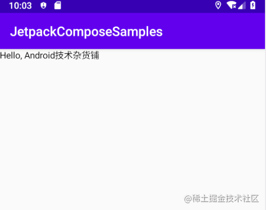
Jetpack Compose is built around the composable function. These functions enable you to define the UI of the application programmatically by describing the shape and data dependencies of the application, rather than focusing on the UI construction process. To create a composable function, you only need to add a @ composable annotation in front of the function name. The Text above is a composable function.
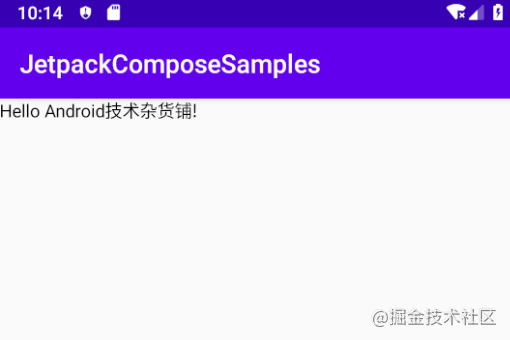
4. Define a composable function
A composable function can only be called in the scope of another composable function. To change a function into a composable function, just add the @ composable annotation before the function name. We move the part of setContent in the above code outside, extract it into a composable function, and then pass a parameter name to the text element.
class MainActivity : AppCompatActivity() {
    override fun onCreate(savedInstanceState: Bundle?) {
        super.onCreate(savedInstanceState)
        setContent {
            Greeting("Android Technical grocery store")
        }
    }
}

@Composable
fun Greeting(name: String) {
    Text(text = "Hello $name!")
}
4, Layout
UI elements are hierarchical, and elements are contained in other elements. In Jetpack Compose, you can build the UI hierarchy by adjusting the composable function from other composable functions.
In the xml layout of Android, if you want to display a layout with a vertical structure, the longest is LinearLayout. Set the android:orientation value to vertical, and the child elements will be arranged vertically. Then, in Jetpack Compose, how to realize the vertical layout? Let's add some Text first.
1. Add multiple Text
In the above example, we added a Text display Text. Now we add three texts, and the code is as follows:
class MainActivity : AppCompatActivity() {
override fun onCreate(savedInstanceState: Bundle?) {
super.onCreate(savedInstanceState)
setContent {
NewsStory()
}
}
}
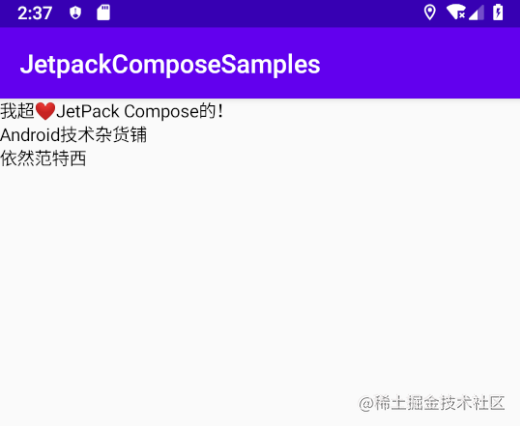
@Composable
fun NewsStory() {
Text("I super❤️JetPack Compose of")
Text("Android Technical grocery store")
Text("Still van tesey")
}
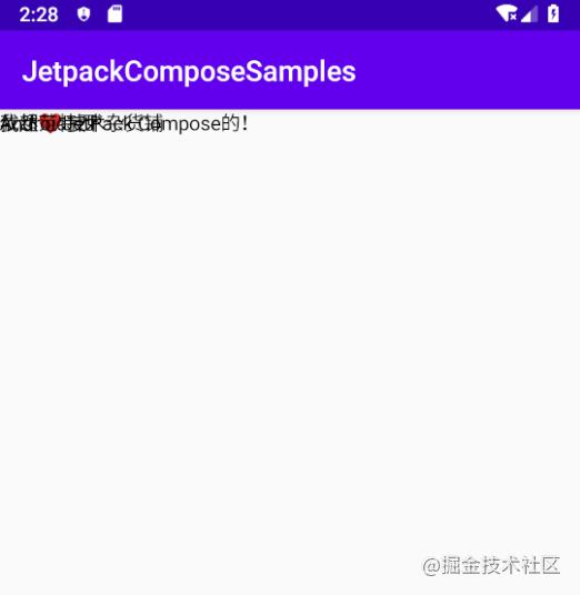
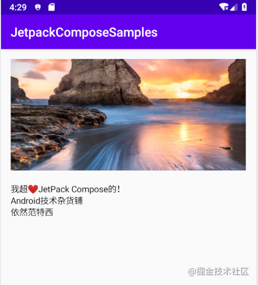
As can be seen from the above figure, we have added three text elements. However, since we have not provided any information on how to arrange them, the three text elements are drawn overlapping each other, making the text unreadable.
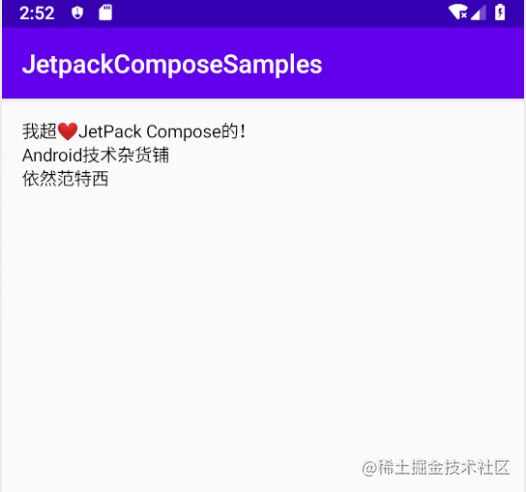
2. Use Column
To make the overlapped Text arranged vertically, we need to use the Column function. Do the students who have written fluent look familiar? Yes, the name and function of the Column Widget in the shuttle are exactly the same, and even their properties are the same.
@Composable
fun NewsStory() {
    Column { //  Add Column to arrange the layout vertically
        Text("I super❤️JetPack Compose of")
        Text("Android Technical grocery store")
        Text("Still van tesey")
    }
}
The effects are as follows:
You can see that the layout overlapped in front is now arranged vertically, but by default, it is arranged one by one from the upper left corner without any spacing. Next, let's set some styles for the Column.
3. Add style to Column
When calling Column (), you can pass parameters to Column () to configure the size and position of Column and set the arrangement of child elements.
@Composable
fun NewsStory() {
    Column (
        crossAxisSize = LayoutSize.Expand,
        modifier = Spacing(16.dp)
    ){ //  Add Column to arrange the layout vertically
        Text("I super❤️JetPack Compose of")
        Text("Android Technical grocery store")
        Text("Still van tesey")
    }
}
As shown in the figure above, padding is filled in, and other effects are almost the same. The setting attributes in the above code are explained as follows:
-
crossAxisSize: Specifies the Column component (Note: in Compose, all components are composable functions, and the components in the text refer to composable functions) for the size in the horizontal direction, set crossAxisSize to LayoutSize.Expand, which means that the Column width should be the maximum width allowed by its parent component, which is equivalent to match_parant in the traditional layout, and another value is LayoutSize.Wrap. You can see from the name that it is in the package Capacity, which is equivalent to wrap in traditional layout_ content.
-
Modifier: enables you to make other format changes. In this case, we will apply a Spacing modifier that will space the Cloumn from the surrounding view.
4. How to display a picture?
In the original Android native layout, the display picture has the corresponding control ImageView. You can display it by setting the local picture address or Bitmap. How to display the picture in Jetpack Compose?

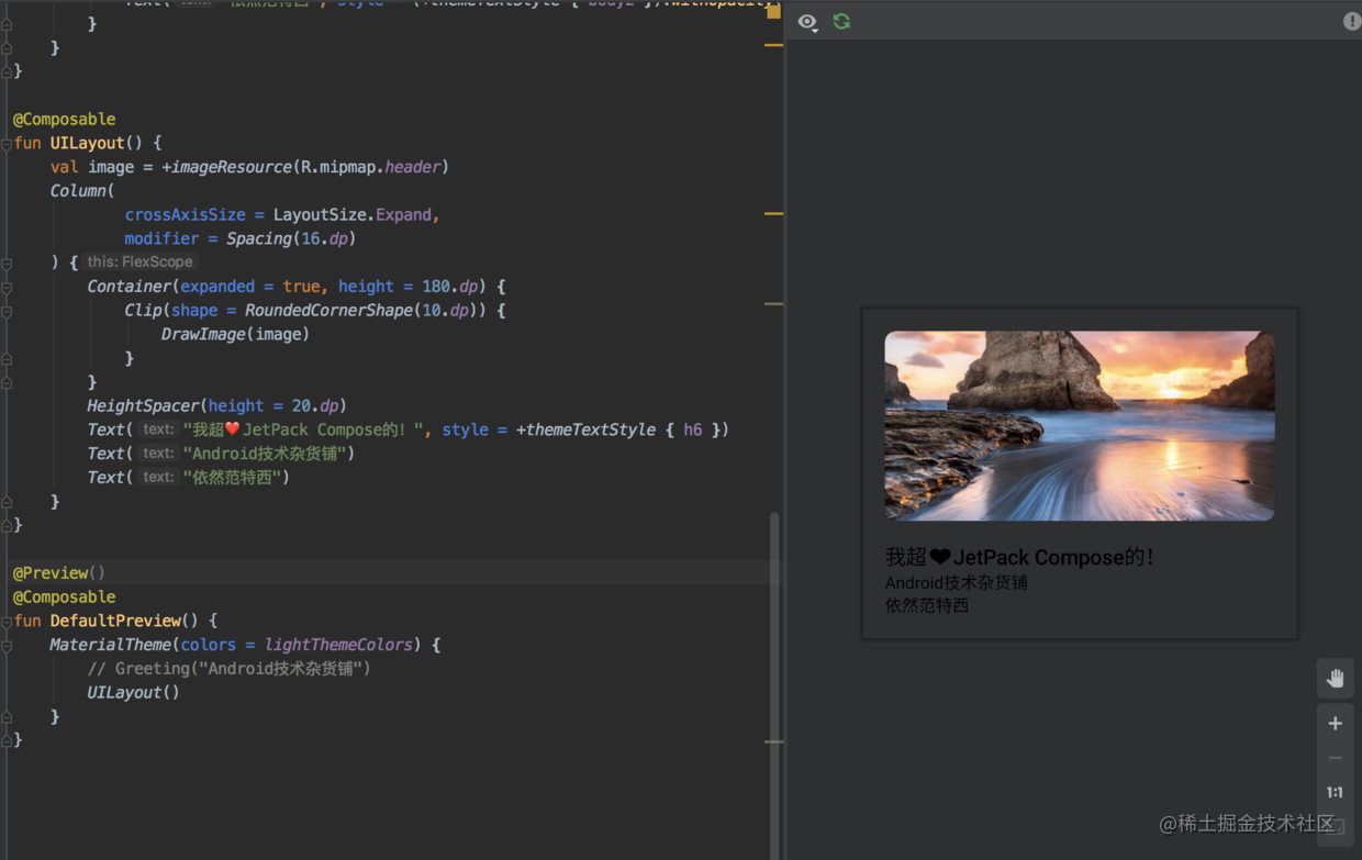
Let's download this picture locally and add it to the explorer, named header Png, let's change the NewsStory() method above, first get the image from the resource folder, and then draw the image through DrawImage():
@Composable
fun NewsStory() {
    // Get picture
    val image = +imageResource(R.mipmap.header)
    Column (
        crossAxisSize = LayoutSize.Expand,
        modifier = Spacing(16.dp)
    ){ //  Add Column to arrange the layout vertically
        // display picture
        DrawImage(image)

        Text("I super❤️JetPack Compose of")
        Text("Android Technical grocery store")
        Text("Still van tesey")
    }
}
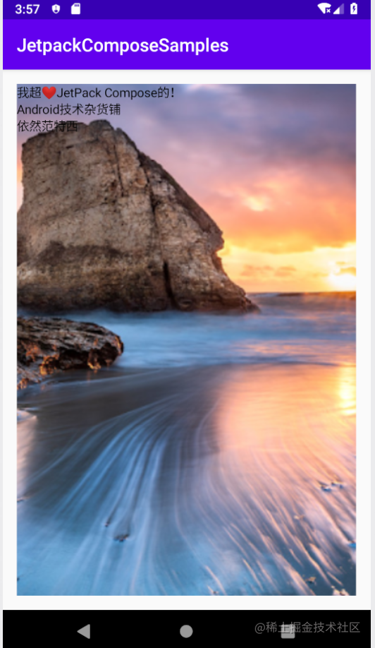
As you can see, the picture will not be displayed in the correct ratio. Next, let's fix it.
The picture has been added to the layout, but it expands to fill the entire view and is arranged in collage with the text, which is displayed on the upper layer. To style the graphic, put it in the container (another control like that in the shuttle)
- Container: a generic content object that holds and schedules other UI elements. You can then apply the size and location settings to the container.
@Composable
fun NewsStory() {
    // Get picture
    val image = +imageResource(R.mipmap.header)
    Column (
        crossAxisSize = LayoutSize.Expand,
        modifier = Spacing(16.dp)
    ){ //  Add Column to arrange the layout vertically
        // Put it in a container and set the size
        Container(expanded = true, height = 180.dp) {
            // display picture
            DrawImage(image)
        }
        Text("I super❤️JetPack Compose of")
        Text("Android Technical grocery store")
        Text("Still van tesey")
    }
}
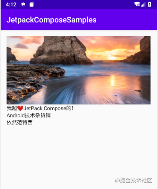
-
expanded: Specifies the size of the Container. The default is false (the size of the Container is the size of the child component, equivalent to wrap_content). If it is set to true, it specifies that the size of the Container is the maximum size allowed by the parent control, equivalent to match_parent.
-
Height: set the height of the Container. The priority of the height property is higher than expanded, so expanded will be overwritten. As in the above example, set the height to 180dp, that is, the width of the Container is the width of the parent control, and the height is 180dp
5. Add spacing Spacer
We can see that there is no space between the picture and the text. In the traditional layout, we can add the Margin attribute to set the space. In jetpack composition, we can use highspace() and widespace() to set the vertical and horizontal space
 HeightSpacer(height = 20.dp) //Set vertical spacing 20dp
 WidthSpacer(width = 20.dp) // Set horizontal spacing 20dp
In the above example, let's add a 20dp gap between the picture and the text:
@Composable
fun NewsStory() {
    // Get picture
    val image = +imageResource(R.mipmap.header)
    Column (
        crossAxisSize = LayoutSize.Expand,
        modifier = Spacing(16.dp)
    ){ //  Add Column to arrange the layout vertically
        // Put it in a container and set the size
        Container(expanded = true, height = 180.dp) {
            // display picture
            DrawImage(image)
        }

        HeightSpacer(height = 20.dp) // Add vertical spacing 20dp

        Text("I super❤️JetPack Compose of")
        Text("Android Technical grocery store")
        Text("Still van tesey")
    }
}
5, Design with Material design
Compose aims to support the design principles of Material Design. Many components implement Material Design and can be used out of the box. In this section, some Material components will be used to set the style of the app
1. Add Shape style
Shape is one of the pillars in the Material Design system. Let's use the clip function to round cut the picture.
@Composable
fun NewsStory() {
    // Get picture
    val image = +imageResource(R.mipmap.header)
    Column (
        crossAxisSize = LayoutSize.Expand,
        modifier = Spacing(16.dp)
    ){ //  Add Column to arrange the layout vertically
        // Put it in a container and set the size
        Container(expanded = true, height = 180.dp) {
            Clip(shape = RoundedCornerShape(10.dp)) {
                // display picture
                DrawImage(image)
            }

        }

        HeightSpacer(height = 20.dp) // Add vertical spacing 20dp

        Text("I super❤️JetPack Compose of")
        Text("Android Technical grocery store")
        Text("Still van tesey")
    }
}
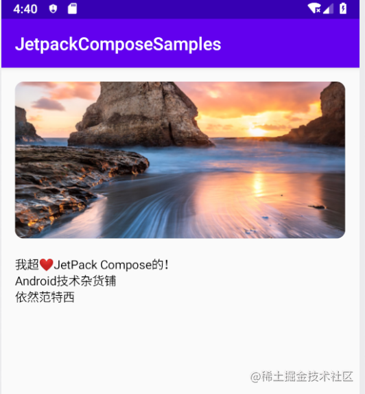
The shape is invisible, but our picture has been cropped to the set shape style, so as shown in the figure above, the picture has rounded corners.
2. Add some styles to Text
With Compose, you can easily take advantage of Material Design principles. Apply MaterialTheme() to the created component
@Composable
fun NewsStory() {
    // Get picture
    val image = +imageResource(R.mipmap.header)
    // Design with Material Design
    MaterialTheme() {
        Column (
            crossAxisSize = LayoutSize.Expand,
            modifier = Spacing(16.dp)
        ){ //  Add Column to arrange the layout vertically
            // Put it in a container and set the size
            Container(expanded = true, height = 180.dp) {
                Clip(shape = RoundedCornerShape(10.dp)) {
                    // display picture
                    DrawImage(image)
                }

            }

            HeightSpacer(height = 20.dp) // Add vertical spacing 20dp

            Text("I super❤️JetPack Compose of")
            Text("Android Technical grocery store")
            Text("Still van tesey")
        }
    }
}
As in the above code, after adding MaterialTheme, run it again without any change. The text now uses the default text style of MaterialTheme. Next, we apply a specific paragraph style to each text element.
@Composable
fun NewsStory() {
    // Get picture
    val image = +imageResource(R.mipmap.header)
    // Design with Material Design
    MaterialTheme() {
        Column (
            crossAxisSize = LayoutSize.Expand,
            modifier = Spacing(16.dp)
        ){ //  Add Column to arrange the layout vertically
            // Put it in a container and set the size
            Container(expanded = true, height = 180.dp) {
                Clip(shape = RoundedCornerShape(10.dp)) {
                    // display picture
                    DrawImage(image)
                }

            }

            HeightSpacer(height = 20.dp) // Add vertical spacing 20dp

            Text("I super❤️JetPack Compose of", style = +themeTextStyle { h5 }) // Note the addition of style
            Text("Android Technical grocery store", style = +themeTextStyle { body1 }) // Note the addition of style
            Text("Still van tesey", style = +themeTextStyle { body2 }) // Note the addition of style
        }
    }
}

Now look, our text style has changed. There are 6 styles h1-h6 in the title. In fact, the styles in HTML are very similar. The content text has the styles in body1 and body22.
The Material palette uses some basic colors. If you want to emphasize the text, you can adjust the opacity of the text:
  Text("I super❤️JetPack Compose of", style = (+themeTextStyle { h5 }).withOpacity(0.87f))
  Text("Android Technical grocery store", style = (+themeTextStyle { body1 }).withOpacity(0.87f))
  Text("Still van tesey", style = (+themeTextStyle { body2 }).withOpacity(0.6f))

Sometimes, the title is very long, but we don't want to wrap the long title, which will affect our app UI. Therefore, we can set the maximum number of lines of text to be displayed, and the excess part will be truncated.

As shown in this example, we set the maximum number of rows to be displayed to 2, and partial truncation processing for more than:
  Text("I super❤️JetPack Compose of It is simple to write and highly reusable. Many components can be extracted for reuse without managing complex state changes!",
                maxLines = 2, overflow = TextOverflow.Ellipsis,
                style = (+themeTextStyle { h5 }).withOpacity(0.87f))

You can see that after maxLines and overflow are set, the excess part will be truncated and will not affect the whole layout style.
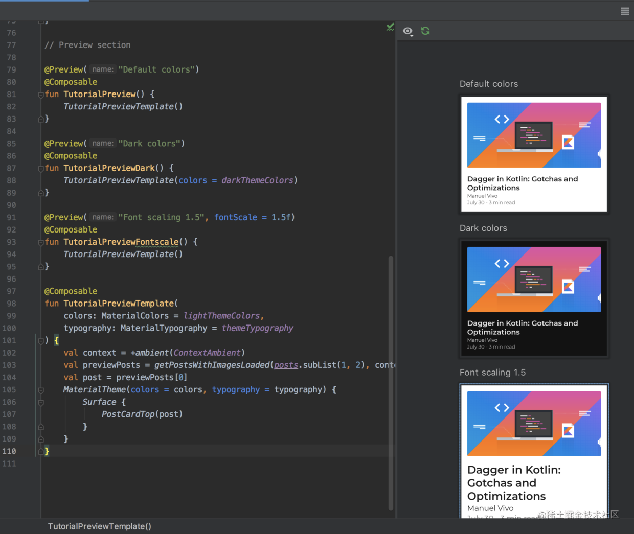
6, Composite layout live preview
Starting from Android Studio 4.0, it provides the function of previewing the composable function in the IDE. As before, you don't have to download a simulator first, then put the app status on the simulator and run the app to see the effect.
However, one limitation is that the composable function cannot have parameters
The following two conditions are met:
- Function has no arguments
- Add the @ Preview annotation before the function
The preview effect is as follows:
When the layout is changed, a navigation bar will appear at the top to show that the preview has expired. Click build & refresh to refresh the preview

This is really a great function. Like other declarative layouts, such as React and fluent, it does not have this function. After the layout, you need to run it again to see the effect. Although it can be hot started, it is still not as direct as this preview.
Another great thing is that the composite preview can preview multiple composable functions at the same time.
The effects are as follows:
7, Summary
Jetpack Compse is still a trial version, so there must be many problems. It can not be used in commercial projects now, but this does not prevent us from learning and experiencing it. The declarative UI framework has developed rapidly in recent years, and React has laid a solid foundation for declarative UI. The release of fluent has successfully brought the idea of declarative UI to the field of mobile terminal development. Apple and Google have successively released their own declarative UI frameworks SwiftUI and Jetpack Compose. In the future, the native UI layout and declarative UI may be the mainstream.
The above is all the content of this article. I hope it is useful to you!
This article is transferred from https://juejin.cn/post/6844903999347359751 , in case of infringement, please contact to delete.