In the development process, our buttons basically have their own style. Sometimes we need to make a rounded corner, sometimes we need a border, sometimes we need a dashed border or we need a circular button. Think that most of the implementation is to write a shape file, define the border rounded corners and other related attributes inside. If there are many different styles of buttons in the project, then we need to write a lot of shape files, which we can not bear. The emergence of SuperButton can help you solve the above problems, away from shape file writing.
There are pictures and facts.
github source address Portal
Opening chapter
Before we start, let's look at how shape files are written.
<?xml version="1.0" encoding="utf-8"?>
<shape
    xmlns:android="http://schemas.android.com/apk/res/android"
    android:shape=["rectangle" | "oval" | "line" | "ring"] >
    <corners
        android:radius="integer"
        android:topLeftRadius="integer"
        android:topRightRadius="integer"
        android:bottomLeftRadius="integer"
        android:bottomRightRadius="integer" />
    <gradient
        android:angle="integer"
        android:centerX="integer"
        android:centerY="integer"
        android:centerColor="integer"
        android:endColor="color"
        android:gradientRadius="integer"
        android:startColor="color"
        android:type=["linear" | "radial" | "sweep"]
        android:useLevel=["true" | "false"] />
    <size
        android:width="integer"
        android:height="integer" />
    <solid
        android:color="color" />
    <stroke
        android:width="integer"
        android:color="color"
        android:dashWidth="integer"
        android:dashGap="integer" />
</shape>
The shape file above lists the commonly used attributes, of course, not all of them will be used. We will start this article with this shape file as a reference.
We know that after writing shape file, it is introduced by the way of android:background="@drawable/shape". Then whether Android has a way to get the class of shape-related attributes? After some searching, we find that there is still a GradientDrawable class that can be implemented. For the introduction of GradientDrawable, please go to Google.
From the source code of Gradient Drawable, you can see that there are many methods in it that are the same as the names of each shape node, so this is the class we need, and the rest is to start using Gradient Drawable to implement our encapsulation path.
Specific realization
Because the code is not complicated, you can read the comments and understand them, so you can paste the code directly.
First initialize gradientDrawable = new GradientDrawable();
   /**
     * Set the shape type to correspond to the four properties of the shape
     */
    private void setShape() {

        switch (shapeType) {
            case RECTANGLE:
                gradientDrawable.setShape(GradientDrawable.RECTANGLE);
                break;
            case OVAL:
                gradientDrawable.setShape(GradientDrawable.OVAL);
                break;
            case LINE:
                gradientDrawable.setShape(GradientDrawable.LINE);
                break;
            case RING:
                gradientDrawable.setShape(GradientDrawable.RING);
                break;
        }
    }
Four rounded corners can be set as a whole or each angle can be set separately by one of the following methods
    /**
     * Setting the radius of the fillet is effective only if the type is rectangular.
     */
    private void setRadius() {
        if (shapeType == GradientDrawable.RECTANGLE) {
            if (cornersRadius != 0) {
                gradientDrawable.setCornerRadius(dip2px(mContext, cornersRadius));//Set the radius of the corner
            } else {
                //1 and 2 are the upper left corner, 3 and 4 are the upper right corner, 5 and 6 are the lower right corner, 7 and 8 are the lower left corner.
                gradientDrawable.setCornerRadii(
                        new float[]
                                {
                                        cornersTopLeftRadius, cornersTopLeftRadius,
                                        cornersTopRightRadius, cornersTopRightRadius,
                                        cornersBottomRightRadius, cornersBottomRightRadius,
                                        cornersBottomLeftRadius, cornersBottomLeftRadius
                                }
                );
            }
        }
    }
Setting Gradient Related Properties
    /**
     * Set the background color
     * If an Orientation is set, it defaults to a gradient Button, otherwise it is a pure color Button.
     */
    private void setOrientation() {
        if (gradientOrientation != -1) {
            if (Build.VERSION.SDK_INT >= Build.VERSION_CODES.JELLY_BEAN) {
                gradientDrawable.setOrientation(getOrientation(gradientOrientation));

                if (gradientCenterColor == -1) {
                    gradientDrawable.setColors(new int[]{gradientStartColor, gradientEndColor});
                } else {
                    gradientDrawable.setColors(new int[]{gradientStartColor, gradientCenterColor, gradientEndColor});
                }

                switch (gradientType) {
                    case linear:
                        gradientDrawable.setGradientType(GradientDrawable.LINEAR_GRADIENT);
                        break;
                    case radial:
                        gradientDrawable.setGradientType(GradientDrawable.RADIAL_GRADIENT);
                        gradientDrawable.setGradientRadius(gradientGradientRadius);

                        break;
                    case sweep:
                        gradientDrawable.setGradientType(GradientDrawable.SWEEP_GRADIENT);
                        break;
                }


                gradientDrawable.setUseLevel(gradientUseLevel);

                if (gradientCenterX != 0 && gradientCenterY != 0) {
                    gradientDrawable.setGradientCenter(gradientCenterX, gradientCenterY);
                }

            }
        } else {
            gradientDrawable.setColor(solidColor);
        }
    }


    /**
     * Set the color gradient type
     *
     * @param gradientOrientation gradientOrientation
     * @return Orientation
     */
    private GradientDrawable.Orientation getOrientation(int gradientOrientation) {
        GradientDrawable.Orientation orientation = null;
        switch (gradientOrientation) {
            case TOP_BOTTOM:
                orientation = GradientDrawable.Orientation.TOP_BOTTOM;
                break;
            case TR_BL:
                orientation = GradientDrawable.Orientation.TR_BL;
                break;
            case RIGHT_LEFT:
                orientation = GradientDrawable.Orientation.RIGHT_LEFT;
                break;
            case BR_TL:
                orientation = GradientDrawable.Orientation.BR_TL;
                break;
            case BOTTOM_TOP:
                orientation = GradientDrawable.Orientation.BOTTOM_TOP;
                break;
            case BL_TR:
                orientation = GradientDrawable.Orientation.BL_TR;
                break;
            case LEFT_RIGHT:
                orientation = GradientDrawable.Orientation.LEFT_RIGHT;
                break;
            case TL_BR:
                orientation = GradientDrawable.Orientation.TL_BR;
                break;
        }
        return orientation;
    }
Size in the corresponding shape sets shape layout size and border and splitting line
/*
* Set the value of size
*/
    private void setSize() {
        if (shapeType == RECTANGLE) {
            gradientDrawable.setSize(sizeWidth, sizeHeight);
        }
    }

    /**
     * Set border width, color dotted line gap
     */
    private void setBorder() {
        gradientDrawable.setStroke(dip2px(mContext, strokeWidth), strokeColor, strokeDashWidth, strokeDashGap);
    }
Now that all the required methods have been written, all that remains is to customize the view inheritance button and add its own defined properties.
Then use it in your code
            <com.allen.library.SuperButton
                android:layout_width="70dp"
                android:layout_height="70dp"
                android:layout_margin="5dp"
                android:text="border-radius"
                stv:sCornersRadius="5dp"
                stv:sStrokeColor="@color/colorAccent"
                stv:sStrokeWidth="0.2dp" />
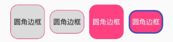
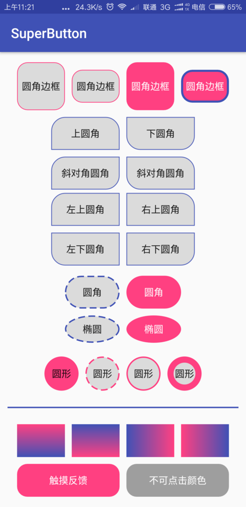
Rectangles, ellipses, lines and rings can be achieved by configuring shapeType types.
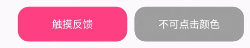
So far, the part about shape code implementation has been completed, which can achieve many effects of shape, but carefully you find that the touch feedback pressed by the button is no longer available. Previously, it was realized through selector, then whether the code can be realized. The answer must be OK.
    /**
     * Gets the Selector after the settings
     *
     * @return stateListDrawable
     */
    public StateListDrawable getSelector() {

        StateListDrawable stateListDrawable = new StateListDrawable();

        //Pay attention to the order in which the background will be replaced as long as there is a state that matches it.
        //So don't put the big picture ahead, if sd.addState(new[]{},normal) comes first, it won't work.
        stateListDrawable.addState(new int[]{android.R.attr.state_pressed, android.R.attr.state_enabled}, getDrawable(android.R.attr.state_pressed));
        stateListDrawable.addState(new int[]{-android.R.attr.state_enabled}, getDrawable(-android.R.attr.state_enabled));
        stateListDrawable.addState(new int[]{}, getDrawable(android.R.attr.state_enabled));

        return stateListDrawable;
    }
Then set the selector to setBackground.
if (Build.VERSION.SDK_INT < 16) {
            setBackgroundDrawable(useSelector ? getSelector() : getDrawable(0));
        } else {
            setBackground(useSelector ? getSelector() : getDrawable(0));
        }
Let's run it and see how it works.
Last
See the above introduction is not a simple feeling, then quickly roll up the sleeves, their own play! After all, you don't have to write so many shape s in the future, haha! We can move less bricks in the future.