This article introduces the Grid grid in Ant. It is mentioned that the Grid divides the horizontal area into 24 parts. The divided information block is called a box. Each box can be composed of multiple areas (the Grid of all boxes in the same row adds up to 24). It is recommended that the number of boxes arranged horizontally is at most four and at least one.
Base grid
Let's start with a basic example:
<a-row>
  <a-col :span="12">
    <div class="grid-content bg-blue-light">
      <span style="color: white;">col-12</span>
    </div>
  </a-col>
  <a-col :span="12">
    <div class="grid-content bg-blue">
      <span style="color: white;">col-12</span>
    </div>
  </a-col>
</a-row>
<a-row>
  <a-col :span="8">
    <div class="grid-content bg-blue-light">
      <span style="color: white;">col-8</span>
    </div>
  </a-col>
  <a-col :span="8">
    <div class="grid-content bg-blue">
      <span style="color: white;">col-8</span>
    </div>
  </a-col>
  <a-col :span="8">
    <div class="grid-content bg-blue-light">
      <span style="color: white;">col-8</span>
    </div>
  </a-col>
</a-row>
<a-row>
  <a-col :span="6">
    <div class="grid-content bg-blue-light">
      <span style="color: white;">col-6</span>
    </div>
  </a-col>
  <a-col :span="6">
    <div class="grid-content bg-blue">
      <span style="color: white;">col-6</span>
    </div>
  </a-col>
  <a-col :span="6">
    <div class="grid-content bg-blue-light">
      <span style="color: white;">col-6</span>
    </div>
  </a-col>
  <a-col :span="6">
    <div class="grid-content bg-blue">
      <span style="color: white;">col-6</span>
    </div>
  </a-col>
</a-row>

<style scoped>
.bg-blue {
  background-color: #00a0e9;
}

.bg-blue-light {
  background-color: #43bdf5;
}

.grid-content {
  min-height: 36px;
  margin-top: 8px;
  margin-bottom: 8px;
  text-align: center;
  padding: 16px 0;

}
</style>
Operation results:
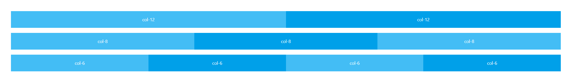
Each < a-row > represents a row, and each < a-col > represents a column. span="6" in < a-col > indicates that the column accounts for 6 grids. The sum of span numbers of all < a-col > in the same < a-row > tag should be 24.
Flex layout
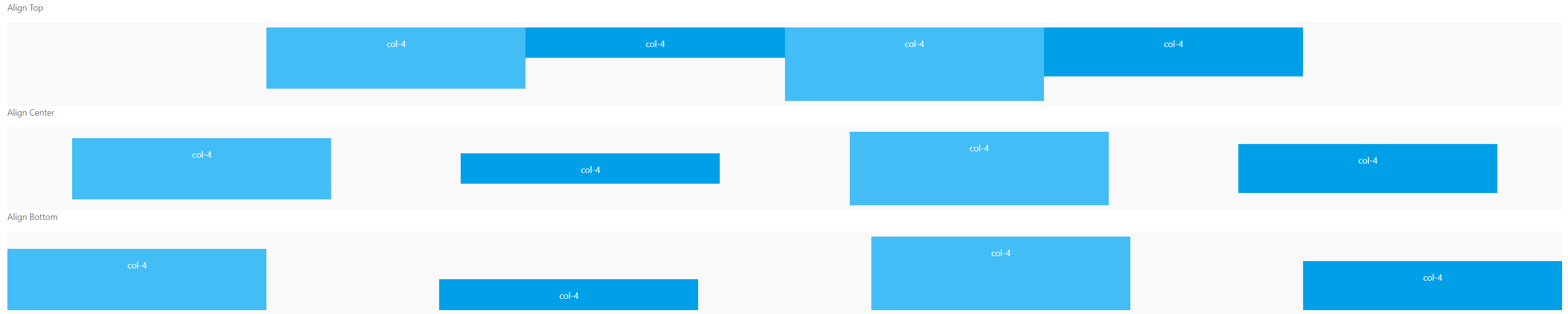
The grid system supports Flex layout, allowing the horizontal alignment of child elements in the parent node - left, center, right, equal width and scattered. Between child elements, top alignment, vertical center alignment and bottom alignment are supported. At the same time, it supports the use of order to define the arrangement order of elements.
Properties on Row
type & align & justify
type: layout mode, optional flex
align: vertical alignment under flex layout: top middle bottom
justify: horizontal arrangement under flex layout: start end center space around space between
The code is as follows:
<p>Align Top</p>
    <a-row type="flex" justify="center" align="top" class="bg-gray">
      <a-col :span="4">
        <div class="grid-content bg-blue-light height-100">
          <span style="color: white;">col-4</span>
        </div>
      </a-col>
      <a-col :span="4">
        <div class="grid-content bg-blue height-50">
          <span style="color: white;">col-4</span>
        </div>
      </a-col>
      <a-col :span="4">
        <div class="grid-content bg-blue-light height-120">
          <span style="color: white;">col-4</span>
        </div>
      </a-col>
      <a-col :span="4">
        <div class="grid-content bg-blue height-80">
          <span style="color: white;">col-4</span>
        </div>
      </a-col>
    </a-row>

    <p>Align Center</p>
    <a-row type="flex" justify="space-around" align="middle" class="bg-gray">
      <a-col :span="4">
        <div class="grid-content bg-blue-light height-100">
          <span style="color: white;">col-4</span>
        </div>
      </a-col>
      <a-col :span="4">
        <div class="grid-content bg-blue height-50">
          <span style="color: white;">col-4</span>
        </div>
      </a-col>
      <a-col :span="4">
        <div class="grid-content bg-blue-light height-120">
          <span style="color: white;">col-4</span>
        </div>
      </a-col>
      <a-col :span="4">
        <div class="grid-content bg-blue height-80">
          <span style="color: white;">col-4</span>
        </div>
      </a-col>
    </a-row>

    <p>Align Bottom</p>
    <a-row type="flex" justify="space-between" align="bottom" class="bg-gray">
      <a-col :span="4">
        <div class="grid-content bg-blue-light height-100">
          <span style="color: white;">col-4</span>
        </div>
      </a-col>
      <a-col :span="4">
        <div class="grid-content bg-blue height-50">
          <span style="color: white;">col-4</span>
        </div>
      </a-col>
      <a-col :span="4">
        <div class="grid-content bg-blue-light height-120">
          <span style="color: white;">col-4</span>
        </div>
      </a-col>
      <a-col :span="4">
        <div class="grid-content bg-blue height-80">
          <span style="color: white;">col-4</span>
        </div>
      </a-col>
    </a-row>


<style scoped>
.bg-blue {
  background-color: #00a0e9;
}

.bg-blue-light {
  background-color: #43bdf5;
}

.grid-content {
  min-height: 36px;
  margin-top: 8px;
  margin-bottom: 8px;
  text-align: center;
  padding: 16px 0;

}


.height-50{
  height: 50px;
}
.height-80{
  height: 80px;
}
.height-100{
  height: 100px;
}
.height-120{
  height: 120px;
}
.bg-gray{
  background-color: rgba(239,239,239,0.37)
}
</style>
Operation results:
gutter
Grid interval can be written as pixel value or support responsive object writing to set the horizontal interval {xs: 8, sm: 16, md: 24}. Or set [horizontal spacing and vertical spacing] simultaneously in the form of array (supported after 1.5.0).
The code is as follows:
<a-row :gutter="[16,32]">
        <a-col class="gutter-row" :span="6">
          <div class="gutter-box">
            col-6
          </div>
        </a-col>
        <a-col class="gutter-row" :span="6">
          <div class="gutter-box">
            col-6
          </div>
        </a-col>
        <a-col class="gutter-row" :span="6">
          <div class="gutter-box">
            col-6
          </div>
        </a-col>
        <a-col class="gutter-row" :span="6">
          <div class="gutter-box">
            col-6
          </div>
        </a-col>
      </a-row>
      <a-row :gutter="[16,32]">
        <a-col class="gutter-row" :span="6">
          <div class="gutter-box">
            col-6
          </div>
        </a-col>
        <a-col class="gutter-row" :span="6">
          <div class="gutter-box">
            col-6
          </div>
        </a-col>
        <a-col class="gutter-row" :span="6">
          <div class="gutter-box">
            col-6
          </div>
        </a-col>
        <a-col class="gutter-row" :span="6">
          <div class="gutter-box">
            col-6
          </div>
        </a-col>
      </a-row>

<style scoped>
    .gutter-example >>> .ant-row > div {
      background: transparent;
      border: 0;
    }
    .gutter-box {
      background: #00a0e9;
      padding: 5px 0;
    }
</style>
Operation results:

Here, the horizontal spacing is set to 16 and the vertical spacing is set to 32.
Properties on Col
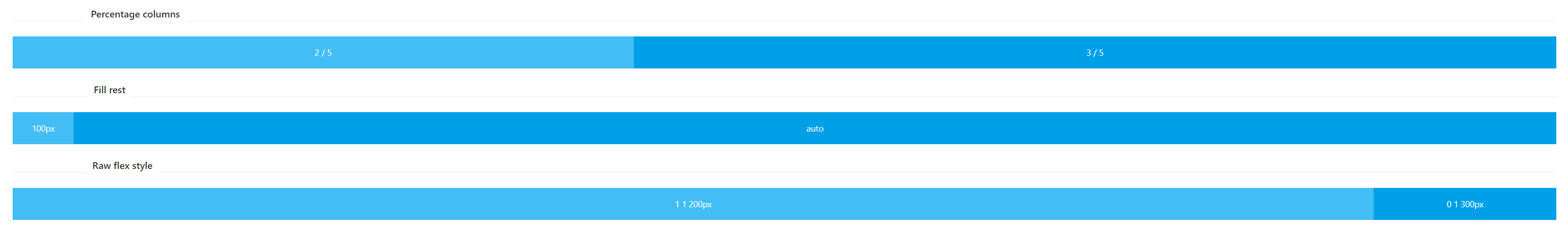
flex
Flex layout filling can replace span when flex layout filling is not used
The code is as follows:
<a-divider orientation="left">
      Percentage columns
    </a-divider>
    <a-row type="flex">
      <a-col :flex="2">
        <div class="grid-content bg-blue-light">
          <span style="color: white;">
            2 / 5
          </span>
        </div>
      </a-col>
      <a-col :flex="3">
        <div class="grid-content bg-blue">
          <span style="color: white;">
            3 / 5
          </span>
        </div>
      </a-col>
    </a-row>
    <a-divider orientation="left">
      Fill rest
    </a-divider>
    <a-row type="flex">
      <a-col flex="100px">
        <div class="grid-content bg-blue-light">
          <span style="color: white;">
            100px
          </span>
        </div>
      </a-col>
      <a-col flex="auto">
        <div class="grid-content bg-blue">
          <span style="color: white;">
            auto
          </span>
        </div>
      </a-col>
    </a-row>
    <a-divider orientation="left">
      Raw flex style
    </a-divider>
    <a-row type="flex">
      <a-col flex="1 1 200px">
        <div class="grid-content bg-blue-light">
          <span style="color: white;">
            1 1 200px
          </span>
        </div>
      </a-col>
      <a-col flex="0 1 300px">
        <div class="grid-content bg-blue">
          <span style="color: white;">
            0 1 300px
          </span>
        </div>
      </a-col>
    </a-row>
Operation results:
offset
The number of spacing cells on the left side of the grid. There can be no grid in the interval, which can realize the left-right offset of the column. offset="4" offsets the element to the right by 4 columns.
The code is as follows:
 <a-row>
      <a-col :span="8">
        <div class="grid-content bg-blue-light">
          <span style="color: white;">
            span="8"
          </span>
        </div>
      </a-col>
      <a-col :span="8" :offset="8">
        <div class="grid-content bg-blue">
          <span style="color: white;">
            span="8"  offset="8"
          </span>
        </div>
      </a-col>
    </a-row>
    <a-row>
      <a-col :span="6" :offset="6">
        <div class="grid-content bg-blue-light">
          <span style="color: white;">
            span="6"  offset="6"
          </span>
        </div>
      </a-col>
      <a-col :span="6" :offset="6">
        <div class="grid-content bg-blue">
          <span style="color: white;">
            span="6"  offset="6"
          </span>
        </div>
      </a-col>
    </a-row>
    <a-row>
      <a-col :span="12" :offset="6">
        <div class="grid-content bg-blue">
          <span style="color: white;">
            span="12"  offset="6"
          </span>
        </div>
      </a-col>
    </a-row>
Operation results:

pull & push
pull: the number of cells the grid moves to the left
push: the number of cells the grid moves to the right
The code is as follows:
    <a-row>
      <a-col :span="18" :push="6">
        col-18 col-push-6
      </a-col>
      <a-col :span="6" :pull="18">
        col-6 col-pull-18
      </a-col>
    </a-row>
Operation results:

span
When the number of grid placeholders is 0, it is equivalent to display: none. It has been used many times before
Responsive layout
-
Trigger response when XS < 576px
-
Trigger response when sm ≥ 576px
-
Trigger response when md ≥ 768px
-
Trigger response when lg ≥ 992px
-
Trigger response when xl ≥ 1200px
-
Trigger response when xxl ≥ 1600px
The code is as follows:
<a-row>
  <a-col :xs="2" :sm="4" :md="6" :lg="8" :xl="10">
    <div class="grid-content bg-blue-light">
      <span style="color: white;">
        Less than 276 px:2 Greater than 576 px:4 Greater than 768 px:6 >=992px:8 Greater than 1200 px:10
      </span>
    </div>
  </a-col>
  <a-col :xs="20" :sm="16" :md="12" :lg="8" :xl="4">
    <div class="grid-content bg-blue">
      <span style="color: white;">
        Less than 276 px:20 Greater than 576 px:16 Greater than 768 px:12 >=992px:8 Greater than 1200 px:4
      </span>
    </div>
  </a-col>
  <a-col :xs="2" :sm="4" :md="6" :lg="8" :xl="10">
    <div class="grid-content bg-blue-light">
      <span style="color: white;">
        Less than 276 px:2 Greater than 576 px:4 Greater than 768 px:6 >=992px:8 Greater than 1200 px:10
      </span>
    </div>
  </a-col>
</a-row>
Operation results:
When the width of the parent container is greater than 1200px

When the parent container width is less than 1200px and greater than 992px
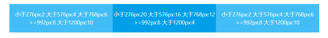
Note: in the same row, the sum of all xs values should be 24, the sum of all sm values should be 24, and so on
This article ends here. The following articles will take you to use other components one by one, and share the special usage encountered in development. It is recommended to collect them