1, Understanding image components
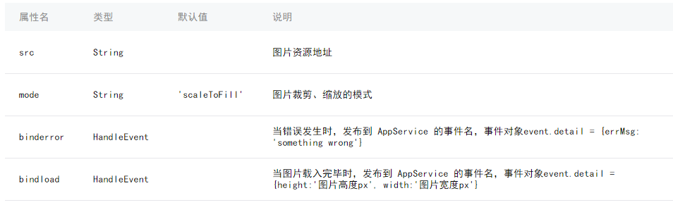
Because the image has a default fixed width and height, it is not easy for us to adapt the image. Let's solve it together
Two. Method
(1) . using mode: widthFix
widthFix: the width is the same, the height changes automatically, and the width height ratio of the original image is the same.
First, we set the image mode to widthFix, and then add a fixed rpx width to the image, such as 730rpx.
In this way, the picture can also be adaptive.. Because the rpx of the applet itself is an adaptive display unit
(2) . use the bindload binding function to dynamically adapt.
We can bind a function to image. This function, like the bindload description above, can get the width and height of the original image.
Then calculate their aspect ratio.. Then set a width size (rpx), and finally dynamically set the width and height of image through style. The code is as follows:
1. Write the page structure index.wxml:
2. Set data index.js
- <span style="font-family:'Comic Sans MS';font-size:18px;color:#333333;"><image src="../uploads/2.jpg" bindload="imageLoad"
- style="width:{{imgwidth}}rpx; height:{{imgheight }}rpx;"></image></span>
- <span style="font-family:'Comic Sans MS';font-size:18px;color:#333333;">//Get application instance
- var app = getApp()
- Page({
- data: {
- screenWidth: 0,
- screenHeight:0,
- imgwidth:0,
- imgheight:0,
- },
- onLoad: function() {
- var _this = this;
- wx.getSystemInfo({
- success: function(res) {
- _this.setData({
- screenHeight: res.windowHeight,
- screenWidth: res.windowWidth,
- });
- }
- });
- },
- imageLoad: function(e) {
- var _this=this;
- var $width=e.detail.width, //Get the true width of the picture
- $height=e.detail.height,
- ratio=$width/$height; //True aspect ratio of picture
- var viewWidth=500, //Set the picture display width
- viewHeight=500/ratio; //Calculated height value
- this.setData({
- imgwidth:viewWidth,
- imgheight:viewHeight
- })
- }
- })</span>