1, Life cycle function
2, Components
For example, in small programs, there are tab tab effects, round blog effects or star scoring of multiple pages. Generally, we do not realize this function for each page. Generally, we encapsulate repeated functions or modules into components, and import which page can be used.
1. Create component
Create a new components folder (at the same level as the pages directory) under the root directory of the project, and then create each component.
2. Global reference component
On app JSON is defined as follows:
{
  "pages":[
    . . . .
  ],
  "usingComponents": {
    "my-test":"/components/test1/test1"
  },
  . . .
}
It can then be used in each page as follows
<my-test></my-test>
3. Local reference component
In the json file of a single page, set the following
{
  "usingComponents": {
    "my-test":"/components/test1/test1"
  }
}
Use the following in the page:
<my-test></my-test>
4. Differences between components and pages
- Although the component and page are composed of four file components, the json file of the component has the following attributes:
{
  "component": true
}
- The Component initializes the Component function and the Page initializes the Page function
Page({})

Component({})
- The event handling function of the component needs to be placed in methods, and the event handling function of the page needs to be placed directly in Page()
Component({
  data: {

  },
  methods: {
    Event function name:function(){}
  }
})


Page({
    Event function name:function(){}
})
5. Style processing
- app. The style settings in wxss only affect the page, not the components
For example, app The styles defined in wxss are as follows:
.red{
  color:red;
}
Page search In wxml, if the font color is red, the component will not be affected
<view class="red">Test text</view>
be careful
Note that the above settings are only useful for class selectors if you are in app In wxss, both components and pages will work with the style set by the tag selector. In order to avoid style conflicts, it is recommended that the pages with components be in app Using class selectors to define styles in wxss
6. Component property and method settings
(1)data
Like the page, the data in the component also defines its own variables, and the page view is rendered through {}}.
Components js file is defined as follows
Component({
  data: {
    num:10
  }
})
Components The following is used in wxml:
{{num}}(2) Events
Components The structure defined in wxml is as follows:
<button bindtap="addNum">click+1</button>
<view>{{num}}</view>
Components js is defined as follows:
// components/test1/test1.js
Component({

  data: {
    num:10
  },
  methods: {
    addNum:function(){
      this.setData({
        num:this.data.num+1
      })
    }
  }
})
So we found that it is the same as that used in the page
(3)properties
properties is the content passed from the acceptance page to the component. The format is as follows:
Page delivery is as follows:
<my-test info="tom"></my-test>
Component test JS is set as follows:
Component({
  properties: {
    info:{
      type:String,
      value:'Default value'
    }
  }
})
At this time, if the delivery is successful, tom will be displayed. If the delivery is unsuccessful, the default value will be the string "default value"
(4) Using listeners in components
Add content to wxml of subcomponent:
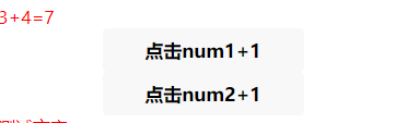
<view>{{num1}}+{{num2}}={{sum}}</view>
<button bindtap="addNum1">click num1+1</button>
<button bindtap="addNum2">click num2+1</button>
Add events and listeners to js of subcomponents
Component({
  data: {
    num1:0,
    num2:0,
    sum:0
  },
  methods: {
    addNum1:function(){
      this.setData({
        num1:this.data.num1+1
      })
    },
    addNum2:function(){
      this.setData({
        num2:this.data.num2+1
      })
    }
  },
  observers:{
    "num1,num2":function(newNum1,newNum2){
      this.setData({
        sum:newNum1+newNum2
      })
    }
  }
})
At this time, when you click the two buttons, the values of number 1 and number will change, and the sum will also change. If you do not add a listener, and will not change with it.
7. Parent child component value transfer
(1) Father to son
- Create a new components folder in the project root directory, where you can create new sub components
- Create a new page test and configure test JSON is as follows:
{
  "usingComponents": {
    "my-son":"/components/son/son"
  }
}
- test.wxml uses components and passes values through attributes
<my-son num="{{10}}"></my-son>
- Sub assembly son JS is configured as follows:
Component({
  properties: {
    num:Number
  }
  . . .
}
- Subcomponents render the received num variables through the {}} template syntax
<text>{{num}}</text>
(2) son to father
- Subcomponent test Binding and passing events in wxml
<button bindtap="click">The child component passes values to the parent component</button>
- Pass data in the event click method of the subcomponent. Note that the first parameter in triggerEvent is the passed event name, and the second parameter is the passed value, which can be a variable.
// components/son/son.js
Component({
  data: {

  },
  methods: {
    click:function(){
      this.triggerEvent('handle',{value:111})
    }
  }
})
- Receive data in page test The processing in wxml is as follows:
<my-son bind:handle="getContent"></my-son>
Page test JS is defined as follows:
Page({
  data: {
    . . .
  },
  getContent:function(event){
    console.log(event.detail.value)
  },
  . . .

}
(3) Get component instance object
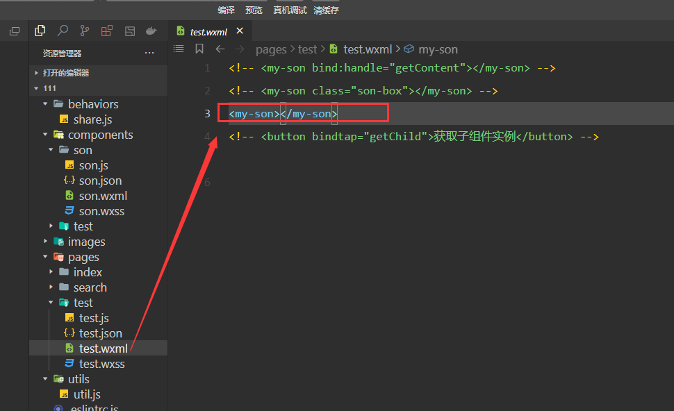
- Page test The following definitions are defined in wxml
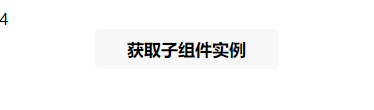
<my-son class="son-box"></my-son>
<button bindtap="getChild">Get sub component instance</button>
- Page test Processing getChild method in JS
Page({
  data: {
    . . .
  },
  getChild:function(){
   let son= this.selectComponent(".son-box");
   son.setData({
     number:son.data.number+1
   })
  },
  . . .
})
- Sub assembly son Defined in JS
Component({
  properties: {
    . . .
  },

  data: {
    number:0
  },
  . . .
})
- Sub assembly son The rendering in wxml is as follows:
<text>{{number}}</text>
At this time, click the button in the page, and the data in the sub component will change.
8.behaviors
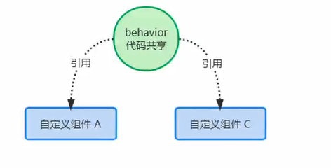
behaviors is mainly to realize data sharing among multiple components.
(1) Use steps
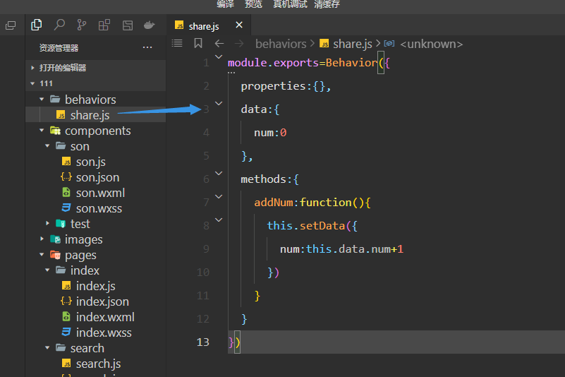
- Create a behaviors folder in the root directory of the project, and create a new file, such as named share js
module.exports=Behavior({
  properties:{},
  data:{
    num:0
  },
  methods:{
    addNum:function(){
      this.setData({
        num:this.data.num+1
      })
    }
  }
})
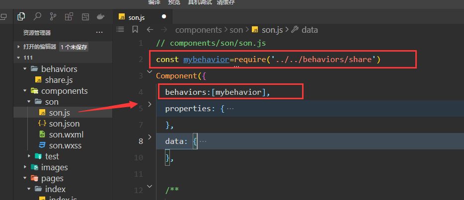
Introduce the behaviors file into a sub component and use the data and methods in it
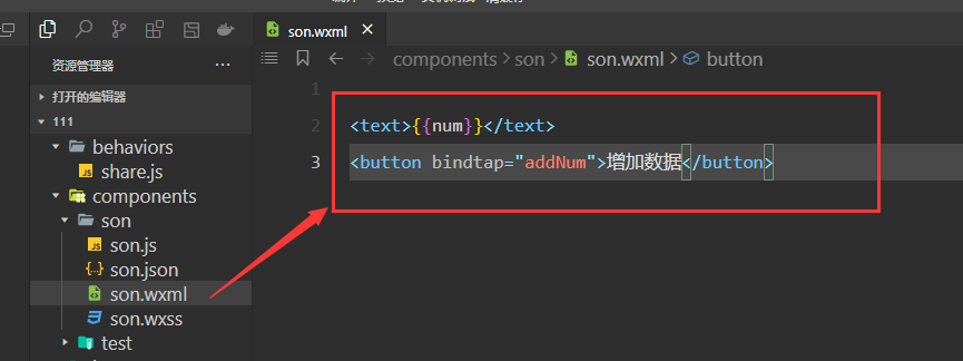
Display content and usage of sub components
-
The above sub components are loaded in the page. Because our components cannot be viewed directly, they can only be seen in each page, so we can open a page casually and display them with components.
At this time, we can change the content in the tag by clicking the button in the page. In essence, the page loads the component. The component does not define its own data, but borrows the shared data and methods in the behaviors file