Application case of building complex network based on NetworkX
Content of this article
This paper mainly includes two parts:
1. Installation of Networkx and drawing of campus network topology. This step has the function of fixing the location of the generation node and adding the user-defined icon of the node.
The main functions are:
G.add_nodes_from(nodes=nodes_list,pos=pos)
G.add_node("Information Center", image=images ["router"])
2. Complete the generation of edges of complex network topology based on networkx. At the same time, weight nodes are added to the network topology map to generate a complex network topology map with weight. After generating the topology map, histogram analysis is carried out on the output of nodes, and its mean mu and sigma equation are analyzed. Then you can draw different display styles of edges according to the weight of the incoming edges.
In the overall completion process, there are reference official websites and some online blogs. The official website is connected as follows: https://networkx.org/documentation/stable/reference/index.html
The specific implementation of this report is described through code comments
1. Installation of networkx and construction of campus topology
1.1 Networkx installation
pip install networkx
It should be noted that networkx has 1 X and 2 The usage of the two versions is different. 2.0 is installed by default Version X.
1.2 campus topology drawing
Open the compilation environment and open jupyter
1) Import dependent Libraries
#Load dependent Libraries
import networkx as nx
from matplotlib import pyplot as plt
import PIL
2) Specify the canvas size and set the basic information of nodes, edges, positions and icons
# Specify canvas size
plt.figure(figsize=(10,10))

# Specify node
nodes_list = ['school of computing','Big data specialty','Information Center','dean's office','Office of Academic Research','Extranet','Education Network']

# Specifies the location of the node
pos = {'school of computing': (8, 10), 'Big data specialty': (6, 10),
 'Information Center': (10, 10), 'dean's office': (10, 8),
 'Office of Academic Research': (10, 12), 'Extranet': (12, 12),'Education Network':(12, 8)}

# Specify edge
edge_list = [
('Information Center', 'Education Network', {'weight': 2}),
('Information Center', 'Extranet', {'weight': 2}),
('school of computing', 'Big data specialty', {'weight': 1}),
('school of computing', 'Information Center', {'weight': 2}),
('Information Center', 'dean's office', {'weight': 2}),
('Information Center', 'Office of Academic Research', {'weight': 2}),
('dean's office', 'Office of Academic Research', {'weight': 2})]

# Adds the specified icon to the network node
# reference resources: https://networkx.org/documentation/latest/auto_examples/drawing/plot_custom_node_icons.html
# Icons for network nodes
icons = {
    "router": "icons/Router.png",
    "internet": "icons/internet.png",
    "PC": "icons/PC.png",
}

# Load Icon
images = {k: PIL.Image.open(fname) for k, fname in icons.items()}

3)Add node, edge, position and other information to the diagram
# Generate a graph
G = nx.Graph()

# Add all node information
G.add_nodes_from(nodes=nodes_list,pos=pos)

# Add all edge information
G.add_edges_from(edge_list)

# Add image attribute to node
G.add_node("Information Center", image=images["router"])
G.add_node("Education Network", image=images["internet"])
G.add_node("Extranet", image=images["internet"])
G.add_node("school of computing", image=images["PC"])
G.add_node("Big data specialty", image=images["PC"])
G.add_node("dean's office", image=images["PC"])
G.add_node("Office of Academic Research", image=images["PC"])
3) Complete icon overlay of nodes
# Construction subgraph
fig, ax = plt.subplots()

# Draw the edges of the network and specify ax as the subgraph
nx.draw_networkx_edges(
    G,
    pos=pos,
    ax=ax,
    arrows=True,
    arrowstyle="-",
    min_source_margin=15,
    min_target_margin=15,
)

# Label for drawing network diagram
nx.draw_networkx_labels(G,pos,ax=ax,font_size=10,font_family="simhei")

# Scale the coordinate system of the data between xlim and ylim, and then scale it to the coordinates of the display diagram
tr_figure = ax.transData.transform
# Convert the displayed coordinate system to the drawing coordinate system
tr_axes = fig.transFigure.inverted().transform

# Set the size and center position of each icon
icon_size = (ax.get_xlim()[1] - ax.get_xlim()[0]) * 0.0125
icon_center = icon_size / 2.0

# Add icons to their respective nodes
for n in G.nodes:
    # pos[n] is the original location of each node
    xf, yf = tr_figure(pos[n])
    # Convert node coordinates to coordinates on the canvas
    xa, ya = tr_axes((xf, yf))
    # get overlapped axes and plot icon
    # Obtain overlapping subgraphs and node icons
    a = plt.axes([xa - icon_center, ya - icon_center, icon_size, icon_size])
    a.imshow(G.nodes[n]["image"])
    a.axis("off")

plt.show()
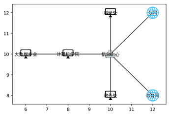
The output results are shown in Figure 1-1:

Figure 1-1 network topology
2. Draw the complex network and specify the filtering algorithm
2.1 generate complex network topology nodes and add weights at the same time
# Import dependent
from matplotlib import pyplot as plt
import networkx as nx
import numpy as np

# Generate random data
G = nx.erdos_renyi_graph(50,0.5)

# Specify canvas size
plt.figure(figsize=(18,18))

# Generate new graph
G_new = nx.Graph()

# According to the number of edges in the graph, random weight values of the same length are generated
weightList = {}
for i in range(len(G.edges())+1):
    weightList[i] = np.random.rand()

# Copy the generated random weights to G_new graph
i = 0
for edge in G.edges():
    i += 1
    G_new.add_edges_from([(edge[0], edge[1], {'weight': weightList[i]})])
# Draw G_new graph
nx.draw_networkx(G_new)
plt.show()
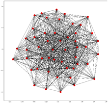
The generation is shown in Figure 2-1

Figure 2-1 G_new graph visualization
2.2 analyze the node exit distribution
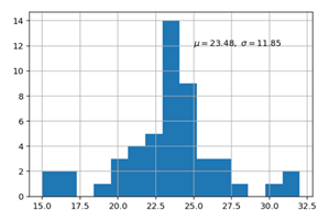
When describing the data distribution, it can be expressed by mu and sigma. In this part, the statistical function of scipy is used to calculate the Sigma value, then the mu value is calculated, and then the degree value of the network is displayed by histogram.
The code is as follows:
# Converts the degree of a node in the network to a dictionary type
de = dict(G_new.degree)
print(de)
# keys is the id of the node and values is the output of the node
keys = [de[v] for v in de.keys()]
values = [v for v in de.values()]

# Calculate the mean and standard deviation
N = len(values)
narray=np.array(values)
sum1=narray.sum()
narray2=narray*narray
sum2=narray2.sum()
mean=sum1/N
var=sum2/N-mean**2
var =np.around(var,2)

# Draw histogram
plt.hist(values,bins=15)

# Add comment information
plt.text(25, 12, r'$\mu={},\ \sigma={}$'.format(mean,var))    #Notes in text
plt.grid(True)

plt.show()
The output is shown in Figure 2-2:

Figure 2-2 degree distribution of network diagram
2.3 draw different styles of graphs through the weight of edges to realize the selection of nodes and edges in the graph
Here, two parameters, maximum weight and minimum weight, are input to filter out three different edges, and then draw them in different styles.
The specific codes are as follows:
## Sets how images are displayed
%matplotlib inline
%config InlineBackend.figure_format = "retina"
plt.figure(figsize=(18,18))

# Get maximum and minimum weights ")
elarge_num = input("Enter the maximum weight")
if len(elarge_num)<2:
    elarge_num = 0.3
else:
    elarge_num = float(elarge_num)

emidle_num = input("Output the lowest weight")
if len(emidle_num)<2:
    emidle_num = 0.3
else:
    emidle_num = float(emidle_num)

## Filter out different edges according to the weight of the input edges
elarge=[(u,v) for (u,v,d) in G_new.edges(data=True) if d['weight'] >elarge_num]
emidle = [(u,v) for (u,v,d) in G_new.edges(data=True) if (d['weight'] >emidle_num) & (d['weight'] <= elarge_num)]
esmall=[(u,v) for (u,v,d) in G_new.edges(data=True) if d['weight'] <=emidle_num]

# Get the location of all nodes according to the layout of the diagram
pos=nx.random_layout(G_new) # positions for all nodes

# Get information about the degree
de = dict(G_new.degree)
keys = [de[v] for v in de.keys()]
values = [v for v in de.values()]

# nodes sets the size of the node based on the node
nx.draw_networkx_nodes(G_new,pos,alpha=0.6,node_size=keys * 100)

# Draw different networks according to the filtered edges
nx.draw_networkx_edges(G_new,pos,edgelist=elarge,
                    width=2,alpha=0.9,edge_color='g')
nx.draw_networkx_edges(G_new,pos,edgelist=emidle,
                    width=1.5,alpha=0.6,edge_color='y')
nx.draw_networkx_edges(G_new,pos,edgelist=esmall,
                    width=1,alpha=0.3,edge_color='b',style='dashed')

# Set the label in bold for Chinese display
nx.draw_networkx_labels(G_new,pos,font_size=10,font_family="simHei")

plt.axis('off')
plt.title("Complex model measurement",FontProperties = font)
plt.show() # display
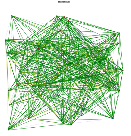
The output screenshot is shown in Figure 2-3:

Figure 2-3 network diagram drawing after screening
3. Summary
This paper mainly completes the installation of networkx and the drawing of campus network topology, as well as the function of filtering nodes according to weight. The functions used in this paper are to fix the location of the generated nodes, add user-defined icons of nodes, and complete node filtering according to the weight and input equivalence.