Graph has recently become a core area of machine learning. For example, you can predict potential connections to understand the structure of social networks, detect fraud, understand consumer behavior of car rental services, or make real-time recommendations. Recently, Ma ë l Fabien, a data scientist, published a series of articles on graph theory and graph learning involving graph theory, graph algorithm and graph learning on his blog.
Selected from towardsdatascience by Ma ë l Fabien, compiled by machine heart, participated in: panda.
This article is the first one, which introduces some basic knowledge of graphs and gives Python examples. More articles and corresponding codes can be accessed: https://github.com/maelfabien/Machine_Learning_Tutorials.
This article covers the following topics:
- What is the picture?
- How do I store graphs?
- Types and properties of Graphs
- Python example
First, make some preparations, open Jupyter Notebook and import the following software packages:
Later articles will use the latest version 2.0 of networkx. networkx is a Python software package for the creation, operation and research of the structure, dynamics and functions of complex networks.
import numpy as np
import random
import networkx as nx
from IPython.display import Image
import matplotlib.pyplot as plt
I will try to be practical and try to explain each concept.
What is the picture?
A graph is a collection of interconnected nodes.
For example, a simple diagram may be as follows:
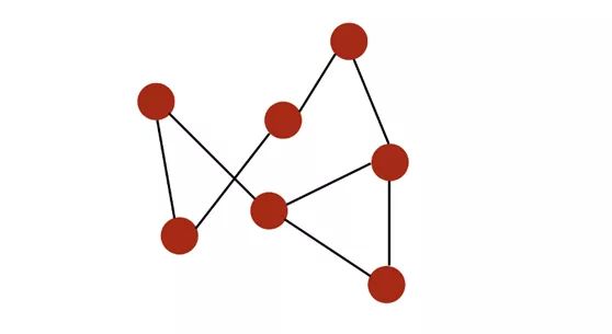
Nodes are marked in red and connected by black edge s.
The diagram can be used to represent:
- social networks
- Webpage
- Biological network
- ...
What kind of analysis can we perform on the graph?
- Study topology and connectivity
- Group detection
- Identify central node
- Predict missing nodes
- Predict missing edges
- ...
You will understand all these concepts in a few minutes.
We first import the first pre built diagram into our notebook:
# Load the graph
G_karate = nx.karate_club_graph()
# Find key-values for the graph
pos = nx.spring_layout(G_karate)
# Plot the graph
nx.draw(G_karate, cmap = plt.get_cmap('rainbow'), with_labels=True, pos=pos)
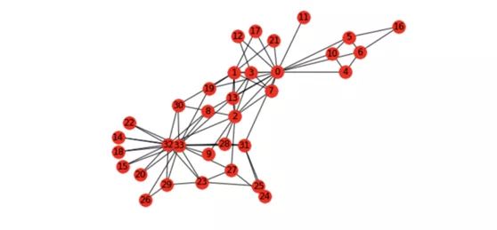 Karate map
What does this karate chart mean? Wayne W. Zachary studied the social network of a karate club from 1970 to 1972. The network includes 34 members of the karate club. The connection between members indicates that they also have connections outside the club. During the study, there was a conflict between administrator John A and coach Mr.Hi (pseudonym), which led to the division of the club into two. Half of the members formed a new club around Mr.Hi, and the other half found a new coach or gave up karate. Based on the collected data, Zachary correctly assigned the groups that all members entered after splitting except one member.
Basic representation of Graphs
Figure G=(V, E) consists of the following elements:
- A set of nodes (also known as vertical) V=1,..., n
- A set of edges E ⊆ V × V
- Edge (i,j) ∈ E connects nodes i and j
- i and j are called neighbor s
- degree of nodes refers to the number of adjacent nodes
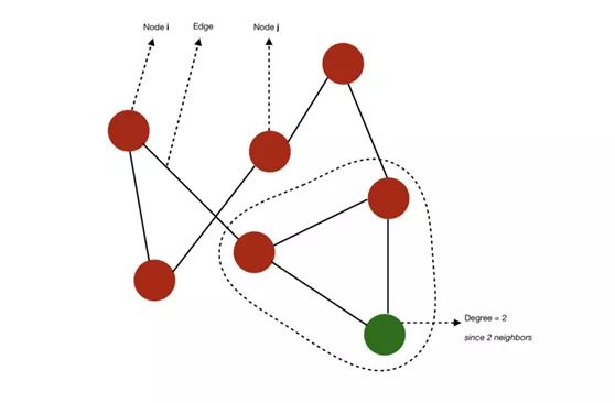 Schematic diagram of nodes, edges and degrees
If all nodes of a graph have n-1 adjacent nodes, the graph is complete. That is to say, all nodes have all possible connection modes.
- The path from i to j refers to the sequence of edges from i to J. The length of the path is equal to the number of edges passed.
- The diameter of a graph refers to the length of the longest path among all the shortest paths connecting any two nodes.
For example, in this case, we can calculate some shortest paths connecting any two nodes. The diameter of the graph is 3, because the length of the shortest path between any two nodes does not exceed 3.
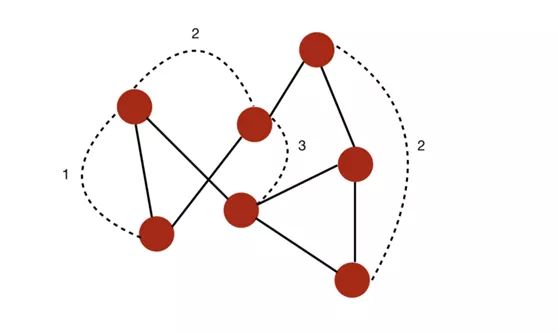 A diagram with a diameter of 3
- geodesic path refers to the shortest path between two nodes.
- If all nodes can connect to each other through a path, they form a connected component. If a graph has only one connected branch, the graph is connected.
For example, the following is a graph with two different connected branches:
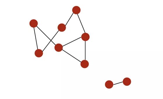 A graph with two connected branches
- If the edges of a graph are sequentially paired, the graph is directed. In degree of i is the number of edges pointing to i, and out degree is the number of edges away from i.
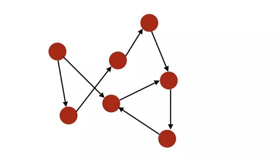 Directed graph
- If the graph has a given node, it can return to a ring. In contrast, if at least one node cannot return, the graph is a cyclic.
- Graphs can be weighted, i.e. weights are applied to nodes or relationships.
- If the number of edges of a graph is smaller than the number of nodes, the graph is sparse. In contrast, if there are many edges between nodes, the graph is dense.
Neo4J's book on graph algorithm gives a clear summary:
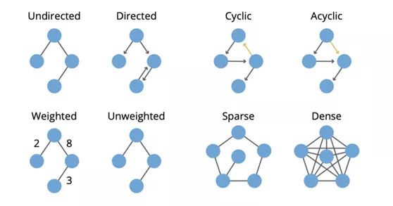 Summary (from Neo4J Graph Book)
Let's see how to retrieve this information of a graph in Python:
n=34
G_karate.degree()
The. degree() attribute returns a list of degrees (number of adjacent nodes) of each node of the graph:
DegreeView({0: 16, 1: 9, 2: 10, 3: 6, 4: 3, 5: 4, 6: 4, 7: 4, 8: 5, 9: 2, 10: 3, 11: 1, 12: 2, 13: 5, 14: 2, 15: 2, 16: 2, 17: 2, 18: 2, 19: 3, 20: 2, 21: 2, 22: 2, 23: 5, 24: 3, 25: 3, 26: 2, 27: 4, 28: 3, 29: 4, 30: 4, 31: 6, 32: 12, 33: 17})
Then, the value of isolation:
# Isolate the sequence of degrees
degree_sequence = list(G_karate.degree())
Calculate the number of edges, but also the measurement of the degree sequence:
nb_nodes = n
nb_arr = len(G_karate.edges())
avg_degree = np.mean(np.array(degree_sequence)[:,1])
med_degree = np.median(np.array(degree_sequence)[:,1])
max_degree = max(np.array(degree_sequence)[:,1])
min_degree = np.min(np.array(degree_sequence)[:,1])
Finally, print all the information:
print("Number of nodes : " + str(nb_nodes))
print("Number of edges : " + str(nb_arr))
print("Maximum degree : " + str(max_degree))
print("Minimum degree : " + str(min_degree))
print("Average degree : " + str(avg_degree))
print("Median degree : " + str(med_degree))
Get:
Number of nodes : 34
Number of edges : 78
Maximum degree : 17
Minimum degree : 1
Average degree : 4.588235294117647
Median degree : 3.0
On average, each person in the figure is connected to 4.6 people.
We can draw histograms of these degrees:
degree_freq = np.array(nx.degree_histogram(G_karate)).astype('float')
plt.figure(figsize=(12, 8))
plt.stem(degree_freq)
plt.ylabel("Frequence")
plt.xlabel("Degre")
plt.show()
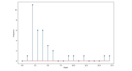 Histogram of degree
As we will see later, the histogram of degree is very important and can be used to determine the type of graph we see.
How do I store graphs?
You may wonder how we store complex graph structures?
There are three ways to store a graph, depending on what you want to do with it:
- Store as edge list:
1   2
1   3
1   4
2   3
3   4
...
We store the ID of each pair of nodes with edge connections.
- Use adjacency matrix, which is usually loaded in memory:
 adjacency matrix
For each possible pairing in the graph, if two nodes have edges connected, it is set to 1. If the graph is undirected, then A is symmetric.
- Use adjacency list:
1 : [2,3, 4]
2 : [1,3]
3:  [2, 4]
...
The best representation depends on usage and available memory. Pictures can usually be saved as txt file.
The diagram may contain some extensions:
- Weighted edge
- Label nodes / edges
- Add eigenvectors related to nodes / edges
Type of graph
In this section, we will introduce two main graph types:
- Erdos-Rényi
- Barabasi-Albert
Erdos-R é nyi model
definition
In Erdos-R é nyi model, we construct a random graph model with n nodes. This graph is generated by drawing edges between pairs of nodes (i,j) independently with probability p. Therefore, we have two parameters: the number of nodes N and the probability p.
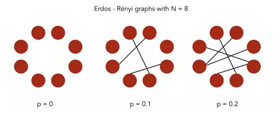 Erdos-R é nyi diagram
In Python, the networkx package has built-in functions for generating Erdos-R é nyi diagrams.
# Generate the graph
n = 50
p = 0.2
G_erdos = nx.erdos_renyi_graph(n,p, seed =100)
# Plot the graph
plt.figure(figsize=(12,8))
nx.draw(G_erdos, node_size=10)
This gives a result similar to the following figure:
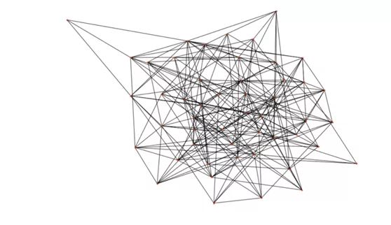 Generated graph
Degree distribution
Let pk be the probability that the degree of randomly selected nodes is k. Due to the random method used in graph construction, the degree distribution of this graph is binomial:
 Binomial node degree distribution
The distribution of the number of degrees of each node should be very close to the mean. It is observed that the probability of a high number of nodes decreases exponentially.
degree_freq = np.array(nx.degree_histogram(G_erdos)).astype('float')
plt.figure(figsize=(12, 8))
plt.stem(degree_freq)
plt.ylabel("Frequence")
plt.xlabel("Degree")
plt.show()
To visualize this distribution, I increased the n in the generated graph to 200.
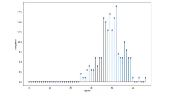 Degree distribution
descriptive statistics
- Average degree by n × P is given. When p=0.2 and n=200, the center is about 40
- Degree expectation (n − 1) × p given
- The degree near the average is the most
We use Python to retrieve these values:
# Get the list of the degrees
degree_sequence_erdos = list(G_erdos.degree())

nb_nodes = n
nb_arr = len(G_erdos.edges())

avg_degree = np.mean(np.array(degree_sequence_erdos)[:,1])
med_degree = np.median(np.array(degree_sequence_erdos)[:,1])

max_degree = max(np.array(degree_sequence_erdos)[:,1])
min_degree = np.min(np.array(degree_sequence_erdos)[:,1])

esp_degree = (n-1)*p

print("Number of nodes : " + str(nb_nodes))
print("Number of edges : " + str(nb_arr))

print("Maximum degree : " + str(max_degree))
print("Minimum degree : " + str(min_degree))

print("Average degree : " + str(avg_degree))
print("Expected degree : " + str(esp_degree))
print("Median degree : " + str(med_degree))
You will get results like this:
Number of nodes : 200
Number of edges : 3949
Maximum degree : 56
Minimum degree : 25
Average degree : 39.49
Expected degree : 39.800000000000004
Median degree : 39.5
The average and expectation here are very close, because there is only a small factor between them.
Barabasi Albert model
definition
In the Barabasi Albert model, we construct a random graph model with n nodes, which has a preferential attachment component. This graph can be generated by the following algorithm:
- Step 1: perform step 2 with probability p, otherwise perform step 3
- Step 2: connect a new node to an existing node selected randomly and evenly
- Step 3: connect the new node to the n existing nodes with a probability proportional to the n existing nodes
The goal of this diagram is to model preferential attachment, which is often observed in real-world networks. (Note: preferential connection refers to the allocation of a certain amount according to the existing amount of each individual or object, which usually further increases the advantage of the dominant individual.)
In Python, the networkx package has built-in functions for generating Barabasi Albert diagrams.
# Generate the graph
n = 150
m = 3
G_barabasi = nx.barabasi_albert_graph(n,m)
# Plot the graph
plt.figure(figsize=(12,8))
nx.draw(G_barabasi, node_size=10)
This will result in a result similar to the following figure:
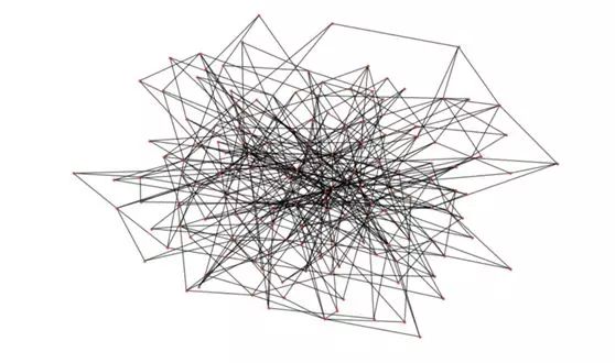 Barabasi Albert diagram
It can be seen that the degree of some nodes is obviously much more than that of other nodes!
Degree distribution
Let pk be the probability that the degree of randomly selected nodes is k. Then the degree distribution follows the power law:
 Power law degree distribution
This distribution is a heavy tailed distribution. Many nodes have low degrees, but a considerable number of nodes have high degrees.
degree_freq = np.array(nx.degree_histogram(G_barabasi)).astype('float')
plt.figure(figsize=(12, 8))
plt.stem(degree_freq)
plt.ylabel("Frequence")
plt.xlabel("Degree")
plt.show()
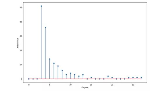 Degree distribution
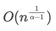
It is said that this distribution is scale-free, and the average degree can not provide any information.
descriptive statistics
- If α ≤ 2, the average degree is a constant, otherwise it will diverge.
- The maximum is in the following order:
# Get the list of the degrees
degree_sequence_erdos = list(G_erdos.degree())

nb_nodes = n
nb_arr = len(G_erdos.edges())

avg_degree = np.mean(np.array(degree_sequence_erdos)[:,1])
med_degree = np.median(np.array(degree_sequence_erdos)[:,1])

max_degree = max(np.array(degree_sequence_erdos)[:,1])
min_degree = np.min(np.array(degree_sequence_erdos)[:,1])

esp_degree = (n-1)*p

print("Number of nodes : " + str(nb_nodes))
print("Number of edges : " + str(nb_arr))

print("Maximum degree : " + str(max_degree))
print("Minimum degree : " + str(min_degree))

print("Average degree : " + str(avg_degree))
print("Expected degree : " + str(esp_degree))
print("Median degree : " + str(med_degree))
The results are similar to the following:
Number of nodes : 200
Number of edges : 3949
Maximum degree : 56
Minimum degree : 25
Average degree : 39.49
Expected degree : 39.800000000000004
Median degree : 39.5
summary
We introduced the main graph types and the most basic attributes used to describe graphs. In the next article, we will delve into graph analysis / algorithms and the different methods used to analyze graphs. The diagram can be used to:
- Real time fraud detection
- Real time recommendation
- Streamline compliance
- Management and monitoring of complex networks
- Identity and access management
- Social apps / features