Basic use of matplotlib
- Initial knowledge of matplotlib
- Basic usage of matplotlib
- figure image of matplotlib
- matplotlib sets coordinate axis 1
- matplotlib sets coordinate axis 2
- matplotlib sets legend Legend Legends
- matplotlib sets annotation annotation annotation
- Scatter scatter plot
- bar histogram
- countours contour map
- 3D Data Map
- Secondary coordinate axis
Initial knowledge of matplotlib
Matplotlib is Python's drawing library. It can be used with NumPy, providing an effective open source alternative to MatLab.
It can also be used with graphical toolkits such as PyQt and wxPython.
Introducing matplotlib module
import pandas as pd
import numpy as np
import matplotlib.pyplot as plt
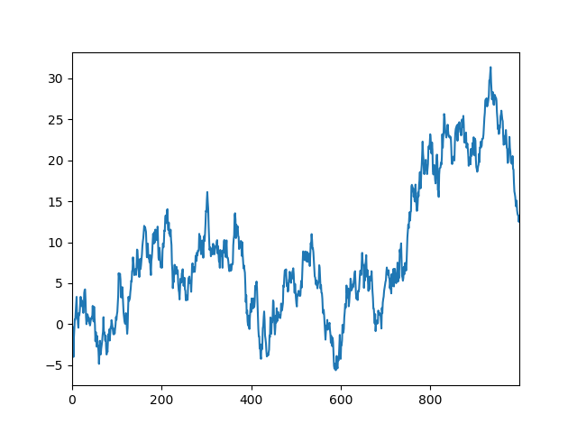
Series linear data
#Series linear data
data = pd.Series(np.random.randn(1000),index=np.arange(1000))
data = data.cumsum()		#accumulation
data.plot()
plt.show()
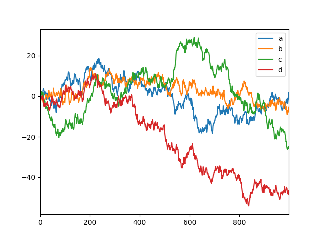
DataFrame Matrix Data
#DataFrame Matrix Data
data = pd.DataFrame(np.random.randn(1000,4),index=np.arange(1000),columns=list("abcd"))
data = data.cumsum()
data.plot()
plt.show()
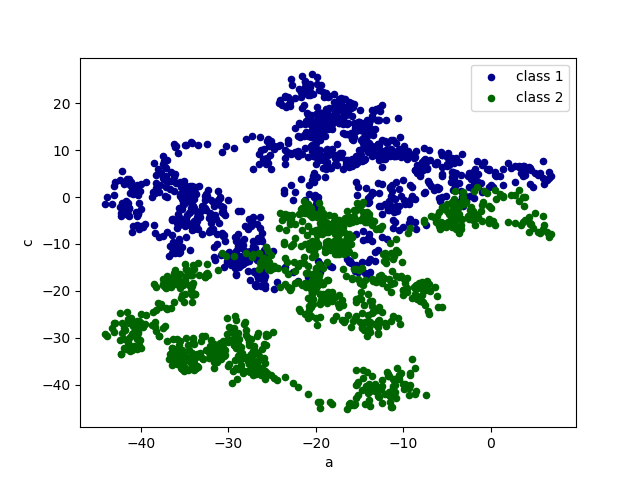
Scatter scatter scatter data
#Scatter scatter scatter data
data = pd.DataFrame(np.random.randn(1000,4),index=np.arange(1000),columns=list("abcd"))
data = data.cumsum()

ax = data.plot.scatter(x='a',y='b',color='DarkBlue',label='class 1')
data.plot.scatter(x='a',y='c',color='DarkGreen',label='class 2',ax=ax)
plt.show()
Basic usage of matplotlib
x = np.linspace(-1,1,50)	#- Divide 50 copies equally between 1 and 1.
y = 2*x+1
plt.plot(x,y)
plt.show()
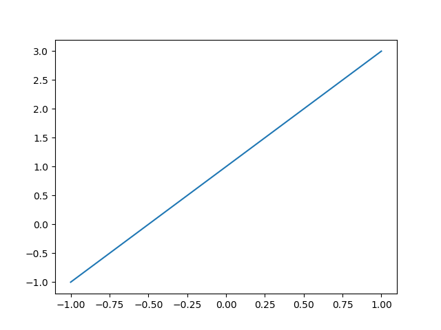
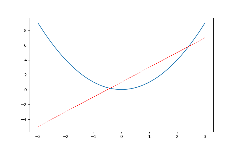
figure image of matplotlib
#One figure and two graphs
x = np.linspace(-3,3,50)
y1 = 2*x+1
y2 = x**2
# plt.figure()							#First chapter
# plt.plot(x,y1)
plt.figure(num=3,figsize=(8,5))			#Second sheets
plt.plot(x,y2)
plt.plot(x,y1,color='red',linewidth=1.0,linestyle='--')
plt.show()
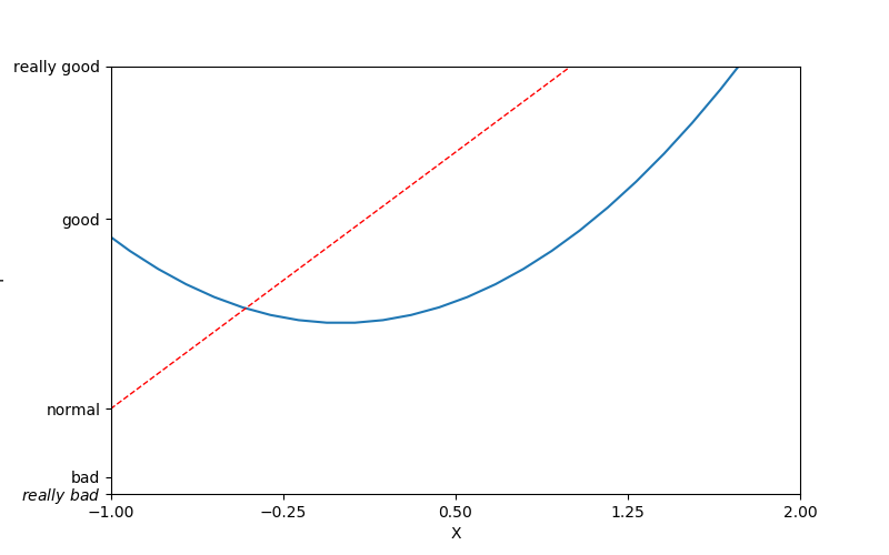
matplotlib sets coordinate axis 1
x = np.linspace(-3,3,50)
y1 = 2*x+1
y2 = x**2
plt.figure(num=3,figsize=(8,5))			#Second sheets
plt.plot(x,y2)
plt.plot(x,y1,color='red',linewidth=1.0,linestyle='--')

plt.xlim((-1,2))		#x axis range
plt.ylim((-2,3))
plt.xlabel('X')			#Representation of the x-axis
plt.ylabel('Y')
new_ticks = np.linspace(-1,2,5)
plt.xticks(new_ticks)
plt.yticks([-2,-1.8,-1,1.22,3],
	[r'$really\ bad$','bad','normal','good','really good'])
plt.show()
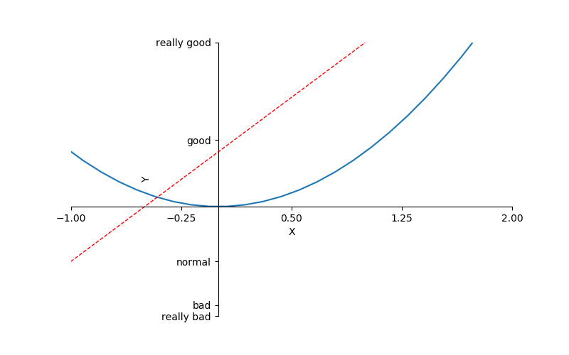
matplotlib sets coordinate axis 2
x = np.linspace(-3,3,50)
y1 = 2*x+1
y2 = x**2
plt.figure(num=3,figsize=(8,5))			#Second sheets
plt.plot(x,y2)
plt.plot(x,y1,color='red',linewidth=1.0,linestyle='--')
plt.xlim((-1,2))
plt.ylim((-2,3))
plt.xlabel('X')
plt.ylabel('Y')
new_ticks = np.linspace(-1,2,5)
print(new_ticks)
plt.xticks(new_ticks)
plt.yticks([-2,-1.8,-1,1.22,3],
	['really bad','bad','normal','good','really good'])

ax = plt.gca()															#gca='get current axis'
ax.spines['right'].set_color('none')				#Cancel the right border
ax.spines['top'].set_color('none')				#Cancel the upper border
ax.xaxis.set_ticks_position('bottom')		#The left border is set to the x-axis
ax.yaxis.set_ticks_position('left')				#The lower border is set to the y-axis
ax.spines['bottom'].set_position(('data',0))	#The x-axis is at 0 of the ordinate.
ax.spines['left'].set_position(('data',0))		#The y-axis is on 0 of the ordinate.
plt.show()
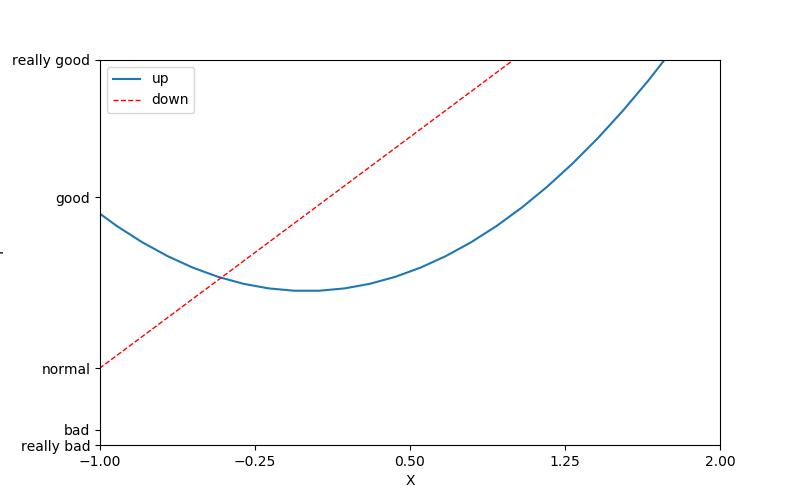
matplotlib sets legend Legend Legends
x = np.linspace(-3,3,50)
y1 = 2*x+1
y2 = x**2
plt.figure(num=3,figsize=(8,5))
plt.xlim((-1,2))
plt.ylim((-2,3))
plt.xlabel('X')
plt.ylabel('Y')
new_ticks = np.linspace(-1,2,5)
print(new_ticks)
plt.xticks(new_ticks)
plt.yticks([-2,-1.8,-1,1.22,3],
	['really bad','bad','normal','good','really good'])
plt.plot(x,y2,label='up')			#label: Represents Legends
plt.plot(x,y1,color='red',linewidth=1.0,linestyle='--',label='down')
plt.legend(loc='best')		#Legend
plt.show()
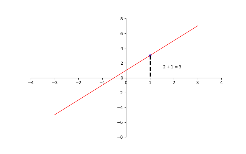
matplotlib sets annotation annotation annotation
x = np.linspace(-3,3,50)
y1 = 2*x+1
plt.figure(num=3,figsize=(8,5))			#Second sheets
plt.plot(x,y1,color='red',linewidth=1.0)
plt.xlim((-4,4))
plt.ylim((-8,8))
ax = plt.gca()
ax.spines['right'].set_color('none')		#Cancel the right border
ax.spines['top'].set_color('none')			#Cancel the upper border
ax.xaxis.set_ticks_position('bottom')
ax.yaxis.set_ticks_position('left')
ax.spines['bottom'].set_position(('data',0))
ax.spines['left'].set_position(('data',0))

x0 = 1
y0 = 2*x0+1
plt.scatter(x0,y0,s=20,color='b')		#Draw points
plt.plot([x0,x0],[y0,0],'k--',lw=2.5)	#Draw line

plt.annotate(r'$2+1=%s$'%y0,xy=(x0,y0),
	xycoords='data',xytext=(+30,-30),textcoords='offset points')
plt.show()
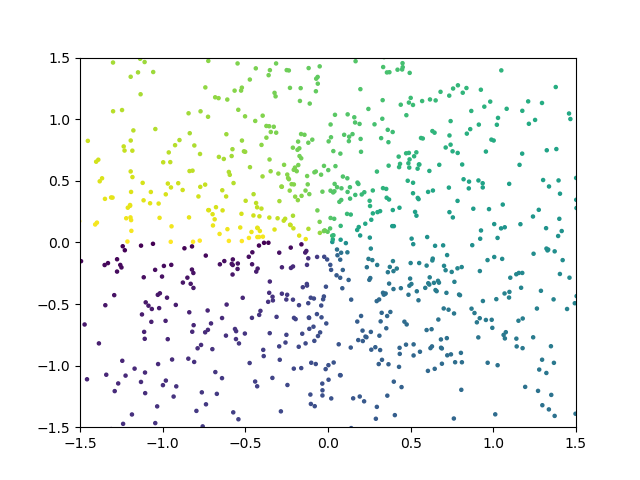
Scatter scatter plot
n=1024
X=np.random.normal(0,1,n)
Y=np.random.normal(0,1,n)
T=np.arctan2(Y,X)			#Set color

plt.scatter(X,Y,s=5,c=T,alpha=1)	#s: for size, alpha: for transparency
plt.ylim((-1.5,1.5))
plt.xlim((-1.5,1.5))
plt.show()
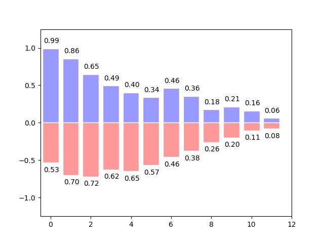
bar histogram
n=12
X=np.arange(n)
Y1=(1-X/float(n))*np.random.uniform(0.5,1.0,n)
Y2=(1-X/float(n))*np.random.uniform(0.5,1.0,n)
plt.bar(X,+Y1,facecolor='#9999ff',edgecolor='white')
plt.bar(X,-Y2,facecolor='#ff9999',edgecolor='white')
for x,y in zip(X,Y1):
	plt.text(x+0.04,y+0.05,'%.2f'%y,ha='center',va='bottom')	#ha: Horizontal, va: Longitudinal
for x,y in zip(X,Y2):
	plt.text(x+0.04,-y-0.05,'%.2f'%y,ha='center',va='top')
plt.ylim((-1.25,1.25))
plt.xlim((-.5,n))
plt.show()
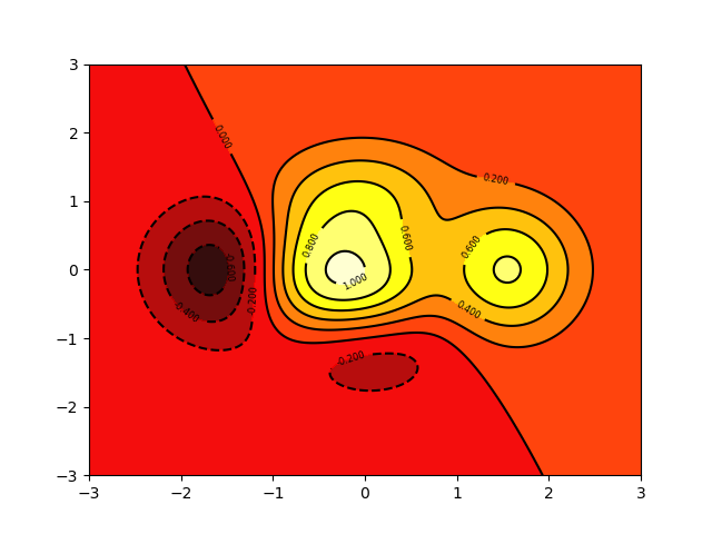
countours contour map
def f(x,y):
    return (1-x/2+x**5+y**3)*np.exp(-x**2-y**2)

n=256
x = np.linspace(-3,3,n)
y = np.linspace(-3,3,n)
X,Y = np.meshgrid(x,y)		#Background Graphics Meshing
plt.contourf(X,Y,f(X,Y),8,alpha=0.95,cmap=plt.cm.hot)	#cmap:colormap
C = plt.contour(X,Y,f(X,Y),8,colors='black',linewidth=.5)	#Setting contours
plt.clabel(C,inline=True,fontsize=6)		#Numbers on contours
plt.show()
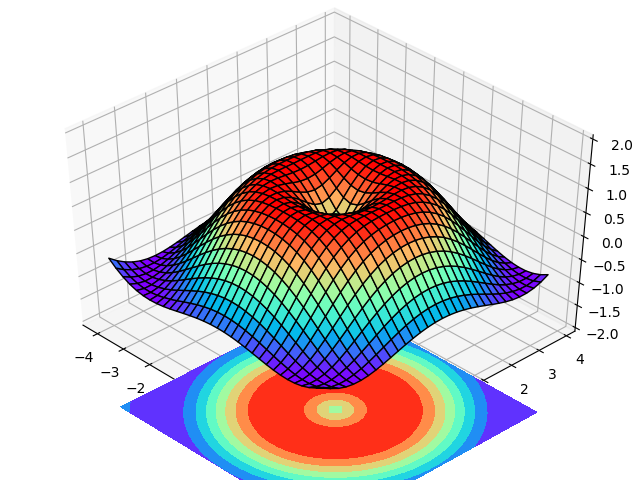
3D Data Map
from mpl_toolkits.mplot3d import Axes3D

fig = plt.figure()			#fig is a window
ax = Axes3D(fig)			#Windows of 3D
X = np.arange(-4,4,0.25)
Y = np.arange(-4,4,0.25)
X,Y = np.meshgrid(X,Y)
R = np.sqrt(X**2+Y**2)
Z = np.sin(R)
ax.plot_surface(X,Y,Z,rstride=1,cstride=1,
	cmap=plt.get_cmap('rainbow'),edgecolor='black')
#Span across rstride, camp color
ax.contourf(X,Y,Z,zdir='z',offset=-4,cmap='rainbow')
ax.set_zlim(-2,2)
plt.show()
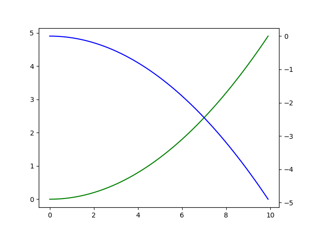
Secondary coordinate axis
x = np.arange(0,10,0.1)
y1 = 0.05*x**2
y2 = -y1

fig,ax1 = plt.subplots()
ax2 = ax1.twinx()
ax1.plot(x,y1,'g-')
ax2.plot(x,y2,'b-')

plt.show()