BFC
Block Formatting Context (BFC) is a part of the visual CSS rendering of Web pages. It is the area where the layout process of block boxes occurs and where floating elements interact with other elements. In other words, elements with BFC characteristics can be regarded as isolated independent containers. The elements in the container will not affect the external elements in layout, and BFC has some characteristics that ordinary containers do not have.
BFC is a hidden attribute, which cannot be opened by general methods
Method of opening BFC
- body root element
- Floating elements: float values other than none
- Absolute positioning element: position (absolute, fixed)
- display is inline block, table cells and flex
- overflow values other than visible (hidden, auto, scroll)
The most methods can refer to: Introduction to BFC in MDN
Characteristics of BFC (from csdn)
-
The inner boxes will be placed vertically, one by one.
-
The vertical distance of boxes is determined by margin. The margins of two adjacent boxes belonging to the same BFC will overlap.
-
The left side of the margin box of each box (block box and row box) contacts the left side of the containing block border box (for left to right formatting, otherwise the opposite). This is true even if there is floating.
-
The area of the BFC does not overlap the float box.
-
BFC is an isolated container on the page. The child elements in the container will not affect the external elements. Vice versa.
-
When calculating the height of BFC, floating elements also participate in the calculation.
Role of BFC
1. Solve the problem of merging outer margins
In general, we set a lower outer margin and an upper outer margin for two adjacent boxes. They are not added, but take the maximum value.
CSS Style
.box1 {
           width: 100px;
           height: 100px;
           background-color: red;
           margin-bottom: 100px;
       }
       .box2 {
           width: 100px;
           height: 100px;
           background-color: orange;
           margin-top: 120px;
       }
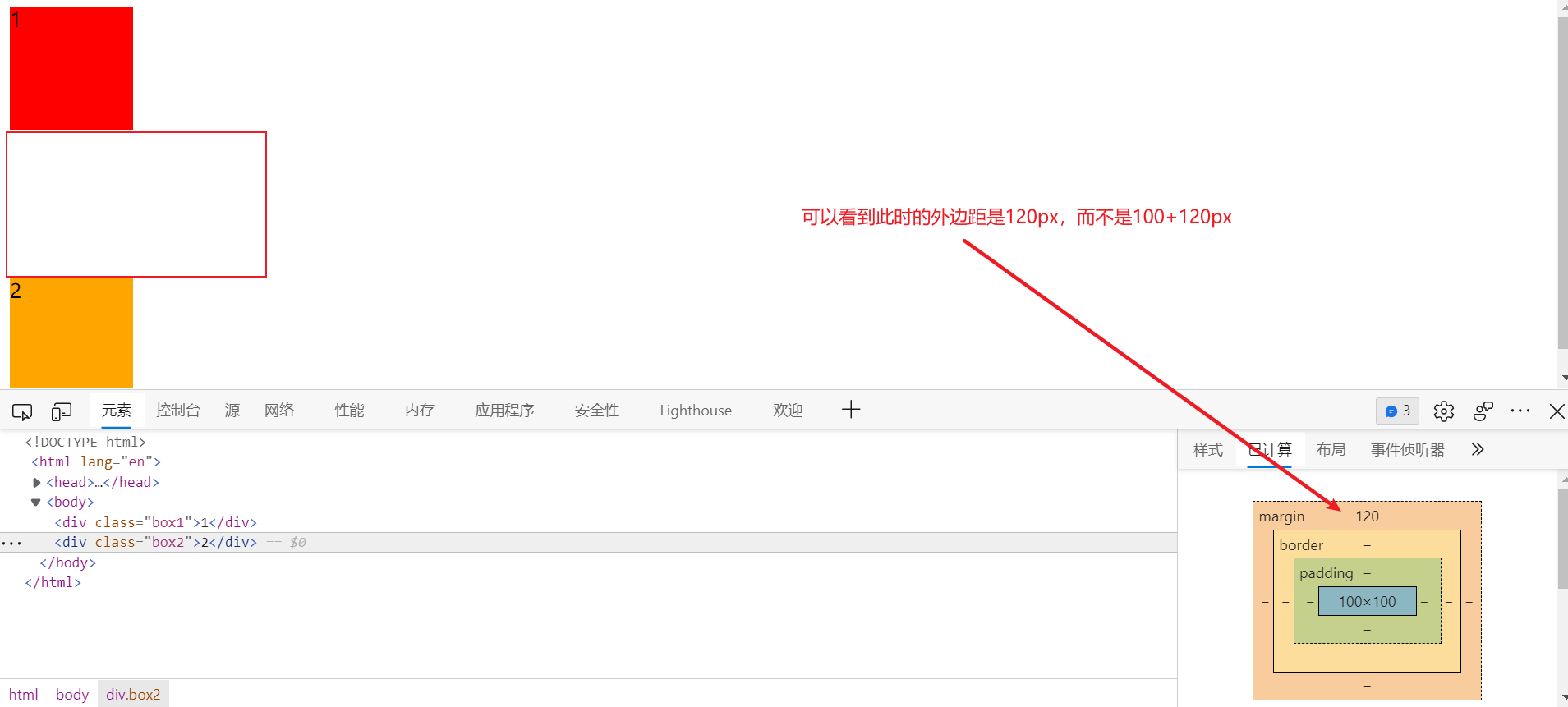
If we want to avoid this problem, we can put two div s into two containers respectively
<!DOCTYPE html>
<html lang="en">
<head>
   <meta charset="UTF-8">
   <meta http-equiv="X-UA-Compatible" content="IE=edge">
   <meta name="viewport" content="width=device-width, initial-scale=1.0">
   <title>Document</title>
   <style>
       .container {
           overflow: hidden;
       }
       .box1 {
           width: 100px;
           height: 100px;
           background-color: red;
           margin-bottom: 100px;
       }
       .box2 {
           width: 100px;
           height: 100px;
           background-color: orange;
           margin-top: 120px;
       }

   </style>
</head>
<body>
   <div class="container"><div class="box1">1</div></div>
   <div class="container"><div class="box2">2</div></div>
</body>
</html>
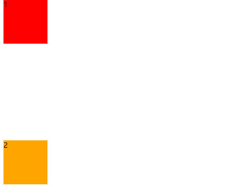
2. Solve the problem of external distance collapse
Set an upward outer margin for box, but it is not separated from box1.
<!DOCTYPE html>
<html lang="en">
<head>
    <meta charset="UTF-8">
    <meta http-equiv="X-UA-Compatible" content="IE=edge">
    <meta name="viewport" content="width=device-width, initial-scale=1.0">
    <title>Document</title>
    <style>

        .box1 {
            width: 200px;
            height: 200px;
            background-color: red;

        }
        .box2 {
            width: 100px;
            height: 100px;
            background-color: orange;
            margin-top: 100px;
        }

    </style>
</head>
<body>
    <div class="box1">
        <div class="box2"></div>
    </div>
</body>
</html>
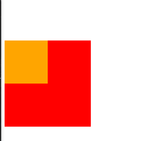
Set box1 to BFC
.box1 {
            width: 200px;
            height: 200px;
            background-color: red;
            overflow: hidden;
        }

3. Solve the problem of high collapse
When the parent box has no height and the child element floats, the floating element will break away from the normal flow, and the parent box will have no content, that is, it will no longer have height. This is to be clear. Here, the method of opening BFC is used.

.box1 {
            border: 10px solid red;
            overflow: hidden;
        }

4. BFC elements will not be overwritten by floating elements
box1 floats to the left, overwriting box2.

.box1 {
            width: 100px;
            height: 100px;
            background-color: red;
            float: left;
        }
        .box2 {
            width: 100px;
            height: 100px;
            background-color: orange;
            overflow: hidden;
        }

5. Two column adaptive layout
<!DOCTYPE html>
<html lang="en">
<head>
    <meta charset="UTF-8">
    <meta name="viewport" content="width=device-width, initial-scale=1.0">
    <meta http-equiv="X-UA-Compatible" content="ie=edge">
    <title>Document</title>
</head>
<style>
    .left {
        width: 100px;
        height: 150px;
        float: left;
        background-color: red;
    }

    .right {
        overflow: hidden;
        height: 300px;
        background-color: orange;
    }
</style>
<body>
    <div class="left">LEFT</div>
    <div class="right">RIGHT</div>
</body>
</html>
Clear floating height collapse
In addition to the initial use of the above methods to start BFC, there are many clear floating methods.
- Additional labeling method, also known as partition method, is recommended by W3C.
- The method of adding overflow to the parent.
- Add an after pseudo element to the parent.
- Adds a double pseudo element to the parent.
<!DOCTYPE html>
<html lang="en">
<head>
    <meta charset="UTF-8">
    <meta name="viewport" content="width=device-width, initial-scale=1.0">
    <meta http-equiv="X-UA-Compatible" content="ie=edge">
    <title>Document</title>
    <style>
        .box1{
            border: 10px red solid;

            /* overflow: hidden; */
        }

        .box2{
            width: 100px;
            height: 100px;
            background-color: #bfa;
            float: left;
        }

        .box3{ /*Additional labels*/
            clear: both;
        }

        .box1::after{
            content: '';
            display: block;
            clear: both;
        }

    </style>
</head>
<body>

    <div class="box1">
        <div class="box2"></div>
        <!-- <div class="box3"></div> -->
    </div>

</body>
</html>
Additional labeling method
The extra tag method is to add an empty tag at the end of the floating element
<div style='clear: both'><div>
Advantages: simple
Disadvantages: add meaningless labels and poor structure.
Note: the empty tag here must be an element in the block.
Summary: the essence of clearing floating: clearing the impact of floating elements leaving the standard flow.
Add overflow to parent
You can add the overflow attribute to the parent and set its attribute value to hidden, auto, scroll
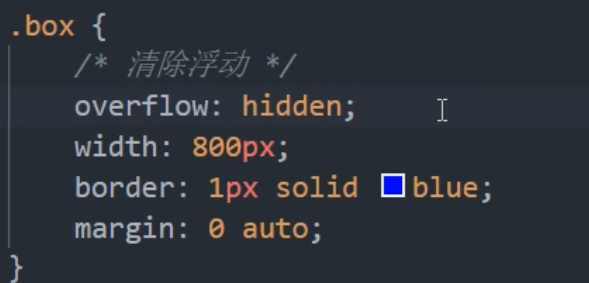
Advantages: simple code
Disadvantages: overflow parts cannot be displayed.
: after pseudo element method
: after mode is an upgraded version of additional tags. It is also added to the element.
.clearfix:after {
	content:'';
	display: block;
	height: 0;
	clear: both;
	visibility: hidden;
}
.clearfix:after {
	/*IE6,7 proper*/
	*zoom: 1;
}
Insert boxes in the back (so it's an upgrade of the additional labeling method)

Advantages: no additional labels are added, and the structure is simple
Disadvantages: take care of lower versions of browsers
Double pseudo element clear float
/*Shang Silicon Valley version*/
<!DOCTYPE html>
<html lang="en">
<head>
    <meta charset="UTF-8">
    <meta name="viewport" content="width=device-width, initial-scale=1.0">
    <meta http-equiv="X-UA-Compatible" content="ie=edge">
    <title>Document</title>
    <style>
        .box1{
            width: 200px;
            height: 200px;
            background-color: #bfa;
        }

        /* .box1::before{
            content: '';
            display: table;
        } */

        .box2{
            width: 100px;
            height: 100px;
            background-color: orange;
            margin-top: 100px;
        }

/* clearfix This style can solve the problems of height collapse and outer margin overlap at the same time. When you encounter these problems, you can directly use the clearfix class */
        .clearfix::before,
        .clearfix::after{
            content: '';
            display: table;
            clear: both;
        }
    </style>
</head>
<body>

    <div class="box1 clearfix">
        <div class="box2"></div>
    </div>

</body>
</html>
Add to parent element
.clearfix:before,.clearfix:after{
	content:"";
	display: block;
}
.clearfix:after{
	clear: both;
}
.clearfix{
	zoom:1;
}
Insert the box in front and back

Clear the final method of floating and outer margin merging
/* clearfix This style can solve the problems of height collapse and outer margin overlap at the same time. When you encounter these problems, you can directly use the clearfix class */
        .clearfix::before,
        .clearfix::after{
            content: '';
            display: table;
            clear: both;
        }