Author: Peter Editor: Peter
Hello, I'm Peter~
Today, I will bring you a new practical case of kaggle data analysis: London bicycle demand forecasting analysis based on long-term and short-term memory network (LSTM) model. Two highlights of this article:
- Advanced visualization: This paper uses seaborn for visual exploration and analysis, with exquisite charts, diversified analysis dimensions and clear conclusions
- Using LSTM model: the use of long-term and short-term network model makes the results more valuable and referential

This is a third ranking scheme:

Interested can refer to the original notebook address for learning:
https://www.kaggle.com/yashgoyal401/advanced-visualizations-and-predictions-with-lstm/notebook
There is another similar article:
https://www.kaggle.com/geometrein/helsinki-city-bike-network-analysis
Article steps
The following are the main steps in the original text: data information, feature engineering, data EDA, preprocessing, model construction, demand prediction and evaluation model

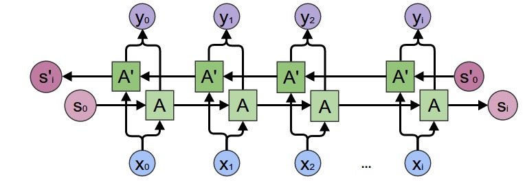
LSTM model
This paper focuses on the use of LSTM model. LSTM is a time recurrent neural network, which is suitable for processing and predicting important events with relatively long interval and delay in time series.
The strength of Xiaobian is limited, and the principle of the model is explained in detail. Reference books and articles:
1. Excellent book: Long Short Term Memory Networks with Python is the work of Jason Brownlee, an Australian machine learning expert
2. Zhihu article: https://zhuanlan.zhihu.com/p/24018768
3. Station B: search the explanation of leader Li Mu about LSTM

If you have strength in the future, you must write an article on the principle of LSTM~
Study together! Roll it!
data
Import library
import pandas as pd
import numpy as np

# seaborn visualization
import seaborn as sns
import matplotlib.pyplot as plt
sns.set(context="notebook", style="darkgrid",
        palette="deep", font="sans-serif",
        font_scale=1, color_codes=True)

# Ignore warning
import warnings
warnings.filterwarnings("ignore")
Read data
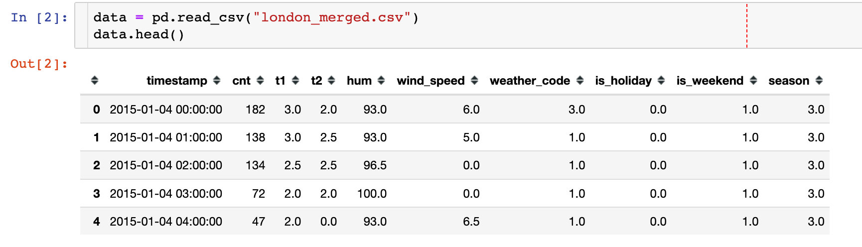
essential information:
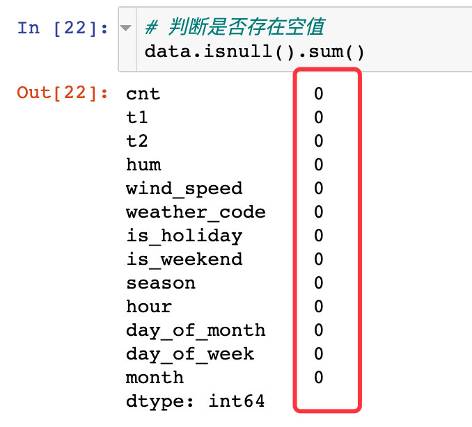
# 1. Data volume
data.shape

(17414, 10)

# 2. Data field type
data.dtypes

timestamp        object
cnt               int64
t1              float64
t2              float64
hum             float64
wind_speed      float64
weather_code    float64
is_holiday      float64
is_weekend      float64
season          float64
dtype: object
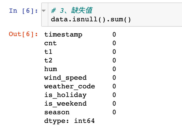
There are no missing values in the data:
Field meaning
Explain the meaning of the fields in the following data:
- Timestamp: timestamp field used to group data
- cnt: new bike share count
- t1: actual temperature in C
- t2: temperature in C "feels like", subjective feeling
- hum: humidity percentage
- windspeed: wind speed, in km / h
- weathercode: weather category; (see the last in the figure below for specific values)
- Ishholiday: Boolean field, 1-holiday, 0-non holiday
- isweekend: Boolean field; 1 if the day is weekend
- Season: category meteorological season: 0 - spring; 1 - summer; 2 - autumn; 3 - winter

TensorFlow basic information
View the GPU information and version of TensorFlow:

Characteristic Engineering
The following describes the implementation of Feature Engineering in this paper:
Data information
The info information of a DataFrame can display many basic information, such as field name, non empty quantity, data type and so on

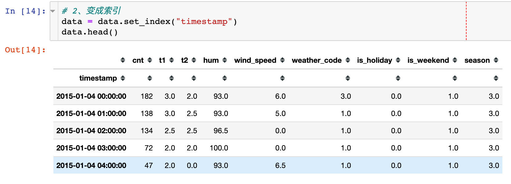
Time field processing
Process the time related fields in the original data:
1. Convert timestamp to time type
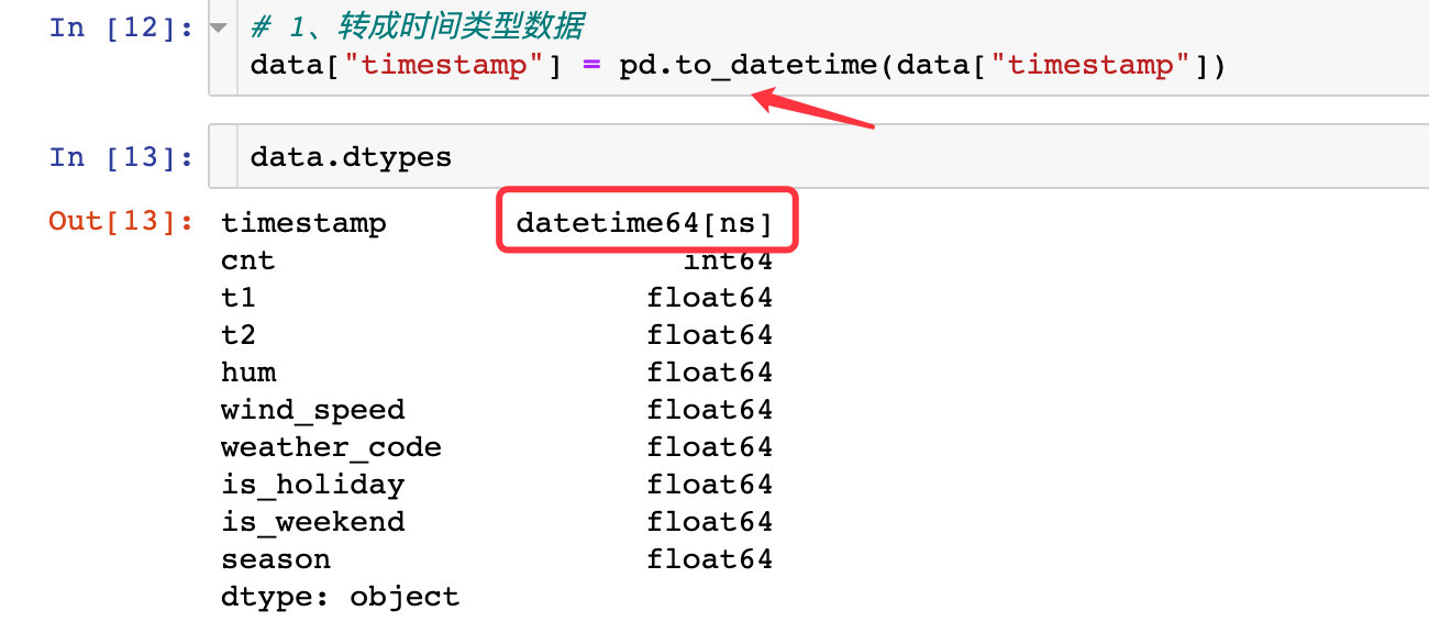
2. Convert to index
Use set_ The index method converts the timestamp attribute to an index
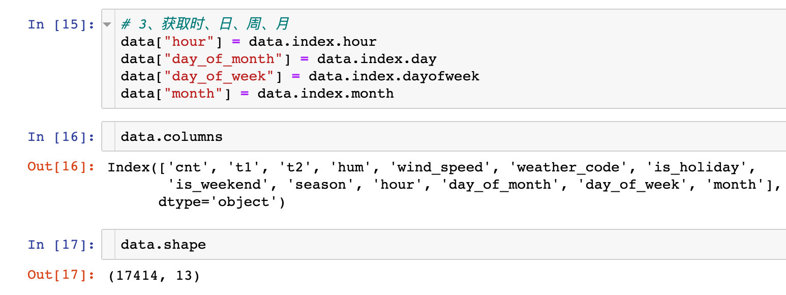
3. When extracting, the day, week, month and other information of a month
Extract multiple information related to time and view the shape of the data at the same time
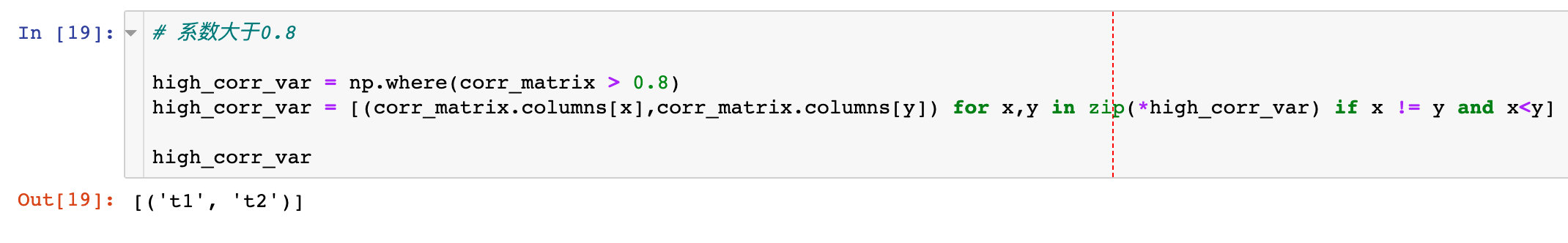
Correlation coefficient analysis
1. The absolute value is obtained from the correlation coefficient

2. The correlation coefficient between filtering two attributes is greater than 0.8
Data EDA
Correlation coefficient thermodynamic diagram
plt.figure(figsize=(16,6))

sns.heatmap(data.corr(),
            cmap="YlGnBu",  # Color system
            square=True,  # square
            linewidths=.2,
            center=0,
            linecolor="red"  # line color
           )

plt.show()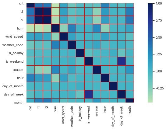
Through the thermodynamic diagram, we find that the correlation coefficients of t1 and t2 are relatively high, which is consistent with the above conclusion that the coefficient between attributes is greater than 0.8
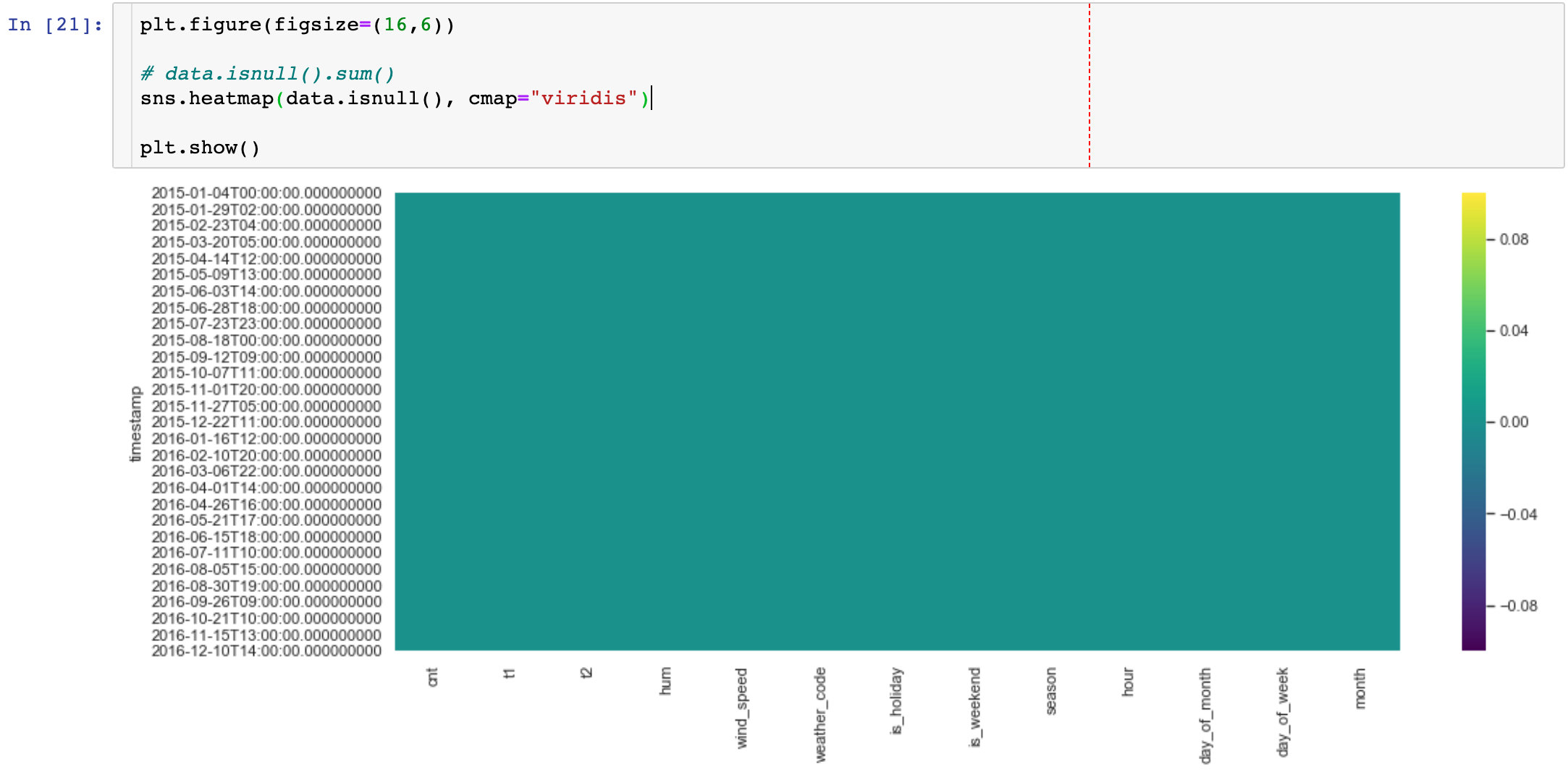
Null value judgment
About how to judge whether there is a null value in a piece of data, the common methods used by the editor are as follows:
The method used in this paper is: Based on the thermal diagram display. There is no information in the graph, indicating that there is no null value in the data
Demand change
The relationship between the overall demand cnt and time:
plt.figure(figsize=(15,6))

sns.lineplot(data=data,  # incoming data
             x=data.index,  # time
             y=data.cnt  # requirement
            )

plt.xticks(rotation=90)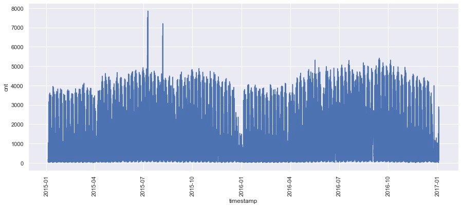
From the graph above, we can see the demand change under the overall date.
Sample by month
The sampling function in pandas uses resample, and the frequency can be day, week, month, etc
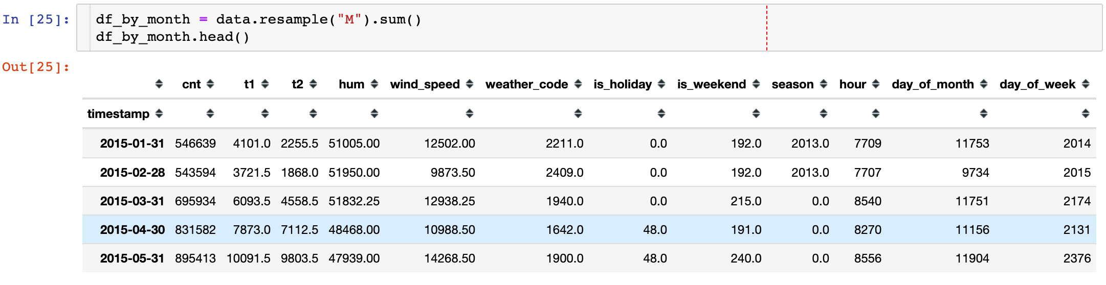
Check the change of monthly demand over time:
plt.figure(figsize=(16,6))

sns.lineplot(data=df_by_month,
             x=df_by_month.index,
             y=df_by_month.cnt,
             color="red"
            )

plt.xticks(rotation=90)

plt.show()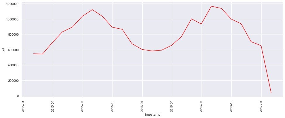
The following three conclusions can be observed from the figure:
- From the beginning of the year to July and August, the demand showed an upward trend
- It reached a certain peak in August
- After August, demand began to decline
Hourly demand
plt.figure(figsize=(16,6))

sns.pointplot(data=data,  # data
              x=data.hour,  # hour
              y=data.cnt,  # requirement
              color="red"  # colour
             )

plt.show()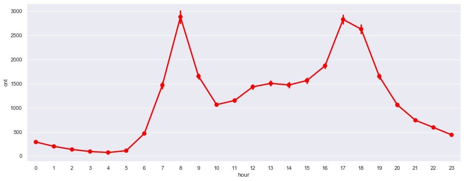
Monthly demand comparison
plt.figure(figsize=(16,6))

sns.pointplot(data=data,
              x=data.month,
              y=data.cnt,
              color="red"
             )
plt.show()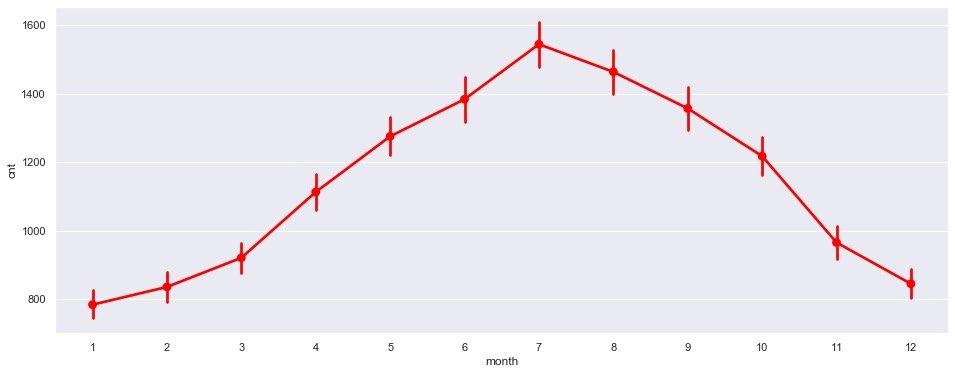
Obvious conclusion: July is the peak of demand
Statistics by week
plt.figure(figsize=(16,6))

sns.pointplot(data=data,
              x=data.day_of_week,
              y=data.cnt,
              color="black")

plt.show()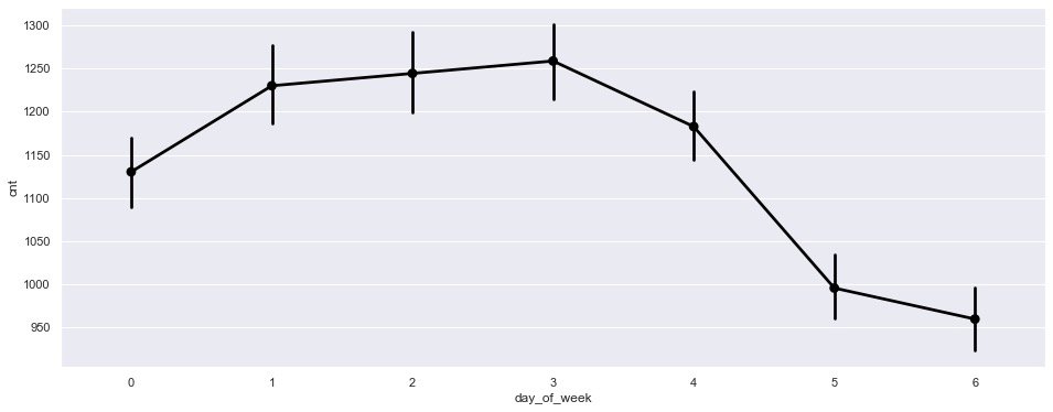
It is observed from the figure that:
- The demand from Monday to Friday is significantly higher than that on weekends;
- Meanwhile, it showed a downward trend on Friday
According to natural day
plt.figure(figsize=(16,6))

sns.lineplot(
  data=data,
  x=data.day_of_month,  # One day in a month
  y=data.cnt,  # requirement
  color="r")

plt.show()
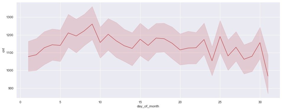
3 conclusions:
- The demand is gradually increasing in the first 10 days
- There are some small fluctuations in the middle 10 days
- In the last 10 days, the fluctuation increased and showed a downward trend
Visualization effects in multiple dimensions
Hours based on holidays
plt.figure(figsize=(16,6))

sns.pointplot(data=data,
              x=data.hour,  # Statistics by hour
              y=data.cnt,
              hue=data.is_holiday  # Holiday grouping
             )

plt.show()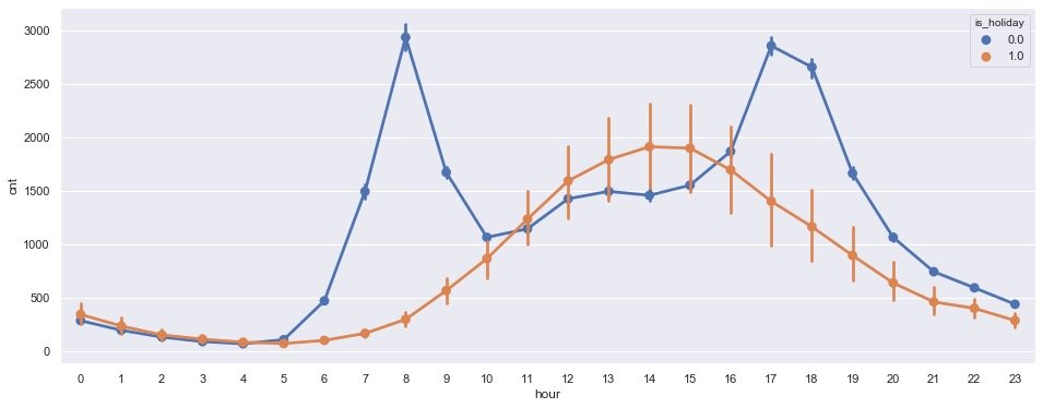
The results presented by the above graphics;
- Non holiday (is_holiday=0): at 8 o'clock and 17 and 18 o'clock in the afternoon, it is the peak time of car use, which happens to be the time of commuting
- In the case of holidays (1): 2-3 p.m. is the real peak period of car use
Month based on holidays
plt.figure(figsize=(16,6))

sns.pointplot(data=data,
              x=data.month,
              y=data.cnt,
              hue=data.is_holiday
             )

plt.show()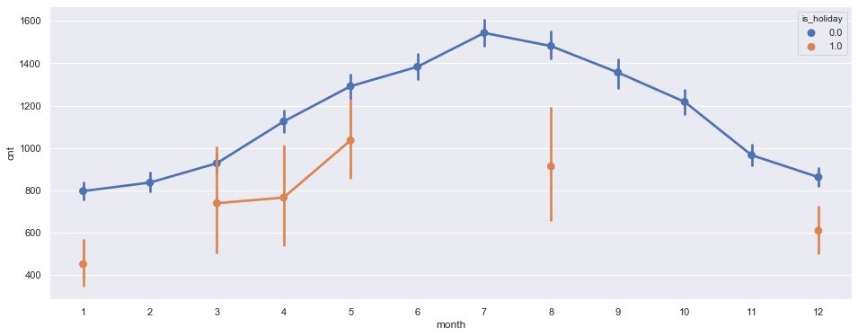
In non holidays, the peak of car use was reached in July
3. According to quarterly statistics
plt.figure(figsize=(16,6))

sns.pointplot(data=data,
              y=data.cnt,
              x=data.month,
              hue=data.season, # Quarterly grouping
             )

plt.show()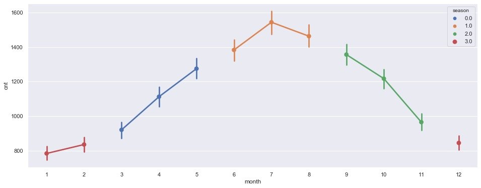
It is observed from the above figure that the third quarter (June – July – August) is the time when the demand for vehicles is the largest
4. Quarter + holiday
plt.figure(figsize=(16,6))

# Group statistics quantity
sns.countplot(data=data,
              x=data.season,
              hue=data.is_holiday,
             )

plt.show()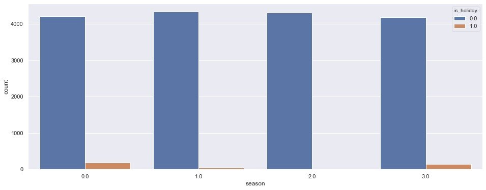
From quarter 1-2-3-4, the overall demand in non holiday quarters 1 and 2 is slightly higher than that in quarter 0 and 3; In holidays, there is a certain demand in the 0-3 quarter
5. Weekend + hours
plt.figure(figsize=(16,6))

sns.lineplot(
    data=data,
    x=data.hour,  # hour
    y=data.cnt,
    hue=data.is_weekend)  # Weekend statistics

plt.show()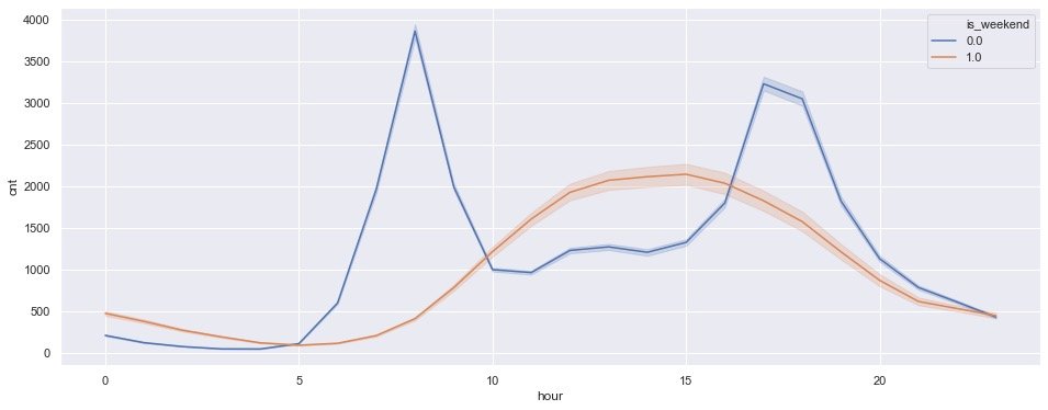
- Non weekend (0): it is still 7-8 a.m. and 17-18 p.m., which are the peak periods of car use
- Weekend (1): the peak time is 14-15 p.m
This conclusion is consistent with the above
6. Quarter + hour
plt.figure(figsize=(16,6))

sns.pointplot(data=data,
              x=data.hour,
              y=data.cnt,
              hue=data.season # Quarterly statistics
             )

plt.show()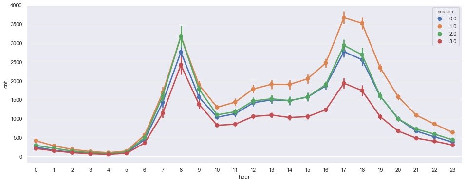
Check the demand of each hour by quarter: the overall trend is roughly the same, reaching the high seal period in the morning around 8 o'clock and another high seal period at 17-18 o'clock in the afternoon (after work)
Weather factors
Relationship between humidity and demand
Observe the change of demand under different humidity:
plt.figure(figsize=(16,6))

sns.pointplot(data=data,
              x=data.hum,
              y=data.cnt,
              color="black")

plt.xticks(rotation=90)

plt.show()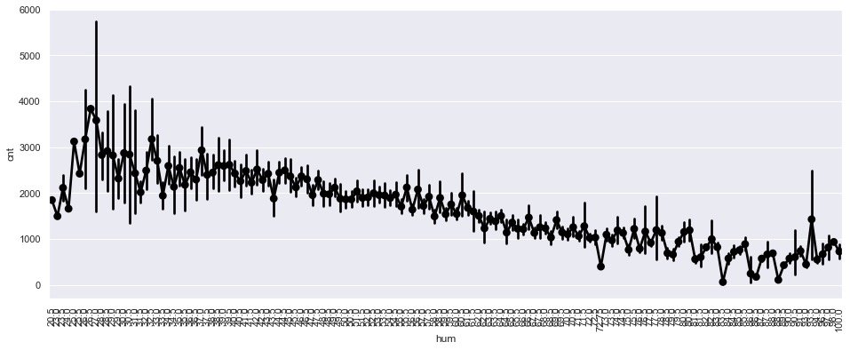
It can be seen that the higher the air humidity, the lower the overall demand
Wind speed and demand
plt.figure(figsize=(16,6))

sns.pointplot(data=data,
              x=data.wind_speed,
              y=data.cnt)

plt.xticks(rotation=90)

plt.show()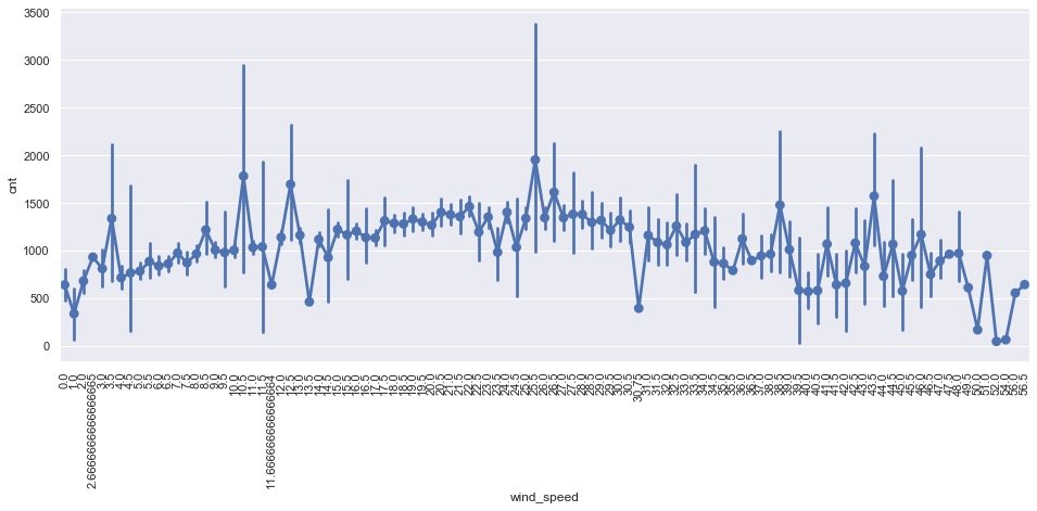
Impact of wind speed on demand:
- There is a local peak when the wind speed is 25.5
- When the wind speed is high or low, the demand decreases
Different weather conditions_ code
plt.figure(figsize=(16,6))

sns.pointplot(data=data,
              x=data.weather_code,
              y=data.cnt)

plt.xticks(rotation=90)

plt.show()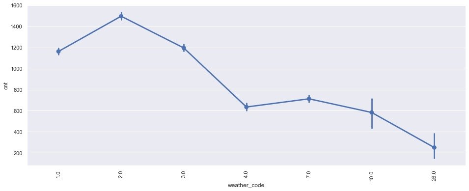
Conclusion: it can be seen that the demand is the largest in the case of scattered couds (weather_code=2)
Weather conditions + hours
plt.figure(figsize=(16,6))

sns.pointplot(data=data,
              x=data.hour,
              y=data.cnt,
              hue=data.weather_code # Sub weather statistics
             )

plt.show()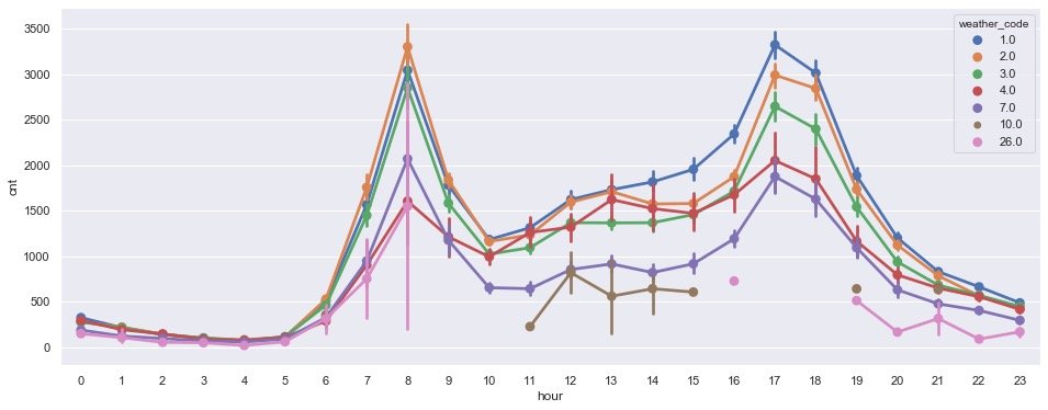
It is observed from the morning that different weather has little impact on the trend of hourly demand, and the demand is still the largest during the rush hour, indicating that workers' travel to work is hardly affected by the weather!!!
Natural days + weather conditions
plt.figure(figsize=(16,6))

sns.countplot(
    data=data,
    x=data.day_of_week,  # What day of the week
    hue=data.weather_code,  # weather condition
    palette="viridis")

plt.legend(loc="best")  # Location selection

plt.show()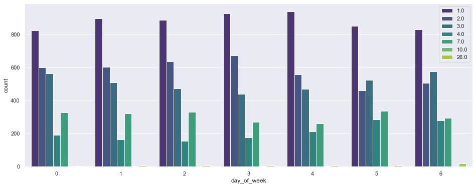
It can be observed from the above figure:
- On different days of the week, the demand under code=1 is the largest
- Demand: Code > 1 to 4 weeks
- By Saturday and Sunday: people pay less attention to the weather when they travel. Except code=1, the demand gap of other weather conditions is also narrowing!
Box diagram
The box chart can reflect the distribution of a set of data
By hour
plt.figure(figsize=(16,6))

sns.boxplot(data=data,
            x=data.hour,  # hour
            y=data.cnt)

plt.show()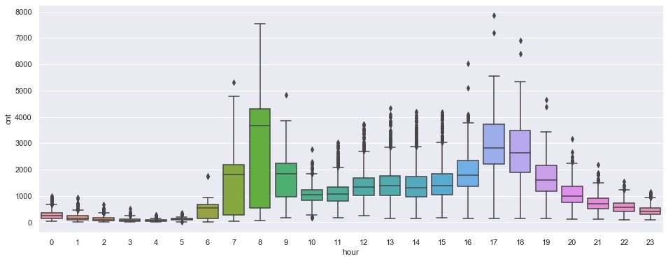
From the distribution of the box chart, it is observed that there are two important time periods: 7-8 a.m. and 17-18 p.m
Day of the week
plt.figure(figsize=(16,6))

sns.boxplot(
    data=data,
    x=data["day_of_week"],
    y=data.cnt)

plt.show()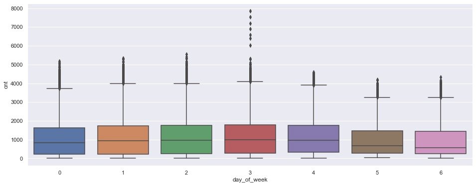
In the box chart based on week, there is a certain rush hour on Wednesday
Natural day of the month
plt.figure(figsize=(16,6))

sns.boxplot(data=data,
            x=data["day_of_month"],
            y=data.cnt)

plt.show()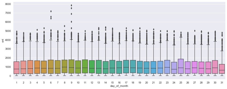
In the case of natural days, there is a peak on the 9th
monthly
plt.figure(figsize=(16,6))

sns.boxplot(data=data,
            x=data["month"],
            y=data.cnt)

plt.show()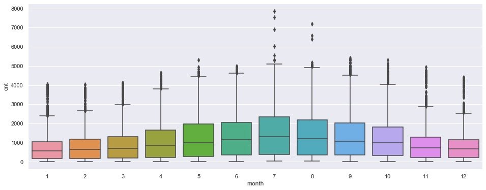
It is obviously observed that there is a certain peak demand from July to August, and the demand on both sides is relatively less
Holiday + day of month
# Are the days and holidays counted in each month

plt.figure(figsize=(16,6))

sns.boxplot(
    data=data,
    x=data["day_of_month"],
    y=data.cnt,
    hue=data["is_holiday"])

plt.show()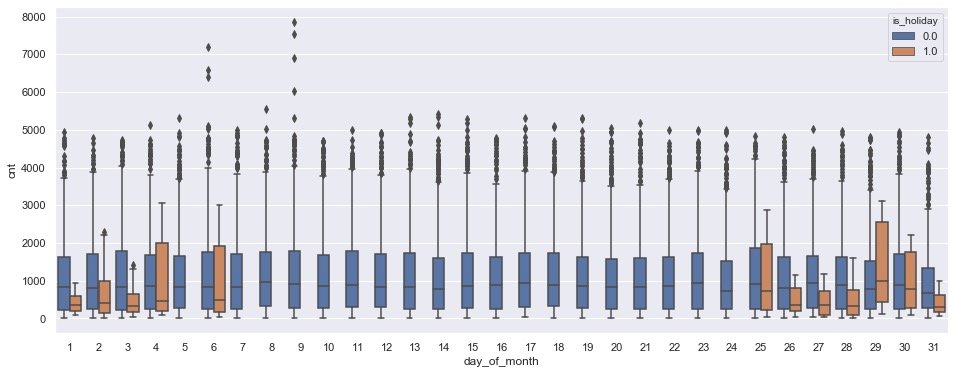
Data preprocessing
Let's start modeling. The first step is data preprocessing, which mainly includes two points:
- Segmentation of data sets
- Data normalization and standardization
Segmentation data
The data set is segmented in a ratio of 9:1:
# Module for segmenting data sets
from sklearn.model_selection import train_test_split
train,test = train_test_split(data,test_size=0.1, random_state=0)
print(train.shape)
print(test.shape)

# ------
(15672, 13)
(1742, 13)
data normalization
from sklearn.preprocessing import MinMaxScaler
# Instantiate object
scaler  = MinMaxScaler()

# Fitting of some fields
num_col = ['t1', 't2', 'hum', 'wind_speed']
trans_1 = scaler.fit(train[num_col].to_numpy())

# Training set conversion
train.loc[:,num_col] = trans_1.transform(train[num_col].to_numpy())
# Test set conversion
test.loc[:,num_col] = trans_1.transform(test[num_col].to_numpy())

# Normalization of label cnt
cnt_scaler = MinMaxScaler()
# data fitting
trans_2 = cnt_scaler.fit(train[["cnt"]])
# Data conversion
train["cnt"] = trans_2.transform(train[["cnt"]])
test["cnt"] = trans_2.transform(test[["cnt"]])
Training set and test set
# Used to display the progress bar
from tqdm import tqdm_notebook as tqdm
tqdm().pandas()

def prepare_data(X, y, time_steps=1):
    Xs = []
    Ys = []

    for i in tqdm(range(len(X) - time_steps)):
        a = X.iloc[i:(i + time_steps)].to_numpy()
        Xs.append(a)
        Ys.append(y.iloc[i + time_steps])

    return np.array(Xs), np.array(Ys)

steps = 24

X_train, y_train = prepare_data(train, train.cnt, time_steps=steps)
X_test, y_test = prepare_data(test, test.cnt, time_steps=steps)

print(X_train.shape)
print(X_test.shape)
print(y_train.shape)
print(y_test.shape)
LSTM modeling
Import library
Import relevant libraries before modeling:
# 1. Import required libraries
from keras.preprocessing import sequence
from keras.models import Sequential
from keras.layers import Dense, Dropout, LSTM, Bidirectional
# 2. Instantiate objects and fit modeling
model = Sequential()
model.add(Bidirectional(LSTM(128,
input_shape=(X_train.shape[1],
X_train.shape[2]))))
model.add(Dropout(0.2))
model.add(Dense(1, activation="sigmoid"))
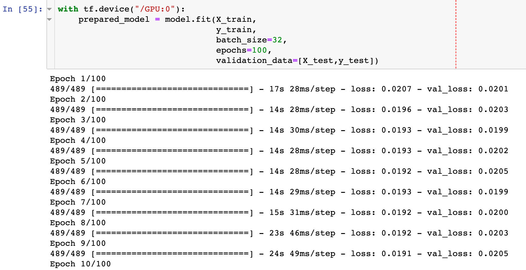
model.compile(optimizer="adam", loss="mse")Model preparation
After the data of the training set is imported, the data fitting and modeling process is carried out:
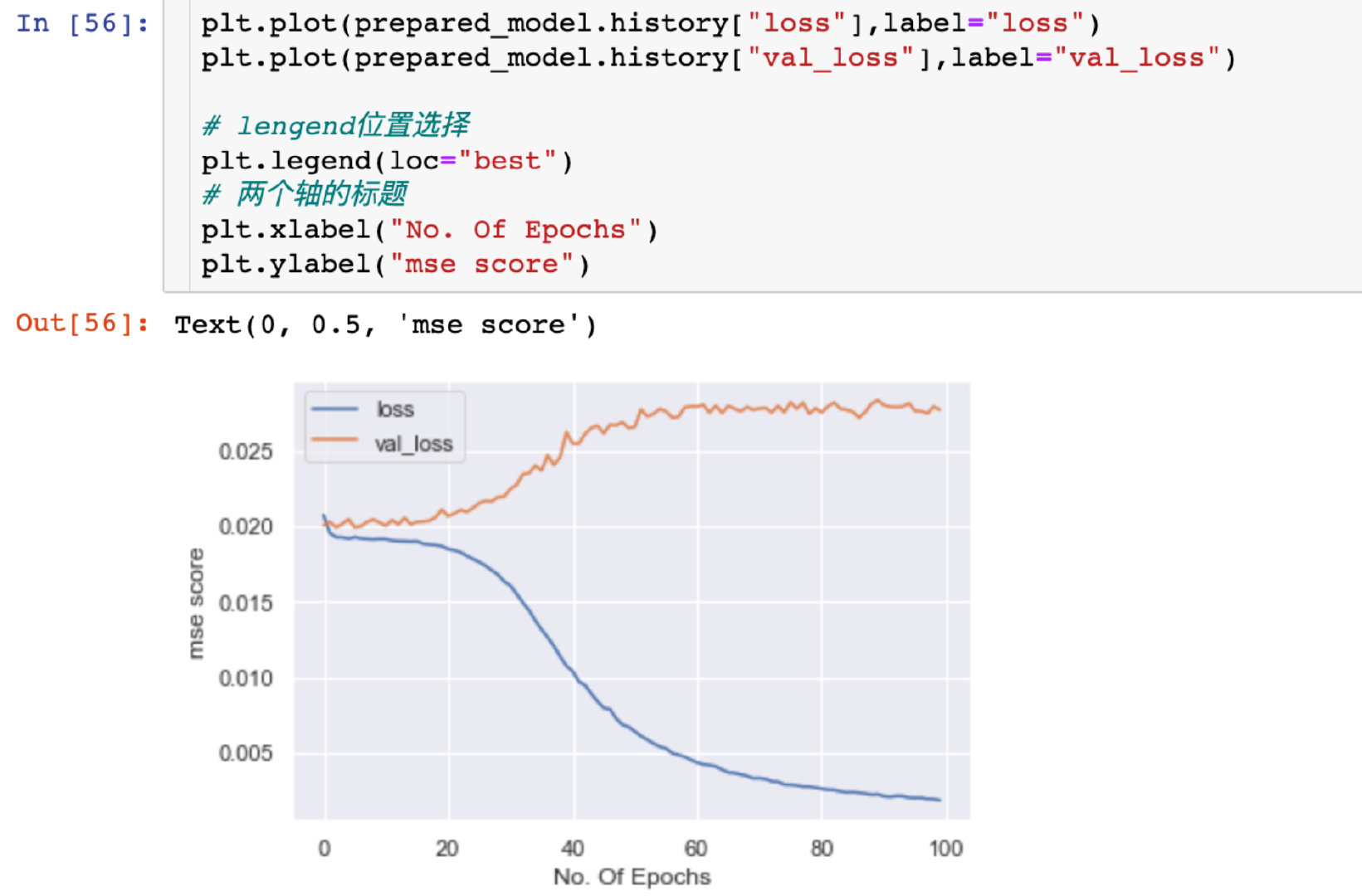
Relationship between mean square deviation and Epoch
Explore the size of mean square deviation under different Epoch:
plt.plot(prepared_model.history["loss"],label="loss")
plt.plot(prepared_model.history["val_loss"],label="val_loss")

# Lengen location selection
plt.legend(loc="best")
# Title of two axes
plt.xlabel("No. Of Epochs")
plt.ylabel("mse score")
Demand forecast
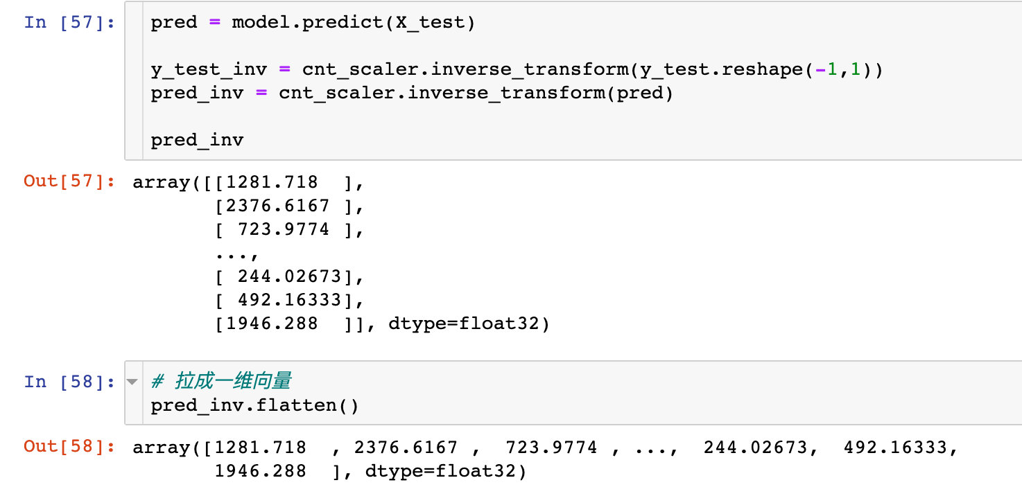
Generate true and predicted values
inverse_ The transform function converts the standardized data into the original data.
pred = model.predict(X_test)  # Prediction of test set
y_test_inv = cnt_scaler.inverse_transform(y_test.reshape(-1,1))  # Transformation data
pred_inv = cnt_scaler.inverse_transform(pred)  # Predicted value conversion
pred_inv
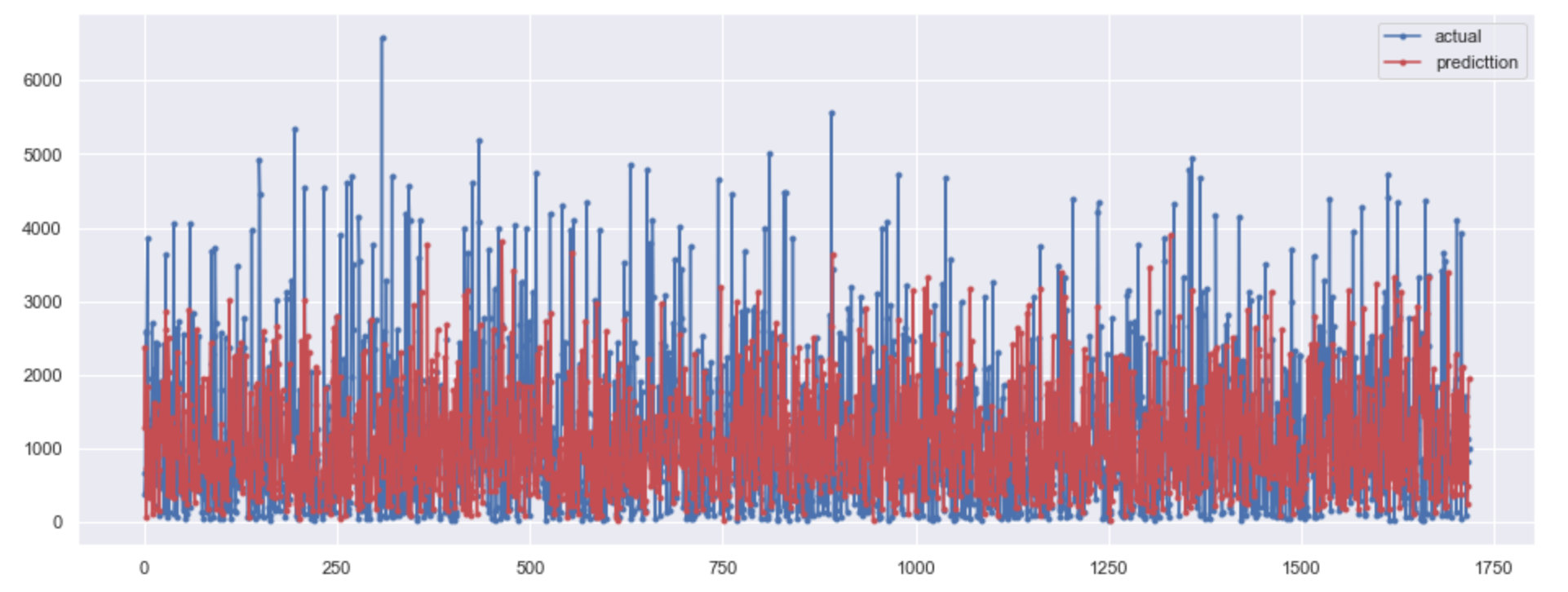
Drawing comparison
Plot and compare the transformed value of the test set with the predicted value based on the model:
plt.figure(figsize=(16,6))

# Test sets: true values
plt.plot(y_test_inv.flatten(), marker=".", label="actual")
# Model predicted value
plt.plot(pred_inv.flatten(), marker=".", label="predicttion",color="r")
# Legend location
plt.legend(loc="best")
plt.show()

Generate data
Compare the real value of the test set with the predicted value and evaluate it through two indicators:
1. The method in the original text (I think it is complicated):
# The process of the original method is complicated

y_test_actual = cnt_scaler.inverse_transform(y_test.reshape(-1,1))
y_test_pred = cnt_scaler.inverse_transform(pred)

arr_1 = np.array(y_test_actual)
arr_2 = np.array(y_test_pred)

actual = pd.DataFrame(data=arr_1.flatten(),columns=["actual"])
predicted = pd.DataFrame(data=arr_2.flatten(),columns = ["predicted"])

final = pd.concat([actual,predicted],axis=1)
final.head()
2. Personal method
y_test_actual = cnt_scaler.inverse_transform(y_test.reshape(-1,1))
y_test_pred = cnt_scaler.inverse_transform(pred)
final = pd.DataFrame({"actual": y_test_actual.flatten(),
                      "pred": y_test_pred.flatten()})
final.head()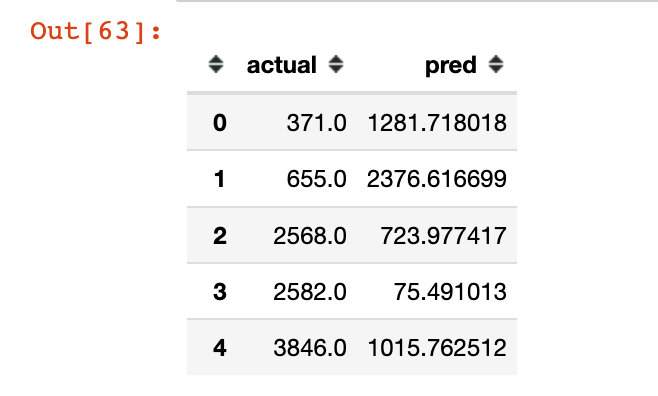
Model evaluation
Through mse and r2_score index to evaluate the model:
# mse,r2_score
from sklearn.metrics import mean_squared_error, r2_score

rmse = np.sqrt(mean_squared_error(final.actual, final.pred))
r2 = r2_score(final.actual, final.pred)

print("rmse is : ", rmse)
print("-------")
print("r2_score is : ", r2)

# result
rmse is :  1308.7482342002293
-------
r2_score is :  -0.3951062293743659
Next, the author draws a graph to compare the real value with the predicted value:
plt.figure(figsize=(16,6))

# Real and predicted value mapping
plt.plot(final.actual, marker=".", label="Actual label")
plt.plot(final.pred, marker=".", label="predicted label")
# Legend location
plt.legend(loc="best")

plt.show()

Doubtful points
Peter has a personal doubt: what are the differences between the following two pictures, except for the different colors? After looking at the whole source code, the drawing data and code are the same. The author also wrote two paragraphs:
Note that our model is predicting only one point in the future. That being said, it is doing very well. Although our model can't really capture the extreme values it does a good job of predicting (understanding) the general pattern.
Speaking Mandarin: note that our model predicts only one point in the future. Having said that, it did a good job. Although our model can't really capture extreme values, it still does a good job in predicting (understanding) general patterns
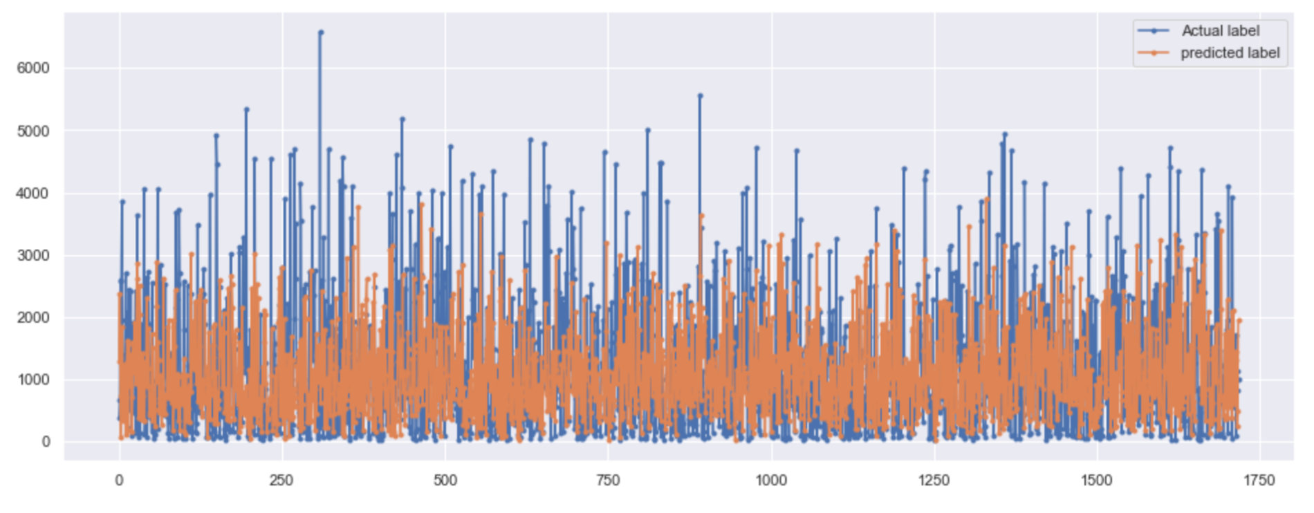
AS you can see that I have used Bidirectional LSTM to train our model and Our model is working quite well.Our model is cap*able to capture the trend and not capturing the Extreme values which is a really good thing. SO, we can say that the overall perfomance is good.
Speaking Mandarin: as you can see, I use two-way LSTM to train our model, and our model works well. Our model can capture trends rather than extreme values, which is a very good thing. Therefore, we can say that the overall performance is good.
The following is the source code of the whole modeling. Please refer to learning and discuss the above doubts:
# Partition dataset
from sklearn.model_selection import train_test_split
train,test = train_test_split(data,test_size=0.1,random_state=0)

# data normalization
from sklearn.preprocessing import MinMaxScaler
scaler  = MinMaxScaler()
# Normalization of four independent variables
num_colu = ['t1', 't2', 'hum', 'wind_speed']
trans_1 = scaler.fit(train[num_colu].to_numpy())
train.loc[:,num_colu] = trans_1.transform(train[num_colu].to_numpy())
test.loc[:,num_colu] = trans_1.transform(test[num_colu].to_numpy())
# Normalization of dependent variables
cnt_scaler = MinMaxScaler()
trans_2 = cnt_scaler.fit(train[["cnt"]])
train["cnt"] = trans_2.transform(train[["cnt"]])
test["cnt"] = trans_2.transform(test[["cnt"]])

# Import modeling library and instantiation
from keras.preprocessing import sequence
from keras.models import Sequential
from keras.layers import Dense, Dropout , LSTM , Bidirectional
# Instantiation of temporal objects
model = Sequential()
model.add(Bidirectional(LSTM(128,input_shape=(X_train.shape[1],X_train.shape[2]))))
model.add(Dropout(0.2))
model.add(Dense(1,activation="sigmoid")) # Activate function selection
model.compile(optimizer="adam",loss="mse")  # Optimizer and loss function selection

with tf.device('/GPU:0'):
    prepared_model = model.fit(X_train,
                               y_train,
                               batch_size=32,
                               epochs=100,
                               validation_data=[X_test,y_test])

# Comparison of two losses
plt.plot(prepared_model.history["loss"],label="loss")
plt.plot(prepared_model.history["val_loss"],label="val_loss")
plt.legend(loc="best")
plt.xlabel("No. Of Epochs")
plt.ylabel("mse score")

# Prediction of test data set
pred = model.predict(X_test)

# Restoration of cnt data
y_test_inv = cnt_scaler.inverse_transform(y_test.reshape(-1,1))
pred_inv = cnt_scaler.inverse_transform(pred)

# Drawing 1
plt.figure(figsize=(16,6))
plt.plot(y_test_inv.flatten(), marker=".",label="actual")
plt.plot(pred_inv.flatten(), marker=".",label="prediction",color="r")

# Restoration of cnt data
y_test_actual = cnt_scaler.inverse_transform(y_test.reshape(-1,1))
y_test_pred = cnt_scaler.inverse_transform(pred)

# Convert to array
arr_1 = np.array(y_test_actual)
arr_2 = np.array(y_test_pred)

# Generate DataFrame of Pandas and merge data
actual = pd.DataFrame(data=arr_1.flatten(),columns=["actual"])
predicted = pd.DataFrame(data=arr_2.flatten(),columns = ["predicted"])
final = pd.concat([actual,predicted],axis=1)

# evaluating indicator
from sklearn.metrics import mean_squared_error, r2_score
rmse = np.sqrt(mean_squared_error(final.actual,final.predicted))
r2 = r2_score(final.actual,final.predicted)
print("rmse is : {}\nr2 is : {}".format(rmse,r2))

# Drawing 2
plt.figure(figsize=(16,6))
plt.plot(final.actual,label="Actual data")
plt.plot(final.predicted,label="predicted values")
plt.legend(loc="best")