As a back-end developer, front-end headaches, learning bootstrap can beautify a few pages. I don't feel uncomfortable anymore. Learning address:
https://www.imooc.com/video/3346
1 Navigation Bar
Copy it as normal from the boostrap page. Modify the js file path.
- Navbar centered display, navbar-fluid line aligned left and right
- The navbar-inverse class changes the appearance of the navigation bar to black.
- navbar-fixed-top anchors the navigation bar at the top and is also anchored to the left and right.
<nav class="navbar navbar-default navbar-fixed-top navbar-inverse">
  <div class="container">
    <!-- Brand and toggle get grouped for better mobile display -->
    <div class="navbar-header">
      <button type="button" class="navbar-toggle collapsed" data-toggle="collapse" data-target="#bs-example-navbar-collapse-1" aria-expanded="false">
        <span class="sr-only">Toggle navigation</span>
        <span class="icon-bar"></span>
        <span class="icon-bar"></span>
        <span class="icon-bar"></span>
      </button>
      <a class="navbar-brand" href="#">Modern Browser Museum</a>
    </div>

    <!-- Collect the nav links, forms, and other content for toggling -->
    <div class="collapse navbar-collapse" id="bs-example-navbar-collapse-1">
      <ul class="nav navbar-nav">
        <li class="active"><a href="#">Overview<span class="sr-only">(current)</span></a></li>
        <li><a href="#">Brief Description</a></li>
        <li><a href="#">About </a></li>
      </ul>

    </div><!-- /.navbar-collapse -->
  </div><!-- /.container-fluid -->
</nav>
Note: Adding a fixed navigation bar will obscure the rest of the page unless padding is set for the <body>element, and the default height of the navigation bar is 50px, such as body{padding-top:70px;}
2 drop-down menu
dropdown-toggle class and data-toggle="dropdown"
 <li class="dropdown">
          <a href="#"Class=" dropdown-toggle "data-toggle=" dropdown "role=" button "aria-haspopup=" true "aria-expanded=" false ">feature <span class=" caret "></span></a>
          <ul class="dropdown-menu">
            <li><a href="#">Action</a></li>
            <li><a href="#">Another action</a></li>
          </ul>
        </li>
dropdown-toggle class and data-toggle="dropdown"
ul is the content of the drop-down menu.
Note: Bootstrap calls the bootstrap plug-in without writing JavaScript code by simply setting the data property.
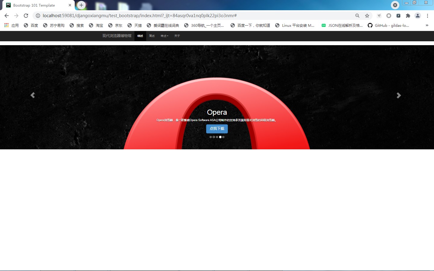
3 Rolling Advertising
https://v3.bootcss.com/javascript/#carousel
Carousel
Arrows with left and right switching, what to rotate, little circles for rotated navigation
Represents a rolling ad:
<div id="carousel-example-generic" class="carousel slide" data-ride="carousel">
ol class ="carousel-indicators" corresponds to the rotation of navigation circles. The following:
 <ol class="carousel-indicators">
    <li data-target="#carousel-example-generic" data-slide-to="0" class="active"></li>
    <li data-target="#carousel-example-generic" data-slide-to="1"></li>
    <li data-target="#carousel-example-generic" data-slide-to="2"></li>
  </ol>
Roadcast content, where the src of img is the address of the rotation picture,:
<!-- Wrapper for slides -->
  <div class="carousel-inner" role="listbox">
    <div class="item active">
      <img src="..." alt="...">
      <div class="carousel-caption">
        ...
      </div>
    </div>
    <div class="item">
      <img src="..." alt="...">
      <div class="carousel-caption">
        ...
      </div>
    </div>
    ...
  </div>
This is the arrow to the left and right of the relay component:
<a class="left carousel-control" href="#carousel-example-generic" role="button" data-slide="prev">
    <span class="glyphicon glyphicon-chevron-left" aria-hidden="true"></span>
    <span class="sr-only">Previous</span>
  </a>
  <a class="right carousel-control" href="#carousel-example-generic" role="button" data-slide="next">
    <span class="glyphicon glyphicon-chevron-right" aria-hidden="true"></span>
    <span class="sr-only">Next</span>
  </a>
Write the following five contents in the broadcast.
        <div class="item">
            <img src="images/safari-big.jpg" alt="3 slide">
            <div class="carousel-caption">
                <h1>Safari</h1>

                <p>Safari,Is the latest operating system for Apple computers Mac OS X Browser in.</p>

                <p><a class="btn btn-lg btn-primary" href="http://www.apple.com/cn/safari/" target="_blank"
                      role="button">Click me to download</a></p>
            </div>
In this way, the pictures displayed in the browser are a little too big to modify the style.
        .carousel{
            height:500px;
            background-color:#000;
            }
        .carousel .item{
            height:500px;
            background-color:#000;
            }
        .carousel img{
            width:100%;
            }
As above, the picture shows well, but a little bit away from it.
Body{padding-top:50px;} Just change this back to 50
Simple font settings
.carousel-caption p{
    margin-bottom: 20px;
    font-size:20px;
    line-height: 1.8;
}
4. Raster system, 3 columns
 <div class="row" id="summary-container">
        <div class="col-md-4">
            <img class="img-circle" src="images/chrome-logo-small.jpg" alt="chrome">

            <h2>Chrome</h2>

            <p>Google Chrome,also called Google Browser, is a web browser Google(Google) Web browser developed by the company.</p>

            <p><a class="btn btn-default" href="#"Role=" button ">click me to download </a></p>
        </div>
        <div class="col-md-4">
            <img class="img-circle" src="images/firefox-logo-small.jpg" alt="firefox">

            <h2>Firefox</h2>

            <p>Mozilla Firefox,The Chinese name is often called "Firefox" or "Firefox Browser", which is an open source web browser.</p>

            <p><a class="btn btn-default" href="#"Role=" button ">click me to download </a></p>
        </div>
        <div class="col-md-4">
            <img class="img-circle" src="images/safari-logo-small.jpg" alt="safari">

            <h2>Safari</h2>

            <p>Safari,Is the latest operating system for Apple computers Mac OS X Browser in.</p>

            <p><a class="btn btn-default" href="#"Role=" button ">click me to download </a></p>
        </div>
    </div>
Set the top edge distance to the top distance, which can be set by scrolling the padding of the picture content
        .carousel{
            height:500px;
            background-color:#000;
            margin-bottom: 60px;
            }## Title
To center, you need to set the div outside, change it to container, and add an id to set the style.
<div class="container" id="summary-container">
</div>


#summary-container .col-md-4{
     text-align:center;
 }
5 plus a horizontal line
hr tag, write a class, 40 PX up and down, is the line width, written in the div container above
<hr class="divider">
Style:
hr.divider{
    margin: 40px 0;
}
6 tabs
Tabs can place more content and save page space.
Instead of writing javascript code, simply specify data-toggle="tab" for page elements and add NAV and nav-tabs class es for ul
href of the li tag a in nav-tabs corresponds to the id of the tab-content
tab-content is the content of a tab.
Write it in the div container above
   <ul class="nav nav-tabs" role="tablist" id="feature-tab">
        <li class="active"><a href="#tab-chrome" role="tab" data-toggle="tab">Chrome</a></li>
        <li><a href="#tab-firefox" role="tab" data-toggle="tab">Firefox</a></li>
        <li><a href="#tab-safari" role="tab" data-toggle="tab">Safari</a></li>
        <li><a href="#tab-opera" role="tab" data-toggle="tab">Opera</a></li>
        <li><a href="#tab-ie" role="tab" data-toggle="tab">IE</a></li>
    </ul>

    <div class="tab-content">
        <div class="tab-pane active" id="tab-chrome">
            <div class="row feature">
                <div class="col-md-7">

                    <h2 class="feature-heading">Google Chrome <span
                            class="text-muted">Use the browser most widely</span></h2>

                    <p class="lead">Google Chrome,also called Google Browser, is a web browser Google(Google) Web browser developed by the company.
                        The browser is based on other open source software, including WebKit,The goal is to improve stability, speed, and security, and to create a simple and efficient user interface.</p>
                </div>
                <div class="col-md-5">
                    <img class="feature-image img-responsive" src="images/chrome-logo.jpg"
                         alt="Chrome">
                </div>
            </div>
        </div>
        <div class="tab-pane" id="tab-firefox">
            <div class="row feature">
                <div class="col-md-5">
                    <img class="feature-image img-responsive" src="images/firefox-logo.jpg"
                         alt="Firefox">
                </div>
                <div class="col-md-7">

                    <h2 class="feature-heading">Mozilla Firefox <span class="text-muted">Beautiful fox</span>
                    </h2>

                    <p class="lead">Mozilla Firefox,The Chinese name is often called "Firefox" or "Firefox Browser". It is an open source web browser.
                        Use Gecko Engine (non ie Kernel), supports multiple operating systems such as Windows,Mac and linux. </p>
                </div>
            </div>
        </div>
        <div class="tab-pane" id="tab-safari">
            <div class="row feature">
                <div class="col-md-7">

                    <h2 class="feature-heading">Safari <span class="text-muted">Mac User Preference</span></h2>

                    <p class="lead">Safari,Is the latest operating system for Apple computers Mac OS X Browser in, using KDE Of KHTML As the core of browser operation.
                        Safari Beta was first released on Jan. 7, 2003 and became Mac OS X v10.3 And the default browser that follows is iPhone and IPAD and iPod touch Specified browser.</p>
                </div>
                <div class="col-md-5">
                    <img class="feature-image img-responsive" src="images/safari-logo.jpg"
                         alt="Safari">
                </div>
            </div>
        </div>
        <div class="tab-pane" id="tab-opera">
            <div class="row feature">
                <div class="col-md-5">
                    <img class="feature-image img-responsive" src="images/opera-logo.jpg"
                         alt="Opera">
                </div>
                <div class="col-md-7">

                    <h2 class="feature-heading">Opera <span class="text-muted">Small but easy to use</span>
                    </h2>

                    <p class="lead">Opera Browser, a Norwegian Opera Software ASA Company-produced web browsers that support multi-page tabbed browsing.
                        Is a cross-platform browser that can be used in Windows,Mac and Linux Run on three operating system platforms..</p>
                </div>
            </div>
        </div>
        <div class="tab-pane" id="tab-ie">
            <div class="row feature">
                <div class="col-md-7">

                    <h2 class="feature-heading">IE <span class="text-muted">You'll see</span></h2>

                    <p class="lead">Internet Explorer,Original name Microsoft Internet Explorer(6 Before version)and Windows Internet
                        Explorer(7,8,9,10 Edition),
                        Abbreviation IE,Is a web browser launched by Microsoft Corporation in the United States. The typesetting engine it uses(Commonly known as the kernel)by Trident. </p>
                </div>
                <div class="col-md-5">
                    <img class="feature-image img-responsive" src="images/ie-logo.jpg"
                         alt="IE">
                </div>
            </div>
        </div>
    </div>
The col-md-7 and col-md-5 settings are different so that each interlaced drop can feel the change of the page.
7 Style 6 text, title, subtitle
Font centered,
The title is set in blue,
Subtitle set to gray,
<div class="row feature"> </div>
If the code in 6 is set up, set up a new div, wrap the content in and style it without affecting other places.
Set the spacing for the feature so that it does not all face the sky
.feature-heading{
    font-size: 50px;
    color:#2a6496;
    margin-top:120px;
}

.feature-heading .text-muted{
    font-size: 28px;
    color:#0f0f0f;
}
8 Copyright Settings
Add a line,
Add a footer tag
<hr class="divider">
<footer>
    <p class="pull-right"><a href="#Top "> back to top </a></p>
    <p>©2021 ppp Copyright Information</p>
</footer>
class="pull-right" is to align it to the right in bootstrap, otherwise it will go up and down
There is no land at present. We can go directly below the initial body settings and also 50px
        body {
            padding-top: 50px;
            padding-bottom: 50px;
        }
9 About, pop-up box making, modal box
Head of pop-up box, content of pop-up box, bottom of pop-up box:
<div class="modal fade" tabindex="-1" role="dialog">
<div class="modal-dialog" role="document">
<div class="modal-content">
<div class="modal-header">
<button type="button" class="close" data-dismiss="modal" aria-label="Close"><span aria-hidden="true">×</span></button>
<h4 class="modal-title">Modal title</h4>
</div>
<div class="modal-body">
<p>One fine body…</p>
</div>
<div class="modal-footer">
<button type="button" class="btn btn-default" data-dismiss="modal">Close</button>
<button type="button" class="btn btn-primary">Save changes</button>
</div>
</div><!-- /.modal-content -->
</div><!-- /.modal-dialog -->
</div><!-- /.modal -->
Modify content. The pop-up box is currently hidden, so to show it, you need to set the corresponding label.
First give our modal box an ID such as id="about".
<div class="modal fade" tabindex="-1" role="dialog" id="about">
Then set data-toggle="modal" data-target="#about" for the corresponding label.
<li><a href="#" data-toggle="modal" data-target="#About ">about </a></li>
The modal box will pop up. 6666666666666666666
10 Menu Positioning
Get the id of the div that contains the Tab tag, get the id of the Tab tag, and call the show method to open the tag
I've been here for a long time.
Cut your feet.
id="demo-navbar" added above
 <div class="collapse navbar-collapse" id="demo-navbar">
            <ul class="nav navbar-nav">
                <li class="active"><a href="#">Overview<span class="sr-only">(current)</span></a></li>
                <li><a href="#">Brief Description</a></li>
                <li class="dropdown">
                    <a href="#" class="dropdown-toggle" data-toggle="dropdown" role="button" aria-haspopup="true"
                       aria-expanded="false">Characteristic<span class="caret"></span></a>
                    <ul class="dropdown-menu">
                        <li><a href="#tab-chrome">Chrome</a></li>
                        <li><a href="#tab-firefox">Firefox</a></li>
                        <li><a href="#tab-opera">Opera</a></li>
                        <li><a href="#tab-safari">Safari</a></li>
                        <li><a href="#tab-ie">IE</a></li>

                    </ul>
                </li>
The following plus id="tab-list"
    <ul class="nav nav-tabs" role="tablist" id="tab-list">
        <li class="active"><a href="#tab-chrome" role="tab" data-toggle="tab">Chrome</a></li>
        <li><a href="#tab-firefox" id="firefox" role="tab" data-toggle="tab">Firefox</a></li>
        <li><a href="#tab-safari" role="tab" data-toggle="tab">Safari</a></li>
        <li><a href="#tab-opera" role="tab" data-toggle="tab">Opera</a></li>
        <li><a href="#tab-ie" role="tab" data-toggle="tab">IE</a></li>
    </ul>
Bottom script:
<script>
    $(document).ready(function(){
        $("#demo-navbar .dropdown-menu a").click(function(e){
            var href = $(this).attr("href");
            console.log(href)
			$('#tab-list a[href=' + href + ']').tab("show");
            });
    })
</script>
Succeeded. $ ('#tab-list a[href='+ href +']'). tab("show");
Here href then has a bunch of quotation marks just for stitching up, which is annoying and has been going on for half a day.
Complete. Learning means trying and error, and succeeding. All in one and all in three. Go on.