grid layout
Grid layout is used for page allocation in the Bootstrap framework. Its function is mainly to make responsive pages, which can adapt to our mobile phones, PIDs, computers and computers with larger screens. You only need to make one page to adapt to these four situations. It's very convenient. Compared with what we talked about before Streaming layout,flex layout,rem layout , the grid layout is simpler. So how? What is the principle? Look down
As we said before, in rem layout, you need to divide the screen into the number of copies you need, and then divide the total screen width by this score to obtain the value of font size, so that we can calculate the size of page elements later and reference this font size for operation. This is the rem layout mentioned earlier. It is worth saying that the number of copies and grid divide the screen into 12 equal parts, And with the size of the screen, the 12 equal parts will also expand or shrink. Then you have to ask: how to use it
First, let's go to the official bootstrap website: https://v3.bootcss.com/ Download the style class.
After downloading, let's see what's in the file?
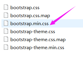
The style file we are mainly referring to now is the Css file pointed by the purple arrow. Move it to our style file to facilitate page reference. What to do after quoting
Let's take a look at a small test used:
Before use, let's talk about the precautions:
- When bootstrap is used, the class name of the parent box in the html structure must be the. container class, because this class is the style written by the team. If you change the class name, it will have no effect. After the parent box is available, we know that the grid layout is an allocated column, so we have to define the row first. Therefore, after the. container, there must be a sub box with. Row as the class name, and then put any number of boxes to be laid in the. Row box
- The screen is divided into four sizes. There are four class names corresponding to each other, (the screen size is arranged from small to large: col XS; col SM; col MD; col LG;)
- Then you may have to ask: how do you know how many small boxes account for in my. row? It's very simple. Just add a number after the corresponding screen size class above. eg: (col-xs-5: it means that in the super small screen, the box with col-xs-5 as the class name occupies 5 copies of the screen width. Then col-md-10 occupies 10 copies on the medium screen.) tips: we have to write enough 12 copies of the box, otherwise the box space will be insufficient, There will be times when it doesn't look good.
Test:
Structure:
// First reference the bootstrap.min.css file in our bootstrap, and then write the structure
<body>
<div class="container"> // The parent class is:. container
<div class="row"> // A row. Row is given under the parent class to facilitate sorting in the row, 12 equal parts
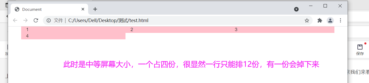
<div class="col-xs-12 col-sm-6 col-md-4 col-lg-3">1</div>
<div class="col-xs-12 col-sm-6 col-md-4 col-lg-3">2</div>
<div class="col-xs-12 col-sm-6 col-md-4 col-lg-3">3</div>
<div class="col-xs-12 col-sm-6 col-md-4 col-lg-3">4</div>
// We can see: I set different copies for the four small boxes in the line, so what does it mean? How to see it? First of all: col - is followed by xs, sm,md and lg, so let's look at them one by one, l first look at Col lg; When lg represents a large screen, it is obvious that I am followed by 3, a total of four 3, exactly 12 copies. His implementation result is that the four small boxes are evenly distributed in one line.
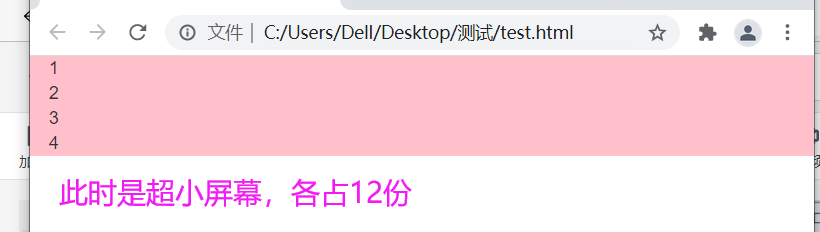
// Let's look again in the same way:. col-xs-12, what does this mean? In fact, what I want to achieve is that when the ultra-small screen is used, each element will be directly displayed on one line, so that we can see more clearly and reflect the benefits of responsiveness.
</div>
</div>
</body>
If you don't understand the above, I'll pick them out and let's see the effect:
-
The four boxes are: col-lg-3 large screen: (you can see that at the largest screen, the four small boxes are evenly distributed, accounting for 3 copies each, a total of 12 copies).

-
.col-md-4:
-
.col-sm-6:
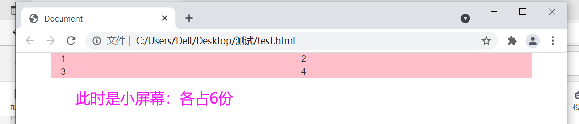
-
.col-xs-12
From here, we can see how the grid layout allocates columns on different screens.
Do you want to try it when you see here?
Don't worry, there are several useful classes behind
- Col LG offset - number of copies offset to the right
 Code: as follows:
<body>
    <div class="container">
        <div class="row">
            <div class="col-lg-3 ">1</div>
            <div class="col-lg-3 col-lg-offset-9">2</div>    // offset-9 means that the second box is shifted to the right by 9 copies. Of course, this number is checked from the leftmost side, that is, the position occupied by the first box is also occupied, which is similar to absolute positioning. We set the left offset value relative to the. row box. We set 9, and its own size is 3, that is, it just keeps it from falling to the second line and displayed at the last position of the first line.
        </div>
    </div>
</body>
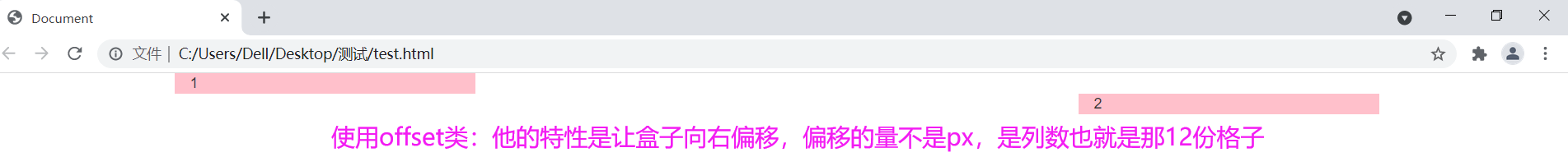
- Col LG push - number of copies to be pushed to the right
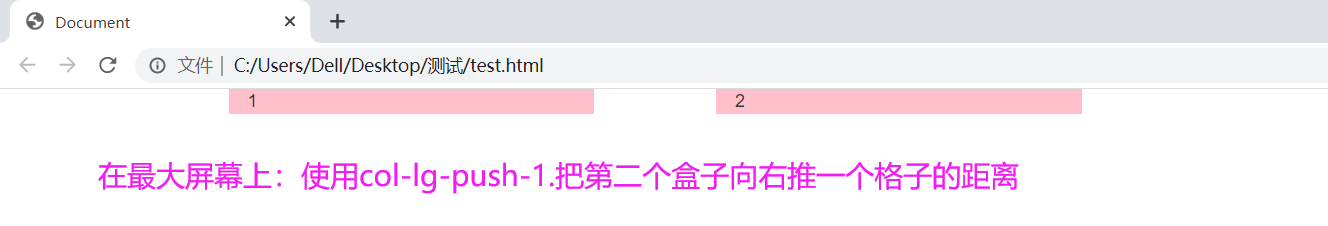
code:
<body>
    <div class="container">
        <div class="row">
            <div class="col-lg-3 ">1</div>
            <div class="col-lg-3 col-lg-push-1">2</div>   // push realizes the effect of pushing to the right;
        </div>
    </div>
</body>
- Col LG pull - how many squares are pulled back to the left
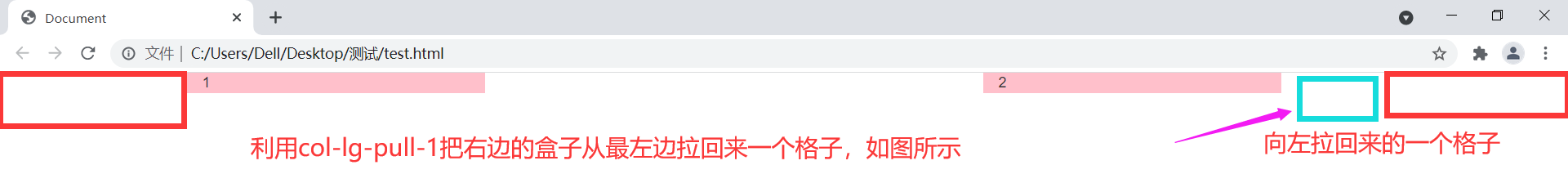
<body>
    <div class="container">
        <div class="row">
            <div class="col-lg-3">1</div>
            <div class="col-lg-3 col-lg-offset-6 col-lg-pull-1">2</div>  // Pull the size of a grid to the left
        </div>
    </div>
</body>
The above is the common knowledge of grid layout;
tips: the grid layout is divided into 12 grids. The grid in another row can be nested. Remember to write. Row in this grid, and the grid is still 12. Let the elements in this grid allocate these 12. The operation is the same as the above thought.
Results achieved:

tips: the class name of sun box should be consistent with his father's name, that is, the size of the screen.
<body>
    <div class="container">
        <div class="row">
            <div class="col-lg-3">1</div>
            <div class="col-lg-3">
                <div class="row">
                    <div class="col-lg-6">2</div>
                    <div class="col-lg-6">3</div>
                </div>
            </div>
        </div>
    </div>
</body>