This article records common tool classes.
record
Borders:
// Set border
<span class="border"></span>
<span class="border-top"></span>
<span class="border-right"></span>
<span class="border-bottom"></span>
<span class="border-left"></span>

// Remove border
<span class="border-0"></span>
<span class="border-top-0"></span>
<span class="border-right-0"></span>
<span class="border-bottom-0"></span>
<span class="border-left-0"></span>

// Set color
border-primary/secondary/success/danger/warning/info/light/dark/white

// fillet
rounded/rounded-top/bottom/left/right/circle(circular)/0(Remove fillet)
Clearfix:
// Clear level float
<div class="bg-info clearfix">
  <button type="button" class="btn btn-secondary float-left">Example Button floated left</button>
  <button type="button" class="btn btn-secondary float-right">Example Button floated right</button>
</div>
Close icon:
<button type="button" class="close" aria-label="Close"> <span aria-hidden="true">×</span> </button>
Colors:
// Text color
.text-primary
.text-secondary
.text-success
.text-danger
.text-warning
.text-info
.text-light
.text-dark
.text-muted
.text-white

// background color
.bg-primary
.bg-secondary
.bg-success
.bg-danger
.bg-warning
.bg-info
.bg-light
.bg-dark
.bg-white
Display:
// d-{value} or d-{size}-{value} control display logic
.d-none // hide
.d-inline // Inline display
.d-inline-block
.d-block // Occupy one line
.d-table
.d-table-cell
.d-table-row
.d-flex
.d-inline-flex
Embedded: (embed ded)
<div class="embed-responsive embed-responsive-16by9"> // You can control the scale
  <iframe class="embed-responsive-item" src="https://www.youtube.com/embed/zpOULjyy-n8?rel=0" allowfullscreen></iframe>
</div>
flex:
// d-{value} or d-{size}-{value}
.d-flex // Occupy one line, with flex inside
.d-inline-flex // It only occupies the content size, and the inside is flex
.flex-row // Child elements from left to right
.flex-row-reverse // Child elements from right to left
.flex-column // Child elements from top to bottom
.flex-column-reverse // Child elements from bottom to top
// Align horizontally for each child element
.justify-content-start // Align child elements left
.justify-content-end // Align child elements right
.justify-content-center // Align child elements to center
.justify-content-between // Align child elements
.justify-content-around // Uniform distribution of sub elements
// Vertical alignment for each child element
.align-items-start // Child element top alignment
.align-items-end // Child element bottom alignment
.align-items-center // Child elements centered vertically
.align-items-baseline // Child element baseline alignment
.align-items-stretch // The height of the child element is the same as that of the parent element
// For multi line flex, all child elements on a whole line are controlled as a whole
.align-content-start
.align-content-end
.align-content-center
.align-content-around
.align-content-stretch
// Use it on child elements to change their vertical alignment
.align-self-start
.align-self-end
.align-self-center
.align-self-baseline
.align-self-stretch
// Automatic margin
ml-auto // This element is automatically aligned to the left
mr-auto // The right side of this element is automatically aligned
// wrap
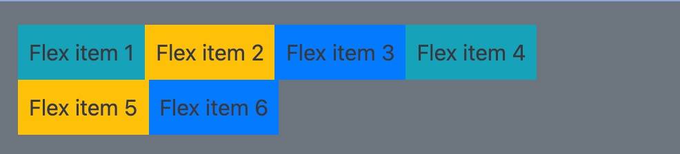
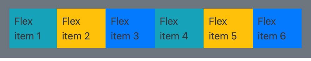
.flex-nowrap // Flex containers are single line. In this case, flex children may overflow the container
.flex-wrap // The flex container is multiline. In this case, the overflow part of the flex sub item will be placed on a new line, and a line break will occur inside the sub item
.flex-wrap-reverse // Reverse wrap
// order
order-0/12 // 0 is the front and 12 is the back
float:
.float-left
.float-right
.float-none
image replacement:
<h1 class="text-hide" style="background-image: url('/assets/brand/bootstrap-solid.svg'); width: 50px; height: 50px;"> Bootstrap < / H1 > is SEO friendly and generally uses images.
Position:
// Non corresponding formula
<div class="position-static">...</div>
<div class="position-relative">...</div>
<div class="position-absolute">...</div>
<div class="position-fixed">...</div>
<div class="position-sticky">...</div>
<div class="fixed-top">...</div>
<div class="fixed-bottom">...</div>
<div class="sticky-top">...</div>
Sizing:
// http://getbootstrap.com/docs/4.0/utilities/sizing/
// width setting
w-25/2-50/w-75/w-100 Width percentage setting
// height setting
h-25/h-50/h75/h-100 Height percentage setting
mh-25/mh-50/mh-75/mh-100 Maximum height percentage setting
Spacing:
// {property}{sides}-[{breakpoint}]-{size}
// m -> margin, p -> padding
// l -> left, r -> right, t -> top, b -> bottom, x -> left&right, y -> top&bottom, blank -> all 4 sides
// size * spacer
// 0 -> 0, 1 -> 0.25, 2-> 0.5, 3 -> 1.0, 4 -> 1.5, 5 -> 3, auto -> auto
mx-auto Center, py-3
Text:
.text-left
.text-right
.text-center
.text-justify
.text-nowrap // Single line, overflow
.text-truncate // Width overflow
.text-lowercase // All lowercase
.text-uppercase // uppercase
.text-capitalize // title case
.font-weight-bold // Bold font
.font-weight-normal // Normal coarseness
.font-weight-light // Slightly fine
.font-italic // Italics
Vertial Align:
// Internal font alignment
.align-baseline
.align-top
.align-middle
.align-bottom
.align-text-top
.align-text-bottom
Visible:
// Controls the implementation of the visible attribute, which is different from the display attribute. It is not displayed but reserved for screen readers
<div class="visible">...</div>
<div class="invisible">...</div>
V4 major changes
- Use Flex layout as a whole
- Use rem instead of px,em
- normalize using reboot
- Discard panels,thumbnails,wells and use card instead
- To discard the built-in icon, you need to find a third party. Such as glyphs / octicons / font awesome
- Discard the affix plug-in for jquery
- Discard the pager and customize it with button
- Highly nested design, no longer strictly limit the parent-child relationship
- Massive css renaming
- Grid system is no longer limited to 12 grids
Bootstrap 4 notes
Sample code
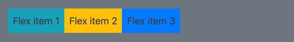
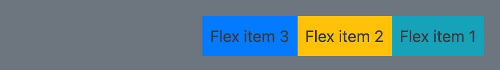
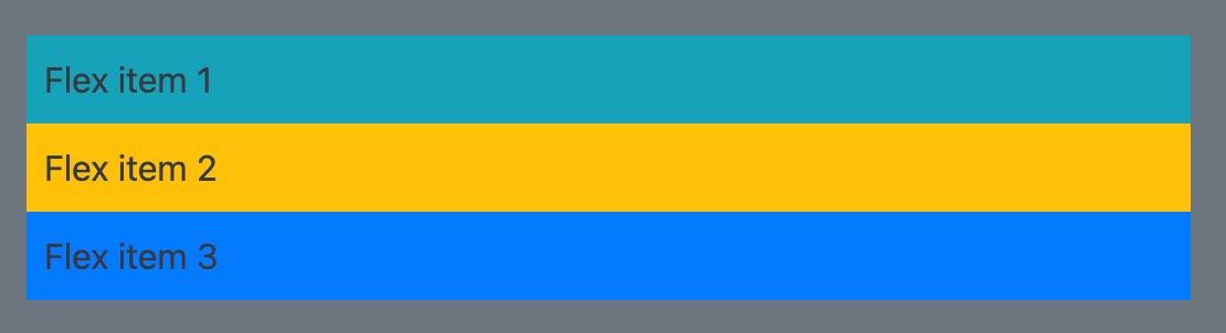
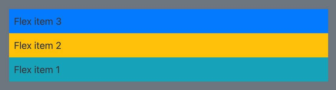
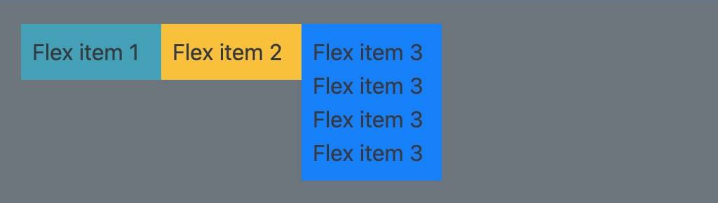
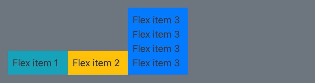
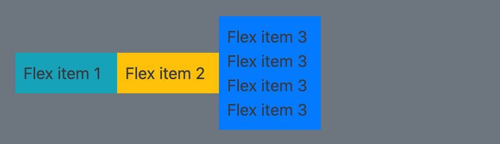
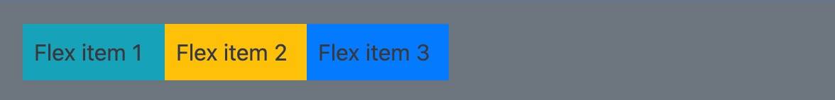
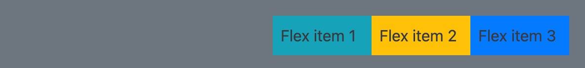
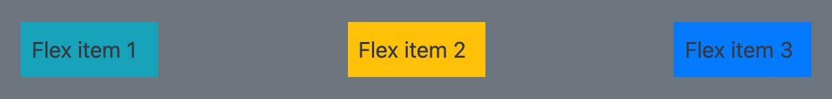
    <div class="d-flex p-3 bg-secondary text-dark container-fluid">
        <div class="item p-2 bg-info">Flex item 1</div>
        <div class="item p-2 bg-warning">Flex item 2</div>
        <div class="item p-2 bg-primary">Flex item 3</div>
    </div>
-
BG info, BG warning, BG primary: set various background colors
-
Text white: white font
-
text-black-50: half black font
-
Container / container fluid: container / full screen container
-
d-flex:
-
Flex direction: four values can be taken:
-
row: the horizontal direction of the spindle, arranged from left to right
-
Row reverse: the horizontal direction of the spindle, arranged from right to left
-
column: the vertical direction of the spindle, arranged from top to bottom
-
Column reverse: the vertical direction of the spindle, arranged from bottom to top
-
-
Flex wrap / flex nowrap: Wrap / do not wrap lines when the container cannot be displayed
-
flex-wrap:
-
flex-nowrap:
-
-
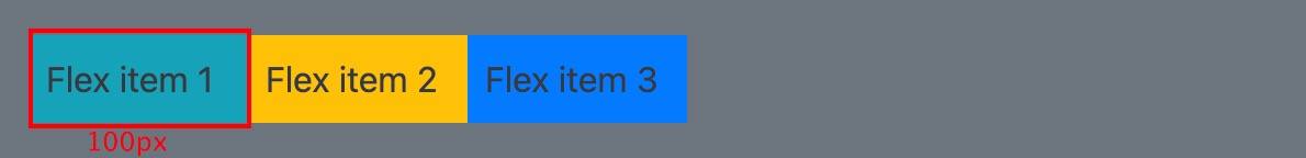
Flex basis: defines the space size of the item element.
-
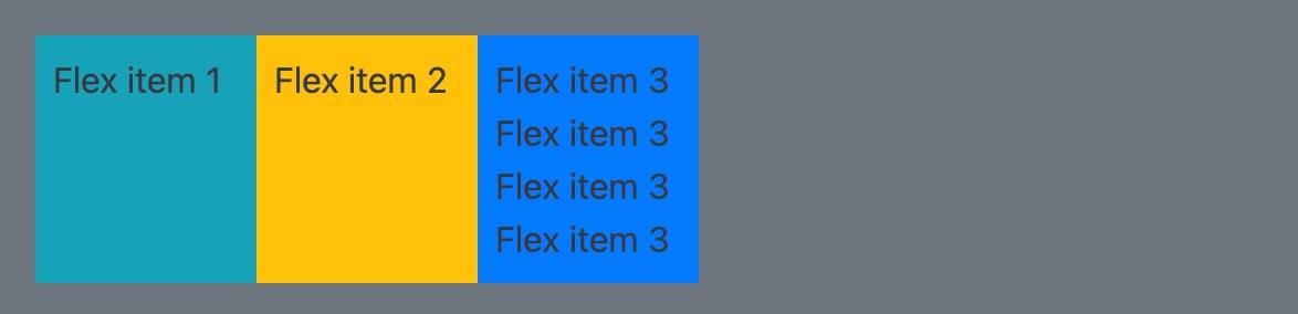
Flex growth: if it is assigned as a positive integer, the flex element will increase in size along the main axis based on flex basis, and the subsequent value is the growth proportion.
-
Flex shrink: the flex grow attribute deals with the problem that flex elements add space on the spindle. On the contrary, the flex shrink attribute deals with the problem of flex element shrinkage. Shrink in proportion to the following values.
-
Flex abbreviation: you may rarely see flex grow, flex shrink, and flex basis attributes used alone, but mixed in flex In short form. Flex shorthand allows you to write three values in this order - Flex growth, flex shrink, and flex basis.
.box {
  display: flex;
}
.one {
  flex: 1 1 auto;
}
.two {
  flex: 1 1 auto;
}
.three {
  flex: 1 1 auto;
}
<div class="box">
  <div class="one">One</div>
  <div class="two">Two</div>
  <div class="three">Three</div>
</div>
-
Align items: the attribute aligns the elements in the cross axis direction and applies them to the parent container.
-
Strength: stretch to maximum container alignment
-
flex-start:
-
flex-end
- center
-
-
Justify content: align the elements in the spindle direction. The spindle direction is the direction set through flex direction. The initial value is flex start,
You can also set the value to space between, take out the remaining space after the elements are arranged, and distribute it evenly between the elements, so the spacing between the elements is equal. Or use space around to make the left and right spaces of each element equal.-
stretch :
-
flex-start:
-
flex-end:
-
center:

-
space-evenly:

-
space-around:

-
space-between:
-