1. Concept
- Is a front-end development framework
- Bootstrap is based on HTML, CSS and JAVASCRIPT. It is simple and flexible, making Web development faster.
- Many css styles and js plug-ins are defined. Developers can directly use these styles and plug-ins to get rich page effects
- Framework: a semi-finished software. Developers can develop and simplify the code on the basis of the framework.
- Responsive layout: the same set of pages can be compatible with devices with different resolutions
2. Standard formwork
<!doctype html>
<html lang="zh-CN">
<head>

    <meta charset="utf-8">
    <meta http-equiv="X-UA-Compatible" content="IE=edge">
    <meta name="viewport" content="width=device-width, initial-scale=1">
    <!-- The above three meta label*must*Put it at the top, anything else*must*Follow! -->
    <title>Bootstrap</title>

    <!--    BootstrapCDN    -->
    <!-- Bootstrap -->
    <link rel="stylesheet" href="https://stackpath.bootstrapcdn.com/bootstrap/3.4.1/css/bootstrap.min.css" integrity="sha384-HSMxcRTRxnN+Bdg0JdbxYKrThecOKuH5zCYotlSAcp1+c8xmyTe9GYg1l9a69psu" crossorigin="anonymous">
    <!-- jQuery  -->
    <script src="https://fastly.jsdelivr.net/npm/jquery@1.12.4/dist/jquery.min.js" integrity="sha384-nvAa0+6Qg9clwYCGGPpDQLVpLNn0fRaROjHqs13t4Ggj3Ez50XnGQqc/r8MhnRDZ" crossorigin="anonymous"></script>
    <!-- load Bootstrap All JavaScript plug-in unit -->
    <script src="https://stackpath.bootstrapcdn.com/bootstrap/3.4.1/js/bootstrap.min.js" integrity="sha384-aJ21OjlMXNL5UyIl/XNwTMqvzeRMZH2w8c5cRVpzpU8Y5bApTppSuUkhZXN0VxHd" crossorigin="anonymous"></script>

</head>
<body>

</body>
</html>
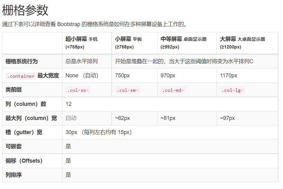
3. Responsive layout
3.1 grid system
concept
- Divide a row into 12 grids on average. You can specify how many grids the elements occupy.
- There are 12 grids on devices with different frequency division rates, but the responsive layout can be realized by specifying the number of grids occupied by each element on different devices
step
-
Define the container, which is equivalent to the table in the table
-
Two container classes cannot be nested with each other.
-
container: there is blank space on both sides (a little smaller than 100% width)
-
Container fluid: each device is 100% wide (fully occupied)
<div class="container">
  ...
</div>

<div class="container-fluid">
  ...
</div>
-
-
Define the row, which is equivalent to tr in the table
-
Style: row
<div class="container-fluid">
    <div class="row">
		...
    </div>
</div>
-
-
Define the element and specify the number of grids occupied by the element on different devices.
- Style: col - Equipment Code - number of grids
<style>
    .inner{
        border: 1px solid red;
    }
</style>

<div class="container-fluid">
     <div class="row">
         <div class="col-lg-1 col-sm-2 inner">grid</div>
         <div class="col-lg-1 col-sm-2 inner">grid</div>
         <div class="col-lg-1 col-sm-2 inner">grid</div>
         <div class="col-lg-1 col-sm-2 inner">grid</div>
         <div class="col-lg-1 col-sm-2 inner">grid</div>
         <div class="col-lg-1 col-sm-2 inner">grid</div>
         <div class="col-lg-1 col-sm-2 inner">grid</div>
         <div class="col-lg-1 col-sm-2 inner">grid</div>
         <div class="col-lg-1 col-sm-2 inner">grid</div>
         <div class="col-lg-1 col-sm-2 inner">grid</div>
         <div class="col-lg-1 col-sm-2 inner">grid</div>
         <div class="col-lg-1 col-sm-2 inner">grid</div>
     </div>
</div>
be careful
- If the number of cells in a row exceeds 12, the excess part will wrap
- Grid class properties can be upward compatible. The grid class is applicable to real devices whose screen width is greater than or equal to the size of the dividing point
- If the real device width is less than the minimum value of the device code that sets the grid class attribute, an element will fill a whole line
4. Global CSS Style
Official documents
https://v3.bootcss.com/css/#overview
4.1 buttons
-
btn btn style
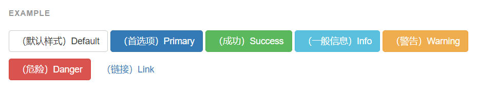
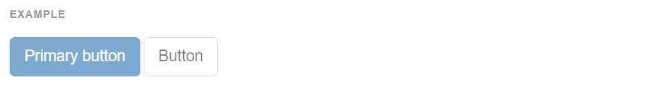
<!-- Standard button -->
<button type="button" class="btn btn-default">((default style) Default</button>

<!-- Provides extra visual weight and identifies the primary action in a set of buttons -->
<button type="button" class="btn btn-primary">((preferences) Primary</button>

<!-- Indicates a successful or positive action -->
<button type="button" class="btn btn-success">((successful) Success</button>

<!-- Contextual button for informational alert messages -->
<button type="button" class="btn btn-info">((general information) Info</button>

<!-- Indicates caution should be taken with this action -->
<button type="button" class="btn btn-warning">((warning) Warning</button>

<!-- Indicates a dangerous or potentially negative action -->
<button type="button" class="btn btn-danger">((danger) Danger</button>

<!-- Deemphasize a button by making it look like a link while maintaining button behavior -->
<button type="button" class="btn btn-link">((link) Link</button>
-
Size: buttons of different sizes can be obtained by using BTN LG, BTN SM and BTN XS.
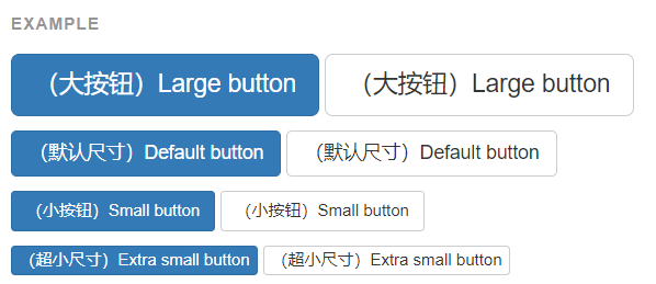
<button type="button" class="btn btn-primary btn-lg">((large button) Large button</button>
<button type="button" class="btn btn-default btn-lg">((large button) Large button</button>
-
Activation status: by adding active
<a href="#" class="btn btn-primary btn-lg active" role="button">Primary link</a>
<a href="#" class="btn btn-default btn-lg active" role="button">Link</a>
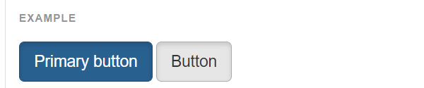
-
disabled status: disabled
<button type="button" class="btn btn-lg btn-primary" disabled="disabled">Primary button</button>
<button type="button" class="btn btn-default btn-lg" disabled="disabled">Button</button>
4.2 pictures
-
class = "img responsive": pictures account for 100% of any size (they can be scaled by themselves)
-
Picture shape
 <!-- square -->
<img src="..." alt="..." class="img-rounded">

 <!-- circular -->
<img src="..." alt="..." class="img-circle">

 <!-- Photo frame -->
<img src="..." alt="..." class="img-thumbnail">
4.3 forms
- table: basic style
- Table striped: striped table
- Table bordered: a table with borders
- Table hover: mouse over
- Table condensed: Condensed table
- State class
- active
- success
- info
- warning
- danger
4.4 forms
- form-control
- See more official documents
5. Components
Official documents
https://v3.bootcss.com/components/
5.1 navigation bar
<nav class="navbar navbar-default">
    <div class="container-fluid">

        <div class="navbar-header">
            <!--    Hamburger button    -->
            <button type="button" class="navbar-toggle collapsed" data-toggle="collapse" data-target="#bs-example-navbar-collapse-1" aria-expanded="false">
                <span class="sr-only">Toggle navigation</span>
                <span class="icon-bar"></span>
                <span class="icon-bar"></span>
                <span class="icon-bar"></span>
            </button>
            <a class="navbar-brand" href="#">Brand</a>
        </div>


        <div class="collapse navbar-collapse" id="bs-example-navbar-collapse-1">
            <ul class="nav navbar-nav">
                <li class="active"><a href="#">Link <span class="sr-only">(current)</span></a></li>
                <li><a href="#">Link</a></li>
                <!--    Drop down box    -->
                <li class="dropdown">
                    <a href="#" class="dropdown-toggle" data-toggle="dropdown" role="button" aria-haspopup="true" aria-expanded="false">Dropdown <span class="caret"></span></a>
                    <ul class="dropdown-menu">
                        <!--Drop down item-->
                        <li><a href="#">Action</a></li>
                        <li><a href="#">Another action</a></li>
                        <li><a href="#">Something else here</a></li>

                        <!--    Horizontal line      -->
                        <li role="separator" class="divider"></li>

                        <li><a href="#">Separated link</a></li>
                        <li role="separator" class="divider"></li>
                        <li><a href="#">One more separated link</a></li>
                    </ul>
                </li>
            </ul>

            <form class="navbar-form navbar-left">
                <div class="form-group">
                <!--    Search box     -->
                    <input type="text" class="form-control" placeholder="Search">
                </div>
                <!--    Submit button    -->
                <button type="submit" class="btn btn-default">Submit</button>
            </form>

        </div><
    </div>
</nav>
5.2 paging bar
<nav aria-label="Page navigation">
<ul class="pagination">
<li>
<a href="#" aria-label="Previous">
<span aria-hidden="true">«</span>
</a>
</li>
<li><a href="#">1</a></li>
<li><a href="#">2</a></li>
<li><a href="#">3</a></li>
<li><a href="#">4</a></li>
<li><a href="#">5</a></li>
<li>
<a href="#" aria-label="Next">
<span aria-hidden="true">»</span>
</a>
</li>
</ul>
</nav>
6. Plug in
Official documents
https://v3.bootcss.com/javascript/
6.1 rotation chart
<div id="carousel-example-generic" class="carousel slide" data-ride="carousel">
  <!-- Indicators -->
  <ol class="carousel-indicators">
    <li data-target="#carousel-example-generic" data-slide-to="0" class="active"></li>
    <li data-target="#carousel-example-generic" data-slide-to="1"></li>
    <li data-target="#carousel-example-generic" data-slide-to="2"></li>
  </ol>

  <!-- Wrapper for slides -->
  <div class="carousel-inner" role="listbox">
    <div class="item active">
      <img src="..." alt="...">
      <div class="carousel-caption">
        ...
      </div>
    </div>
    <div class="item">
      <img src="..." alt="...">
      <div class="carousel-caption">
        ...
      </div>
    </div>
    ...
  </div>

  <!-- Controls -->
  <a class="left carousel-control" href="#carousel-example-generic" role="button" data-slide="prev">
    <span class="glyphicon glyphicon-chevron-left" aria-hidden="true"></span>
    <span class="sr-only">Previous</span>
  </a>
  <a class="right carousel-control" href="#carousel-example-generic" role="button" data-slide="next">
    <span class="glyphicon glyphicon-chevron-right" aria-hidden="true"></span>
    <span class="sr-only">Next</span>
  </a>
</div>