1. Introduction to Responsive Layout
- It is compatible with multiple terminals on the website - rather than making a specific version for each terminal, which aims to provide users with a more comfortable interface and better user experience.
- Advantages and disadvantages:
Advantages:
(1) High flexibility in facing different resolution devices
(2) It can quickly solve the problem of device display.
Disadvantages:
(1) Compatible with all kinds of equipment, heavy workload and low efficiency
(2) Code burdensome, there will be hidden useless elements, loading time is long.
2. Realization of Responsive Layout
Media Query in 2.1 CSS
- Basic Elements
divice-width,divce-height //Width and height of equipment, physical width and height of equipment
width,height //Width and Height of Rendering Window Current Display Page Width and Height
orientation//Handheld Direction of Equipment
resolution //Resolution of equipment
- Usage method
(1) Outreach
<link type="text/css" rel="stylesheet" href="style.css" media="only screen and (max-width:640px)">(2) Embedded Styles
<style>
        @media  screen and (min-width: 640px) {
            body{
                background-color: antiquewhite;
            }
        }
</style>
3.Bootstrap
Introduction to 3.1 bootstrap
- Simple, intuitive and powerful front-end development framework makes web development more rapid and simple
- Advantages: Fast, simple, flexible grid system, strong children, responsive layout, cross-platform.
- Download: getbootstrap.com
3.2 Example Introduction
Achieving the effect of official examples
<!DOCTYPE html>
<html lang="en">
<head>
    <meta charset="UTF-8">
    <title>bootstrap Simple Use</title>
    <link rel="stylesheet" href="bootstrap.min.css" type="text/css">
    <link rel="stylesheet" href="style03.css" type="text/css">
</head>
<body>
<div class="container">
    <nav class="navbar navbar-default">
        <div class="container-fluid">
            <!-- Brand and toggle get grouped for better mobile display -->
            <div class="navbar-header">
                <button type="button" class="navbar-toggle collapsed" data-toggle="collapse" data-target="#bs-example-navbar-collapse-1" aria-expanded="false">
                    <span class="sr-only">Toggle navigation</span>
                    <span class="icon-bar"></span>
                    <span class="icon-bar"></span>
                    <span class="icon-bar"></span>
                </button>
                <a class="navbar-brand" href="#">Brand</a>
            </div>

            <!-- Collect the nav links, forms, and other content for toggling -->
            <div class="collapse navbar-collapse" id="bs-example-navbar-collapse-1">
                <ul class="nav navbar-nav">
                    <li class="active"><a href="#">Link <span class="sr-only">(current)</span></a></li>
                    <li><a href="#">Link</a></li>
                    <li class="dropdown">
                        <a href="#" class="dropdown-toggle" data-toggle="dropdown" role="button" aria-haspopup="true" aria-expanded="false">Dropdown <span class="caret"></span></a>
                        <ul class="dropdown-menu">
                            <li><a href="#">Action</a></li>
                            <li><a href="#">Another action</a></li>
                            <li><a href="#">Something else here</a></li>
                            <li role="separator" class="divider"></li>
                            <li><a href="#">Separated link</a></li>
                            <li role="separator" class="divider"></li>
                            <li><a href="#">One more separated link</a></li>
                        </ul>
                    </li>
                </ul>
                <form class="navbar-form navbar-left">
                    <div class="form-group">
                        <input type="text" class="form-control" placeholder="Search">
                    </div>
                    <button type="submit" class="btn btn-default">Submit</button>
                </form>
                <ul class="nav navbar-nav navbar-right">
                    <li><a href="#">Link</a></li>
                    <li class="dropdown">
                        <a href="#" class="dropdown-toggle" data-toggle="dropdown" role="button" aria-haspopup="true" aria-expanded="false">Dropdown <span class="caret"></span></a>
                        <ul class="dropdown-menu">
                            <li><a href="#">Action</a></li>
                            <li><a href="#">Another action</a></li>
                            <li><a href="#">Something else here</a></li>
                            <li role="separator" class="divider"></li>
                            <li><a href="#">Separated link</a></li>
                        </ul>
                    </li>
                </ul>
            </div><!-- /.navbar-collapse -->
        </div><!-- /.container-fluid -->
    </nav>

<div class="row">
    <div class="col-md-1">.col-md-1</div>
    <div class="col-md-1">.col-md-1</div>
    <div class="col-md-1">.col-md-1</div>
    <div class="col-md-1">.col-md-1</div>
    <div class="col-md-1">.col-md-1</div>
    <div class="col-md-1">.col-md-1</div>
    <div class="col-md-1">.col-md-1</div>
    <div class="col-md-1">.col-md-1</div>
    <div class="col-md-1">.col-md-1</div>
    <div class="col-md-1">.col-md-1</div>
    <div class="col-md-1">.col-md-1</div>
    <div class="col-md-1">.col-md-1</div>
</div>
<div class="row">
    <div class="col-md-8">.col-md-8</div>
    <div class="col-md-4">.col-md-4</div>
</div>
<div class="row">
    <div class="col-md-4">.col-md-4</div>
    <div class="col-md-4">.col-md-4</div>
    <div class="col-md-4">.col-md-4</div>
</div>
<div class="row">
    <div class="col-md-6">.col-md-6</div>
    <div class="col-md-6">.col-md-6</div>
</div>

<form>
    <div class="form-group">
        <label for="exampleInputEmail1">Email address</label>
        <input type="email" class="form-control" id="exampleInputEmail1" placeholder="Email">
    </div>
    <div class="form-group">
        <label for="exampleInputPassword1">Password</label>
        <input type="password" class="form-control" id="exampleInputPassword1" placeholder="Password">
    </div>
    <div class="form-group">
        <label for="exampleInputFile">File input</label>
        <input type="file" id="exampleInputFile">
        <p class="help-block">Example block-level help text here.</p>
    </div>
    <div class="checkbox">
        <label>
            <input type="checkbox"> Check me out
        </label>
    </div>
    <button type="submit" class="btn btn-default">Submit</button>
</form>
</div>
</body>
</html>
Sample diagram 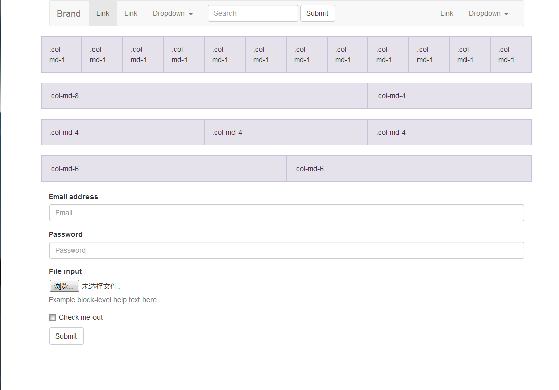
Analysis:
Container
There are two functions: to provide width limitation in response to possible changes in width, and to provide a horizontal padding so that its internal content does not touch the browser's boundaries, size 15 px, to achieve content in the middle. When the page width changes, the width of the container also changes. And the width of column s is based on percentages, so their values don't need to change.
Note that you don't need or should not nest another container in the container.
row
Rows are containers directly existing in columns. According to document description, rows can have up to 12 columns, but they can be flexibly extended by nesting. At the same time, as wrapper s of columns which are all left-floating, they have the nature of clearfix. At the same time, row has a special feature, that is, there are - 15px margin s on the left and right, which are used to offset the 15px padding in container.
Note: Why does the grid default to 12 columns, because 12 is easier to divide into 3, 4, 2, 6 equivalents?
column
Each column will also have a padding in the horizontal direction of 15px, and colunmn can only survive in row. Since the margin of row is -15px, then column on both sides will encounter the boundary of container. But colunmn itself has 15px padding so that its contents do not touch container, and there are 30px slots between different column contents.
Note: Be sure to put column in row.
nesting
When the above series of container, row and column are set up, the grid system can be extended by nesting, that is, nesting row directly in the column, without the need to nest another layer of container: nesting.
Remember that both containers and column s have 15px padding, which is equivalent to containers in nseting, so that arbitrary nesting can be achieved.
3.3 Use of bootstrap
<!DOCTYPE html>
<html lang="en">
<head>
<meta charset="UTF-8">
<link rel="stylesheet" href="bootstrap.min.css" type="text/css">
<title>Use bootstrap</title>
</head>
<body>
<nav class="navbar navbar-inverse navbar-fixed-top">
<div class="container">
<!-- Brand and toggle get grouped for better mobile display -->
<div class="navbar-header">
<button type="button" class="navbar-toggle collapsed" data-toggle="collapse"
data-target="#bs-example-navbar-collapse-1" aria-expanded="false">
<span class="sr-only">Toggle navigation</span>
<span class="icon-bar"></span>
<span class="icon-bar"></span>
<span class="icon-bar"></span>
</button>
<a class="navbar-brand" href="#">Project name</a>
</div>
<!-- Collect the nav links, forms, and other content for toggling -->
<div class="collapse navbar-collapse" id="bs-example-navbar-collapse-1">
<form class="navbar-form navbar-right">
<div class="form-group">
<input type="text" class="form-control" placeholder="Email">
</div>
<div class="form-group">
<input type="text" class="form-control" placeholder="Password">
</div>
<button type="submit" class="btn btn-success">Sign in</button>
</form>
</div><!-- /.navbar-collapse -->
</div><!-- /.container-fluid -->
</nav>
<div class="jumbotron">
<div class="container">
<h1 style="padding-top: 50px">Hello, world!</h1>
<p>This is a template for a simple marketing or informational website. It includes a large callout called a
jumbotron and three supporting pieces of content. Use it as a starting point to create something more
unique.</p>
<p><a class="btn btn-primary btn-lg" href="#" role="button">Learn more »</a></p>
</div>
</div>
<div class="container">
<div class="row">
<div class="col-md-4">
<h2>Heading</h2>
<p>Donec id elit non mi porta gravida at eget metus. Fusce dapibus, tellus ac cursus commodo, tortor mauris condimentum nibh, ut fermentum massa justo sit amet risus. Etiam porta sem malesuada magna mollis euismod. Donec sed odio dui.</p>
<p><a class="btn btn-default btn-lg" role="button">View Detail »</a></p>
</div>
<div class="col-md-4"><h2>Heading</h2>
<p>Donec id elit non mi porta gravida at eget metus. Fusce dapibus, tellus ac cursus commodo, tortor mauris condimentum nibh, ut fermentum massa justo sit amet risus. Etiam porta sem malesuada magna mollis euismod. Donec sed odio dui.</p>
<p><a class="btn btn-default btn-lg" role="button">View Detail »</a></p>
</div>
</div>
<hr/>
<footer>
<p>©2017 Company, byd666.</p>
</footer>
</div>
</body>
</html>
4 Summary
Using bootstrap to achieve responsive layout is faster, but the code redundancy is too large, loading speed is not fast enough, and to be proficient in some content of official documents, you need to know which style you need, so that you can improve your development speed faster.