Bootstrap overview
What is Bootstrap
Bootstrap is a framework based on HTML, CSS and JavaScript languages. It has simple and flexible features, and has style libraries, components and plug-ins.
Bootstrap is often used to develop responsive layout and mobile device priority Web projects, which can help developers quickly build front-end pages.
Framework: a set of architecture. It has a relatively complete set of web page function solutions, and the control is in the framework itself. There are prefabricated style libraries, components and plug-ins. Users should develop according to some specifications specified in the framework
Bootstrap features
- Mobile device first. Since bootstrap 3, the framework includes the mobile device first style throughout the whole library
- Browser support. All mainstream browsers support Bootstrap
- Easy to use
- Responsive design, Bootstrap's responsive CSS can be adapted to desktops, tablets and mobile phones
- Contains powerful built-in components
Composition of Bootstrap
- Basic structure: Bootstrap provides a basic structure with grid system, link style and background
- CSS: Bootstrap features global CSS settings, defining basic HTML element styles, extensible class es, and an advanced grid system
- Components: Bootstrap contains more than a dozen reusable components for creating images, drop-down menus, navigation, warning boxes, pop-up boxes, etc
- JavaScript plug-ins: Bootstrap contains more than a dozen custom jQuery plug-ins
Use of Bootstrap
Download the compilation package and import its core css file and JavaScript file in the page.
<link href="bootstrap.min.css" ref="stylesheet"/>
<script src="../js/jquery-3.4.1.js"></script>
<script src="bootstrap.min.js" type="text/javascript"></script>
Use the file address provided by CDN (must be networked).
<link href="https://cdn.jsdelivr.net/npm/bootstrap@5.0.2/dist/css/bootstrap.min.css" rel="stylesheet">
<script src="https://cdn.jsdelivr.net/npm/bootstrap@5.0.2/dist/js/bootstrap.min.js"></script>
Bootstrap layout container
Bootstrap needs to wrap a. Container container for page content and grid system. Bootstrap defines this class in advance, called. Container, which provides two classes for this purpose.
These two containers cannot be nested with each other.
- . container: class is used for containers with fixed width and supporting responsive layout
<div class="container"></div>
- . container fluid: class is used for containers that are 100% wide and occupy all viewport s
<div class="container-fluid"></div>
Global css style of Bootstrap
Disable zoom on mobile devices
<meta user-scalable=no />
Title label
h1 - h6 all have corresponding class attributes:. H1 ~. H6.
Page body
Font size: 14px
Line height: 1.428
form
.table: Basic style of table

.table-striped: Zebra crossing effect(Interlaced discoloration)

.table-bordered: frame

.table-hover: Mouse over effect(Respond to mouse over)

.table-condensed: Table compact style
- Status class style: sets the style of rows or cells
.table-active

.table-success: successful

.table-info: ordinary

.table-primary: major

.table-warning: Warning

.table-danger: dangerous
form
.form-group: It can make the form controls arranged in a better position

.form-control: You can use this style input,textarea,select The width of the is 100%
Button
- The style of the button
<button type="button" class="btn btn-primary">university</button>

<button type="button" class="btn btn-success">university</button>

<button type="button" class="btn btn-warning">university</button>

<button type="button" class="btn btn-danger">university</button>

<button type="button" class="btn btn-info">university</button>
- Button size
.btn-lg: Big button

.btn-sm: Small button

.btn-xs: Ultra small button

.btn-block: The width of the button is 100 of the parent container%
Picture style
.img-rounded: Fillet picture

.img-circle: Circular picture

.img-thumbnail: Border fillet

.img-responsive: Responsive picture

.center-block: Picture centered horizontally
Auxiliary class
- The color of the text
.text-success

.text-primary

.text-warning

.text-info

.text-danger
- background color
.bg-success

.bg-primary

.bg-warning

.bg-info

.bg-danger
- Triangle symbol
<span class="caret"></span>
- Clear float
<div class="clearfix"></div>
- Show and hide content
 <div class="hidden"></div>

 <div class="show"></div>
Bootstrap grid system
Grid system: grid systems, also known as grid system, refers to dividing the page layout into equal width columns, and then modularizing the page layout through the definition of the number of columns.
Bootstrap provides a responsive, mobile device first streaming grid system. With the increase of screen or viewport size, the system will be automatically divided into up to 12 columns.
Divide the screen or viewport into up to 12 columns, create a page layout through a series of row and column combinations, and put our content in the columns.
The width of the container in the Bootstrap is fixed, but the width of the container is different under different screens. We divide the container into 12 equal parts.
- Rows must be placed in containers (. container or. container fluid) for proper arrangement and padding
- Each row can be divided into several columns (cols), which can only be used as the direct child elements of the row
- Columns in the grid system represent the range they span by specifying values from 1 to 12
- If a row contains more than 12 columns, the elements of the redundant columns will be arranged in another row as a whole
- Each column has left and right 15 pixel padding by default
- You can specify the class names of multiple devices for a column at the same time to divide different copies, such as "col-md-4 col-sm-6"
- To achieve the average division of columns, you need to add a class prefix to the columns
| Class prefix | equipment |
|---|---|
| col-xs-* | Ultra small screen, mobile phone (< 768px) |
| col-sm-* | Small screen, tablet (> = 768px) |
| col-md-* | Medium screen desktop display (> = 992px) |
| col-lg-* | Large screen, large desktop display (> = 1200px) |
Column nesting
The built-in grid system of the grid system nests the content again.
We can add a new. row element and a series of. Col SM - * elements to the existing. Col SM - * elements.
We'd better add a row to the column nesting, so that the padding value of the parent element can be cancelled, and the height is automatically as high as the parent.
Column offset (right offset)
Using the. Col MD offset - * class, you can offset the column to the right, which is actually adding a left margin to the current element by using a selector.
. col MD offset - *: indicates the number of columns offset.
Column sorting
You can easily change the order of columns by using the. Col MD push - * and col MD pull - * classes.
Delete grid spacing
Use. Row no gutters to remove grid spacing.
Grid under flow container
Container fluid: the width of the grid is 100%.
Font Icon
- Include the font file directory – fonts in the sibling directory of the css file
- Use labels to add font icons
<span class="glyphicon glyphicon-ok"></span>
drop-down menu
<div class="dropdown">
     <button type="button" class="btn dropdown-toggle" data-toggle="dropdown">
           theme
           <span class="caret"></span>
     </button>
     <ul class="dropdown-menu" >
          <li>
               <a  href="#">Java</a>
          </li>
          <li>
               <a href="#"> Data Mining</a>
          </li>
          <li>
                <a  href="#"> data communication / network</a>
          </li>
          <li  class="divider"></li>
          <li>
                <a  href="#"> separate links</a>
          </li>
      </ul>
</div>
Button group
- By adding BTN group to the container, you can put a group of buttons on the same line
- In the button group, except the first and last buttons, the other buttons are not rounded
<div class="btn-group">
     <button type="button" class="btn btn-default">
         <span class="glyphicon glyphicon-step-backward"></span>
     </button>
     <button type="button" class="btn btn-default">
         <span class="glyphicon glyphicon-chevron-left"></span>
     </button>
     <button type="button" class="btn btn-default">
         <span class="glyphicon glyphicon-chevron-right"></span>
     </button>
     <button type="button" class="btn btn-default">
         <span class="glyphicon glyphicon-pause"></span>
     </button>
</div>
Buttons Toolbar
Add BTN toolbar to the class attribute of the container, and then use it in combination with the button group.
Input group box
- Set the class attribute of the container to input group
- Add in the container and set the class attribute to input group addon
Responsive tools
In order to speed up the development of mobile device friendly pages, we can easily display or hide page content for different devices by using media query function and these tools.
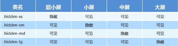
In contrast, visible XS visible SM visible MD visible LG displays the content of a page.
Collapse menu
<!--data-toggle Custom attribute values and div of class With the same attribute value, click the hyperlink to jump to the given div upper(id attribute)-->
<a class="btn btn-primary" data-toggle="collapse" href="#collapseExample">
    Yao Cen
</a>
<div class="collapse" id="collapseExample">
    <div class="card card-body">
        I would like to pay tribute to Qiantang with Yao Cen
    </div>
    <div class="card card-body">
        To Yao Cen
    </div>
</div>
Rotation chart
  <div id="carouselExampleControls" class="carousel slide" data-ride="carousel">
    <!-- Carousel indicator -->
    <ol class="carousel-indicators">
      <li data-target="#carouselExampleIndicators" data-slide-to="0" class="active"></li>
      <li data-target="#carouselExampleIndicators" data-slide-to="1"></li>
      <li data-target="#carouselExampleIndicators" data-slide-to="2"></li>
    </ol>
    <div class="carousel-inner">
      <div class="carousel-item active">
        <img src="images/slide1.webp" class="d-block w-100" alt="...">
      </div>
      <div class="carousel-item">
        <img src="images/slide2.webp" class="d-block w-100" alt="...">
      </div>
      <div class="carousel-item">
        <img src="images/slide3.webp" class="d-block w-100" alt="...">
      </div>
    </div>
    <!-- View previous -->
    <a class="carousel-control-prev" href="#carouselExampleControls" role="button" data-slide="prev">
      <span class="carousel-control-prev-icon"></span>
    </a>
    <!-- View next -->
    <a class="carousel-control-next" href="#carouselExampleControls" role="button" data-slide="next">
      <span class="carousel-control-next-icon"></span>
    </a>
  </div>