1, Introduction
Responsive layout is that a website can be compatible with multiple terminals, rather than making a specific version for each terminal. This concept was born to solve the problem of mobile Internet browsing.
Navigation bar and rotation account for a high proportion in the head of most websites, especially the navigation bar, which plays the role of website map.
In the responsive layout, the navigation bar is required to display different styles according to the terminal screen size.
2, Knowledge points
2.1 navigation bar
Official explanation: the navigation bar is a responsive basic component used as the navigation header in your application or website. They can be folded (and can be turned on or off) on the mobile device and gradually become a horizontal flat pattern as the width of the viewport increases.
2.1.1 basic navigation bar
Before using Bootstrap, it is customary to construct a navigation bar with < UL > + < li >.
<!--Code part-->
<style>
.navigation-past{
    list-style: none;
}
.navigation-past>li{
    float: left;
    padding: 8px;
}
.navigation-past>li>a{
    text-decoration: none;
    color: #000;
}
.active-past{
    background: #E7E7E7;
}
</style>
<ul class="navigation-past">
	   <!--Select-->
    <li class="active-past"><a href="#">Navigation First</a></li>
    <li><a href="#">Navigation Second</a></li>
    <li><a href="#">Navigation Third</a></li>
    <li><a href="#">Navigation Fourth</a></li>
    <li><a href="#">Navigation Fifth</a></li>
</ul>
design sketch:

If you use Bootstrap, you can add some modifications to the familiar structure. First, set a layer of < div > outside < UL > and add the style navbar navbar default; Then add the style NAV navbar NAV to the < UL > inside; Finally, add the style active to the selected part. A basic Bootstrap navigation is completed.
<!--Code part-->
<div class="navbar navbar-default" role="navigation">
    <ul class="nav navbar-nav">
        <li class="active"><a href="#">Navigation First</a></li>
        <li><a href="#">Navigation Second</a></li>
        <li><a href="#">Navigation Third</a></li>
        <li><a href="#">Navigation Fourth</a></li>
        <li><a href="#">Navigation Fifth</a></li>
    </ul>
</div>
design sketch:

Here, a role="navigation" attribute is added to the outermost layer. Here is the tag attribute of HTML5. The purpose is to make the tag semantic, facilitate the screen reader to identify it, and facilitate the browsing of special people.
2.1.2 advanced navigation bar
When browsing some official websites, the first thing you see is the bright company LOGO and exaggerated rotation in the upper left corner. Bootstrap has reserved a LOGO position in the navigation. The use method is to add a style navbar header's < div > in the outer < div > and a style navbar brand's < a > element in this < div >.
<!--Code part-->
<div class="navbar navbar-default" role="navigation">
			<div class="navbar-header">
						<a href="#" class="navbar-brand">LOGO</a>
			</div>
    <ul class="nav navbar-nav">
        <li class="active"><a href="#">Navigation First</a></li>
        <li><a href="#">Navigation Second</a></li>
        <li><a href="#">Navigation Third</a></li>
        <li><a href="#">Navigation Fourth</a></li>
        <li><a href="#">Navigation Fifth</a></li>
    </ul>
</div>
design sketch:

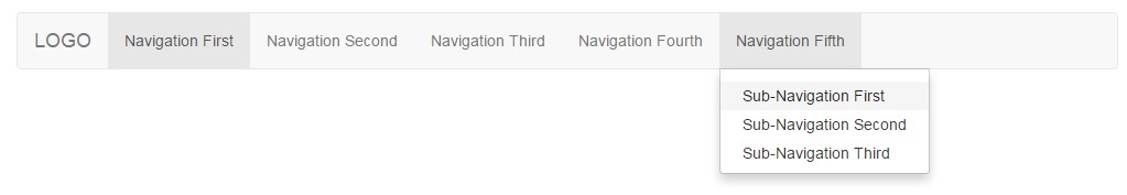
Sometimes the first level navigation is not enough. It needs to be combined with the second level navigation to show more content. Usage: first, add the style dropdown in the < li > element that needs secondary navigation, and add the style dropdown toggle and attribute data toggle = "dropdown" in the < a > element; Then put a < UL > + < li > combination under < a > in < li > and add the style dropdown menu to the < UL > label.
<!--Code part-->
<div class="navbar navbar-default" role="navigation">
			<div class="navbar-header">
						<a href="#" class="navbar-brand">LOGO</a>
			</div>
    <ul class="nav navbar-nav">
        <li class="active"><a href="#">Navigation First</a></li>
        <li><a href="#">Navigation Second</a></li>
        <li><a href="#">Navigation Third</a></li>
        <li><a href="#">Navigation Fourth</a></li>
        <li class="dropdown">
            <a href="#" class="dropdown-toggle" data-toggle="dropdown" role="button" aria-haspopup="true" aria-expanded="false">
                Navigation Fifth
                <ul class="dropdown-menu">
                    <li><a href="#">Sub-Navigation First</a></li>
                    <li><a href="#">Sub-Navigation Second</a></li>
                    <li><a href="#">Sub-Navigation Third</a></li>
                </ul>
            </a>
        </li>
    </ul>
</div>
design sketch:
A new attribute aria haspopup = "true" aria expanded = "false" appears here. Similarly, this is a new attribute added to HTML5. Here, Jiang Zhongqiu of the Segmentfault community is quoted as an answer.
Aria haspopup: true indicates that a menu or floating element will appear when clicking; false indicates no pop-up effect. Aria expanded: indicates the expanded state. The default value is undefined, indicating that the current deployment status is unknown. Other optional values: true indicates that the element is expanded; false indicates that the element is not expanded.
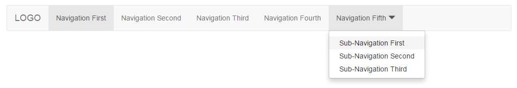
The drop-down box usually has a downward arrow symbol ▼. Similarly, this effect is also supported in Bootstrap, but the glyphs Font Icon of her own font library needs to be introduced.
Official introduction: Bootstrap includes more than 250 font icons from Glyphicon Halflings. Glyphicons Halflings is generally charged, but their authors allow Bootstrap to be used for free. To thank you, I hope you can add one for glyphics as much as possible Links.
Usage: create a new < span > element, and then add the style glyphicon glyphicon triangle bottom.
Example of glyphics Font Icon usage:
<!--Code part-->
<li class="dropdown">
    <a href="#" class="dropdown-toggle" data-toggle="dropdown" role="button" aria-haspopup="true" aria-expanded="false">
        Navigation Fifth <span class="glyphicon glyphicon-triangle-bottom" aria-hidden="true"></span>
        <ul class="dropdown-menu">
            <li><a href="#">Sub-Navigation First</a></li>
            <li><a href="#">Sub-Navigation Second</a></li>
            <li><a href="#">Sub-Navigation Third</a></li>
        </ul>
    </a>
</li>
design sketch:
be careful:
- Add a space between glyphs Font Icon and text, otherwise it will affect the correct display of style (padding).
- The server needs to add the corresponding MIME type correctly, otherwise a 404 error will be reported when loading the font.
In addition, the arrows here can also be realized by using the style caret provided by Bootstrap. The arrows here are realized by CSS. How to use: < span class = "caret" > < / span >.
2.1.3 responsive navigation bar
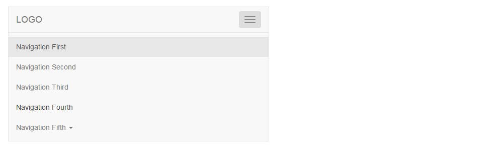
When browsing websites on the mobile terminal, you often see navigation guides composed of several horizontal lines (≡). Bootstrap, as a mobile device, also supports this demand. The use method of responsive navigation is relatively fixed. First, add a fixed code in the navigation Title < div class = "navbar header" >; Then, the < UL > element that needs to be folded in the small screen is wrapped with a layer of < div > element of the style collapse navbar collapse, and the element is added with an ID of any name, for example: id = "navigation collapse"; Finally, add the data target attribute on the < button > element of the responsive button to point to the content ID to be folded, for example: data target = "#navigation collapse".
<!--Code part-->
<div class="navbar navbar-default" role="navigation">
    <div class="navbar-header">
						<!--The following is a fixed writing method, which can be copied and pasted when used-->
        <button class="navbar-toggle" type="button" data-toggle="collapse" data-target="#navigation-collapse">
          <span class="sr-only">Toggle Navigation</span>
          <span class="icon-bar"></span>
          <span class="icon-bar"></span>
          <span class="icon-bar"></span>
        </button>
        <a href="#" class="navbar-brand">LOGO</a>
    </div>
    <div class="collapse navbar-collapse" id="navigation-collapse">
        <ul class="nav navbar-nav">
            <li class="active"><a href="#">Navigation First</a></li>
            <li><a href="#">Navigation Second</a></li>
            <li><a href="#">Navigation Third</a></li>
            <li><a href="#">Navigation Fourth</a></li>
            <li class="dropdown">
                <a href="#" class="dropdown-toggle" data-toggle="dropdown" role="button" aria-haspopup="true" aria-expanded="false">
                    Navigation Fifth <span class="caret"></span>
                    <ul class="dropdown-menu">
                        <li><a href="#">Sub-Navigation First</a></li>
                        <li><a href="#">Sub-Navigation Second</a></li>
                        <li><a href="#">Sub-Navigation Third</a></li>
                    </ul>
                </a>
            </li>
        </ul>
    </div>
</div>
design sketch:
2.2 rotation
Picture rotation is one of the important parts of the website. It is often used to put event advertisements or enterprise publicity pictures, sometimes called "slides". The rotation effect in Bootstrap is realized by the JavaScript plug-in Carousel.
2.2.1 basic rotation
The use method of rotation is also relatively fixed, and special scenes can be modified as required. Note that you need to add an id to the outermost < div > element and point to this id in the small circle.
<!--Code part-->
<div id="my-banner" class="carousel">
    <!--Place a dot and click to switch the rotation-->
    <ol class="carousel-indicators">
        <!--Add style active Indicates the rotation displayed by default, data-slide-to="0"Property indicates the order in which the rotation is displayed-->
        <li data-target="#my-banner" data-slide-to="0" class="active"></li>
        <li data-target="#my-banner" data-slide-to="1"></li>
    </ol>
    <!--Here is the picture of the rotation display-->
    <div class="carousel-inner">
        <!--Add style active Represents the picture displayed by default-->
        <div class="item active">
            <img src="http://www.mazey. net/img/upload/image/20170712/b1. Jpg "ALT =" rotation ">
        </div>
        <div class="item">
            <img src="http://www.mazey. net/img/upload/image/20170712/b2. Jpg "ALT =" rotation ">
        </div>
    </div>
</div>
design sketch:

2.2.2 advanced rotation
A complete rotation should have the functions of automatic play, click switch, suspension stop and additional description text. Don't worry, these bootstraps all have them!
2.2.2.1 automatic broadcast
The outermost < div > element adds attribute data ride = "carousel" and style slide (to make the rotation play smoother), such as < div id = "my banner" class = "carousel slide" data ride = "carousel" >. At this time, the automatic playback time of the rotation is 5 seconds (default). If you want to change this value, set the attribute data interval = "the value you want". If I want to rotate once in 3 seconds (3000 ms), set data interval = "3000". In addition, the rotation is stopped by default (data pause = "hover"). If you want to prohibit the suspension playback, set the attribute data pause = "false".
2.2.2.2 adding text
Add < div > of carousel caption style under the < img > element of the rotation picture, and the text stored in it can be correctly displayed on the rotation.
<!--Code part-->
<div class="carousel-caption">
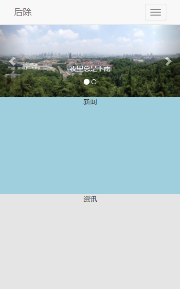
<h5>It always rains at night</h5>
</div>
2.2.2.3 click switch
Place two < a > elements under the rotation picture, href point to the rotation id, and add the attribute data slide = "prev / next forward / backward".
<!--Code part-->
<!--<a>Elemental href Point to rotation id-->
<a class="left carousel-control" href="#my-banner" data-slide="prev" role="button">
    <span class="glyphicon glyphicon-chevron-left"></span>
</a>
<a class="right carousel-control" href="#my-banner"  data-slide="next" role="button">
    <span class="glyphicon glyphicon-chevron-right"></span>
</a>
Example of rotation code:
<!--Code part-->
<div id="my-banner" class="carousel slide" data-ride="carousel" data-interval="3000" data-pause="false">
    <!--Place a dot and click to switch the rotation-->
    <ol class="carousel-indicators">
        <!--Add style active Indicates the rotation displayed by default, data-slide-to="0"Property indicates the order in which the rotation is displayed-->
        <li data-target="#my-banner" data-slide-to="0" class="active"></li>
        <li data-target="#my-banner" data-slide-to="1"></li>
    </ol>
    <!--Here is the picture of the rotation display-->
    <div class="carousel-inner">
        <!--Add style active Represents the picture displayed by default-->
        <div class="item active">
            <img src="http://www.mazey. net/img/upload/image/20170712/b1. Jpg "ALT =" rotation ">
            <div class="carousel-caption">
                <h5>It always rains at night</h5>
            </div>
        </div>
        <div class="item">
            <img src="http://www.mazey. net/img/upload/image/20170712/b2. Jpg "ALT =" rotation ">
            <div class="carousel-caption">
                <h5>In addition to reminding youのworld</h5>
            </div>
        </div>
    </div>
    <!--<a>Elemental href Point to rotation id-->
    <a class="left carousel-control" href="#my-banner" data-slide="prev" role="button">
        <span class="glyphicon glyphicon-chevron-left"></span>
    </a>
    <a class="right carousel-control" href="#my-banner"  data-slide="next" role="button">
        <span class="glyphicon glyphicon-chevron-right"></span>
    </a>
</div>
design sketch:

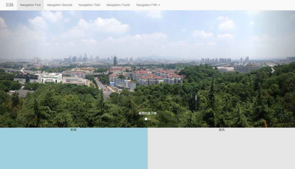
3, Actual combat
Try to combine the grid system + navigation bar + rotation layout to create a responsive page.
Computer side rendering:
Effect drawing of mobile terminal:
In fact, it is very simple to achieve such an effect. First, let's take a look at how grid parameters work on a variety of screen devices.
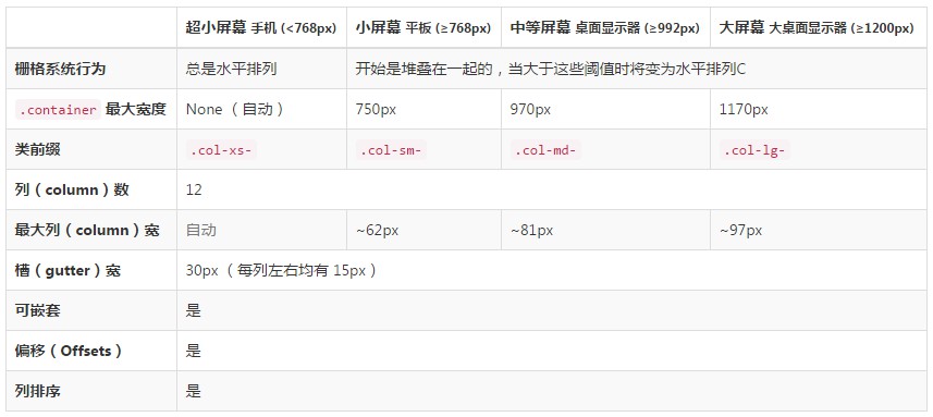
Add the styles col XS - *, col SM - * and col MD - *. When the screen is small (screen width < 992px), col XS - *, col SM - * takes effect and col MD - * fails; In case of large screen (screen width ≥ 992px), col MD - * takes effect, col XS - *, col SM - * fails. For example: < div class = "col-xs-12 col-sm-12 col-md-6" > News < / div > < div class = "col-xs-12 col-sm-12 col-md-6" > information < / div >.
Demo address: https://mazey.cn/bootstrap-blueprints/lesson-second-navigation/index.html , source code address: https://github.com/mazeyqian/bootstrap-blueprints/tree/master/lesson-second-navigation.
Copyright notice
All original articles of this blog are copyrighted by the author. Reprint must include this statement, keep this article complete, and indicate the author in the form of hyperlink Post Division And the original address of this article: https://blog.mazey.net/2575.html
(end)