🐦
1.base - basic components
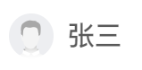
1.Avatar (registered globally)


<Avatar :src="item.avatar" :gender="item.gender"></Avatar>
- Parameter configuration:
| parameter | explain | type | Optional value | Default value |
|---|---|---|---|---|
| src | Avatar picture | String | - | - |
| gender | User gender | String / Number | - | - |
2.Back
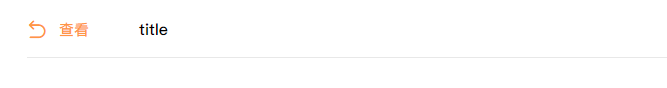
import Back from '@comp/base/Back'
<Back @back="methods" title="title" />
- Parameter configuration:
| parameter | explain | type | Optional value | Default value |
|---|---|---|---|---|
| title | title | String | - | - |
| specialPadding | Special padding value. If true, it is special padding: 0 40px | Boolean | true / false | false |
- event:
| Event name | explain |
|---|---|
| back | Click to return to the method |
3.BlockTag

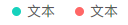
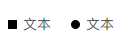
import BlockTag from '@comp/base/BlockTag'
1.<BlockTag type="1">written words</BlockTag>
2.<BlockTag type="1" round>written words</BlockTag>
3.<BlockTag color="black"> text</BlockTag>
- Parameter configuration:
| parameter | explain | type | Optional value | Default value |
|---|---|---|---|---|
| type | Color type, color 1 from left | String / Number | - | 1 |
| round | Is it round | Boolean | true|false | false |
| color | Custom color | String | - | - |
4.ConditionPopover
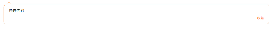
import ConditionPopover from '@comp/base/ConditionPopover'
<el-button @click.stop="isCollapse = true">Button</el-button>
<ConditionPopover :el="el" :collapse.sync="isCollapse">
    Condition content
</ConditionPopover>
- Parameter configuration:
| parameter | explain | type | Optional value | Default value |
|---|---|---|---|---|
| el | Control object at small arrow position | VNode / HTMLElement | - | - |
| collapse | Fold | Boolean | true|false | true |
5.Header

import Header from '@comp/base/Header'
<Header>content</Header>
6.Icon (Global registered)
<Icon iconName="back" color="blue" size="18px"> </Icon>
- Parameter configuration:
| parameter | explain | type | Optional value | Default value |
|---|---|---|---|---|
| iconName | Using svg files in assets | String | - | - |
| color | Icon color | String | - | - |
| size | Icon size | String | - | 16px |
7.Logo

import Logo from '@comp/base/Logo'
<Logo></Logo>
8.Mine
import Mine from '@comp/base/Mine'
<Mine src="" name=""></Mine>
- Parameter configuration:
| parameter | explain | type | Optional value | Default value |
|---|---|---|---|---|
| src | head portrait | String | - | - |
| name | name | String | - | - |
9.Notify


import Notify from '@comp/base/Notify'
<Notify :msgNum="88" :max="99"></Notify>
<Notify isDot></Notify>
//msgNum: digital display / / max: default 99 //isDot: dot display
- Parameter configuration:
| parameter | explain | type | Optional value | Default value |
|---|---|---|---|---|
| msgNum | number | String / Number | - | - |
| max | Name Max | String / Number | - | 99 |
| isDot | Whether dot display | Boolean | true|false | false |
10.Pagination

import Pagination from '@comp/base/Pagination'
<Pagination :total="100" :pageSize="10" :hideOnSinglePage="true"></Pagination>
//Total: total / / pageSize: number of paging pages
//hideOnSinglePage: whether to display paging components when there is only one page of data. true is not displayed by default
- Parameter configuration:
| parameter | explain | type | Optional value | Default value |
|---|---|---|---|---|
| total | total | String / Number | - | 0 |
| pageSize | Paged pages | String / Number | - | 10 |
| hideOnSinglePage | Whether to display paging component when there is only one page of data | Boolean | true|false | true |
11.Popover
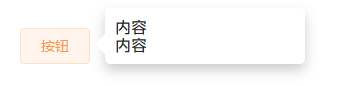
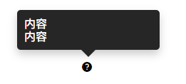
import Popover from '@comp/base/Popover'
<Popover width="200" tigger="hover" placement="right-end" dark hideTtriangle>
    <el-button>Button</el-button>//Control point on
    <template #Content > / / content
        content
        <br />
        content
    </template>
</Popover>
- Parameter configuration:
| parameter | explain | type | Optional value | Default value |
|---|---|---|---|---|
| width | width | String | - | 150 |
| dark | theme | Boolean | true/false | false |
| tigger | Trigger mode | String | click/hover | click |
| placement | Occurrence position | String | top-start /top / top-end / bottom-start / bottom / bottom-end / left-start / left / left-end / right-start / right / right-end | top |
| hideTtriangle | Hide triangle tip | Boolean | true / false | false |
12.SideBar
Registered globally
13.Tabs
import Tabs from '@comp/base/Tabs'
<Tabs :tabList="tabList"></Tabs>
- Parameter configuration:
| parameter | explain | type | Optional value | Default value |
|---|---|---|---|---|
| tabList | Component array | Array | - | - |
tabList Parameter form:
[
    {
        name: 'schedule',
        title: 'Interview schedule',
        lazy: true,
        comp: () => import('route')
    },
]
- tabList parameter configuration:
| parameter | explain | type | Optional value | Default value |
|---|---|---|---|---|
| name | Component name | String | - | - |
| title | Component display name | String | - | - |
| lazy | Lazy loading | Boolean | true / false | false |
| comp | Component address | - | - | - |
14.Tag
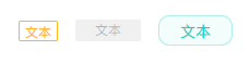

import Tag from '@comp/base/Tag'
<Tag size="mini" :type="1"></Tag>
<Tag size="medium" :type="2"></Tag>
<Tag :type="3"></Tag>

custom style
<Tag style=""></Tag>
- Parameter configuration:
| parameter | explain | type | Optional value | Default value |
|---|---|---|---|---|
| size | size | String | mini / medium / default | default |
| type | Color type | String / Number | When size=mini, type has 1,2,3; When size =: medium, the type has 1,2,3; When size = default, the type has 1,2,3,4,5,6; Then look at the returned value of the interface | 1 |
15.Rate


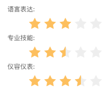
import Rate from '@comp/base/Rate'
<Rate :rate="rate" size="large" writable @chooseRate="chooseRate"></Rate>
rate: [
    {
        name: 'Language expression',
        value: 0
    },
    {
        name: 'Professional skills',
        value: 0
    },
    {
        name: 'Appearance',
        value: 0
    }
]
chooseRate(index, val){
    this.$set(this.rate[index], 'value', val)
}
- Configuration parameters:
| parameter | explain | type | Optional value | Default value |
|---|---|---|---|---|
| rate | Array data | Array | - | - |
| size | type | String | mini / medium / large | mini |
| writable | Can I select (not read-only) | Boolean | true / false | false |
- rate parameter:
| parameter | explain | type | Optional value | Default value |
|---|---|---|---|---|
| name | Array text | String | - | - |
| value | numerical value | Number * * (must be number)** | - | - |
- event:
| Event name | explain |
|---|---|
| chooseRate | This event is generally not required for read-only; Generally, it is bundled with writable. When this method is available, it returns the value value of subscript index and rate array data. The value of the array can be modified through $set |
16. NoData (registered globally)

 <NoData type="2" Width="250px" height="250px">
    <p>no data</p> This is a slot
 </NoData>
- Parameter configuration:
| parameter | explain | type | Optional value | Default value |
|---|---|---|---|---|
| width | wide | String | "xxx+px" | 250 |
| height | high | String | "xxx+px"250 | |
| img | Custom picture path | String | - | - |
| type | The transfer type reads img pictures under Nodata. What pictures you need can be transferred or added by yourself | String,Number | - | 1 |
2.business - business component
1.CandidateCard-?
2.chat chat
import chatItem from '@comp/business/chat/chatItem'
<chatItem></chatItem>
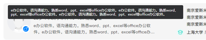
3.Resume resume
Resume, screenshot is only part
import Resume from '@comp/business/Resume'
<Resume></Resume>
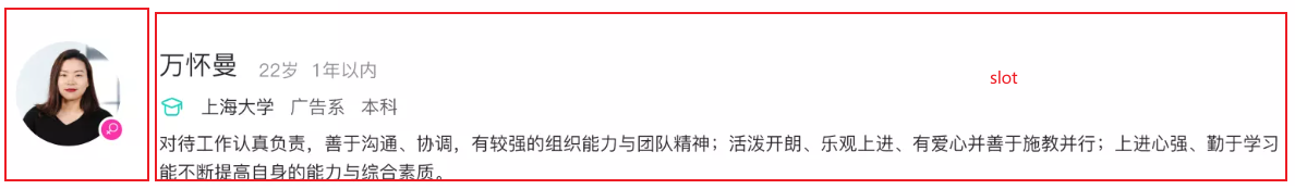
4.TalentCard - talent card
import TalentCard from '@comp/business/TalentCard'
<TalentCard> </TalentCard> //Talent card
5. Talent pool card
No picture
import TalentPoolCard from '@comp/business/TalentPoolCard'
<TalentPoolCard> </TalentPoolCard>
6.todo
(1)blockBox
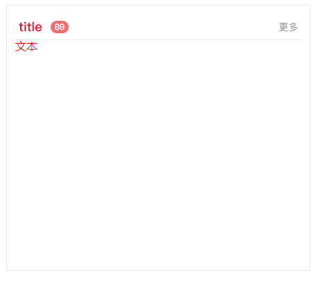
import blockBox from '@comp/business/todo/blockBox'
<blockBox customStyle="color:red" count="89" title="title"> text</blockBox>
//customStyle: style, multiple styles use ";" Separated by / / count: number of messages / / Title: title
- Parameter configuration:
| parameter | explain | type | Optional value | Default value |
|---|---|---|---|---|
| customStyle | User defined style, multiple styles use "; "Separated by" | String | - | - |
| count | Number of messages | String / Number | - | - |
| title | title | String | - | title |
(2)todoTabs
import todoTabs from '@comp/business/todo/todoTabs'
<todoTabs :tabList="tabList"></todoTabs> //tabList: tabs array{
name:name, count:numerical value }
- Parameter configuration:
| parameter | explain | type | Optional value | Default value |
|---|---|---|---|---|
| tabList | tabs array | String | - | - |
- tabList array parameters:
| parameter | explain | type | Optional value | Default value |
|---|---|---|---|---|
| name | name | String | - | - |
| count | numerical value | Number | - | - |
(3)todoItem
import todoItem from '@comp/business/todo/todoItem'
<todoItem :item="item"></todoItem>
- Parameter configuration:
| parameter | explain | type | Optional value | Default value |
|---|---|---|---|---|
| item | name | String | - | - |
7.VipSign member


import VipSign from '@comp/business/VipSign'
<VipSign vipType="1"></VipSign>
- Parameter configuration:
| parameter | explain | type | Optional value | Default value |
|---|---|---|---|---|
| vipType | Membership type | String / Number | 0 / 1 / 2 / 3 | 0 |
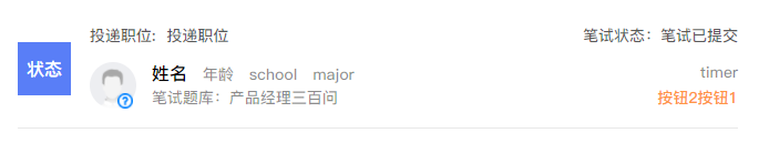
8.Calendar
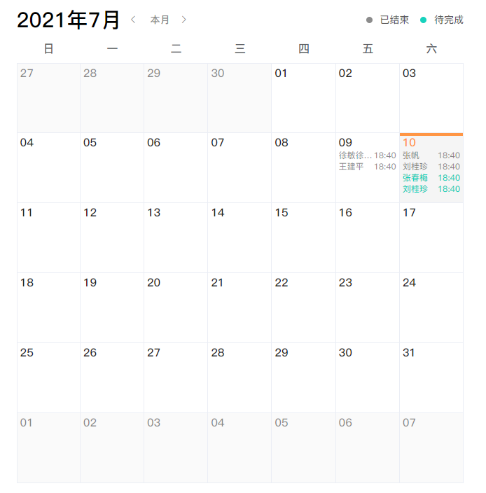
import Calendar from '@comp/base/Calendar'
<Calendar :schedule="schedule" @getClickDay="getClickDay"></Calendar>
- Parameter configuration:
| parameter | explain | type | Optional value | Default value |
|---|---|---|---|---|
| schedule | Schedule information | Array | - | - |
//Temporary data structure of schedule [{date: '2021-07-09', time: '18:40', content: 'Xu Min, Xu Min, Xu Min, status: 0}]
- event:
| Event name | explain |
|---|---|
| getClickDay | Get the date clicked by the user to match the interview arrangement |
3.dialog - pop up window placement
(1)Example
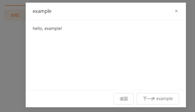
<el-button @click="open">Button</el-button>
methods: {
    open () {
        this.$dialog.Example({
            props: {
                msg: 'hello, example!'
            }
        })
    }
}
//Example: pop up name
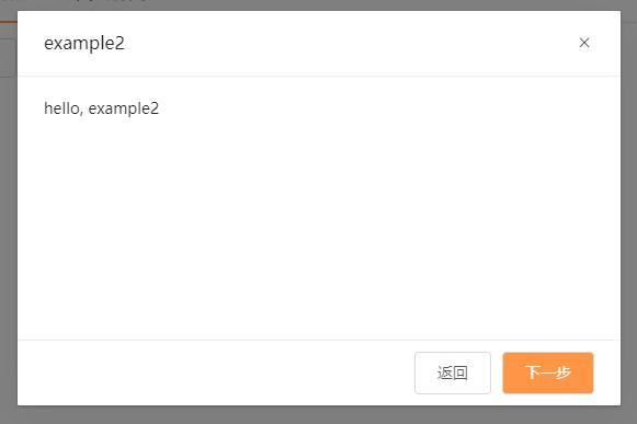
(2)Example2
4.global - Global
(1)$dialog - pop up layer
//Where you need to call up the pop-up window
this.$dialog.Pop up name({
  props: {
    //Parameter collection passed into the component
    msg: 'hello, example!'
  }
})
Pop up name.vue
<DialogLayout parameter></DialogLayout>
- Parameter configuration:
| parameter | explain | type | Optional value | Default value |
|---|---|---|---|---|
| title | Pop up title | String | - | - |
| showClose | Show close button | Boolean | true / false | true |
| cancelBtnText | Cancel button text | String | - | - |
| confirmBtnText | Confirm button text | String | - | - |
| close | Close button event | Function | - | - |
| cancel | Cancel button event | Function | - | - |
| confirm | Confirm button events | Function | - | - |
(2)$_confirm bullet box
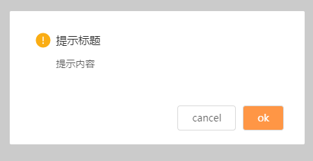
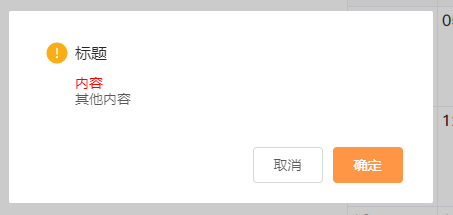
this.$_confirm({
    type: '',
    title: '',
    msg: '',
	msgColor:'',
    other:'',
    btn: {
        ok: 'ok',
        cancel: 'cancel'
    }
})
  .then(() => {
    console.log('Determine operation')
  })
  .catch(() => {
    console.log('Cancel operation')
  })
//Generally, just copy this
 this.$_confirm({
     title: '',
     msg: ''
 })
     .then(() => {
     console.log('Determine operation')
 })
     .catch(() => {
     console.log('Cancel operation')
 })
-
Parameter configuration:
parameter explain type Optional value Default value type Prompt type. Currently, there are only warning icons String warning / success / error warning title title String - title msg content String - Reminder content msgColor Content color String - - other Other content String - - btn Button Object - - -
btn parameters:
| parameter | explain | type | Optional value | Default value |
|---|---|---|---|---|
| ok | OK button text | String | - | determine |
| cancel | Cancel button text | String | - | cancel |
(3)#_notify notification
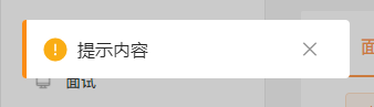
this.$_notify({
  msg: 'Prompt content',
  position: 'lt/rt',
  time: 5000
})
- Parameter configuration:
| parameter | explain | type | Optional value | Default value |
|---|---|---|---|---|
| msg | Prompt content | String | - | content |
| position | Occurrence position | String | LT (left of screen) / RT (right of screen) | lt |
| time | When the time expires, the notification will be automatically closed. When automatic closing is not required, the value is' notAuto ' | String / Number | number / notAuto | 3000 |
Version 5.v1-v1
1.base
(1)Step step
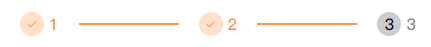
import Steps from '@comp/v1/base/steps'
<Steps :list="list" active="2"></Steps> //list: array / / active: step
- Parameter configuration:
| parameter | explain | type | Optional value | Default value |
|---|---|---|---|---|
| list | array | Array | - | content |
| active | What is the current step | String / Number | - | 0 |
(2)tab
//Login interface
6.layout - Layout
1.DialogLayout
Pop up window original style
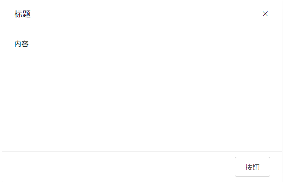
This parameter jumps to view 4 global-$dialog
import DialogLayout from '@/layout/dialog'
<DialogLayout :showClose="false">
    <template #title>
		<div>title</div>
    </template>
    <template #default>
		<div>content</div>
    </template>
    <template #footer>
		Button
    </template>
</DialogLayout>
2.HomeLayout
Interface style
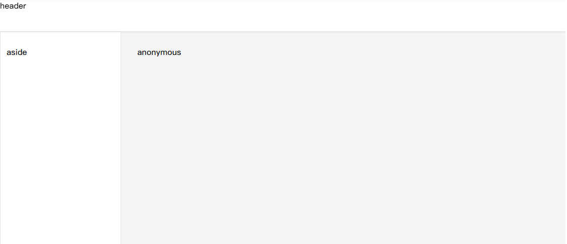
import Home from '@/layout/home'
<Home>
    <template #header>header</template>
    <template #aside>aside</template>
    <template>anonymous</template>
</Home>
3.PageLayout (registered globally)
Background block in the middle of the interface
<PageLayout>
    <template>anonymous</template>
</PageLayout>
4.PersonalLayout
Blue lake B.3.1 personal homepage
import PersonalLayout from '@/layout/personal'
<PersonalLayout>
    <template #header>header</template>
    <template #default>anonymous</template>
    <template #aside>aside</template>
</PersonalLayout>
5.PicLayout (Global registered)
Personal information layout
<PicLayout avatarCenter :avatarSize="80" :data="{ avatar: '', gender: 0 }">
    <slot></slot>
</PicLayout>
1.avatarCenter: auto|stretch|center(default)|flex-start|flex-end|baseline|initial|inherit;
2.avatarSize: Avatar size 3.data:{ avatar:'', gender:'',
showGender:true(default)|false }
- Parameter configuration:
| parameter | explain | type | Optional value | Default value |
|---|---|---|---|---|
| avatarCenter | position | String | auto / stretch / cente / flex-start / flex-end / baseline / initial / inherit | Internal center |
| avatarSize | Avatar size | Number | - | - |
| showGender | Show | Boolean | true / false | true |
| data | Object data | Object | - | - |
- data parameter:
| parameter | explain | type | Optional value | Default value |
|---|---|---|---|---|
| avatar | Avatar picture address | String | - | - |
| gender | Gender | String / Number | - | - |
6.FhPageLayout (Global registered)
Main body to be fixed
<FhPageLayout>

</FhPageLayout>
7.directives - Instructions
1.v-tooltip
More than text is omitted and hovered
Special configuration: / / runtime mode template compiler, in order to use template compiler: Vue config. js------------------------------------runtimeCompiler: true
The hovering style that needs to be changed is @ / plugins / element UI / rewrite / tooltip In SCSS, only the length is limited here, and the maximum length is 600px
<div v-tooltip="{ row: 2, content: text,attrs: tootipParams }"></div>
//text, tooltipparams is the parameter name, which can be changed
data(){
    return{
        text: 'This is a very long, very long, very long, very long, very long, very long, very long content'
        tootipParams: {
            placement: 'right',
            effect: 'light'
        }
    }
}
- Parameter configuration:
| parameter | explain | type | Optional value | Default value |
|---|---|---|---|---|
| row | Number of lines, several lines will be displayed | Number | - | 1 |
| content | content | String | - | - |
| attrs | Style configuration | Object | - | - |
- attrs optional values:
| parameter | explain | type | Optional value | Default value |
|---|---|---|---|---|
| placement | Location of occurrence | String | top / top-start / top-end / bottom / bottom-start / bottom-end / left / left-start / left-end / right / right-start / right-end | top |
| effect | Theme provided by default | String | dark / light | dark |
2.v-focus
Enter interface focus
<el-input v-model="input" placeholder="Input information..." v-focus></el-input>
3.v-enlargeImg
Click the picture to enlarge and the reference item pop-up window will pop up
<img src="@/assets/img/activity.png" alt="" v-enlargeImg/>
<el-image src="@/assets/img/activity.png" alt="" v-enlargeImg></el-image>
8. General operation
1. Get the current role
import { mapGetters } from 'vuex'

computed: {
    ...mapGetters(['currentRole'])
},