1 component Foundation
1.1 what are components
Component is an abstract concept and a simple encapsulation of data and methods. In terms of object-oriented thinking, some classes that meet certain specifications are combined to form components, which can provide users with some specific functions.
1.2 advantages of components
Component is an independent structural unit in a page. It is an abstraction of structure. It mainly exists in the form of page structure and has strong reusability. The use of components is not complicated. Each component has its own scope. Each component area works independently and does not affect each other.
Components can have their own properties and methods. Different components also have basic interaction functions, and can realize complex project functions according to business logic.
1. Components can be reused
2. Improve development efficiency
3. Components are modular
4. Reduce coupling between codes
5. Code is easier to maintain and manage
2 common components of bootstrap
2.1 buttons
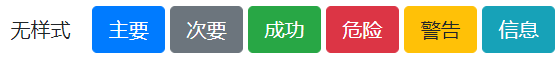
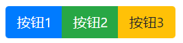
1. Style
Buttons are a common part of a page. When users click a button in the page, they can realize different functions according to different buttons.
| Class name | explain |
|---|---|
| btn | Styleless button (white) |
| btn-primary | Main button (blue) |
| btn-secondary | Secondary button (gray) |
| btn-success | Success button (green) |
| btn-danger | Danger button (red button) |
| btn-warning | Warning button (yellow) |
| btn-info | Information button (blue) |
    <button class="btn">no style</button>
    <button class="btn btn-primary">main</button>
    <button class="btn btn-secondary">secondary</button>
    <button class="btn btn-success">success</button>
    <button class="btn btn-danger">DANGER</button>
    <button class="btn btn-warning">warning</button>
    <button class="btn btn-info">information</button>
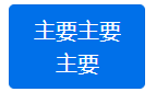
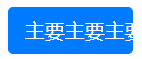
2. Disable text wrapping
When implementing the button style, if the text content in the button exceeds the width of the button, the content in the button will automatically wrap by default. If you don't want the button text to wrap, you can add the text nowrap class name to the button.
    <button class="btn btn-primary">Main main</button>
    <style>
        .btn{
            width: 100px;
        }
    </style>
    <button class="btn btn-primary text-nowrap">Main main</button>
    <style>
        .btn {
            width: 100px;
        }
    </style>
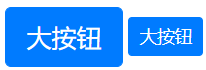
3. Sets the size of the button
In Bootstrap, you can not only directly set to prohibit text wrapping, but also adjust the size of the button through the class name.
| Class name | explain |
|---|---|
| btn-lg | Big button |
| btn-sm | Small button |
    <button class="btn btn-primary btn-lg">Big button</button>
    <button class="btn btn-primary btn-sm">Big button</button>
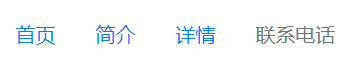
2.2 navigation
In order to more conveniently realize the page structure of the navigation bar in the page, Bootstrap provides us with components to realize the navigation bar.
| Class name | explain |
|---|---|
| nav | Example: < UL class = "NAV" > < / UL > |
| nav-item | Example: < Li class = "NAV item" ></li> |
| nav-link | Example: < a href = "#" class = "NAV link" ></a> |
| disabled | Indicates that the link is prohibited. Example: < a href = "#" class = "disabled" ></a> |
Example: authoring a navigation bar
    <ul class="nav">
        <li class="nav-item">
            <a href="#"Class =" NAV link "> Home Page</a>
        </li>
        <li class="nav-item">
            <a href="#"Class =" NAV link "> Introduction</a>
        </li>
        <li class="nav-item">
            <a href="#"Class =" NAV link "> details</a>
        </li>
        <li class="nav-item">
            <a href="#"Class =" NAV link disabled "> contact number</a>
        </li>
    </ul>
2.3 breadcrumb navigation
In the previous content, the page structure of traditional navigation is realized, which can not show the position of the current page in the navigation hierarchy.
Bootstrap common components provide breadcrumb navigation. The page effect of breadcrumb navigation is realized by automatically adding separators to the navigation hierarchy.
    <nav aria-label="breadcrumb">
        <ol class="breadcrumb">
            <li class="breadcrumb-item active" aria-current="page">home page</li>
        </ol>
    </nav>

    <nav aria-label="breadcrumb">
        <ol class="breadcrumb">
            <li class="breadcrumb-item">
                <a href="#"> Home Page</a>
            </li>
            <li class="breadcrumb-item active" aria-current="page">brief introduction</li>
        </ol>
    </nav>

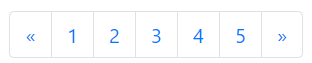
2.4 paging
In the process of front-end page development, the function of the pager is often used. The function of the pager is to help users quickly jump to the page with the specified page number. When users want to open the specified page, they do not need multiple operations of the user, which realizes the effect of one step and improves the user experience.
<ul class="pagination">
<li class="page-item">
<a href="#" class="page-link">
<span>«</span>
</a>
</li>
<li class="page-item">
<a href="#" class="page-link">1</a>
</li>
<li class="page-item">
<a href="#" class="page-link">2</a>
</li>
<li class="page-item">
<a href="#" class="page-link">3</a>
</li>
<li class="page-item">
<a href="#" class="page-link">4</a>
</li>
<li class="page-item">
<a href="#" class="page-link">5</a>
</li>
<li class="page-item">
<a href="#" class="page-link">
<span>»</span>
</a>
</li>
</ul>
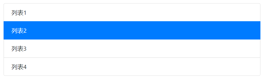
2.5 list
Before learning the common components of Bootstrap, in order to realize the list page structure, we must first write the list structure, and then write cumbersome CSS code according to the style requirements of the list structure.
In order to improve the efficiency of development, the list page structure can be realized directly through the list component in Bootstrap.
    <ul class="list-group">
        <li class="list-group-item">List 1</li>
        <li class="list-group-item active">List 2</li>
        <li class="list-group-item">Listing 3</li>
        <li class="list-group-item">Listing 4</li>
    </ul>
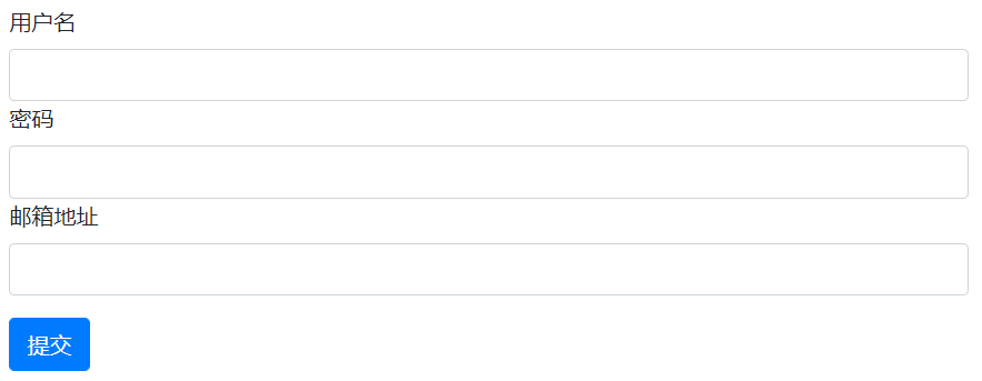
2.6 forms
In the process of front-end page development, in addition to page structures such as navigation, list and button, form is also an important part of page structure.
The form mainly includes form, button, input and other elements. The form page structure is realized by defining input, button and other elements in the form element.
    <form action="#">
        <div class="form-group">
            <label for="User">user name</label>
            <input type="text" id="User" class="form-control">
            <label for="Password">password</label>
            <input type="password" id="Password" class="form-control">
            <label for="Email">e-mail address</label>
            <input type="email" id="Email" class="form-control">
        </div>
        <button type="submit" class="btn btn-primary">Submit</button>
    </form>
2.7 button group
In the previous explanation, I learned the implementation of a single button, but I can't realize the page structure of multiple buttons.
In order to realize the structure of multiple button pages, Bootstrap provides the function of button group. Button group is to place multiple buttons in a class named In the parent element of BTN group.
    <div class="btn-group">
        <button class="btn btn-primary">Button 1</button>
        <button class="btn btn-success">Button 2</button>
        <button class="btn btn-warning">Button 3</button>
    </div>
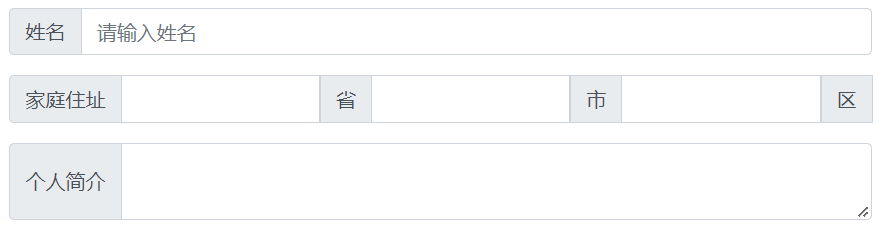
2.8 input box group
In addition to the button group page structure, the common components of Bootstrap also provide the components of input box group to realize the page structure of multiple input boxes. The main implementation idea is to define the page structure of multiple input boxes in the parent element of the class named input group.
    <!-- mb-3 Up and down spacing -->
    <div class="input-group mb-3">
        <!-- input-group-prepend Modify fillet degree -->
        <div class="input-group-prepend">
            <!-- input-group-text Modify background color -->
            <span class="input-group-text">full name</span>
        </div>
        <input type="text" class="form-control" placeholder="Please enter your name">
    </div>
    <div class="input-group mb-3">
        <div class="input-group-prepend">
            <span class="input-group-text" id="basic-addon1">Home address</span>
        </div>
        <input type="text" class="form-control">
        <div class="input-group-prepend">
            <span class="input-group-text">province</span>
        </div>
        <input type="text" class="form-control">
        <div class="input-group-prepend">
            <span class="input-group-text">city</span>
        </div>
        <input type="text" class="form-control">
        <div class="input-group-prepend">
            <span class="input-group-text">area</span>
        </div>
    </div>
    <div class="input-group">
        <div class="input-group-prepend">
            <span class="input-group-text">Personal profile</span>
        </div>
        <textarea class="form-control"></textarea>
    </div>
3. Bootstrap realizes menu function
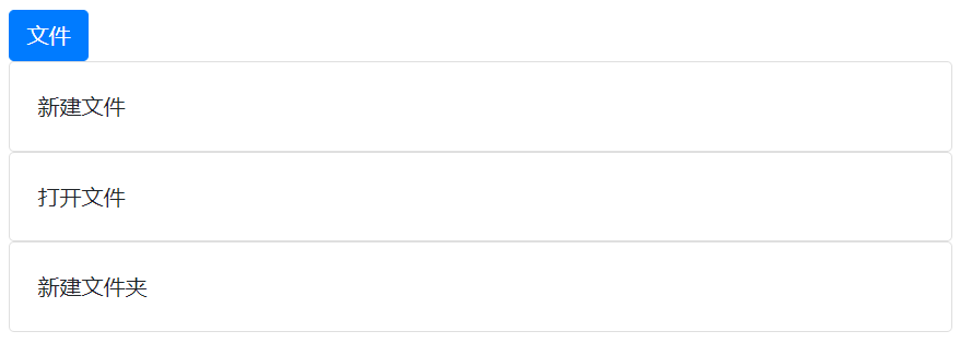
3.1 folding menu
Folding menu is a common function module in the front-end page, such as displaying and hiding commodity information through folding menu. Realization idea of folding menu function:
1. When the user clicks the option menu in the page, the page will display the content information under the current option;
2. When you click the options menu again, the page will automatically hide the content information under the current option.
The following collapse menu only needs to import three files.
    <link rel="stylesheet" href="../bootstrap.min.css">
    <script src="../jquery.js"></script>
    <script src="../bootstrap-3.4.1-dist/js/bootstrap.min.js"></script>
The main codes are as follows:
    <a href="#ZD "class =" BTN BTN primary "data toggle =" collapse "> file</a>
    <div class="collapse" id="zd">
        <div class="card card-body">new file</div>
    </div>
    <div class="collapse" id="zd">
        <div class="card card-body">Open file</div>
    </div>
    <div class="collapse" id="zd">
        <div class="card card-body">New folder</div>
    </div>
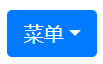
3.2 pull down menu
Implementation idea of drop-down menu:
1. When the user clicks the option button in the page, the page will display the menu options under the current option;
2. When the user clicks the option button in the page again, the page will automatically hide the menu options under the current option button.
The following code introduces four files
    <link rel="stylesheet" href="../bootstrap.min.css">
    <script src="../jquery.js"></script>
    <script src="../bootstrap-3.4.1-dist/js/popper.min.js"></script>
    <script src="../bootstrap-3.4.1-dist/js/bootstrap.min.js"></script>
Here is the code:
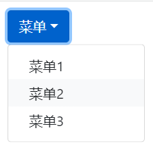
    <div class="dropdown">
        <!-- dropdown-toggle Indicates that it can be scaled -->
        <button class="btn btn-primary dropdown-toggle" data-toggle="dropdown">menu</button>
        <div class="dropdown-menu">
            <a href="#"Class =" dropdown item "> menu 1</a>
            <a href="#"Class =" dropdown item "> menu 2</a>
            <a href="#"Class =" dropdown item "> menu 3</a>
        </div>
    </div>
4. Bootstrap realizes the function of rotation chart
4.1 what is a rotation chart
Rotation chart is an important part of page structure, which is mainly used to display the activity information in the page.
4.2 function analysis of rotation chart
The rotation chart can realize the automatic and manual switching of activity information in the page. Ideas for realizing the function of rotation chart:
1. When the mouse pointer moves to the picture, the activity information stops automatic switching;
2. When the user clicks the left button on the picture, the picture can be switched to the previous one;
3. When the user clicks the right button on the picture, the picture information can be switched to the next one;
4. Below the picture is a rotating picture indicator, which can display the display status of the current picture information;
5. When the mouse pointer moves out of the picture, the picture information is automatically switched.
4.3 rotation chart activity information
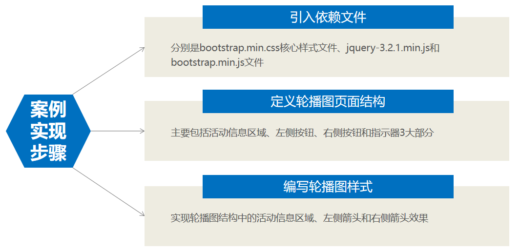
This step can realize the automatic switching of pictures, but it cannot be controlled. Take importing three pictures as an example.
    <div id="lb" class="carousel slide" data-ride="carousel">
        <div class="carousel-inner">
            <div class="carousel-item active">
                <img src="../images/1.jfif" class="d-block w-100">
            </div>
            <div class="carousel-item">
                <img src="../images/2.jfif" class="d-block w-100">
            </div>
            <div class="carousel-item">
                <img src="../images/3.jfif" class="d-block w-100">
            </div>
        </div>
    </div>

4.4 left arrow of rotation chart
Define a class name of carousel control prev for the < a > tag, which means to set the style of the left arrow;
Define the value of the href attribute of the < a > tag as #lb, indicating that it is bound to the outermost box of the rotation chart;
Define the value of role as button, indicating the button role;
Define the value of data slide attribute as prev, which means to view the previous picture;
Define a span element with a class name of carousel control prev icon inside the < a > tag, representing the arrow icon on the left;
Define the span element of the class name SR only, and set the content to Previous.
        <!-- View previous -->
        <a href="#lb" class="carousel-control-prev" role="button" data-slide="prev">
            <span class="carousel-control-prev-icon"></span>
            <span class="sr-only">Previous</span>
        </a>

4.5 right arrow of rotation chart
Define a class name of carousel control next for the < a > tag, which means to set the style of the arrow on the right;
Define the value of the href attribute of the < a > tag as #lb, indicating that it is bound to the outermost box of the rotation chart;
Define the value of role as button, indicating the button role;
Define the value of data slide attribute as next, which means to view the next picture;
Define a span element with a class name of carousel control next Icon inside the < a > tag, representing the arrow icon on the right;
Define the span element of the class name SR only and set the content to Next.
        <!-- View next -->
        <a class="carousel-control-next" href="#lb" role="button" data-slide="next">
            <span class="carousel-control-next-icon"></span>
            <span class="sr-only">Next</span>
        </a>

4.6 rotation chart indicator
Define the < ol > ordered list structure with the class name carousel indicators, which represents the rotation chart indicator;
Define the < li > element inside the < ol > element to represent each small icon in the rotation chart indicator;
And define the value of data target attribute as #lb, indicating that the target location of the rotation map is set;
Define the values of the data slide to attribute as 0, 1 and 2 respectively, indicating the index value of the current indicator icon.
        <!-- Carousel indicator -->
        <ol class="carousel-indicators">
            <li data-target="#lb" data-slide-to="0" class="active"></li>
            <li data-target="#lb" data-slide-to="1"></li>
            <li data-target="#lb" data-slide-to="2"></li>
        </ol>
4.7 all codes
    <div id="lb" class="carousel slide" data-ride="carousel">
        <div class="carousel-inner">
            <div class="carousel-item active">
                <img src="../images/1.jfif" class="d-block w-100">
            </div>
            <div class="carousel-item">
                <img src="../images/2.jfif" class="d-block w-100">
            </div>
            <div class="carousel-item">
                <img src="../images/3.jfif" class="d-block w-100">
            </div>
        </div>
        <!-- View previous -->
        <a href="#lb" class="carousel-control-prev" role="button" data-slide="prev">
            <span class="carousel-control-prev-icon"></span>
            <span class="sr-only">Previous</span>
        </a>
        <!-- View next -->
        <a class="carousel-control-next" href="#lb" role="button" data-slide="next">
            <span class="carousel-control-next-icon"></span>
            <span class="sr-only">Next</span>
        </a>
        <!-- Carousel indicator -->
        <ol class="carousel-indicators">
            <li data-target="#lb" data-slide-to="0" class="active"></li>
            <li data-target="#lb" data-slide-to="1"></li>
            <li data-target="#lb" data-slide-to="2"></li>
        </ol>
    </div>
Note: the js file should be written later, otherwise importing the style first may cause flicker.
    <script src="../jquery.js"></script>
    <script src="../bootstrap-3.4.1-dist/js/bootstrap.min.js"></script>
The renderings are as follows: