The chart of rectangular coordinate system refers to the chart with x-axis and y-axis. The common charts of rectangular coordinate system include: bar chart, broken line chart and scatter chart
There are some general configurations for charts in rectangular coordinate system
1> grid Grid
Grid is used to control the layout and size of rectangular coordinate system. x-axis and y-axis are drawn on the basis of grid
- Display grid
show: true
- grid border
borderWidth : 10
- Location and size of grid
left,right,top,bottom,width,height
Let's take the histogram as an example
 <div id="box" style="width: 600px; height: 400px;"></div>
    <script>
      var xData= ['Xiao Ming', 'Li Xiaohong', 'Xiao Gang', 'Xiao Wang', 'Lao Wang', 'Lao Gang', 'Old red', 'Lao Ming']
      var yData = [50, 60, 90, 40, 70, 80, 70, 60]
        var box=echarts.init(document.getElementById("box"))
        var option={
            xAxis:{
                type:'category',
                data:xData
            },
            yAxis:{
                type:'value'
            },
            series:{
                type:"bar",
                data:yData,
                barWidth: '30%', // Width of column
                markPoint:{
                    data:[
                        {
                            type:"max",name:"Maximum"
                        },
                        {
                            type:"min",name:"minimum value"
                        }
                    ]
                },
                markLine: {
                    data: [
                        {
                            type: 'average', name: 'average value'
                        }
                    ]
                }
            },
            label:{
                show:true,//Show
                rotate:60//Rotation angle
            }
        }
        box.setOption(option)
    </script>
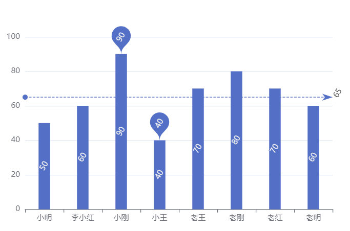
At this point, we configure the grid
var option={
            grid:{
                show:true
            },
            .............
        }
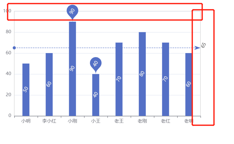
You can see the border
grid configuration:
grid:{
                show:true,   //Show
                borderWidth:10,   //Border width
                borderColor:'red',   //Border color
                left:100,   //from left
                top:100,   //Distance above
                width:100,   //Payment for chart
                height:200  //Height of chart
             },
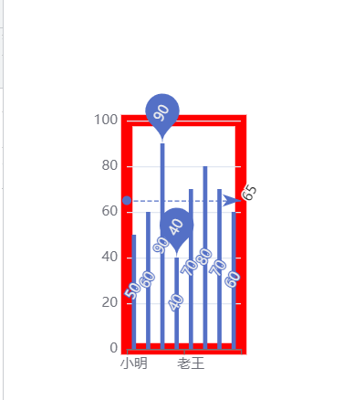
Coordinate axis axis
The coordinate axis is divided into x-axis and y-axis. There are at most two positions of x-axis and y-axis in a grid
- Axis type
Value: value axis, which will automatically read the number from the target data
Category: category axis. This type must set category data through data
- Coordinate axis position
xAxis: the value can be top or bottom
yAxis: can be left or right
var option = {
  xAxis: {
    type: 'category',
    data: xData,
    position: 'top'
 },
  yAxis: {
    type: 'value',
    position: 'right'
 }
}
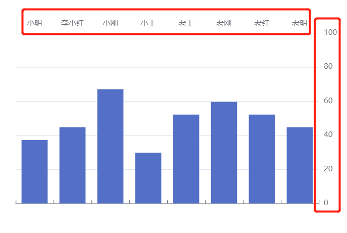
Area scaling dataZoom
toolbox is also an area zoom
 var option={
            toolbox:{
                feature:{
                    dataZoom:{}
                }
            },
            xAxis:{
                type:'category',
                data:xData,
            },
            yAxis:{
                type:'value',
            },
            series:{
                type:"bar",
                data:yData,

            },
        }
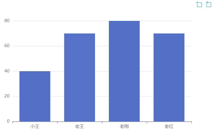
dataZoom is used for area scaling and data range filtering. Both x-axis and y-axis can be used
dataZoom is an array, which means that multiple area scalers can be configured
- Area zoom type
Slider: slider
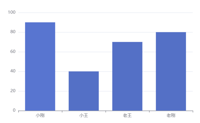
inside: built in, zoom by mouse wheel or two fingers
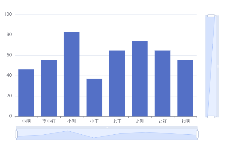
- Active shaft
xAxisIndex: set which x-axis is controlled by the scaling component. Generally, write 0
yAxisIndex: set which y-axis is controlled by the scaling component. Generally, write 0
- Indicates the scaling of the initial state
start: the starting percentage of the data window range
End: the end percentage of the data window range
Slider slider
var option={
            dataZoom:[
                {
                    type:'slider',
                },

            ],
            xAxis:{
                type:'category',
                data:xData,
            },
            yAxis:{
                type:'value',
            },
            series:{
                type:"bar",
                data:yData,
            },
        }
At this time, a slider will be added at the bottom for us to select
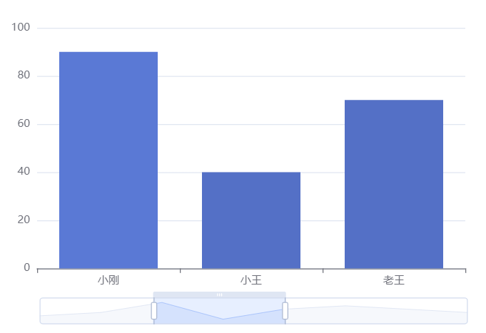
inside: built in, zoom by mouse wheel or two fingers
 dataZoom:[
                {
                    type:'inside',
                },

            ],
At this time, place the mouse on the histogram and use the wheel key to zoom
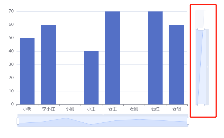
Active shaft
xAxisIndex: set which x-axis is controlled by the scaling component. Generally, write 0
yAxisIndex: set which y-axis is controlled by the scaling component. Generally, write 0
     dataZoom: [
                  {
                     type: 'slider',
                     xAxisIndex: 0
                  },
                  {
                     type: 'slider',
                     yAxisIndex: 0,
                  }
                ],
Indicates the scaling of the initial state
start: the starting percentage of the data window range
End: the end percentage of the data window range
dataZoom: [
                  {
                     type: 'slider',
                     xAxisIndex: 0
                  },
                  {
                     type: 'slider',
                     yAxisIndex: 0,
                     start: 0,
                     end: 80
                  }
                ],
Note: for charts in non rectangular coordinate system, such as pie chart map, the above three configurations may not take effect