Hello, I'm brother CAI.
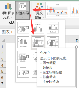
Recently, when doing data visualization, I hope to display the data table on the graph at the same time. For this requirement, it is more convenient to use excel. You can directly select layout 5 from the quick layout. So, what can we do if we want to do this in python?
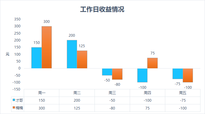
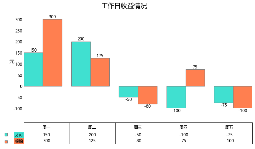
Preview of desired effect:
1. Excel simple drawing
It's very simple. Directly select the data to insert the histogram, and then select the corresponding layout in chart tool - Design - quick layout.

2. Python drawing
Here we use matplotlib, bar and table.
The chart elements can be divided into histogram and data table. matplotlib just provides the corresponding interface.
2.1 histogram drawing
First draw a histogram. In the case, there are two groups of data, so it is a combined histogram. In this drawing, there are several knowledge points that can be recorded:
- Position when setting the title (specified with parameters x,y)
- When setting the axis title, use the parameter rotation rotation direction
- Set axis range
- Display data label (using ax.bar_label method)
import numpy as np
import matplotlib.pyplot as plt

# Chinese and negative display
plt.rcParams['font.sans-serif'] = ['Microsoft YaHei']
plt.rcParams['axes.unicode_minus'] = False

# Create canvas
fig, ax = plt.subplots(figsize=(10, 4), dpi=100)

# Case data
data = [[150, 200,  -50, -100,  -75],
        [300, 125,  -80,  75, -100],
        ]
# Columns and rows
columns = ('Monday', 'Tuesday', 'Wednesday', 'Thursday', 'Friday')
rows = ['Brother CAI', 'Nannan']

# Drawing parameters
index = np.arange(len(columns))-0.1
bar_width = 0.4

# Set histogram color
colors = ['turquoise', 'coral']

# Histogram
bar1 = plt.bar(index, data[0],
               bar_width, color=colors[0], edgecolor='grey')
bar2 = plt.bar(index+bar_width, data[1],
               bar_width, color=colors[1], edgecolor='grey')

# Set title
ax.set_title('Earnings on weekdays', fontsize=16, y=1.1,x=0.44)
# Set axis title
ax.set_ylabel("element", fontsize=12, color='black', alpha=0.7, rotation=360)
# Set Y-axis interval
ax.set_ylim(-150, 350)

# Display data labels
ax.bar_label(bar1, label_type='edge')
ax.bar_label(bar2, label_type='edge')

# x. The y-axis scale is not displayed
ax.tick_params(axis=u'both', which=u'both', length=0)
# x-axis scale and scale value are not displayed
plt.xticks([])
The output is as follows:
2.2. Chart table drawing
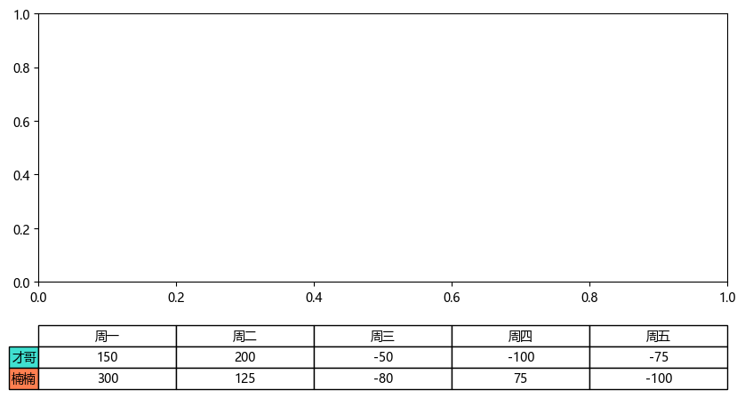
Let's take a look at the drawing of the chart table. Let's take the case data to draw it separately:
# Create canvas
fig, ax = plt.subplots(figsize=(10, 4), dpi=100)
# table chart
the_table = plt.table(cellText=data,
                      rowLabels=rows,rowColours=colors,
                      colLabels=columns, cellLoc='center', loc="bottom",
                      bbox=[0, -0.4, 1, 0.24]
                      )
The output is as follows:
About PLT The parameters of table are described as follows:
cellText: table cell text. The newline character in the string is not supported temporarily, which may cause the text to exceed the cell boundary
Cellcolors: table cell background color
cellLoc: alignment of table cell text. The value range is {left ',' center ',' right '}. The default value is' right'
colWidths: table cell width
rowLabels: table row header text
Rowcolors: background color of table row header
rowLoc: alignment of table row header text. The value range is {'full', 'left', 'right'}. The default value is' left '
colLabels: table list header text
Colors: table list header background color
Collac: alignment of table header text. The value range is {full ',' left ',' right '}. The default value is' left'
loc: the position of the cell relative to the subgraph
bbox: draw the bounding box of the table
Finally, what we need to do is to combine the above two diagrams. In the process of combination, we may need to make some format fine-tuning.
2.3. combination
In this case, the requirements for combination diagram are as follows:
- The histogram border is not displayed
- The column name in the chart table should be higher and the cell height should be lower
- The legend position should be consistent with the corresponding line
In order to realize the appeal demand, we can deal with it in the following ways:
# Set cell height
cellDict = the_table.get_celld()
for i in range(0, len(columns)):
    cellDict[(0, i)].set_height(0.6)
    for j in range(1, len(rows)+1):
        cellDict[(j, i)].set_height(0.4)

# Set the height of the row list cell in the chart table
cellDict[(1, -1)].set_height(0.4)
cellDict[(2, -1)].set_height(0.4)

# Set chart table cell text font
the_table.auto_set_font_size(False)
the_table.set_fontsize(10)

# Set chart table cell border
for key, cell in the_table.get_celld().items():
    cell.set_linewidth(0.6)

# Border hiding
ax.spines['top'].set_visible(False)
ax.spines['right'].set_visible(False)
ax.spines['bottom'].set_visible(False)
ax.spines['left'].set_visible(False)

name = ['', '']
# Sets the location of the legend
ax.legend(name, handlelength=0.7, labelspacing=0.6,
          bbox_to_anchor=(-0.1, -0.23),
          loc='upper left', frameon=False)
Finally, we can get satisfactory results:
The above is all the content of this time. You can modify the parameters and try more to get familiar with it.