Drop-shadow and box-shadow are css attributes of shadow effect (halo effect). The biggest difference between them is that box-shadow can only produce rectangular shadows, while drop-shadow can produce shadows of exactly the same shape as opaque areas of objects. Below is the use of two css attributes:

.drop-shadow {
    -webkit-filter: drop-shadow(12px 12px 7px rgba(0, 0, 0, 0.7));
    filter: drop-shadow(12px 12px 7px rgba(0, 0, 0, 0.7))
}

.box-shadow {
    box-shadow: 12px 12px 7px rgba(0, 0, 0, 0.7);
}
Because they are both shadow effects, the values that they can set are almost the same: in the above example, all values of parameters from left to right represent: horizontal offset, vertical offset, shadow blur distance, shadow color. Next, I'll compare drop-shadow with box-shadow for you.
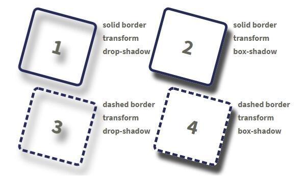
Border and Deformation Effect
The shadows of drop-shadow and box-shadow can reflect the roundness and distortion of the border. The difference is that drop-shadow reflects the shape of the actual border, the shadow of the solid line and the shadow of the dotted line; box-shadow regards the border and its contents as a complete box, and creates the shadow of the whole box, while the style of the border will be ignored and directly regarded as the real line frame.
.box {
    border: 5px solid #262b57;
    width: 120px;
    height: 120px;
    border-radius: 10px;
    transform: rotate(15deg);
    font-size: 40px;
    text-align: center;
    line-height: 120px;
}

.dashed {
    border-style: dashed;
}
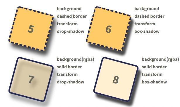
Background and transparency
If the box has a set color (not transparent), the drop-shadow and box-shadow shadows look similar. What if the background of the box is translucent? We can see from the picture that the color around the shadow is darker and the color in the middle is lighter, so we can infer that transparency has an effect on drop-shadow and no effect on box-shadow.
.bk {
    background-color: #ffcc66;
}

.bk-alpha {
    background-color: rgba(255, 204, 102, 0.3);
}
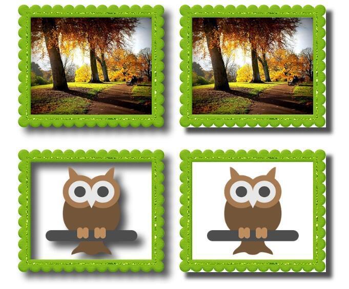
image border
From the example, we know that drop-shadow can reflect the irregular shape of image-border, while box-shadow directly regards the border as a solid frame, ignoring the shape of the border picture. The owl in the picture is a transparent PNG file. Drop-shadow not only reflects the shape of the frame picture, but also reflects the shape of the owl in the frame. Box-shadow adheres to the consistent principle and regards the frame and the picture as a complete box.
.frame {
    width: 286px;
    height: 240px;
    -moz-border-image: url(frame_green_.png) 25 25 repeat;
    -webkit-border-image: url(frame_green_.png) 25 25 repeat;
    border-width: 25px;
    border-image: url(frame_green_.png) 25 25 repeat;
    border-color: #79b218;
    border-style: inset;
    border-width: 25px;
    box-sizing: border-box;
    display: block;
    margin: 10px;
}
Pseudo element
Pseudo-elements drop-shadow can reflect the shape of pseudo-elements, while box-shadow ignores pseudo-elements.
.addition {
    width: 100px;
    height: 100px;
    background-color: #ffcc66;
    margin: 10px 60px;
    position: relative;
    display: inline-block;
}

.addition:before {
    width: 50px;
    height: 50px;
    background-color: #ff8833;
    content: '';
    display: block;
    position: absolute;
    left: 0;
    top: 50%;
    margin-left: -40px;
    transform: rotate(45deg);
    margin-top: -10px;
}

.addition:after {
    width: 60px;
    height: 60px;
    background-color: #ff8833;
    margin: 10px;
    content: '';
    display: block;
    transform: rotate(20deg);
    transform: skew(20deg, 20deg);
    top: 5px;
    right: -40px;
    position: absolute;
}
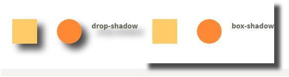
A small block within a block.
The shadow of drop-shadow can reflect the shape of all elements in the block, while box-shadow can directly reflect the rectangular shadow of the block.
.square {
    width: 50px;
    height: 50px;
    display: inline-block;
    background-color: #ffcc66;
    margin: 20px;
}
.circle {
    width: 50px;
    height: 50px;
    display: inline-block;
    border-radius: 50%;
    background-color: #ff8833;
    margin: 20px;
}
<div class="demo-wrap">
    <div class="drop-shadow">
        <span class="square"></span>
        <span class="circle"></span>
        <p>drop-shadow</p>
    </div>
    <div class="box-shadow">
        <span class="square"></span>
        <span class="circle"></span>
        <p>box-shadow</p>
    </div>
</div>
Differences between drop-shadow and box-shadow
Drop-shadow has no inset shadow and spread features. As far as support is concerned, IE does not support drop-shadow attributes at present; box-shadow is generally supported by all browsers.
In order to help you make learning easy and efficient, we will share a large number of information for free, and help you to overcome difficulties on the way to becoming a front-end engineer and even a whole stack engineer. Here we recommend a front-end stack learning button qun: 784783012. Welcome to the group for discussion, learning and communication, and common progress.
When you really start learning, you will inevitably not know where to start, which leads to inefficiency and affects the confidence to continue learning.
But the most important thing is not to know which technologies need to be mastered, learning frequently trample holes, and ultimately waste a lot of time, so effective resources are still necessary.