Constraint Layout (Constraint Layout), the latest Android layout launched by Google I/O in 2016, is still in the perfect stage. It should become the mainstream layout style in terms of the strength of its launch. In the latest version of Android Studio, Constraint Layout has become the default layout.
concept
ConstraintLayout Constraints Layout Constraints Layout Confines the position of View in the screen according to other elements or views in the layout. It contains three important information, setting the position according to other views, setting the position according to the parent container, and setting the position according to the baseline.
layout_constraint [source] [target]= "[target ID]"
For example:
app:layout_constraintBottom_toBottomOf="@+id/constraintLayout"
Constraint the bottom of the current View to the bottom of the target View. The target View is constraintLayout. This indicates that the current View is placed at the bottom of the constraintLayout (parent container) and the bottom is consistent.
To demonstrate multiple examples, use the reused Active page. Set the title and layout Id according to the parameters.
public class LayoutDisplayActivity extends AppCompatActivity {
    private static final String TAG = LayoutDisplayActivity.class.getSimpleName();
    static final String EXTRA_LAYOUT_ID = TAG + ".layoutId"; // Layout ID

@Override protected void onCreate(@Nullable Bundle savedInstanceState) {
    super.onCreate(savedInstanceState);
    setTitle(getIntent().getStringExtra(Intent.EXTRA_TITLE));
    final int layoutId = getIntent().getIntExtra(EXTRA_LAYOUT_ID, 0);
    setContentView(layoutId); // Setting Page Layout, Reusing Layout
    }
}
The main page uses ListView to display multiple items, each with a different layout. Click on items to send different Intent s and fill in the pages to be displayed.
public class MainActivity extends AppCompatActivity {
 @Override
 protected void onCreate(Bundle savedInstanceState) {
     super.onCreate(savedInstanceState);
     setContentView(R.layout.activity_main);

    ListView list = (ListView) findViewById(R.id.activity_main);
    ArrayAdapter<String> adapter = new ArrayAdapter<>(this,
            android.R.layout.simple_list_item_1, LIST_ITEMS);
    list.setAdapter(adapter);
    list.setOnItemClickListener(new AdapterView.OnItemClickListener() {
        @Override
            public void onItemClick(AdapterView<?> adapterView, View view, int i, long l) {
                // Reuse Display Layout
                Intent intent = new Intent(MainActivity.this, LayoutDisplayActivity.class);
                intent.putExtra(Intent.EXTRA_TITLE, LIST_ITEMS[i]); // Title
                intent.putExtra(LayoutDisplayActivity.EXTRA_LAYOUT_ID, LAYOUT_IDS[i]); // Layout Id
                startActivity(intent);
            }
        });
    }
}
Basics
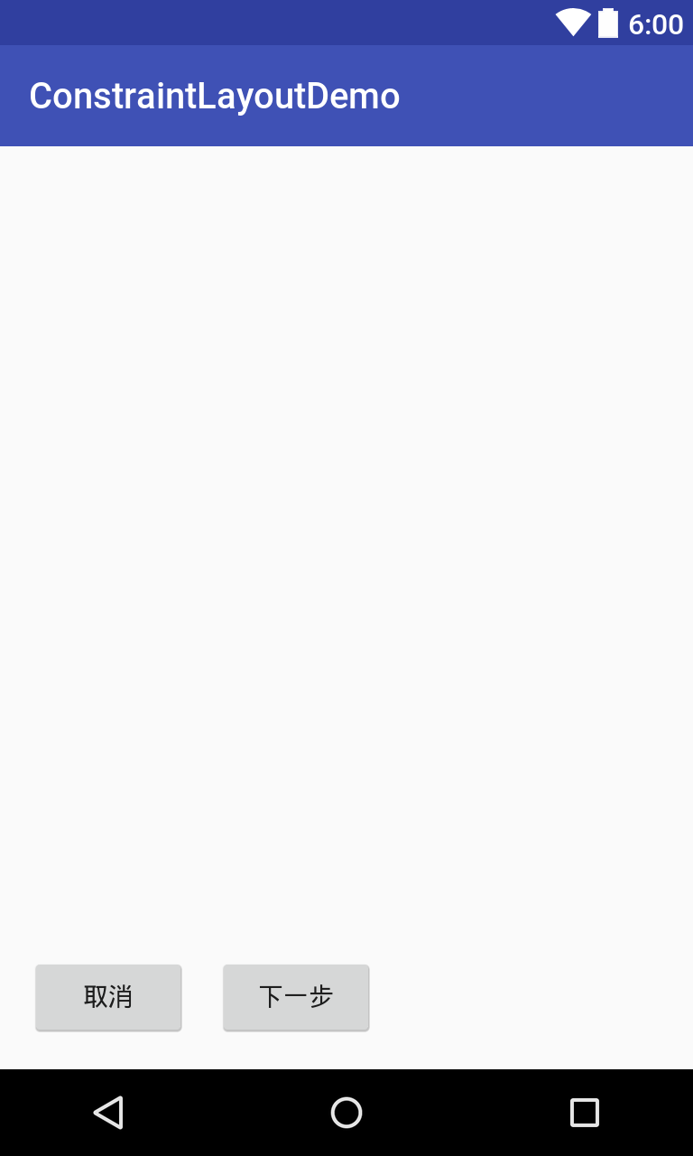
The most basic way to use ConstraintLayout layout is to specify the location directly. The bottom of the Cancel button aligns with the bottom of the constraintLayout (parent container) and the left side aligns with the left side of the parent container. The bottom of the next button aligns with the bottom of the parent container, while the left side aligns with the right side of the cancel button. Margin gap exists at the edge of each button.
<?xml version="1.0" encoding="utf-8"?>
<android.support.constraint.ConstraintLayout
    android:id="@+id/constraintLayout"
    xmlns:android="http://schemas.android.com/apk/res/android"
    xmlns:app="http://schemas.android.com/apk/res-auto"
    android:layout_width="match_parent"
    android:layout_height="match_parent">

    <Button
        android:id="@+id/cancel_button"
        android:layout_width="wrap_content"
        android:layout_height="wrap_content"
        android:layout_marginBottom="16dp"
        android:layout_marginStart="16dp"
        android:text="cancel"
        app:layout_constraintBottom_toBottomOf="@id/constraintLayout"
        app:layout_constraintStart_toStartOf="@id/constraintLayout"/>

    <Button
        android:id="@+id/next_button"
        android:layout_width="wrap_content"
        android:layout_height="wrap_content"
        android:layout_marginBottom="16dp"
        android:layout_marginStart="16dp"
        android:text="Next step"
        app:layout_constraintBottom_toBottomOf="@id/constraintLayout"
        app:layout_constraintStart_toEndOf="@id/cancel_button"/>

</android.support.constraint.ConstraintLayout>
The most important thing in ConstraintLayout's attribute settings is to understand the representation of attributes.
Proportion
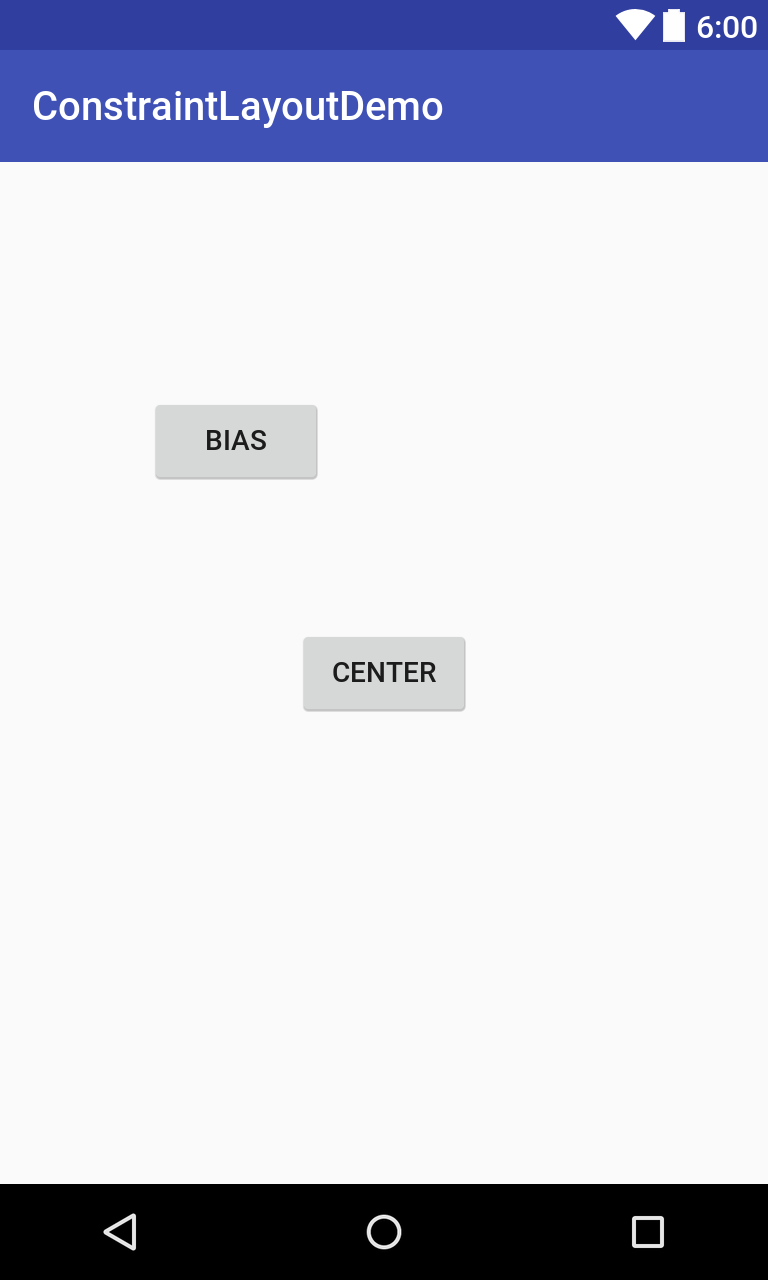
In addition to aligning attributes, the ConstraintLayout layout also has important proportional attributes. The Center button needs to align all boundaries with the constraintLayout (parent container) boundary, which is in the middle. It can also set the ratio of level to vertical, such as 0.25. The ratio of level to vertical of the Bias button is 0.25, which means the ratio of left to right is 1:4, and the ratio of top to bottom is 1:4.
Constraint Horizontal_bias sets the horizontal ratio and constraint Vertical_bias sets the vertical ratio.
<?xml version="1.0" encoding="utf-8"?>
<android.support.constraint.ConstraintLayout
    xmlns:tools="http://schemas.android.com/tools"
    android:id="@+id/constraintLayout"
    xmlns:android="http://schemas.android.com/apk/res/android"
    xmlns:app="http://schemas.android.com/apk/res-auto"
    android:layout_width="match_parent"
    android:layout_height="match_parent">

    <Button
        android:layout_width="wrap_content"
        android:layout_height="wrap_content"
        android:text="Center"
        app:layout_constraintEnd_toEndOf="@id/constraintLayout"
        app:layout_constraintStart_toStartOf="@id/constraintLayout"
        app:layout_constraintTop_toTopOf="@+id/constraintLayout"
        app:layout_constraintBottom_toBottomOf="@+id/constraintLayout"/>

    <Button
        android:layout_width="wrap_content"
        android:layout_height="wrap_content"
        android:text="Bias"
        app:layout_constraintEnd_toEndOf="@id/constraintLayout"
        app:layout_constraintStart_toStartOf="@id/constraintLayout"
        app:layout_constraintTop_toTopOf="@+id/constraintLayout"
        app:layout_constraintBottom_toBottomOf="@+id/constraintLayout"
        app:layout_constraintHorizontal_bias="0.25"
        app:layout_constraintVertical_bias="0.25"/>

</android.support.constraint.ConstraintLayout>
Tools: The layout_editor_absoluteX attribute aids the view, understands the true distance of the boundary, and clicks on the visual layout automatically generates it.
Guide line
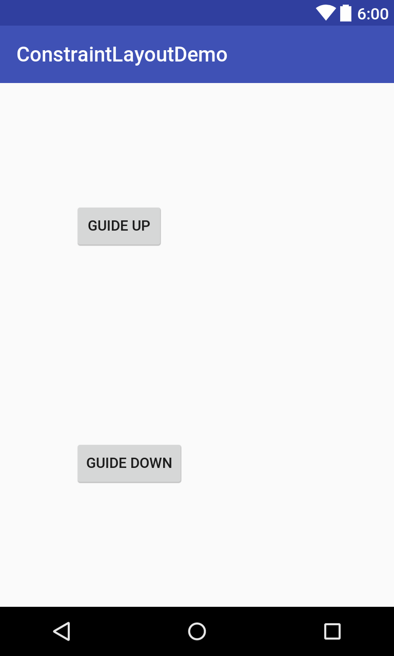
In addition to aligning with the layout, Constraint Layout layout can also be aligned with the guide line. Set the vertical guide line 72 dp. Button on the left side are aligned with the guide line, up and down using a proportional arrangement, a 0.25 ratio, a 0.75 ratio.
<?xml version="1.0" encoding="utf-8"?>
<android.support.constraint.ConstraintLayout
    xmlns:tools="http://schemas.android.com/tools"
    android:id="@+id/constraintLayout"
    xmlns:android="http://schemas.android.com/apk/res/android"
    xmlns:app="http://schemas.android.com/apk/res-auto"
    android:layout_width="match_parent"
    android:layout_height="match_parent">

    <android.support.constraint.Guideline
        android:id="@+id/guideLine"
        android:layout_width="wrap_content"
        android:layout_height="wrap_content"
        android:orientation="vertical"
        app:layout_constraintGuide_begin="72dp"/>

    <Button
        android:layout_width="wrap_content"
        android:layout_height="wrap_content"
        android:text="Guide Up"
        app:layout_constraintStart_toStartOf="@id/guideLine"
        app:layout_constraintTop_toTopOf="@+id/constraintLayout"
        app:layout_constraintBottom_toBottomOf="@+id/constraintLayout"
        app:layout_constraintVertical_bias="0.25"/>

    <Button
        android:layout_width="wrap_content"
        android:layout_height="wrap_content"
        android:text="Guide Down"
        app:layout_constraintStart_toStartOf="@id/guideLine"
        app:layout_constraintTop_toTopOf="@+id/constraintLayout"
        app:layout_constraintBottom_toBottomOf="@+id/constraintLayout"
        app:layout_constraintVertical_bias="0.75"/>

</android.support.constraint.ConstraintLayout>
View Size
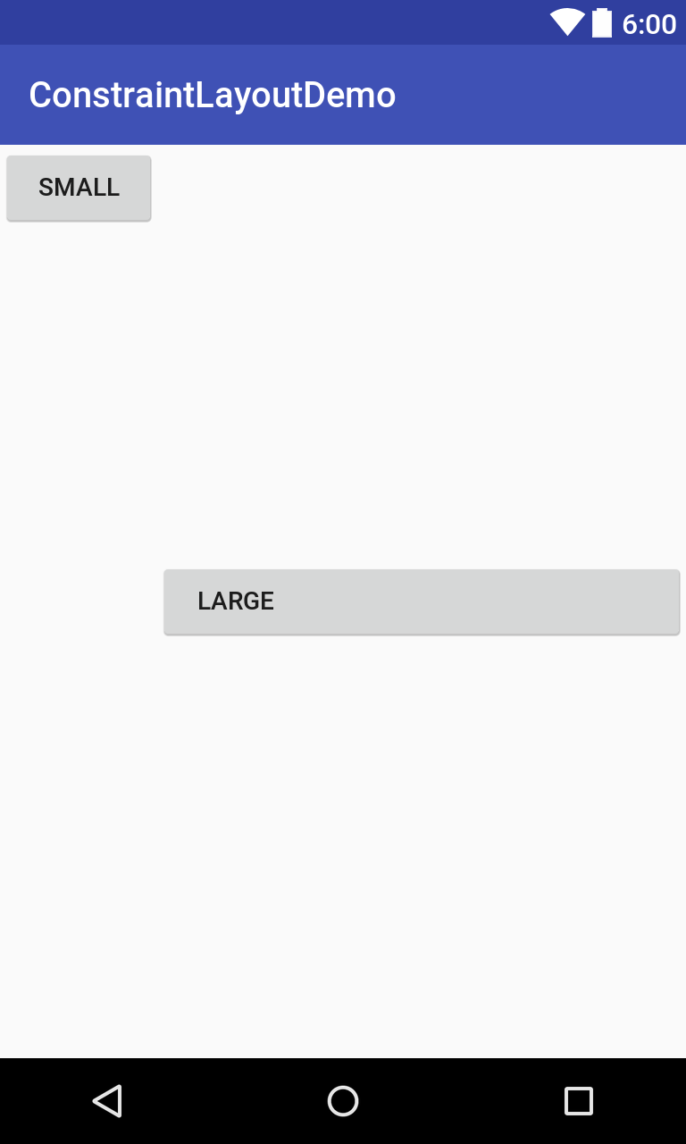
Controls in the ConstraintLayout layout can also set filling size. Controls whose width is set to 0dp will automatically fill according to location. For example, Large button, left alignment with Small button, right alignment with constraintLayout parent control, right alignment with constraintLayout parent control, width set to 0dp, will actually fill all positions.
<?xml version="1.0" encoding="utf-8"?>
<android.support.constraint.ConstraintLayout
    android:id="@+id/constraintLayout"
    xmlns:android="http://schemas.android.com/apk/res/android"
    xmlns:app="http://schemas.android.com/apk/res-auto"
    android:layout_width="match_parent"
    android:layout_height="match_parent">

    <Button
        android:id="@+id/small"
        android:layout_width="wrap_content"
        android:layout_height="wrap_content"
        android:text="Small"
        app:layout_constraintStart_toStartOf="@id/constraintLayout"
        app:layout_constraintTop_toTopOf="@id/constraintLayout"/>

    <Button
        android:layout_width="0dp"
        android:layout_height="wrap_content"
        android:text="Large"
        app:layout_constraintBottom_toBottomOf="@id/constraintLayout"
        app:layout_constraintEnd_toEndOf="@id/constraintLayout"
        app:layout_constraintStart_toEndOf="@id/small"
        app:layout_constraintTop_toTopOf="@id/constraintLayout"/>

</android.support.constraint.ConstraintLayout>
View aspect ratio
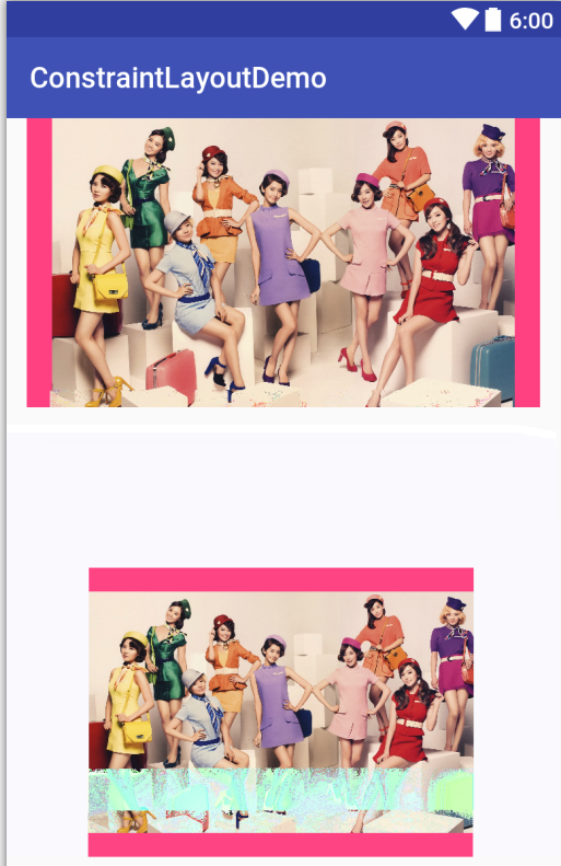
ConstraintLayout layout can also use constraintDimensionRatio to set the aspect ratio of the view. It needs to set the width or height of the view to 0dp. According to another property and proportion, the current property, such as the display size of two picture controls, is calculated.
<?xml version="1.0" encoding="utf-8"?>
<android.support.constraint.ConstraintLayout
    android:id="@+id/constraintLayout"
    xmlns:android="http://schemas.android.com/apk/res/android"
    xmlns:app="http://schemas.android.com/apk/res-auto"
    android:layout_width="match_parent"
    android:layout_height="match_parent">

    <ImageView
        android:layout_width="0dp"
        android:layout_height="200dp"
        android:background="@color/colorAccent"
        android:src="@drawable/total_large"
        app:layout_constraintBottom_toBottomOf="@+id/constraintLayout"
        app:layout_constraintLeft_toLeftOf="@+id/constraintLayout"
        app:layout_constraintRight_toRightOf="@+id/constraintLayout"
        app:layout_constraintTop_toTopOf="@+id/constraintLayout"
        app:layout_constraintVertical_bias="0.0"/>

    <ImageView
        android:layout_width="0dp"
        android:layout_height="200dp"
        android:background="@color/colorAccent"
        android:contentDescription="@null"
        android:src="@drawable/total_large"
        app:layout_constraintBottom_toBottomOf="@+id/constraintLayout"
        app:layout_constraintDimensionRatio="4:3"
        app:layout_constraintLeft_toLeftOf="@+id/constraintLayout"
        app:layout_constraintRight_toRightOf="@+id/constraintLayout"/>

</android.support.constraint.ConstraintLayout>
These are the basic ways to use Constraint Layout constraint layout. It can be observed that Constraint Layout layout takes into account the advantages of Linear Layout and Relative Layout. It is very suitable for building complex layout and will become the mainstream layout of Android.
Author: Jiang Gan
Links to the original text: Constraint Layout