If you don't say much, just say it
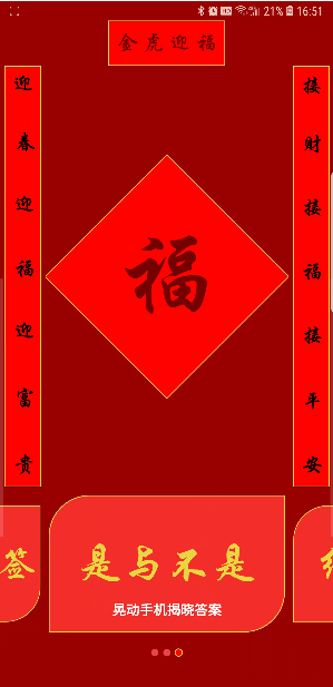
image.png
- As can be seen from the figure, it is divided into upper and lower parts. The upper part is the traditional Spring Festival couplets and blessing words, which represent the new year's greetings to everyone. The lower part is the main function module, including the amount of red envelope, the lucky sign for the new year and yes and No.
- Written in Kotlin language, the technologies involved include: ConstraintLayout, Drawable Customize View, Android animation, Viewpager2, font settings and sensor usage. Creative source
- The main source of this idea is that when you are old, you must send red envelopes to your nephews and nieces for the new year. Hahaha, the amount can be shaken out by themselves this time. It is interactive and random. It is more fun to add fun to the New Year!
- The lucky sign for the new year is a blessing to everyone!
- You will certainly have many scenarios, which will make it difficult to choose, so this module is added to solve such problems!
- The new year also needs to move. It just happens that the traditional shake sign can be shaken with a mobile phone to simulate the effect, and the wrist can kill two birds with one stone (what a good idea)!
- Android phone partners can Download installation package Experience, I can't stop!
The text begins
- First of all, the layout looks quite simple, right? LinearLayout sets the direction vertical, and a LinearLayout is used in the middle to set the direction horizontal.
- But there is a problem, layout nesting, so this is why I use ConstraintLayout to implement it. As shown in the figure below, only one layer is used.
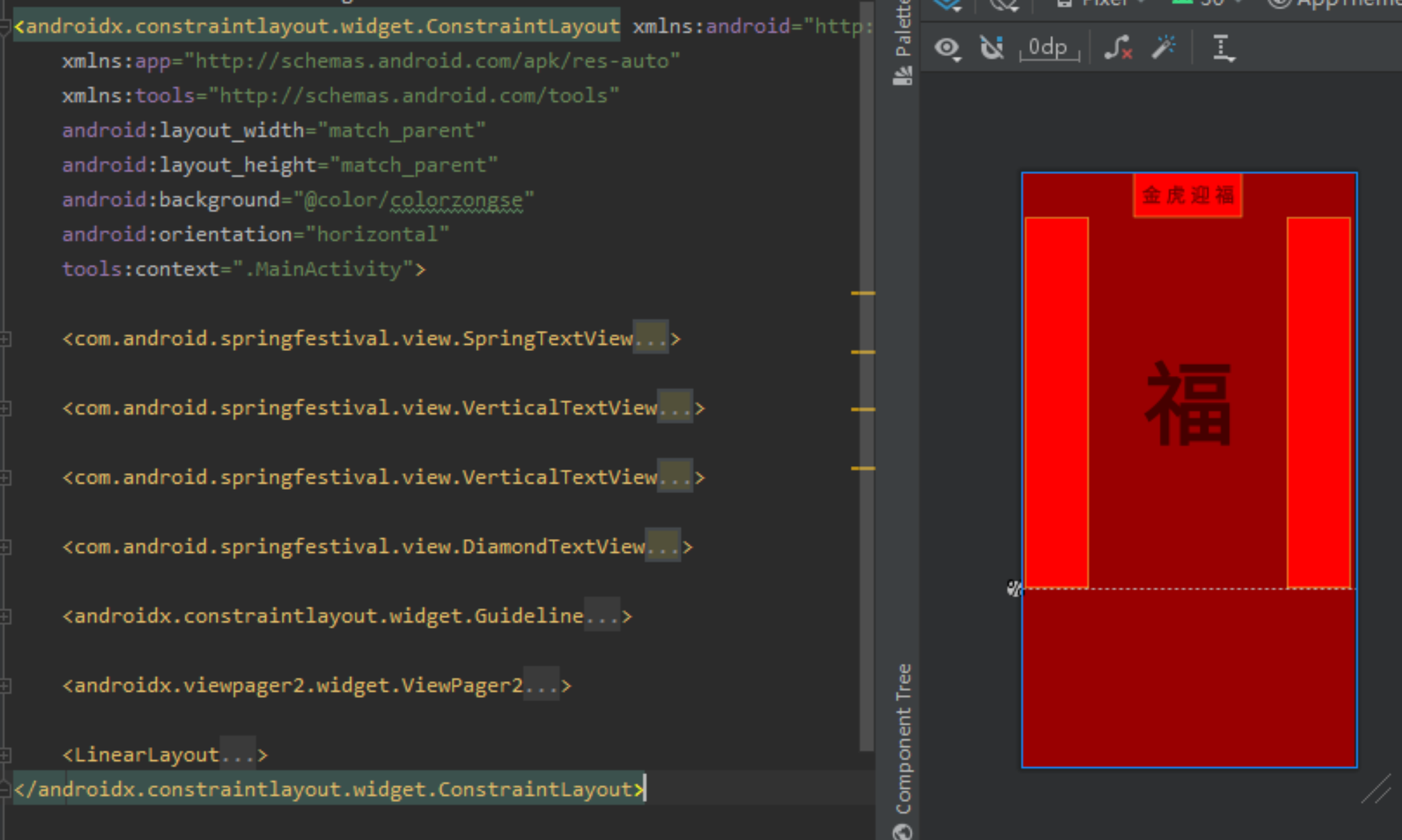
image.png
ConstraintLayout using
- Long winded, some little friends may not have used it, you can refer to it
- At least one of the controls in the ConstraintLayout must be selected for constraint in both horizontal and vertical directions, otherwise the controls will be placed in the upper left corner.
- Top refers to the top, bottom refers to the bottom, start refers to the left, and end refers to the right. The above example
<com.android.springfestival.view.SpringTextView
    android:id="@+id/top"
    android:layout_width="wrap_content"
    android:layout_height="?actionBarSize"
    android:background="@drawable/shape_red_solid"
    android:gravity="center"
    android:paddingLeft="10dp"
    android:paddingRight="10dp"
    android:text="Golden Tiger welcomes blessing"
    android:textSize="24sp"
    android:textStyle="bold"
    app:layout_constraintEnd_toEndOf="parent"
    app:layout_constraintStart_toStartOf="parent"
app:layout_constraintTop_toTopOf="parent" />- This is a horizontal text. You can see that its top is bound to the top of the parent layout, the left is bound to the left of the parent layout, and the right is bound to the right of the parent layout.
- Horizontal centering requires constraints on both the left and right. If it is not necessary, restrict the control to the direction in which you want to place it. For example, place the horizontal batch on the top.
- Next, I want the upper part to account for 70% and the lower part to account for 30%
- Add a Guideline control, set the orientation to horizontal if you want to divide up and down, and change the left and right points to vertical.
- layout_ constraintGuide_ The percentage property is used to set the percentage of the top or left. The range of values is 0 to 1.
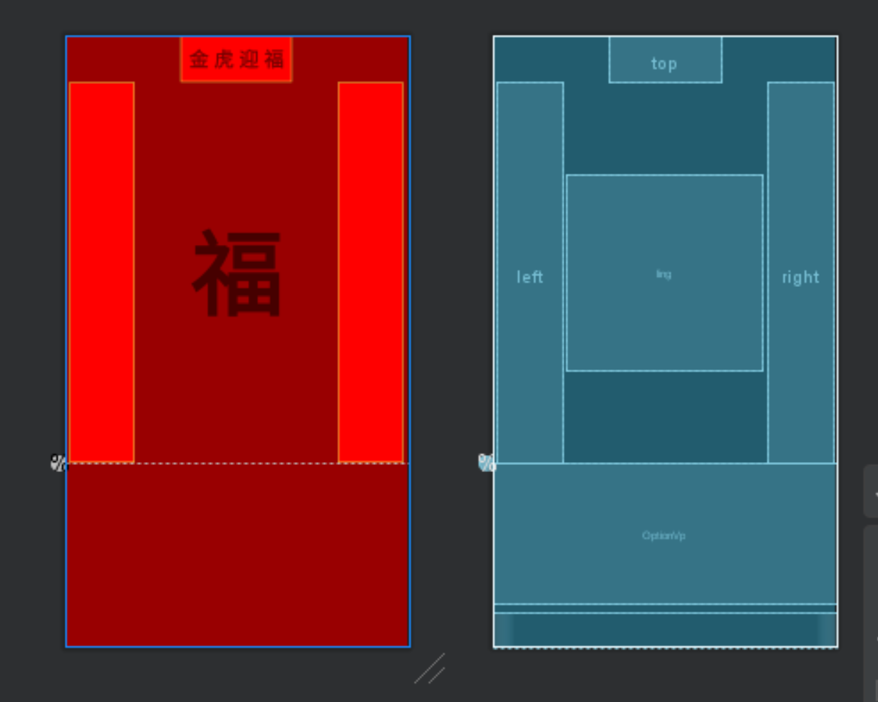
image.png
<androidx.constraintlayout.widget.Guideline
    android:id="@+id/guideline"
    android:layout_width="wrap_content"
    android:layout_height="wrap_content"
    android:orientation="horizontal"
app:layout_constraintGuide_percent="0.7" />- For the couplet and Fu character in the middle, I intend that Fu character accounts for 30% and the rest account for 10% respectively. Therefore, the width and height of the control are set to 0dp, that is, it takes up the remaining space, and the horizontal weight is set for them, 1:3:1.
- Horizontal weight app:layout_constraintHorizontal_weight
- Because the width and height of the Fu character should be consistent, set the ratio of 1:1 to app:layout_constraintDimensionRatio="1:1"
- Note: controls must be interdependent to work.
- The code is as follows:
<com.android.springfestival.view.VerticalTextView
   android:id="@+id/left"
   android:layout_width="0dp"
   android:layout_height="0dp"
   android:layout_marginLeft="5dp"
   android:background="@drawable/shape_red_solid"
   android:ems="1"
   android:paddingTop="10dp"
   android:paddingBottom="10dp"
   android:text="Welcome happiness and wealth in spring"
   android:textSize="24sp"
   android:textStyle="bold"
   app:layout_constraintHorizontal_weight="1"
   app:layout_constraintBottom_toTopOf="@id/guideline"
   app:layout_constraintEnd_toStartOf="@id/ling"
   app:layout_constraintStart_toStartOf="parent"
   app:layout_constraintTop_toBottomOf="@id/top" />

<com.android.springfestival.view.VerticalTextView
   android:id="@+id/right"
   android:layout_width="0dp"
   android:layout_height="0dp"
   android:layout_marginRight="5dp"
   android:background="@drawable/shape_red_solid"
   android:ems="1"
   android:paddingTop="10dp"
   android:paddingBottom="10dp"
   android:text="Receive wealth, happiness and peace"
   android:textSize="24sp"
   android:textStyle="bold"
   app:layout_constraintHorizontal_weight="1"
   app:layout_constraintBottom_toBottomOf="@id/guideline"
   app:layout_constraintEnd_toEndOf="parent"
   app:layout_constraintStart_toEndOf="@id/ling"
   app:layout_constraintTop_toBottomOf="@id/top" />

<com.android.springfestival.view.DiamondTextView
   android:id="@+id/ling"
   android:layout_width="0dp"
   app:layout_constraintDimensionRatio="1:1"
   app:layout_constraintHorizontal_weight="3"
   android:layout_height="0dp"
   android:layout_margin="5dp"
   android:autoSizeTextType="uniform"
   android:gravity="center"
   android:text="blessing"
   android:textStyle="bold"
   app:layout_constraintBottom_toTopOf="@+id/OptionVp"
   app:layout_constraintEnd_toStartOf="@id/right"
   app:layout_constraintStart_toEndOf="@id/left"
   app:layout_constraintTop_toBottomOf="@id/top"
   />
- The following ViewPager2 and indicator use weight to allocate the remaining space by 4:1. Here, the weight is consistent with the usage of LinearLayout.
<androidx.viewpager2.widget.ViewPager2
    android:id="@+id/OptionVp"
    android:layout_width="match_parent"
    android:layout_height="0dp"
    app:layout_constraintBottom_toTopOf="@id/llPointContainer"
    app:layout_constraintEnd_toEndOf="parent"
    app:layout_constraintStart_toStartOf="parent"
    app:layout_constraintTop_toBottomOf="@id/guideline"
    app:layout_constraintVertical_weight="4" />

<LinearLayout
    android:id="@+id/llPointContainer"
    android:layout_width="match_parent"
    android:layout_height="0dp"
    android:layout_marginTop="10dp"
    android:gravity="center_horizontal"
    android:orientation="horizontal"
    app:layout_constraintBottom_toBottomOf="parent"
    app:layout_constraintEnd_toEndOf="parent"
    app:layout_constraintStart_toStartOf="parent"
    app:layout_constraintTop_toBottomOf="@id/OptionVp"
    app:layout_constraintVertical_weight="1" />
Drawable use
- ShapeDrawable is used here
- Its advantage is that it can add background to the control and reduce the use of image resources, so as to reduce the size of package volume.
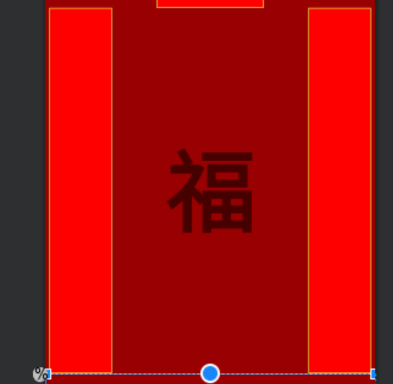
image.png
- The couplet and stroke gold line in the above figure are from ShapeDrawable, and the code is as follows
<?xml version="1.0" encoding="utf-8"?>
<shape xmlns:android="http://schemas.android.com/apk/res/android">

 <stroke
     android:width="1dp"
     android:color="@color/colorGold" />
 <solid android:color="@color/colorRed" />
</shape>
Custom View
Horizontal inscription
- I don't know if the little partner has found that the font is not the system's own font. The easiest way to change the font is to inherit TextView and rewrite his setTypeface method
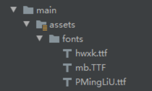
image.png
- Create a new directory as shown in the figure above and put in the fonts we need.
- Use this font and pass it to the parent class.
- It is used in the layout file, and the code is in the ConstraintLayout chapter.
class SpringTextView(context: Context?, attrs: AttributeSet?) :
    AppCompatTextView(context, attrs) {
    //Override font setting method
    override fun setTypeface(tf: Typeface?) {
        super.setTypeface(Typeface.createFromAsset(context.assets, "fonts/hwxk.ttf"))
    }
}
Couplet
- I believe everyone knows that TextView can be vertically arranged with android:ems="1", but it is close together and cannot be evenly divided. It is very unsightly, so we continue to inherit TextView and customize the effect of vertical evenly divided.
- This time, we rewrite the onDraw method to draw the text by ourselves.
- The key point of height drawing is to calculate the gap between each text (the total height minus the padding up and down and the width of the text divided by the number of text minus one)
- Draw width (total width minus width of text divided by two)
- The code is as follows:
override fun onDraw(canvas: Canvas) {
    paint.textSize = textSize
    paint.apply {
        typeface = Typeface.createFromAsset(context.assets,"fonts/hwxk.ttf")
    }
    var textLengthHeight = 0
    val r = Rect()
    val arr = IntArray(text.length)
    canvasLength = measuredHeight - paddingTop - paddingBottom
    if (!TextUtils.isEmpty(text) && text.length > 1) {
        var i = 0
        while (i < text.length) {
            paint.getTextBounds(text.substring(i, i + 1), 0, 1, r)
            textLengthHeight += (r.bottom - r.top)
            arr[i] = r.bottom - r.top
            i++
        }
        space = (canvasLength - textLengthHeight).toDouble() / (text.length - 1)
    }
    var arrlength = 0f
    var i = 0
    while (i < text.length) {
        arrlength += arr[i]
        if (i == 0) {
            canvas.drawText(
                text.substring(i, i + 1),
                ((width - r.right - r.left) / 2).toFloat(),
                (i * space + arrlength).toFloat() + paddingTop,
                paint
            )
        } else {
            canvas.drawText(
                text.substring(i, i + 1),
                ((width - r.right - r.left) / 2).toFloat(),
                (i * space + arrlength).toFloat(),
                paint
            )
        }
        i++
    }
}
Lucky Character
- The diamond TextView system didn't give us. What should we do? Continue to customize!
- Rewrite onDraw as the old rule, get the width and height, take the shortest, draw one with Path, and set the background for TextView.
- I drew it twice here, because how can the word Fu be without Phnom Penh!
override fun onDraw(canvas: Canvas) {
   super.onDraw(canvas)
   var min = min(width, height)
   var mPath = Path().apply {
       moveTo(0F, (min / 2).toFloat());
       lineTo((min / 2).toFloat(), 0F);
       lineTo(min.toFloat(), (min / 2).toFloat());
       lineTo((min / 2).toFloat(), min.toFloat());
       close();
   }
   val bmp = Bitmap.createBitmap(min, min, Bitmap.Config.ARGB_8888)
   val c = Canvas(bmp)
   c.drawPath(mPath, paint)
   c.drawPath(mPath, paintStock)
   setBackgroundDrawable(BitmapDrawable(resources, bmp))
ViewPager2
- I wrote an article before ViewPager2 creates a Banner rotation chart The article here is simple and wordy. Some friends may not have read the previous article.
Implementation of infinite sliding
- The first bit of the data source is add, and the last figure is
val newList = arrayListOf<String>()
newList.add(pic[pic.size-1])
- The last one adds the first picture
for (item in pic) {
    newList.add(item)
}
newList.add(pic[0])- When ViewPager2 slides to bit 0 and the last bit, the processing is as follows:
position | handle |
|---|---|
currentPosition == 0 | setCurrentItem(adapter.itemCount - 2, false) |
currentPosition == adapter.itemCount - 1 | setCurrentItem(1, false) |
- Add sliding listening code to ViewPager2 as follows The key point is in the onPageScrollStateChanged method
bannerVp.registerOnPageChangeCallback(object :
    ViewPager2.OnPageChangeCallback() {
    override fun onPageSelected(position: Int) {
        currentPosition = position
    }
    override fun onPageScrollStateChanged(state: Int) {
        //Automatic scrolling is only allowed when idle
        if (state == ViewPager2.SCROLL_STATE_IDLE) {
            if (currentPosition == 0) {
                bannerVp.setCurrentItem(adapter.itemCount - 2, false)
            } else if (currentPosition == adapter.itemCount - 1) {
                bannerVp.setCurrentItem(1, false)
            }
        }
    }
})
Shape of item
- This is also implemented through ShapeDrawable. The code is as follows
<?xml version="1.0" encoding="utf-8"?>
<shape xmlns:android="http://schemas.android.com/apk/res/android"
    android:shape="rectangle">

    <corners
        android:bottomRightRadius="50dp"
        android:topLeftRadius="50dp" />
    <stroke
        android:width="1dp"
        android:color="@color/colorGold" />
    <solid android:color="#F02A2A" />
</shape>
Addition of indicators
- Dynamically create a View according to the quantity. The code is as follows:
private fun initIndicator(){
    llPointContainer.removeAllViews()
    for (index in 1..size-2) {
        val view = View(this)
        val layoutParams = LinearLayout.LayoutParams(10.dp.toInt(), 10.dp.toInt())
        layoutParams.marginEnd = 8
        layoutParams.marginStart = 8
        view.layoutParams = layoutParams
        llPointContainer.addView(view)
    }
}- Update indicator background while sliding
- In the onPageSelected method of ViewPager2's sliding monitoring, the following methods can be called.
- Remember to make the following judgment
- In the onPageSelected method of ViewPager2's sliding monitoring, the following methods can be called.
if (position <= llPointContainer.childCount) updateIndicator(position)
private fun updateIndicator(position: Int){
    llPointContainer.run {
        for (index in 1..childCount) {
            getChildAt(index - 1).background = resources.getDrawable(R.drawable.circlered)
        }
        if (position > 0) {
            getChildAt(position - 1).background = resources.getDrawable(R.drawable.circlegold)
        }
    }
}- The shape here is also realized through ShapeDrawable.
ViewPager2 one screen multi page effect
- There is a big difference between this and ViewPager's multiple pages on one screen. ViewPager sets margin for itself and clipChildren property to false.
- ViewPager2 is implemented by setting Padding and PageTransformer for RecyclerView
OptionVp.apply {
 offscreenPageLimit=1
 val recyclerView= getChildAt(0) as RecyclerView
 recyclerView.apply {
     val padding = resources.getDimensionPixelOffset(R.dimen.common_line_height) +
             resources.getDimensionPixelOffset(R.dimen.common_line_height)
     // setting padding on inner RecyclerView puts overscroll effect in the right place
     setPadding(padding, 0, padding, 0)
     clipToPadding = false
 }
}
ViewPager2 slide zoom
- Speaking of this, let's talk about PageTransformer, which can be used to set page animation and page spacing. If both spacing and animation are required, CompositePageTransformer will be used.
- As mentioned above, I set the page spacing and used the zoom effect. Let's take a look at the specific code.
val compositePageTransformer = CompositePageTransformer()
compositePageTransformer.addTransformer(ScaleInTransformer())
compositePageTransformer.addTransformer(
    MarginPageTransformer(
        resources.getDimension(R.dimen.common_margin_middle).toInt()
    )
)
OptionVp.setPageTransformer(compositePageTransformer)- Isn't it very fragrant? Use it quickly.
sensor
- There are many sensors in Android. Here we use the acceleration sensor. The steps are as follows:
- Get sensor manager object
- Get acceleration sensor object
- Registration sensor (called in onCreate)
- Release sensor (called in onDestory)
sensorManager = getSystemService(SENSOR_SERVICE) as SensorManager
sensor = sensorManager!!.getDefaultSensor(Sensor.TYPE_ACCELEROMETER)
sensorManager!!.registerListener(this, sensor, SensorManager.SENSOR_DELAY_NORMAL)
sensorManager!!.unregisterListener(this)
- After registering the listener, make business judgment in the onSensorChanged method (in this case, obtain event.values greater than 15). If the business conditions are met, call vibration and pop up a prompt box.
override fun onSensorChanged(event: SensorEvent) {
        /* Function called when the sensor value changes*/
        val values: FloatArray = event.values
        val x = values[0]
        val y = values[1]
        val z = values[2]
        val minValue = 15
        if(!isShake) {
            if (Math.abs(x) > minValue || Math.abs(y) > minValue || Math.abs(z) > minValue) {
                //Start shaking
                isShake = true
                val pattern = longArrayOf(300, 500)
                vibrator!!.vibrate(pattern, -1)
                //Start animation effect
                MyDialog(this)
                    .showDialog(currentPosition - 1)

            }
        }
    }
Realization of vibration
- You need to apply for permission in the manifest file
- Get vibrator manager object
- Call vibration to start vibration
<!-- Vibrator permission-->
<uses-permission android:name="android.permission.VIBRATE"/>
//Get vibrator manager object
vibrator = getSystemService(VIBRATOR_SERVICE) as Vibrator
//Opening vibration
val pattern = longArrayOf(300, 500)
vibrator!!.vibrate(pattern, -1)
Android animation
- Here we use View animation to add entry and exit animation to Dialog. *View animation is like pan, zoom, rotation and transparency. Zoom is used here.
label | meaning |
|---|---|
interpolator | Specify the animation inserter. The common ones are acceleration and deceleration inserters_ decelerate_interpolator, accelerated inserter, elerate_interpolator, decelerate_interpolator. |
pivotX | Horizontal animation start position, relative to the percentage of the screen, 50% means that the animation starts from the middle of the screen |
pivotY | Vertical animation starting position, relative to the percentage of the screen, 50% means that the animation starts from the middle of the screen |
fromXScale | Scale before the start of horizontal animation, 0.0 is not displayed, and 1.0 is the normal size |
toXScale | The final zoom multiple of the horizontal animation. 1.0 is the normal size and larger than 1.0 |
fromYScale | Zoom before the start of vertical animation, 0.0 is not displayed, and 1.0 is the normal size |
toYScale | The final zoom multiple of vertical animation. 1.0 is the normal size and larger than 1.0 |
- With the above description, the next entry animation and exit animation are more convenient to understand
- The center position is scaled from zero to one.
<!-- Animation on pop-up -->
<set xmlns:android="http://schemas.android.com/apk/res/android">
    <scale
        android:interpolator="@android:anim/accelerate_interpolator"
        android:fromXScale="0.0"
        android:toXScale="1.0"
        android:fromYScale="0.0"
        android:toYScale="1.0"
        android:pivotX="50%"
        android:pivotY="50%"
        android:fillAfter="false"
        android:duration="400"/>
</set>
<!-- Animation effect on exit -->
<set xmlns:android="http://schemas.android.com/apk/res/android">
<scale
android:interpolator="@android:anim/accelerate_interpolator"
android:fromXScale="1.0"
android:toXScale="0.0"
android:fromYScale="1.0"
android:toYScale="0.0"
android:pivotX="50%"
android:pivotY="50%"
android:fillAfter="false"
android:duration="400"/>
</set>- Exit is to go back to the center from one to zero.
Random results
- There is no network request here. The answer is written locally and randomly selected for display.
- The random code in Kotlin is simple as follows
(answerList.indices).random()
- I originally wanted to add a database to support human input. Let's realize it slowly in the later stage.
last
I wish all engineers good luck in the year of the tiger. Everything they want will come true in 2022. The idea has been revised several times. Fortunately, they finally insisted on doing it.