Portal VUE project (III)
Page component optimization
Breadcrumb navigation
breadcrumbs displays the path information (Home / blog) of the current page in the effect of bread crumbs. Would it be better for the user experience if navigation click events or custom information could be added to the path.
Modify / SRC / components / layout / component / breadcrumbs Vue is as follows:
<template>
	<!-- ======= Breadcrumbs ======= -->
	<section class="breadcrumbs">
	  <div class="container">

		<ol>
		  <li><a href="/">Home</a></li>
		  <li><a :href="action">{{tag}}</a></li>
		</ol>
		<h2>{{msg}}</h2>

	  </div>
	</section><!-- End Breadcrumbs -->
</template>

<script setup>
defineProps({
  tag: String,
  msg: String,
  action: {
	  type: String,
	  default: "#",
	  required: false
	  },
})
</script>

<style>
</style>
Define component reference attributes tag - tag of the current page, msg - custom display information, action - click to jump address. On the page integrating Breadcrumbs components, just add attribute declaration in the tag, such as < Breadcrumbs tag = "blog" action = "/ blogpage" msg = "blog" > < / Breadcrumbs >.
Click on the navigation bar not to refresh the page
-
Navigation options optimization
The navigation position navbar navbar navigates is mostly the anchor point after the Home page is rendered. If you click the navigation bar option when browsing the Home page without refreshing the page to locate the anchor point, and click the navigation bar option when browsing other pages to jump and locate the anchor point, wouldn't this user experience be better.
Solution: in header Vue adds the component attribute tag - tag of the current page, msg - description information, navigation options in < NAV > tag, and the href attribute of < a > tag is changed to dynamic attribute (determine whether the current reference page is HomePage or BlogPage). -
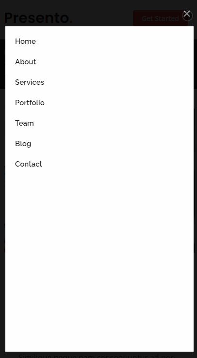
Mobile device terminal navigation bar optimization
The navbar effect of mobile terminals such as mobile phones and iPad s is slightly different. You can click to expand the navigation list, and click the navigation option to automatically close the expanded navigation list.
Implementation idea: according to the browser developer tool (key: F12), the mobile terminal #navbar element is hidden by default, and it is added when opening the navigation list Navbar mobilecss style, and navigation list on / off button by bi-x,. Bi list is controlled by two css styles, so we need to add a switch between displaying and hiding the click event control list.
-
Adjusted / SRC / components / layout / header Vue code is as follows:
<template>

	  <!-- ======= Header ======= -->
	  <header id="header" class="fixed-top d-flex align-items-center">
	    <div class="container d-flex align-items-center">
	      <h1 class="logo me-auto"><a :href="(homePage==tag)?'#':homePage">Presento<span>.</span></a></h1>

	      <nav id="navbar" :class="['navbar','order-last','order-lg-0', (isNavbarMobileOpen?'navbar-mobile':'')]">
	        <ul>
	          <li @click="openNavbar"><a class="nav-link scrollto" :href="(homePage==tag)?'#':(homePage+'#hero')">Home</a></li>
	          <li @click="openNavbar"><a class="nav-link scrollto" :href="(homePage==tag)?'#about':(homePage+'#about')">About</a></li>
	          <li @click="openNavbar"><a class="nav-link scrollto" :href="(homePage==tag)?'#services':(homePage+'#services')">Services</a></li>
	          <li @click="openNavbar"><a class="nav-link scrollto" :href="(homePage==tag)?'#portfolio':(homePage+'#portfolio')">Portfolio</a></li>
	          <li @click="openNavbar"><a class="nav-link scrollto" :href="(homePage==tag)?'#team':(homePage+'#team')">Team</a></li>
	          <li @click="openNavbar"><a :href="(blogPage==tag)?'#blog':(blogPage+'#blog')">Blog</a></li>
	          <li class="dropdown" v-show="false"><a @click="setDropdownLeave(1)" href="javascript:;"><span>Drop Down</span> <i class="bi bi-chevron-down"></i></a>
	            <ul :class="[dropdownLeave==0?'':'dropdown-active']">
	              <li @click="openNavbar"><a href="javascript:;">Drop Down 1</a></li>
	              <li class="dropdown"><a @click="setDropdownLeave(2)" href="javascript:;"><span>Deep Drop Down</span> <i class="bi bi-chevron-right"></i></a>
	                <ul :class="[dropdownLeave==2?'dropdown-active':'']">
	                  <li @click="openNavbar"><a href="javascript:;">Deep Drop Down 1</a></li>
	                  <li @click="openNavbar"><a href="javascript:;">Deep Drop Down 2</a></li>
	                  <li @click="openNavbar"><a href="javascript:;">Deep Drop Down 3</a></li>
	                  <li @click="openNavbar"><a href="javascript:;">Deep Drop Down 4</a></li>
	                  <li @click="openNavbar"><a href="javascript:;">Deep Drop Down 5</a></li>
	                </ul>
	              </li>
	              <li @click="openNavbar"><a href="javascript:;">Drop Down 2</a></li>
	              <li @click="openNavbar"><a href="javascript:;">Drop Down 3</a></li>
	              <li @click="openNavbar"><a href="javascript:;">Drop Down 4</a></li>
	            </ul>
	          </li>
	          <li @click="openNavbar"><a class="nav-link scrollto" :href="(homePage==tag)?'#contact':(homePage+'#contact')">Contact</a></li>
	        </ul>
	        <i @click="openNavbar" :class="['bi', 'bi-list', 'mobile-nav-toggle', (isNavbarMobileOpen?'bi-x':'bi-list')]"></i>
	      </nav><!-- .navbar -->

	      <a :href="(homePage==tag)?'#about':(homePage+'#about')" class="get-started-btn scrollto">Get Started</a>
	    </div>
	  </header><!-- End Header -->

</template>

<script>
export default{
	name: "Header",
	props:{
		tag: String,
		msg: String,
	},
	data() {
		return {
			homePage: "/HomePage",
			blogPage: "BlogPage",
			isNavbarMobileOpen: false,
			dropdownLeave: 0,
		};
	},
	methods:{
		openNavbar(){
			// select('#navbar').classList.toggle('navbar-mobile')
			// this.classList.toggle('bi-list')
			// this.classList.toggle('bi-x')
			if(document.body.clientWidth<=1000){
				this.isNavbarMobileOpen = this.isNavbarMobileOpen?false:true;
				if(this.dropdownLeave != 0){
					this.dropdownLeave = 0; //Close drop-down
				}
			}
		},
		setDropdownLeave(leave){
			if(document.body.clientWidth<=1000 && this.isNavbarMobileOpen){
				if(this.dropdownLeave<leave){
					this.dropdownLeave = leave;
				}else if(leave==1){
					this.dropdownLeave = 0; //Close drop-down
				}else if(this.dropdownLeave==leave){
					this.dropdownLeave = 1; //Close secondary pull-down
				}
			}
		}
	}
}

</script>

<style>
</style>
Similarly, on the page of integrated Header component, just add attribute declaration in the tag, such as < Header tag = "/ blogpage" > < / Header >.
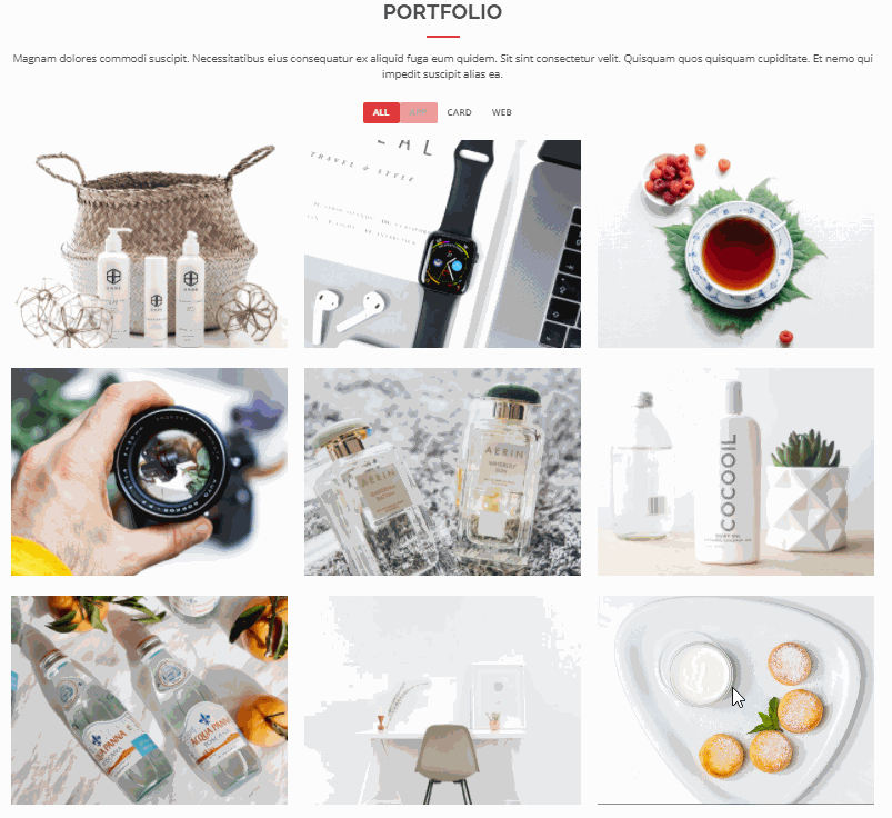
isotope streaming layout and element filtering
The home page Portfolio module shows the picture wall, which supports streaming layout, and realizes interaction through the isotope plug-in (for those interested, enter the research below: isotope )At the same time, there are buttons on the top to switch and filter the elements of different label groups.
In / SRC / components / layout / component / portfolio Vue adds an isotope initialization declaration to bind to the filtering event, and deletes / SRC / assets / JS / main JS corresponding code block. In addition, add the attribute ref = "portfolio flters" in the < UL > tag of id = "portfolio flters", and add the attribute ref = "portfolio container" in the < div > tag with class = "portfolio container". The adjustment codes are as follows:
<script>
import AOS from "aos"

export default{
	data() {
		return {
			portfolioContainer: {},
			portfolioIsotope: null,
			portfolioFilters: {},
		};
	},
	methods:{
		filterActive(e) {
			e.preventDefault();
			if(this.portfolioIsotope == null){
			  // Delay initialization to solve the problem of low height
			  this.portfolioIsotope = new Isotope(this.portfolioContainer, {
				itemSelector: '.portfolio-item',
				layoutMode: 'fitRows'
			  });
			}

			this.portfolioFilters.forEach((el) => {
			  el.classList.remove('filter-active');
			});
			let that = e.currentTarget;
			that.classList.add('filter-active');

			this.portfolioIsotope.arrange({
			  filter: that.getAttribute('data-filter')
			});
			this.portfolioIsotope.on('arrangeComplete', () => {
			  AOS.refresh()
			});
		},
		/**
		* Init Porfolio isotope and filter
		*/
		initIsotope(){
			this.portfolioContainer = this.$refs.portfolioContainer;

			//console.log("before start container height: ", this.portfolioContainer.style.height)
			if (this.portfolioContainer) {
			  // Low altitude (126px) - > delay initialization
			  /* this.portfolioIsotope = new Isotope(this.portfolioContainer, {
				itemSelector: '.portfolio-item',
				layoutMode: 'fitRows'
			  }); */
			  //console.log("start Isotope container height: ", this.portfolioContainer.style.height)

			  this.portfolioFilters = this.$refs.portfolioFlters.childNodes;

			  let that = this;
			  this.portfolioFilters.forEach((el) => {
				el.onclick = that.filterActive;
			  });

			}

		}
	},
	mounted() {
		let that = this;
		this.$nextTick( () =>{
			that.initIsotope();
		});

	}
}
</script>
Back to top button
The implementation of returning to the top of the browsing page is relatively simple. The < a href = "#" > tag can meet the function of returning to the top. Observing the browsing effect of the original static template, we can find that when the current screen (scroll) position is not at the top, the button is displayed. At this time, the < a > tag with class = "back to top" in css style is increased In activecss style, click "back to top" and the button disappears The css style of active also disappears. Therefore, we can add a screen scroll to listen for events.
Modify / SRC / components / layout / footer Vue, add ref="backToTopBtn" attribute in < a > tag with class = "back to top" CSS style; The code is as follows:
<script>
export default{
	mounted() {
		window.addEventListener('scroll', this.backToTopBtnHidden);
	},
	destroyed(){
		window.removeEventListener('scroll', this.backToTopBtnHidden);
	},
	methods: {
		//Monitor scrolling
		backToTopBtnHidden(){
			let scrollTop = window.pageYOffset || document.documentElement.scrollTop || document.body.scrollTop;
			if (!!document.documentElement.scrollTop &&document.documentElement.scrollTop >= 300){
				this.$refs.backToTopBtn.classList.add('active'); //display
				return ;
			}
			this.$refs.backToTopBtn.classList.remove('active'); //hide
		}
  },
}
</script>