CSS Advanced (6) Structure and Layout
1. Adaptive internal elements
Solution
CSS Internal and External Size Models: http://w3.org/TR/css3-sizing
The new keyword for the width and height attributes: min-content, which resolves to the width of the largest non-breakable element inside the container (that is, the widest word, picture, or box element with a fixed width)
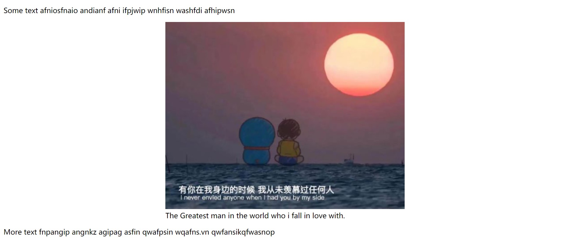
<!-- figcaption Used for description figure The title of the label, figure Used for markup img* -->
<p>Some text afniosfnaio andianf afni ifpjwip wnhfisn washfdi afhipwsn </p>
<figure>
    <img src="1.png" alt="">
    <figcaption>
        The Greatest man in the world who i fall in love with.
    </figcaption>
</figure>
<p>More text fnpangip angnkz agipag asfin qwafpsin wqafns.vn qwfansikqfwasnop </p>
figure{
    max-width: 300px;  /*Fallback mechanism*/
    max-width: min-content;
    margin: auto;
}

figure > img {
    max-width: inherit;
}
Automatically center figure horizontally
2. Precise control of table column widths
Solution
With the attribute table-layout, when the default value is auto, its behavior mode is called the automatic table layout algorithm. The other value is fixed. Fixed table layout mode makes it easier to use. Because the contents of the table do not affect the width of cells, tables do not need to be drawn repeatedly during page download.
table {
	table-layout: fixed;
    width:100%; /*Width must be set to ensure table-layout works*/
}
3. Styling according to the number of sibling elements
scene
Save screen space by hiding or compressing controls as a list grows
- E-mail List
- To-do application
- Palette Application
- Applications with multiple <textarea>elements
Solution
li:only-child{
	/*Style with only one list item*/
}

/*Equivalent to*/
li:first-child:nth-last-child(1){
}
Extensions:
li:first-child:nth-last-child(4),
li:first-child:nth-last-child(4)~li{
	/*Hit all list items when the list contains exactly four items*/
}
Using a preprocessor:
@minin n-items($n) {
    &:first-child:nth-last-child(#{$n}),
    &:first-child:nth-last-child(#{$n})~&{
        @content;
    }
}

/*call*/
li {
    @inclulde n-items(4) {
        /*Attributes and Values*/
    }
}
Match elements based on the number range of sibling elements
Using the: nth-child() selector,: nth-child(n+b) indicates that all elements starting from the BTH are selected
- n+b: How many elements are there at least
- -n+b: maximum number of elements
li:first-child:nth-last-child(n+4),
li:first-child:nth-last-child(n+4)~li{
	/*Hit all list items when the list contains at least four items*/
}

li:first-child:nth-last-child(-n+4),
li:first-child:nth-last-child(-n+4)~li{
	/*Hit all list items when the list contains up to four items*/
}

li:first-child:nth-last-child(n+2):nth-last-child(-n+6),
li:first-child:nth-last-child(n+4)~li{
	/*Hit all list items when the list contains 2-6 items*/
}
4. Full Background and Fixed Width Content
background
The background width is full and the content width is fixed:
- The page contains several large blocks, each of which occupies the width of the viewport and has a different background.
- Content is fixed width, even if the width is different at different resolutions. It is only because the media query changes the fixed width value. In some cases, content in different blocks may have different widths
Solution
footer {
	padding:1em; /*Fallback mechanism*/
    padding: 1em calc(50%-450px); /*With calc, you don't have to write max-width:900px, because there is only 900px available space for content*/
    background:#333;
}
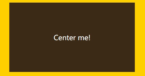
5. Horizontal and Vertical Centering (Focus)
5.1 Horizontal Center
- In-line elements: apply text-align: center to the parent element;
- Block level elements: apply margin:auto to yourself;
5.2 Vertical Centering
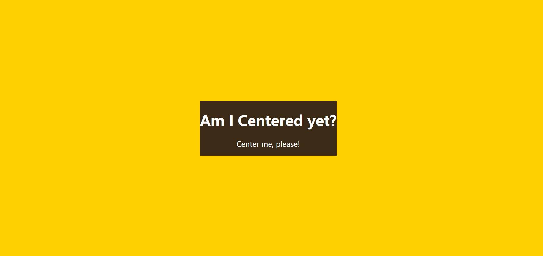
<main>
    <h1>Am I Centered yet?</h1>
    <p>Center me, please!</p>
</main>
Solution based on absolute positioning
main {
    position: absolute;
    top: calc(50%-5em);
    left: calc(50%-15em);
    width: 30em;
    height: 10em;
}
The biggest limitation of the above method is that it requires the element to have a fixed width and height, and in many cases, the size of the element that needs to be centered is often determined by its content
Translate() can be used to convert and move elements based on their own width and height when using percentages in the translate() deformable function so that the dimensions of the elements are not written to death in the offset.
main {
    position: absolute;
    top: 50%;
    left: 50%;
    transform: translate(-50%,-50%);
}
Note: In some browsers, this method may result in blurred display of elements because some elements are placed on half a pixel. This can be done with: transform-style:preserve-3d, but also with a hack.
Solution based on viewport unit
1.viewport units
- 1vw represents 1% of the viewport width and 1vh is similar
- When the viewport width is less than the height, 1vmin=1vw. Otherwise, 1vh
- When the viewport width is greater than the height, 1vmax=1vw. Otherwise, 1vh
main{
    width: 30em;
    padding: 1em 1.5em;
    margin: 50vh auto 0;
    transform: translateY(-50%);
}
flexbox-based solutions (best)
Just write two lines of declaration:
- Set the parent element of the element to be centered: display:flex;
- Set the element itself: margin:auto;
body{
    display: flex;
    min-height: 100vh;
    margin: 0;
}
main {
    margin: auto;
}
Be careful:
- When using flexbox, margin:auto; not only centers the element horizontally, but also vertically
- Width does not need to be specified
- The center element is assigned a width of max-content
Another benefit of felxbox is that you can vertically center anonymous containers (that is, text nodes that are not wrapped by labels)
main {
    display: flex;
    align-items: center;
    justify-content: center;
    width: 18em;
    height: 10em;
}
6. Footer close to the bottom
Assuming that the text of the footer never breaks, the actual height it occupies:
2
That's ok
×
That's ok
high
+
3
×
paragraph
fall
Of
Vertical
straight
abroad
edge
distance
+
page
foot
Of
Vertical
straight
within
edge
distance
2 rows x row height + 3 x paragraph vertical outer margin + footer vertical inner margin
2 rows x row height + 3 x paragraph vertical outer margin + footer vertical inner margin
main {
    min-height: calc(100vh-Header Height-Height of footer);
    box-sizing: border-box;
}
Be careful:
- This method requires ensuring that the text in the footer does not wrap
- Every time you change the size of the footer, you need to adjust the min-height
Flexbox scheme (recommended)
body{
    display: flex;
    flex-flow: column;
    min-height: 100vh; /*Human body occupies the height of the entire viewport*/
}

main {
    flex: 1;  /*Content auto-scaling stack fills all available space*/
}