1. Sprites
In order to effectively reduce the number of requests received and sent by the server and improve the loading speed of the page, CSS wizard technology appears
Core principle: integrate some small background images in the web page into a large picture, so that the server can only request one time
1.1 use of Sprite diagram
Use the core of Sprite diagram:
Wizard technology is mainly aimed at the use of background pictures, which is to integrate multiple small background pictures into a large picture
This big picture is also called sprites sprite or sprite
To move the position of the background picture, you can use background position
The moving distance is the x and y coordinates of the target image. Note that the coordinates in the web page are different (the right side of the x axis is positive, the left side is negative, the lower side of the y axis is positive, and the upper side is negative)
Generally, it moves up and left, so the value is negative
When using sprite images, you need to accurately measure the size and position of each small background image.
Sprite map has many advantages, but its disadvantages are also obvious
The picture file is still relatively large
The picture itself will be enlarged and reduced
Once the picture is made, it is very complicated to change it
At this time, there is a technology to solve the above problems, that is, the Font Icon iconfont
2. Font Icon iconfont
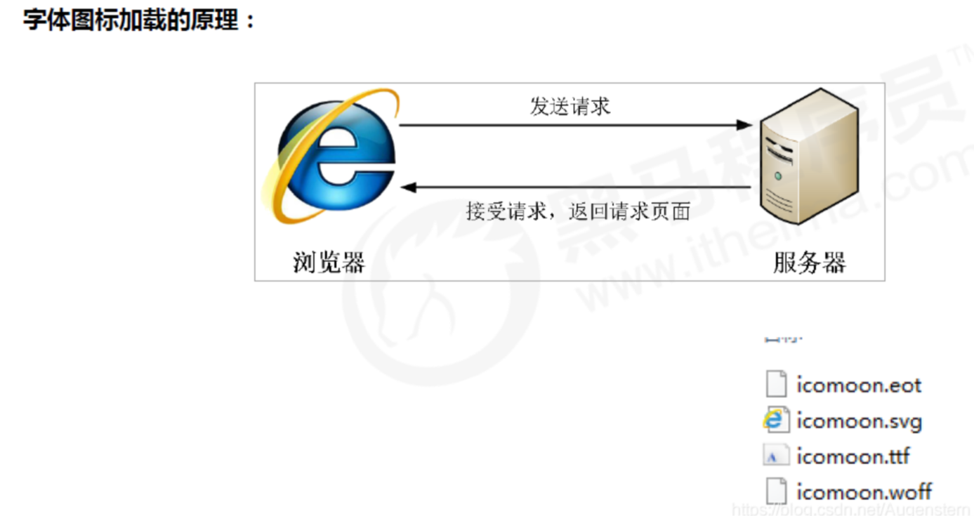
Font Icon usage scenario: mainly used to display some common and commonly used small icons in web pages. It shows icons, which are essentially fonts
advantage:
Lightweight: an icon font is smaller than a series of images. Once the font is loaded, the icon will be rendered immediately, reducing the request of the server
Flexibility: the essence is text. You can change the color at will, produce shadows, transparent effects, rotation, etc
Compatibility: almost all browsers are supported
Steps:
Font icon download
Introduction of Font Icon (introduced into our html page)
Append Font Icon (add new small icon later)
2.1 download of Font Icon
icomoon font
External network, download without login http://icomoon.io
Click IcoMoon App
Select the desired icon
Click Generate Font
Click download
Ali iconfont font library
Login is free, but iconfont Alibaba vector icon library
2.2 introduction of Font Icon
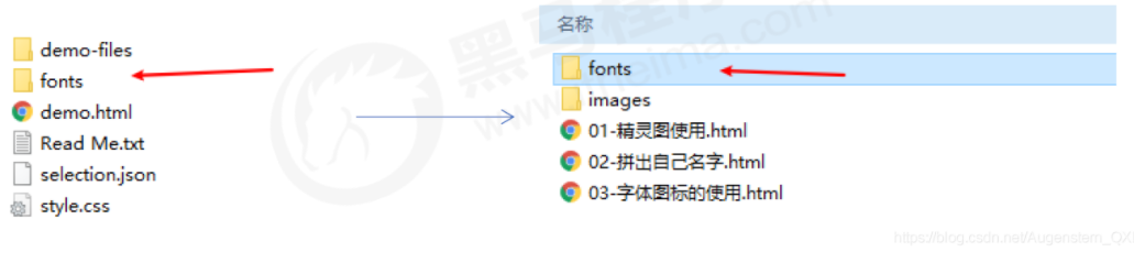
Take icomoon word library network as an example, unzip the download package, and the unzipped files are as follows:
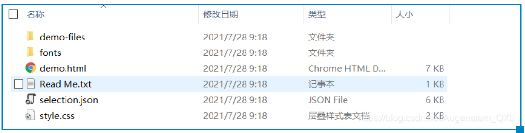
Put the fonts folder in the download package into the root directory of the page
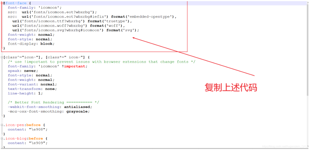
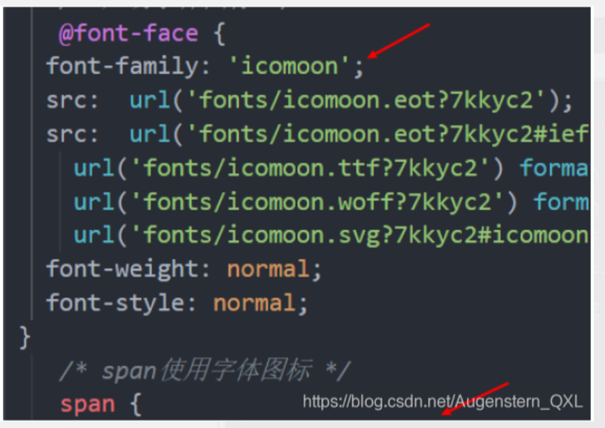
Global declaration of fonts in CSS Style: a simple understanding of introducing these fonts into our page through CSS
Right click to open style CSS, here I demonstrate opening with notepad++, copy the code as shown in the figure and introduce it into our own CSS file
<style>

@font-face {

font-family: 'icomoon';

src: url('fonts/icomoon.eot?7kkyc2');

src: url('fonts/icomoon.eot?7kkyc2#iefix') format('embedded-opentype'),

url('fonts/icomoon.ttf?7kkyc2') format('truetype'),

url('fonts/icomoon.woff?7kkyc2') format('woff'),

url('fonts/icomoon.svg?7kkyc2#icomoon') format('svg');

font-weight: normal;

font-style: normal;

}


</style>
Add small icons in html tags
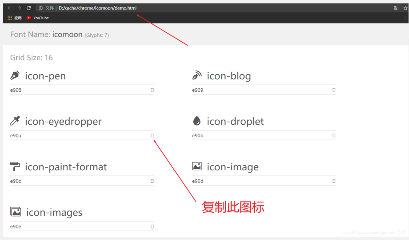
We open the demo. In the extracted file HTML, copy the desired icon and paste it into our < span > < / span > tag
Define fonts for labels
/*span use Font Icon*/
span {

font-family: "icomoon";

}
Note: the value of font family in the label must be the same as the font family we introduced before. Here, it is icomoon
Complete, so our overall code is:
<!DOCTYPE html>
<html lang="en">
<head>
<meta charset="UTF-8">
<meta http-equiv="X-UA-Compatible" content="IE=edge">
<meta name="viewport" content="width=device-width, initial-scale=1.0">
<title>Document</title>
<style>
@font-face {
font-family: 'icomoon';
src: url('fonts/icomoon.eot?7kkyc2');
src: url('fonts/icomoon.eot?7kkyc2#iefix') format('embedded-opentype'), url('fonts/icomoon.ttf?7kkyc2') format('truetype'), url('fonts/icomoon.woff?7kkyc2') format('woff'), url('fonts/icomoon.svg?7kkyc2#icomoon') format('svg');
font-weight: normal;
font-style: normal;
}
span {
font-family: "icomoon";
}
</style>
</head>
<body>
<div>
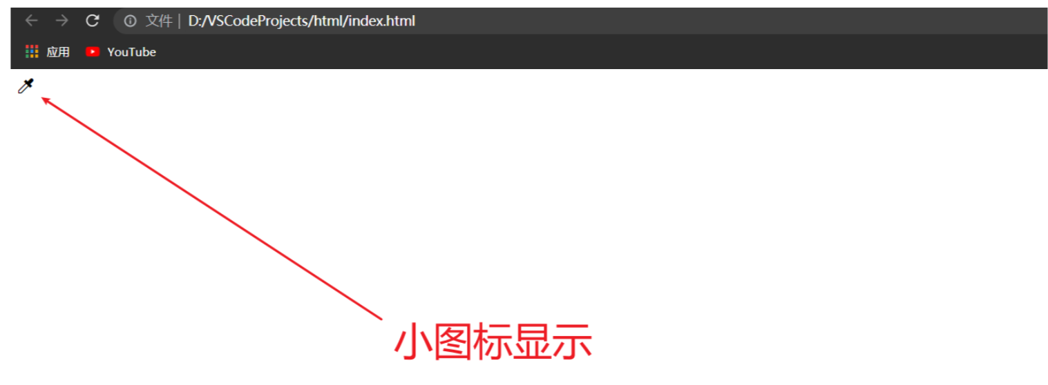
<span> </span>
</div>
</body>
</html>The test effect is:
2.3. Addition of Font Icon
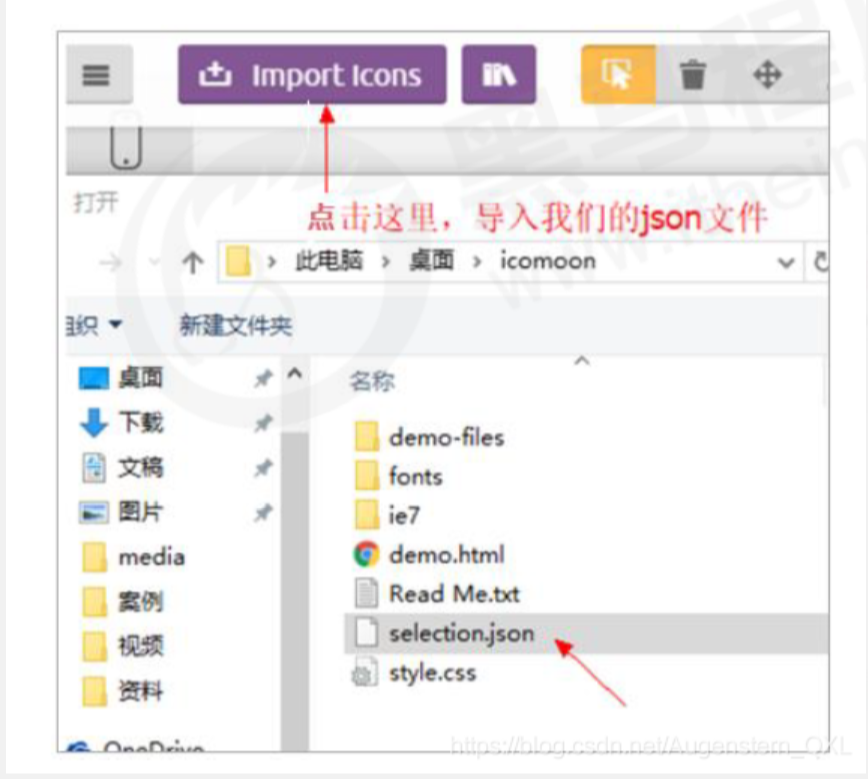
If the original font icon is not enough at work, we need to add a new font icon to the original font file.
Take icomoon word library network as an example, click import icons in the website
Put the selection in the compressed package JSON upload again, then select the new icon you want, download the compressed package again, and replace the original file.
2.4 font file format
Different browsers support different font formats. Font icons are compatible because they contain font files supported by mainstream browsers.
. ttf format woff format eot format svg format. Different browsers support different formats
2.4 Font Icon summary
If you encounter some small icons with simple structure and style, use font icons
If you encounter some small pictures with more complex structure and style, use sprite diagram
3. Interface style
The so-called interface style is to change some user operation styles in order to improve the user experience.
Change the user's mouse style
Form outline
Prevent form field dragging
3.1 mouse style cursor
Mouse style cursor
Sets or retrieves which system predefined cursor shape the mouse pointer moves over the object
li {

cursor: pointer;

}| Attribute value | describe |
| default | Xiaobai, default |
| pointer | Little hand |
| move | move |
| text | text |
| not-allowed | prohibit |
3.2 outline
outline:
Add outline:0 to the form; Or outline: none; After the style, you can remove the default blue border
input {

outline: none;

}
3.3. Prevent dragging text fields
Prevent dragging text field resize
textarea {

resize: none;

}
4,vertical-align
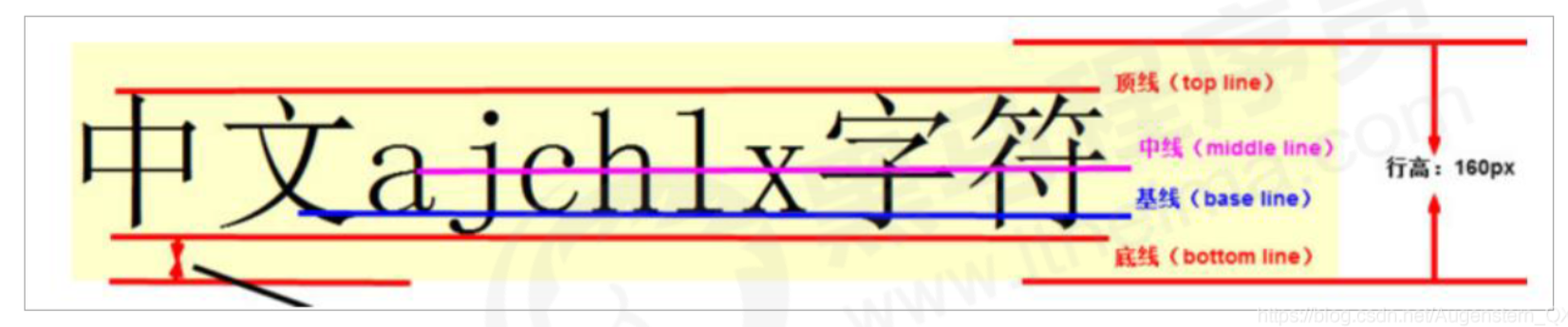
vertical-align:
Usage scenario: it is often used to set the vertical alignment between pictures or forms (inline block elements) and text.
Official explanation: used to set the vertical alignment of an element, but it is only valid for inline elements or inline block elements
vertical-align: baseline | top | middle | bottom
| value | describe |
| baseline | By default, the element is placed on the baseline of the parent element |
| top | Align the top of the element with the top of the highest element in the row (top line alignment) |
| middle | Place this element in the middle of the parent element (midline alignment) |
| bottom | Align the top of the element with the top of the lowest element in the row (bottom line alignment) |
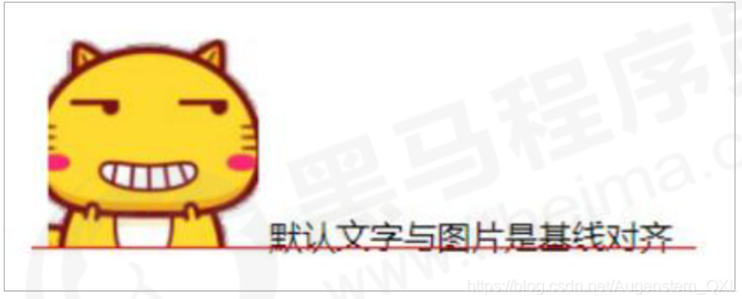
4.1. Picture, form and text alignment
Pictures and forms belong to inline block elements. The default vertical align is baseline alignment.
At this time, you can set the vertical align attribute of the block elements in the lines of pictures and forms to middle, so that the text and pictures can be vertically centered and aligned.
4.2. Solve the blank gap at the bottom of the picture
bug: there will be a blank gap at the bottom of the picture because the block elements in the line will align with the baseline of the text (you can see it by adding a border to the picture)
There are two main solutions:
Add vertical align to the picture: Middle | top | bottom, etc
Convert the picture into a block level element display:block;, Because block level elements will not have vertical align attribute
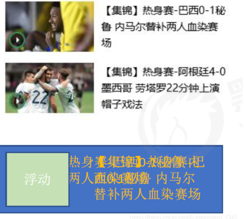
5. Overflow text omitted
5.1. Single line text overflow ellipsis display
Three conditions must be met:
/* 1.Force text to appear on one line first */

white-space: nowrap;         /*The default normal is auto wrap, and nowrap is to force one line of text to be displayed*/


/* 2.Excess hidden */

overflow: hidden;


/* 3.The text replaces the excess with an ellipsis*/

text-overflow: ellipsis;

/*ellipsis:ellipsis*/
5.2 multi line text overflow display ellipsis display
Multi line text overflow displays ellipsis, which has large compatibility problems. It is suitable for webKit browser or mobile terminal (most of the mobile terminal is webKit kernel)
overflow: hidden;

text-overflow: ellopsis;

/* Elastic box model display */

display: -webkit-box;

/* Limit the number of lines of text displayed in a block element */

-webkit-line-clamp: 2;

/* Sets or retrieves the arrangement of the child elements of the expansion box object */

-webkit-box-orient : vertical;
It is more recommended to let the background personnel do this effect, because the background personnel can set how many words to display, which makes the operation easier.
6. Common layout skills
6.1. Application of negative margin
Two boxes with a border of 1px, floating, close together will appear 1 + 1 = 2px
Add margin left to the box on the right: - 1px
Positive numbers go to the right and negative numbers go to the left
Solution when we have multiple boxes:
Move the margin of each box to the left -1px just to press the border of the adjacent box
When the mouse passes a box, you can raise the level of the current box
If there is no positioning, add relative positioning (reserved position)
If there is positioning, add z-index
<head>

<style>

ul li {

float: left;

list-style: none;

width: 150px;

height: 200px;

border: 1px solid red;

margin-left: -11px

}

ul li:hover {

position: relative;

border: 1px solid blue;

}

</style>

</head>

<body>

<ul>

<li></li>

<li></li>

<li></li>

<li></li>

<li></li>

<li></li>

</ul>

</body>
6.2. Text around floating elements
Clever use of floating elements will not suppress the character
6.3 ingenious use of in-line blocks
The page number is displayed in the middle of the page:
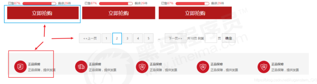
Convert these link boxes into inline blocks, and then specify text align: Center to the parent
Make use of the gap in the middle of the block elements in the row, and add text align: Center to the parent, and the block elements in the row will be centered horizontally