The idea comes from the skeleton screen in "performance optimization":
In sites with a large number of pictures, this will be a very nice experience - picture loading is usually uncomfortable. Generally, the bitmap in a good skeleton is a low pixel picture, that is, the general color matching and change are consistent with the actual content.
Sometimes, for example, if the picture is not fixed, you can use an algorithm to obtain the main color of the picture (at least in the same color system), and use solid color blocks to occupy the space.
Further, in some "relaxed" scenes, we can make the background color / page theme color change with the rotation chart. As for the effect... You can think about the background effect when Netease cloud music slides and cuts songs.
Because it is not a fixed picture, I think of four methods:
- tensorflow.js image color analysis
- canvas analyzes the main tone of the picture and takes the approximate value
- css Gaussian blur
- When uploading a picture, the back-end analyzes and processes the picture, and directly returns a low pixel picture when returning
The first way is still in my practice, and I will write a separate article in the future; The last method is not recommended for personal preference: first, the back-end processing also takes time. On the other hand, it is also transmitted by pictures... yee~, and the back-end may not be recommended for you 🤣)
If you want to see the actual effect, you are recommended to try it yourself, because I found that the pictures captured by QQ screen capture in this article are so dark, and the actual display is still very beautiful.
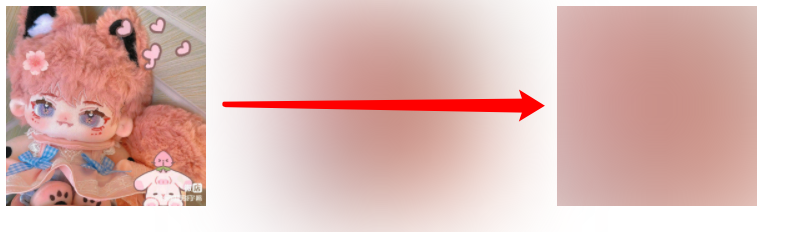
The third method seems to be implemented in pure css. How to obtain it? This is about the filter: blur(); In short, the theme color of a picture can be approximately obtained by using the blur filter and further stretching:
<div></div>
div {
	background: url(Picture address);
	background-size: cover;
	filter: blur(50px);
}
You see, through a relatively large blur filter, blur the image Gaussian by 50px. Is the blurred image a little internal flavor,
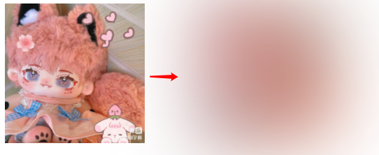
The picture is taken from wechat APP - wechat self owned brand rua baby bar - cotton doll. Welcome to play ( ̄▽  ̄)“
But not yet. There are some fuzzy edges. We can use overflow to cut.
Next, we need to zoom in on the blur angle through transform ():
Pseudo elements are recommended here
div {
	position: relative;
	width: xx;
	height: xx;
	overflow: hidden;
}
div::before {
	content: "";
	position: absolute;
	top: 0;
	left: 0;
	right: 0;
	bottom: 0;
	background: url(Picture address);
	background-size: cover;
	filter: blur(50px);
	transform: scale(2); //Self change
	transform-origin: center center;
}
So you get the main color of the picture. Of course, other processing is required.
Let's talk about the second method - canvas. In fact, it is not recommended, because it is a JS operation, and when the pictures are not fixed and there are many, the loss of performance and experience caused by single thread JS processing this "first-class event" is unimaginable. But I still want to share this article, because this is the first applied result of my original research (I have feelings, hehe)
First, the getImageData() method in canvas can obtain the pixel set of the picture:
function getImagePixel(canvas, img) {
	const context = canvas.getContext("2d");
	context.drawImage(img, 0, 0);
	return context.getImageData(0, 0, canvas.width, canvas.height).data;
}
Here's a reminder for those unfamiliar with canvas: IMG is loaded asynchronously, and all operations on pictures should be carried out in img's onload - you can consider using promise to do this.
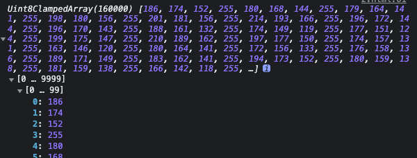
Calling this function will get an array - it is the rgba value, that is, the four data are "a group" during processing. More generally, i+=4 in the for loop! To process the following data:
function getCountArr(pData) {
	let colorList = [], rgba = [], rgbaStr = '';
	for(let i=0; i<pData.length; i+=4) {
		rgba[0] = pData[i];
		rgba[1] = pData[i+1];
		rgba[2] = pData[i+2];
		rgba[3] = pData[i+3];
		if(rgba.indexOf(undefined)!==-1 || pData[i+3] === 0) {
			continue;
		}
		rgbaStr = rgba.join(',');
		if(rgbaStr in colorList) {
			++colorList[rgbaStr];
		}else {
			colorList[rgbaStr] = 1;
		}
	}
	return colorList;
}
At this time, the number of occurrences of each group of data (color value) is obtained.
Then rewrite the getImagePixel function just now:
function getImagePixel(canvas, img) {
	const context = canvas.getContext("2d");
	context.drawImage(img, 0, 0);
	let pixelData = context.getImageData(0, 0, canvas.width, canvas.height).data;
	return getCountArr(pixelData);
}
So far, we can sort them and take out the first value / or take out the average value of some flag items, and basically take them as the background value:
for(let prop in colorList) {
	arr.push({
		color: `rgba(${prop})`,
		count: colorList[prop]
	})
}
arr.sort((a, b)=>{return b.count - a.count;});
Yes!
the path winds along mountain ridges!
Do you really think this method of canvas is just chicken ribs? Imagine such a scenario: in the case of weak network, the picture must be slow to load. At this time, we get the main color of the picture through js and fill it into the position of the picture. Is this a great scene for "fuzzy gradient loading"!
Moreover, the author once encountered such a scene: adding text to the picture. At this time, you need to pay attention to a problem, the main color of the picture. Use canvas to analyze the main color or average color of the picture. You can add white text in dark tone and black text in light tone!