Click the link to see the effect https://ihope_top.gitee.io/my...
This article has been released to official account: 100 miles of Castle Peak.
preface
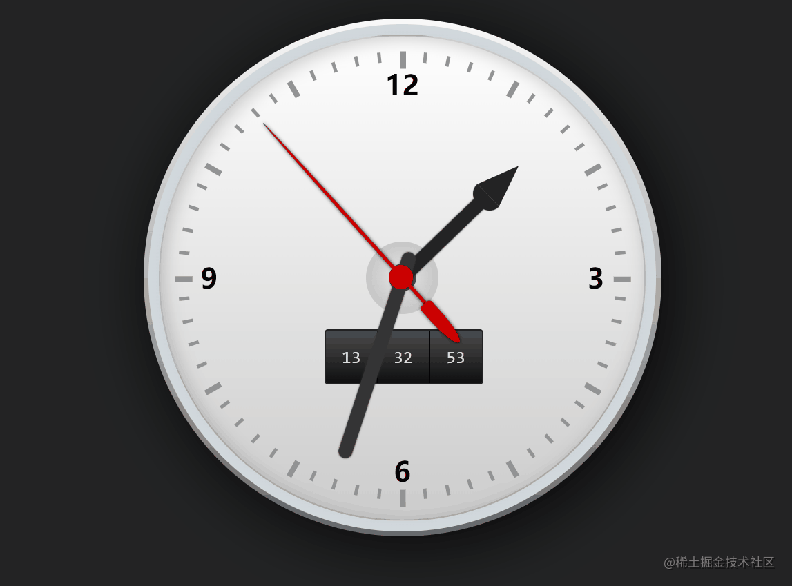
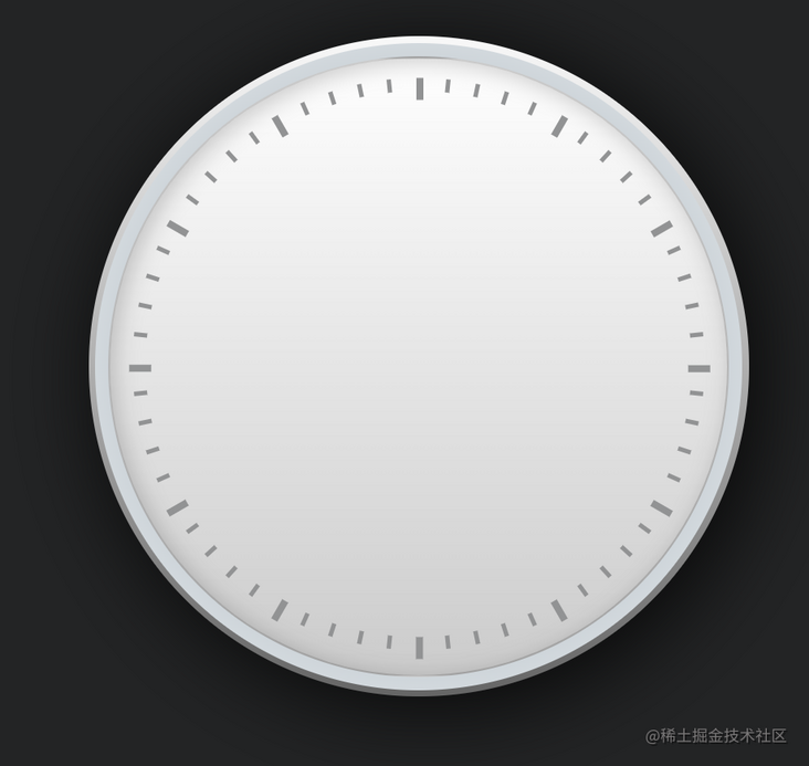
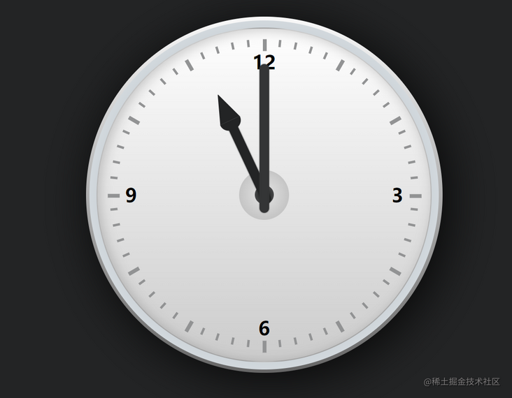
Two days ago, I turned over the materials and found a small case I learned when I first started learning the front end. I used css to draw a rotating dial. I don't know if everyone has written it, as shown in the figure below
Today, I'll share this small case with you. The original case of this effect is completely realized by css, because the rotation of the watch needle has rules to follow. Just set a timed animation. In order to simplify the amount of code and obtain the current time, I optimized it with js. Because the case is very small, I don't need the framework and start directly, Since this simple article is mainly for beginners, I will say it in detail
development
initialization
The first step is to find a folder and create index HTML, and then introduce a style CSS and initialize some styles
Dial making
Next, let's make the dial
panel
The first is the panel part. We only need one node for the html part of the panel, and the others are completed with css
<div id="watch">
<!-- clock dial -->
<div class="frame-face"></div>
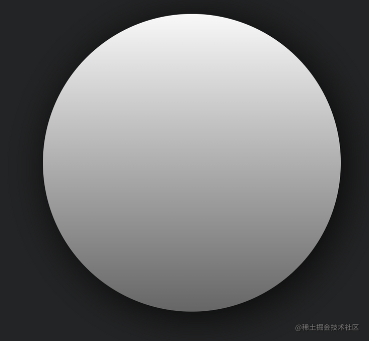
</div>First, we give the dial a basic style to determine the basic structure, and then add some gradients and shadows to create a little three-dimensional feeling
#watch .frame-face {
  position: relative;
  width: 30em;
  height: 30em;
  margin: 2em auto;
  border-radius: 15em;
  background: -webkit-linear-gradient(top, #f9f9f9, #666);
  background: -moz-linear-gradient(top, #f9f9f9, #666);
  background: linear-gradient(top, #f9f9f9, #666);
  box-shadow: 0.5em 0.5em 4em rgba(0, 0, 0, 0.8);
}
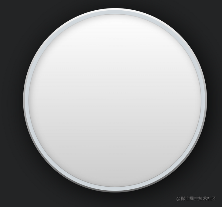
Then we use pseudo class elements to draw a radial gradient to create a sense of hierarchy and make the three-dimensional sense of the dial stronger
#watch .frame-face:before {
  content: '';
  width: 29.4em;
  height: 29.4em;
  border-radius: 14.7em;
  position: absolute;
  top: .3em;
  left: .3em;
  background: -webkit-radial-gradient(ellipse at center, rgba(246, 248, 249, 1) 0%, rgba(229, 235, 238, 1) 65%, rgba(205, 212, 217, 1) 66%, rgba(245, 247, 249, 1) 100%);
  background: -moz-radial-gradient(ellipse at center, rgba(246, 248, 249, 1) 0%, rgba(229, 235, 238, 1) 65%, rgba(205, 212, 217, 1) 66%, rgba(245, 247, 249, 1) 100%);
  background: radial-gradient(ellipse at center, rgba(246, 248, 249, 1) 0%, rgba(229, 235, 238, 1) 65%, rgba(205, 212, 217, 1) 66%, rgba(245, 247, 249, 1) 100%);
}
This is still not pleasing to the eye. We add a pseudo class to make the main panel of the variable dial. Through the contrast effect caused by shadow and gradient, this dial looks more real
#watch .frame-face:after {
  content: '';
  width: 28em;
  height: 28em;
  border-radius: 14.2em;
  position: absolute;
  top: .9em;
  left: .9em;
  box-shadow: inset rgba(0, 0, 0, .2) .2em .2em 1em;
  border: .1em solid rgba(0, 0, 0, .2);
  background: -webkit-linear-gradient(top, #fff, #ccc);
  background: -moz-linear-gradient(top, #fff, #ccc);
  background: linear-gradient(top, #fff, #ccc);
}
scale
There are small scale points around the dial, so that we can know the current specific time. Here we set 60 scale points for the dial. In the dom node, we write a container of scale points first, because there are too many scale points, which we will generate later with js
    <!-- scale -->
    <ul id="minute-marks"></ul>
Come to a basic style
#minute-marks li {
  display: block;
  width: 0.2em;
  height: 0.6em;
  background: #929394;
  position: absolute;
  top: 50%;
  left: 50%;
  margin: -0.4em 0 0 -0.1em;
}
Here, we adjust the position of each scale point through transform to achieve the corresponding effect. The scale of the whole point is more prominent than others, so we need to find out the scale of the whole point and add a prominent effect to it
window.onload = function () {
  // Generate scale
  let markWrap = document.getElementById('minute-marks')

  for (let index = 0; index < 60; index++) {
    let markItem = document.createElement('li')
    markItem.style.cssText = "transform:rotate(" + index * 6 + "deg) translateY(-12.7em)";
    if (index % 5 == 0) {
      markItem.style.width = "0.3em";
      markItem.style.height = "1em";
    }
    markWrap.appendChild(markItem)
  }
}
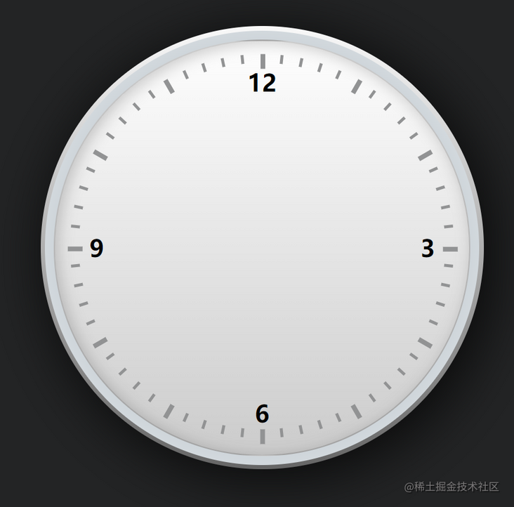
Here, we can also consider adding some digital marks of scales as appropriate
<ul id="digits">
  <li>3</li>
  <li>6</li>
  <li>9</li>
  <li>12</li>
</ul>
#digits {
    width: 30em;
    height: 30em;
    border-radius: 15em;
    position: absolute;
    top: 0;
    left: 50%;
    margin-left: -15em;
}
#digits li {
  font-size: 1.6em;
  display: block;
  width: 1.6em;
  height: 1.6em;
  position: absolute;
  top: 50%;
  left: 50%;
  line-height: 1.6em;
  text-align: center;
  margin: -.8em 0 0 -.8em;
  font-weight: bold;
}

#digits li:nth-child(1) {
  transform: translate(7em, 0)
}

#digits li:nth-child(2) {
  transform: translate(0, 7em)
}

#digits li:nth-child(3) {
  transform: translate(-7em, 0)
}

#digits li:nth-child(4) {
  transform: translate(0, -7em)
}
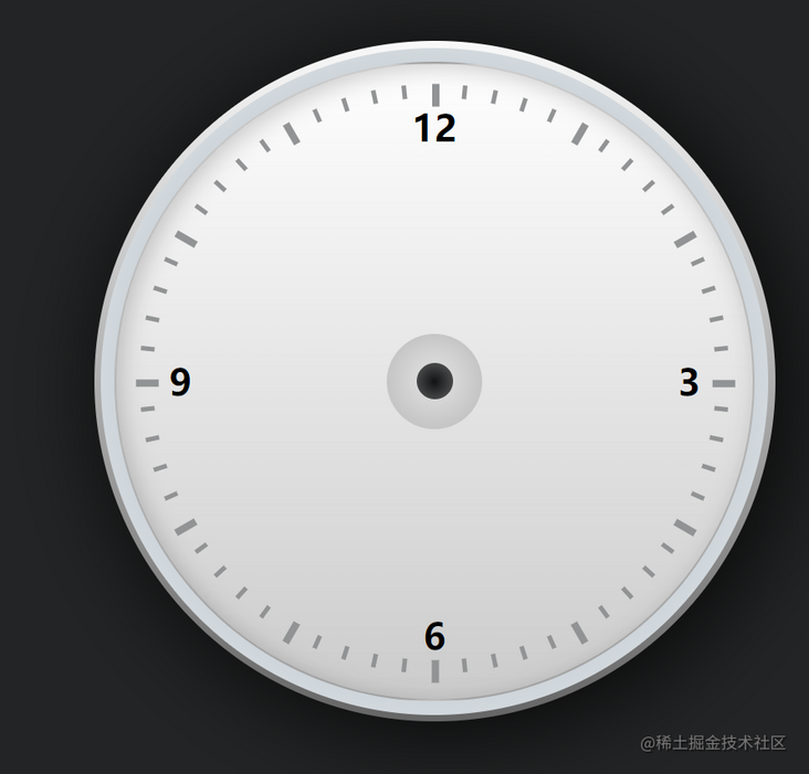
Here, we can also make the center point of the axis where the pointer rotates directly
#digits:before {
  content:'';
  width:1.6em;
  height:1.6em;
  border-radius:.8em;
  position:absolute;
  top:50%; left:50%;
  margin:-.8em 0 0 -.8em;
  background:#121314;
}
#digits:after {
  content:'';
  width:4em;
  height:4em;
  border-radius:2.2em;
  position:absolute;
  top:50%; left:50%;
  margin:-2.1em 0 0 -2.1em;
  border:.1em solid #c6c6c6;
  background:-webkit-radial-gradient(ellipse at center, rgba(200,200,200,0), rgba(190,190,190,1) 90%, rgba(130,130,130,1) 100%);
  background:-moz-radial-gradient(ellipse at center, rgba(200,200,200,0), rgba(190,190,190,1) 90%, rgba(130,130,130,1) 100%);
  background:radial-gradient(ellipse at center, rgba(200,200,200,0), rgba(190,190,190,1) 90%, rgba(130,130,130,1) 100%);
}
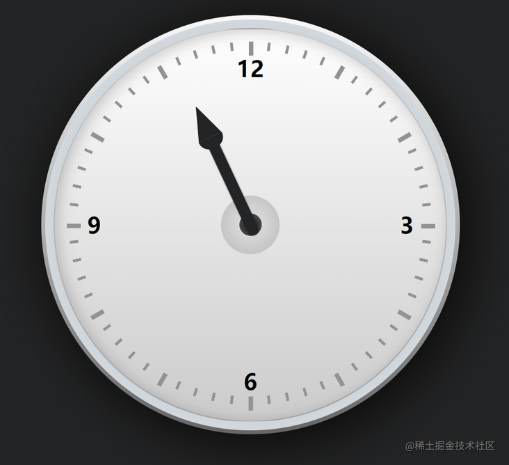
Pointer development
Next, we develop the dial pointer
Pointer here, we prepare three DOMS for you, which are hour hand, minute hand and second hand
    <!-- Pointer -->
    <div class="hours-hand"></div>
    <div class="minutes-hand"></div>
    <div class="seconds-hand"></div>
Clock development
The main part of the hour hand is divided into a needle column and a needle tip. The needle column is a rectangle, and the needle tip can be composed of a semicircle and a triangle
#watch .hours-hand {
    width:.8em;
    height:7em;
    border-radius:0 0 .9em .9em;
    background:#232425;
    position:absolute;
    bottom:50%; left:50%;
    margin:0 0 -.8em -.4em;
    box-shadow:#232425 0 0 2px;
    transform-origin:0.4em 6.2em;
    transform:rotate(-25deg);
}
#watch .hours-hand:before {
    content:'';
    background:inherit;
    width:1.8em;
    height:.8em;
    border-radius:0 0 .8em .8em;
    box-shadow:#232425 0 0 1px;
    position:absolute;
    top:-.7em; left:-.5em;
}
#watch .hours-hand:after {
    content:'';
    width:0; height:0;
    border:.9em solid #232425;
    border-width:0 .9em 2.4em .9em;
    border-left-color:transparent;
    border-right-color:transparent;
    position:absolute;
    top:-3.1em; left:-.5em;
}
Note that we use the attribute transform origin here. This attribute is used to set the rotation reference point. When dom rotates, it will rotate at this point. If it is not set, it will rotate at its own center
Minute hand development
In order to make a distinction, we give different pointers a different style, and the minute hand is just a rectangle
#watch .minutes-hand {
    width:.8em;
    height:12.5em;
    border-radius:.5em;
    background:#343536;
    position:absolute;
    bottom:50%; left:50%;
    margin:0 0 -1.5em -.4em;
    box-shadow:#343536 0 0 2px;
    transform-origin:0.4em 11em;
}
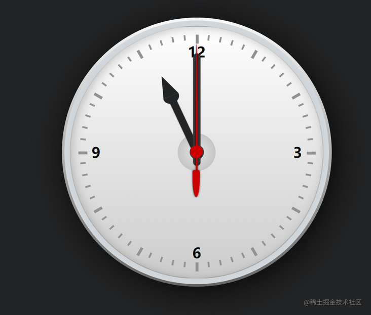
Second hand development
The second hand consists of three parts: a rounded rectangle at the end of the hand, a circle overlapping the center point, and a long needle tip, which can also be made through rounded corners
/* second hand */
#watch .seconds-hand {
  width:.2em;
  height:14em;
  border-radius:.1em .1em 0 0/10em 10em 0 0;
  background:#c00;
  position:absolute;
  bottom:50%; left:50%;
  margin:0 0 -2em -.1em;
  box-shadow:rgba(0,0,0,.8) 0 0 .2em;
  transform-origin:0.1em 12em;
}
#watch .seconds-hand:after {
  content:'';
  width:1.4em;
  height:1.4em;
  border-radius:.7em;
  background:inherit;
  position:absolute;
  left:-.65em; bottom:1.35em;
}
#watch .seconds-hand:before {
  content:'';
  width:.8em;
  height:3em;
  border-radius:.2em .2em .4em .4em/.2em .2em 2em 2em;
  box-shadow:rgba(0,0,0,.8) 0 0 .2em;
  background:inherit;
  position:absolute;
  left:-.35em; bottom:-3em;
}
Let the needle turn
Above, we have developed the basic styles of dial and pointer. Next, we will let the needle rotate. When we just wrote css, we already know that the position of the pointer is realized by transform ing and rotating a certain angle. Therefore, we need to realize the movement of the pointer. We only need to change this angle regularly
  setInterval(function () {
    var time = new Date();
    var hour = time.getHours()
    var minute = time.getMinutes();
    var second = time.getSeconds();
    var hournum;
    if (hour > 12) {
      hournum = ((hour - 12) + minute / 60) * 30;
    } else {
      hournum = (hour + minute / 60 * 100) * 30;
    }
    var minnum = (minute + second / 60) * 6 + second / 60;
    var sennum = second * 6;
    document.getElementsByClassName("hours-hand")[0].style.transform = "rotate(" + hournum + "deg)"
    document.getElementsByClassName("minutes-hand")[0].style.transform = "rotate(" + minnum + "deg)"
    document.getElementsByClassName("seconds-hand")[0].style.transform = "rotate(" + sennum + "deg)"
  }, 1000);
That's it
Digital meter development
Although the pointer is also very intuitive, it is always not as intuitive and accurate as the number, so we can add a small digital dial. The digital dial is simpler. Let's get the current hour, minute and second and refresh it regularly. Here we need the level of the host column dial, and we can't cover the pointer
    <!-- Digital dial -->
    <div class="digital-wrap">
      <ul class="digit-hours"></ul>
      <ul class="digit-minutes"></ul>
      <ul class="digit-seconds"></ul>
    </div>
#watch .digital-wrap {
width:9em;
height:3em;
border:.1em solid #222;
border-radius:.2em;
position:absolute;
top:50%; left:50%;
margin:3em 0 0 -4.5em;
overflow:hidden;
background:#4c4c4c;
background:-webkit-linear-gradient(top, #4c4c4c,#0f0f0f);
background:-moz-linear-gradient(top, #4c4c4c, #0f0f0f);
background:-ms-linear-gradient(top, #4c4c4c,#0f0f0f);
background:-o-linear-gradient(top, #4c4c4c,#0f0f0f);
background:linear-gradient(to bottom, #4c4c4c,#0f0f0f);
}
#watch .digital-wrap ul {
float:left;
width:2.9em;
height:3em;
border-right:.1em solid #000;
color:#ddd;
font-family:Consolas, monaco, monospace;
text-align: center;
line-height: 3em;
}
#watch .digital-wrap ul:last-child {width: 3em; border:none }// Connected to the upper pointer rotation js back
if(hour<10){
hour="0"+parseInt(hour);
}
if(minute<10){
minute="0"+parseInt(minute);
}
if(second<10){
second="0"+parseInt(second);
}
document.getElementsByClassName("digit-hours")[0].innerHTML=hour;
document.getElementsByClassName("digit-minutes")[0].innerHTML=minute;
document.getElementsByClassName("digit-seconds")[0].innerHTML=second;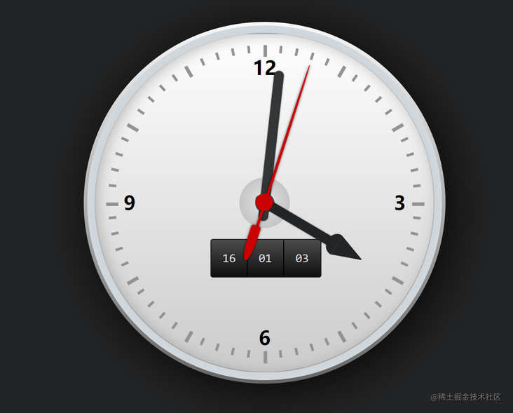
That's it.