@[TOC]HTML+CSS to realize the elastic layout of web pages
Elastic box
Recommended learning address:
Link: CSS3 flex box.
Centering properties understand:
align-items
justify-content
align-content
Station B
Layout effect:

Project address: https://download.csdn.net/download/LF2018131/18888035
Basic knowledge and characteristics
The elastic box consists of a flex container and a flex item.
Elastic containers are defined as elastic containers by setting the value of the display property to flex or inline flex.
The elastic container contains one or more elastic child elements.
characteristic:
Flexible, commonly used in page layout to solve the problem of screen adaptation.
use:
-
When using the elastic layout of the box, you can no longer use "display: inline block" to convert block level elements or intra row elements to intra row block elements.
-
display: flex; Add to parent container.
Note: the outside of the elastic container and the inside of the elastic sub element are rendered normally. The elastic box only defines how the elastic sub elements are laid out in the elastic container.
Basic syntax:
<!DOCTYPE html>
<html lang="en">

<head>
    <meta charset="UTF-8">
    <meta http-equiv="X-UA-Compatible" content="IE=edge">
    <meta name="viewport" content="width=device-width, initial-scale=1.0">
    <title>Document</title>
    <style>
        .ourter {
            width: 400px;
            height: 400px;
            border: 1px solid #f40;
            display: flex;/*Add elastic layout of box*/
        }

        .inner {
            width: 100px;
            /* width: 98px; */
            height: 100px;
            border: 1px solid rgb(0, 0, 0);
            /* display: inline-block; */
            /* display: inline-block; */
            /*When using the elastic layout of the box, you can no longer use display: inline block
            Convert block level elements or inline elements to inline block elements*/
        }
    </style>
</head>

<body>

    <div class="ourter">
        <div class="inner"></div>
        <div class="inner"></div>
        <div class="inner"></div>
        <!-- <div class="inner"></div> -->
    </div>
</body>

</html>
effect: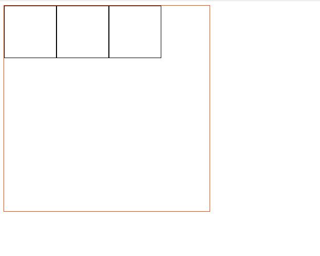
Possible problems in layout
Box compression deformation
When the number of containers is increased to 8, the original width: 100px has been reduced and deformed.
<style>
        .ourter {
            width: 400px;
            height: 400px;
            border: 1px solid #f40;
            display: flex;
        }

        .inner {
            width: 100px;
            /* width: 98px; */
            height: 100px;
            border: 1px solid rgb(0, 0, 0);
            /* display: inline-block; */
        }
    </style>
</head>

<body>

    <div class="ourter">
        <div class="inner">Box 1</div>
        <div class="inner">Box 2</div>
        <div class="inner">Box 3</div>
        <div class="inner">Box 4</div>
        <div class="inner">Box 5</div>
        <div class="inner">Box 6</div>
        <div class="inner">Box 7</div>
        <div class="inner">Box 8</div>
    </div>
</body>
effect:
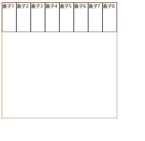
Reason: / * the elastic box model can specify that the sub elements in the box are arranged horizontally by default, and there is no line break by default*/
resolvent:
The style part is not changed, only the body part is changed:
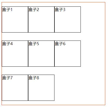
Put eight small boxes into two boxes, four in a group.
<body>
    <div class="ourter">
    <!-- Add first div -->
        <div>
            <div class="inner">Box 1</div>
            <div class="inner">Box 2</div>
            <div class="inner">Box 3</div>
            <div class="inner">Box 4</div>
        </div>
         <!-- Add second div -->
        <div>
            <div class="inner">Box 5</div>
            <div class="inner">Box 6</div>
            <div class="inner">Box 7</div>
            <div class="inner">Box 8</div>
        </div>
    </div>
</body>
effect:
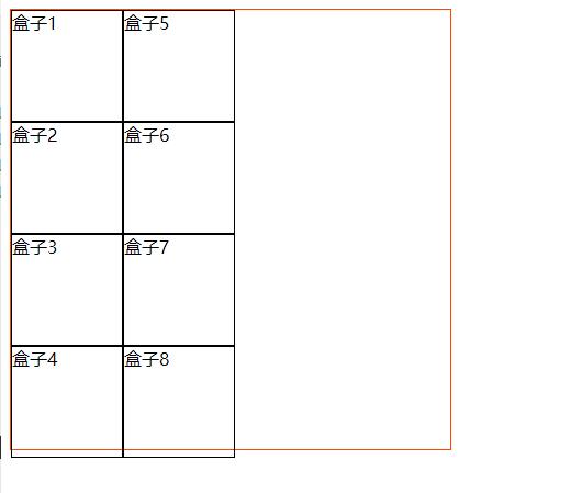
As a result, new problems emerged. The offspring are arranged vertically.
reason:
The default vertical direction is to arrange the remaining equal points, that is, fill in the vertical direction first.
Vertical arrangement of offspring
resolvent:
Back to the previous step, do not add div, divide it into two modules, and directly add styles in the parent:
flex-wrap: wrap;
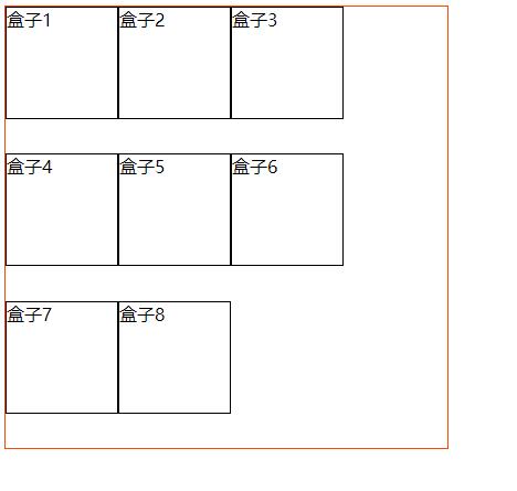
If you add another sentence align items: Center; The element is centered on the side axis. If the height of the element on the side axis is higher than its container, the overflow distance is the same in both directions.
Align items usage: link.
Recommended writing method
<style>
        .ourter {
            width: 400px;
            height: 400px;
            border: 1px solid #f40;
            display: flex;
            /* Clear default vertical arrangement */
            flex-wrap: wrap;
            /* The element is centered on the side axis. If the height of the element on the side axis is higher than its container, the overflow distance is the same in both directions. */
            align-items: center;
            /* The element is aligned to the start point of the side axis.*/
            /* align-content: flex-start; */
            /* When the y-axis is arranged in multiple directions*/
            align-content: flex-start;
            /* Specifies the arrangement of the spindle direction (y) */
            /* justify-content: center; */
            /* Distribute elastic elements evenly on each row. The distance between adjacent elements is the same. The first element of each line is aligned with the beginning of the line, and the last element of each line is aligned with the end of the line. */
            /* justify-content: space-between; */
            /* The distance from the first element of each line to the beginning of the line and the distance from the last element of each line to the end of the line will be half the distance between adjacent elements. */
            justify-content: space-around;
        }

        .inner {
            /* width: 100px; */
            /* Subtract the thickness of the border from the size of each box so that it can be arranged in one line */
            width: 98px;
            height: 100px;
            border: 1px solid rgb(0, 0, 0);
            /* display: inline-block; */
        }
    </style>
</head>

<body>
    <div class="ourter">
        <!-- Add first div -->
        <!-- <div> -->
        <div class="inner">Box 1</div>
        <div class="inner">Box 2</div>
        <div class="inner">Box 3</div>
        <div class="inner">Box 4</div>
        <!-- </div> -->
        <!-- Add second div -->
        <!-- <div> -->
        <div class="inner">Box 5</div>
        <div class="inner">Box 6</div>
        <div class="inner">Box 7</div>
        <div class="inner">Box 8</div>
        <!-- </div> -->
    </div>
</body>
effect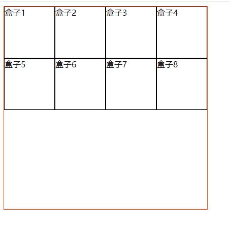
Adjust the size of the parent box and child box, and use the center layout mode you want.