📋 Personal profile
- 💖 About the author: Hello, I'm Daniel 😜
- 📝 Personal homepage: Hall owner a Niu🔥
- 🎉 Support me: like 👍+ Collection ⭐ Email + message 📝
- 📣 Series column: web development🍁
- 💬 Maxim: so far, all failures hinder me from moving forward! 🔥
💐 preface
Today, I summarize the rest of the box model
🌷 Rounded border
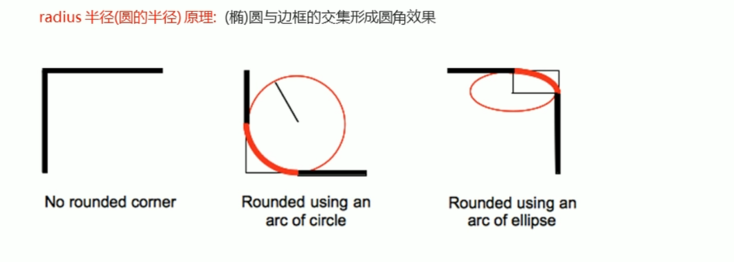
In CSS3, the rounded border style is added, so that our box can be rounded.
The border - radius attribute is used to set the outer border fillet of the element.
 Syntax:
 border - radius : length ;
- Parameter values can be numeric or percentage.
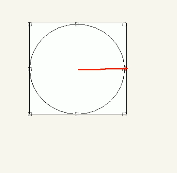
- If it is a square and you want to set it as a circle, change the value to half the height or width, or write it as 50%.
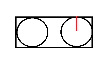
- If it is a rectangle, set it to half the height.
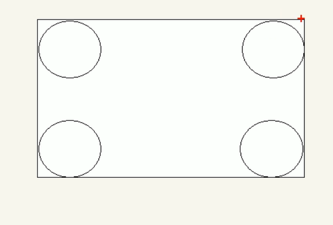
- This attribute is a shorthand attribute, which can be followed by four values, namely, the upper corner, the upper right corner, the lower right corner and the lower left corner.
- Write separately: border - top - left - radius, border - top - right - radius, border- bottom - right - radius and border - bottom - left - radius.
1. Case
<!DOCTYPE html>
<html lang="en">
<head>
<meta charset="UTF-8">
<meta http-equiv="X-UA-Compatible" content="IE=edge">
<meta name="viewport" content="width=device-width, initial-scale=1.0">
<title>Document</title>
<style>
/* Square - > circle. If it is a square and you want to set it as a circle, change the value to half of the height or width, or write it as 50%. */
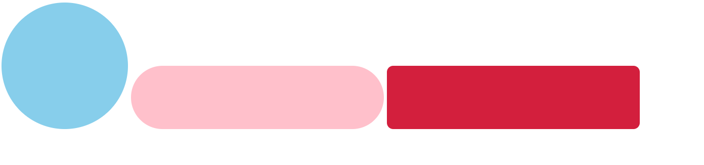
.demo1{
display: inline-block;
width: 200px;
height: 200px;
background-color: skyblue;
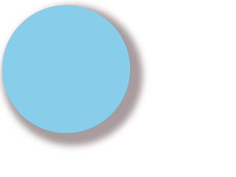
border-radius: 50%; /*100px*/
}
/* If it is a rectangle, set it to half the height. */
.demo2{
display: inline-block;
width: 400px;
height: 100px;
background-color: pink;
border-radius: 50px;
}
.demo3{
display: inline-block;
width: 400px;
height: 100px;
background-color: rgb(211, 31, 61);
border-radius: 10px;
}
</style>
</head>
<body>
<div class="demo1"> </div>
<div class="demo2"> </div>
<div class="demo3"> </div>
</body>
</html>
2. Principle.
So if you want to set the square as a circle, change the value to half the height or width
If it is a rectangle, set it to half the height.
🌷 Box shadow
CSS3 has added box shadow. We can use the box - shadow attribute to add shadow to the box.
Syntax:
 box - shadow : h-shadow v-shadow blur spread color inset ;
| attribute | describe |
|---|---|
| h - shadow | Required. The location of the horizontal shadow. Negative values are allowed. |
| v - shadow | Required. The position of the vertical shadow. Negative values are allowed. |
| blur | Optional. Blur distance. |
| spread | Optional. The size of the shadow. |
| color | Optional. The color of the shadow. |
| inset | Optional. Change the outer shadow to the inner shadow. |
be careful:
1. The default is the outer shadow, but this word cannot be written, otherwise the shadow will be invalid.
2. The box shadow does not occupy space and will not affect the arrangement of other boxes.
<!DOCTYPE html>
<html lang="en">
<head>
    <meta charset="UTF-8">
    <meta http-equiv="X-UA-Compatible" content="IE=edge">
    <meta name="viewport" content="width=device-width, initial-scale=1.0">
    <title>Document</title>
    <style>
        /* Square - > circle. If it is a square and you want to set it as a circle, change the value to half of the height or width, or write it as 50%. */
        .demo1{
            width: 200px;
            height: 200px;
            background-color: skyblue;
            border-radius: 50%; /*100px*/
            box-shadow: 10px 10px 10px 10px rgba(35, 4, 4, .4);
        }


      </style>
  </head>
  <body>
      <div class="demo1">  </div>

  </body>
</html>
🌷 Text shadow
In CSS3, we can use the text - shadow attribute to apply shadows to text.
Syntax:
 text - shadow : h - shadow v - shadow blur color ;
| attribute | describe |
|---|---|
| h - shadow | Required. The location of the horizontal shadow. Negative values are allowed. |
| v - shadow | Required. Vertical shadow position. Negative values are allowed. |
| blurl | Optional. Fuzzy distance. |
| color | Optional. The color of the shadow. |
<!DOCTYPE html>
<html lang="en">
<head>
<meta charset="UTF-8">
<meta http-equiv="X-UA-Compatible" content="IE=edge">
<meta name="viewport" content="width=device-width, initial-scale=1.0">
<title>Document</title>
<style>
.demo1{
font-size: 30px;
color:orange;
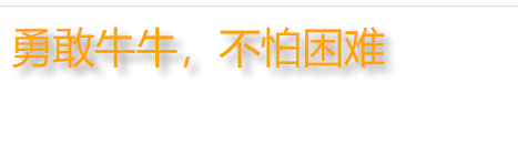
text-shadow: 5px 5px 6px rgba(17, 1, 1, .4) ;
}
</style>
</head>
<body>
<div class="demo1"> Brave cattle are not afraid of difficulties </div>
</body>
</html>
💐 epilogue
After the box model is written, it will bring floating and positioning in the later stage.
See here in the last issue:
👉Selectors in css
👉css box model and its practical cases (Part 1)