css brother selector with mouse click to achieve different effects
The last case completed: beautification of form elements (radio box)
When writing a web page, especially when completing a certain effect with the mouse state, it is found that the corresponding effect can be achieved by using the pseudo class with the corresponding selector. Among them, + ~, is the most used to select sibling elements in the selector. As for several states of the mouse, it will also be involved.
Finally realize the beautification of case form elements!!!!
css + ~ selector
Similarities: both selectors select sibling elements. It is worth noting that the selection range is the sibling element after the element. (it can't be the brother element in front of him! css also doesn't have a parent element selector [it was silly to find a parent element selector at that time. Pay attention later])
Differences: ~ selects all the eligible sibling elements in the back, + selects the next element next to the back. Note: Although the selected range of both is the later element, the range of ~ is all the later elements, + the next element
<!DOCTYPE html>
<html lang="en">
<head>
<meta charset="UTF-8">
<meta http-equiv="X-UA-Compatible" content="IE=edge">
<meta name="viewport" content="width=device-width, initial-scale=1.0">
<title>Document</title>
<style>
p,
h5 {
margin: 4px;
}
.box {
background-color: burlywood;
}
.item {
color: blueviolet;
}
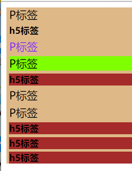
/* +The next sibling p tag is selected in the selector */
.box .item+p {
background: chartreuse;
}
/* + Because the next element next to is not h5, it does not take effect */
.box .item+h5 {
background: chartreuse;
}
/* All sibling h5 tags after item selection */
.box .item~h5 {
background-color: brown;
}
</style>
</head>
<body>
<div class="box">
<p>P label</p>
<h5>h5 label</h5>
<p class="item">P label</p>
<p>P label</p>
<h5>h5 label</h5>
<p>P label</p>
<p>P label</p>
<h5>h5 label</h5>
<h5>h5 label</h5>
<h5>h5 label</h5>
</div>
</body>
</html>
Operation results:
summary
- Both selectors are siblings that select the back edge of the element
- ~Select all eligible sibling elements in the back, + select the next eligible element
Several states of mouse click
- hover the state when the mouse hovers over the upper edge
- Focusclick the mouse to focus (after clicking the common input box, the cursor focuses on the input box)
- Checked: the status selected by the mouse (the status after clicking in the single choice multiple selection box is checked, and then click Cancel)
- Active mouse click status (left click is active)
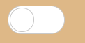
Beautification of form elements
Idea: the beautification of the radio box in the form element is to use the form element to locate the image prepared for the implementation (for example, the wizard image can also be used without the image, mainly to trigger the pseudo class to change the style by clicking the mouse)
The radio box beautifies the following effects
<!DOCTYPE html>
<html lang="en">

<head>
    <meta charset="UTF-8">
    <meta http-equiv="X-UA-Compatible" content="IE=edge">
    <meta name="viewport" content="width=device-width, initial-scale=1.0">
    <title>Document</title>
    <style>
        body {
            background-color: burlywood;
        }

        /* css  Beautified style */
        .check {
            width: 60px;
            height: 30px;
            position: relative;
        }
        .sty {
            width: 58px;
            height: 28px;
            background-color: #fff;
            border-radius: 15px;
            border: 1px solid #c9c9c9;
            position: relative;
            transition: all .3s;
        }
        .sty::before {
            content: "";
            height: 24px;
            width: 24px;
            border: 1px solid #c9c9c9;
            background-color: #ffffff;
            border-radius: 50%;
            position: absolute;
            top: 1px;
            left: 1px;
            transition: all .3s;
        }

        /* css  First change the size of the radio box to the expected size, and then position the input to the beautification position to cover the sty */
        input {
            /* Set the size of the radio box as big as the size of sty */
            width: 60px;
            height: 30px;
            margin: 0;
            /* Locate it in the corresponding position of check */
            position: absolute;
            top: 0;
            left: 0;
            /* Hide and overwrite it on the check */
            opacity: 0;
            z-index: 2;
        }

        /* Click the mouse to trigger checked to change the beautification style */
        .check input:checked+.sty::before {
            top: 1px;
            left: 30px;
        }
        .check input:checked+.sty {
            background-color: #4ed668;
        }
    </style>
</head>

<body>
    <div class="check">
        <!-- Radio  -->
        <input type="checkbox">
        <!-- define styles -->
        <div class="sty"></div>
    </div>
</body>

</html>
Finally, the following effects are achieved:
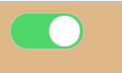 In fact, the so-called beautification is to cover the form elements on the beautified style and change the style by clicking the mouse
Ha ha ha! My girlfriend wrote me and her!